Pixels vs EM & Vertical Rhythm #1943
Comments
|
Nope, no em units. They complicate simple values and scales unnecessarily and for little reward. Pixels are fine as browsers just zoom the page without any problem. |
|
@markdotto is it possible to get a response from a technical rather than designer person? "Complicate simple values" is simply not true. Things like 60px, 40px don't really let you do nice vertical rhythmical composition. It's not about zoom. It's more about other people using a different base font size, therefore requiring having different margins, paddings and sizes of different elements. |
|
Actually I'm more than happy to accept @markdotto's expertise here. What I'd like is some source to reference so I can understand why every design article on typography and vertical rhythm I've read on this is wrong. I assume it's because something has changed, but I'd like to dig in a bit before either committing to an entirely pixel based typography or spending time overriding all of bootstrap's values with an em based one. |
|
As far as I known pixel doesn't works when someone (maybe with vision problems) change the default browser font size. thanks |
|
Can we at least have support for em based settings? Right now if I set $baseFontSize to 1em everything explodes. Thanks |
|
+1 for an explanation or at least support for em based settings. |
|
+1 I would love to hear a detailed explanation. Browser zoom is not equivalent to resizing text for someone who is vision-impaired. |
|
davideicardi is correct, sizes set in pixels are not influenced by the base font size set in most browsers. The problem with px is not only an a11y thing, users change the base font size up or down if they have high or low density screens. Zoom is a great thing, but there is a good reason why browsers have a base font size setting. |
|
+1 I also would like to hear a clear explanation or support for an em based setting (at least for headers and possibly padding ). |
|
If anything em removes complexity. Having px line-heights instead of relative ones are also another weird thing in boostrap. |
|
@markdotto Setting sizes in pixels is not responsive at all. Not responsive to the device and it's settings and not to user preferences. After all, responsive web design is not just about letting boxes move around and change size depending on the width and orientation of the device. |
|
I totally agree with @martent. sizes based on px are not responsive. The only but that I see, is that mostly of the people doesn't know how to work with em sizes properly and that's the main reason from others to reject it. |
|
@markdotto Would be nice to know if this is on the roadmap? Or even being discussed? |
|
I agree with all of you who want em instead of px. I can accept px in some places like borders where you may just want something thin. But an em almost works like an variable. If i want my site more readable i can just set my font-size in body and everything works with it (i.e size of buttons and line heights will change to). I cud use % instead but thats more complex imo. |
|
+1 for more information regarding this. |
|
+1 for explanation on preference for px vs ems or even rems |
|
I'd love to be able to use ems rather than pixels too. An advantage of using ems is that you can adjust the base font size within a media query. If, for example, you use large type on larger displays (to achieve a comfortable measure), you may find that on smaller displays your measure is far too short. Shrinking the base font size within a media query will cause type and line-height (and anything else you have set with ems) to reduce in the correct proportions for all elements. Edit: I think this is pretty much what @izepax is saying, but through using media queries. |
|
not a complete answer but found this #373 |
|
That's the same answer as here. But a lot of people clearly disagree. Using em is really important for manageable themes, I'm really surprised that there are some people who have taken the side of px. |
|
Okay, so here's a bit of a background on the decisions of yesteryear and plans for moving forward.
That's a bit all over and hopefully coherent enough. I'll try to blog about these changes as they come up more, but I'm unsure how close 3.0 is and what that will all entail yet. <3 |
|
I think this was not raised here, but using em instead of pixels is also important for web accessibility. Quite a shame for all website under section 508 (and other accessibility laws around the world) |
|
I actually had a discussion about this today with some other developers and behold this conversation is happening. I have read the reasons why ems are not being used in bootstrap. However as someone who was a designer first and a developer second I can tell you I don't think in pixels and it's kind of belittling to here that designers still think in pixels. I know many designers who think much more deeply about their designs. I think of mine in ratios and in vertical rhythm more than pixels. I hope you guys will reconsider but I have already cut this out of production based on this reason alone. Everything else is great about this framework. |
I'm just going to call these two statements out and call it a day. There are no ill intentions in the statements I made and if you reread what I wrote, you'll see I'm explaining the thinking to date and not any decision that's been made for 3.0. We'll do whatever makes the most sense for the constraints that we can define and take it from there. |
|
+1 for making em an option |
|
Hey I wasn't trying to start anything. There was no malice in this. I was just responding to your statement. Sorry for any problems you had with this. You don't owe me a reason for you thinking. It is your development. I thought this was a conversation and it seems many other people would like to hear you reconsider. I honestly don't care either way. I will continue to use what works for me and am thankful that someone even wanted to develop something like this. |
|
wow - this is a surprising discussion. hoping you'll consider em-based units for v3! |
|
For anyone looking for em-based, truly responsive layouts, we switched to Suzy a while ago and haven't looked back. It makes it easy to visualize in pixels, but execute in ems. Also Thoughtbot have been busy on Bourbon which has a Layout library and a new UI library. It's still early days, but is looking great. If you know Thoughtbot, you'll know this is worth keeping an eye on. |
|
To comply with accessibility standards we switched to Yaml |
|
@vandigroup May I ask if the em port you mentioned is or will be public, and if yes, where? |
|
I will create a repo for it here (on GH) soon and will be free for
Joe Conlin [download vCard Phone: (760) 705-4331 "Vandigroup is a full-service, digital agency, specializing in |
|
@vandigroup Great, thank you! |
|
Inuit.css uses a very nice mixin to handle type sizing in rems https://github.com/csswizardry/inuit.css/blob/master/generic/_mixins.scss#L13-L19 Fallback support could be suppressed fairly easy if needed later on. |
|
+1 for ems |
|
+1 for ems. If you are looking for a semantic, em-based grid system, the Bourbon Neat Grid is a great option. Foundation 4 is much better than previous iterations and can work if you need a "full" package. |
|
Quoting @mdo in Issue № 6342 (regarding v3, which is still under development), emphasis mine:
|
|
+1 for ems |
1 similar comment
|
+1 for ems |
|
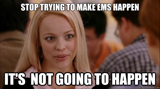
Based on @mdo's response this meme express my feelings accurately towards this issue |
|
+1 for em |
|
+1 for ems |
|
+1 for rems/ems |
|
+1 for rems |
|
+1 again for relative units. My Galaxy S3's 2.5-inch-wide 720px screen displays px-valued styles tiny, and the whole point of using a responsive layout is to be able to use equivalent descriptions for desktop and mobile. |
|
You can have all the gripes with em/rem in the world, but at the end of the day this framework has absolutely appalling typography. The grid system, various components, and JavaScript are all well and fine, but it needs to seriously step up its game with typography. +1 for rems and considering the use of a baseline grid. Some people have already tried to work toward it...But for older versions of Bootstrap. To be clear, I really like Bootstrap and think it's super awesome. It just needs to push the design a tiny bit farther. I'm trying to find a good solution to the problem myself...Including non-invasive add-ons so that it can be completely optional. |
|
Respond.js has supported ems for a few years. Well, it's pretty easy to convert the media queries to ems and it's MUCH better, especially due to page zooming and because of the following:
Now I've got some mixins for rems on fonts, margins, and padding so IE8 can see the fonts in rem which I have to figure out based on a 16px baseline. BTW, IOS is 16px that's why the page zooms when you focus an input unless you have a fix in your css for that.
There's a thread on here on vertical rhythm #11601. It's been VERY good to remove all top margins and even just have a bottom margin on hr tags, no guess work and hardly any over-rides. Plus you can make some nice spacers with empty hr and use that visible-xs on them. Yum |
html font-size is now 100% IE 8 is behaving. |
|
I'm switching to Foundation. REMs !! |
|
+1 bs v4 drop ie8 support and switch to rem unit :) |
|
I have ems and rems and all was rather easy to adjust myself and have fallbacks for IE8 which people still use |
|
@carasmo if you use rem for every rules in your CSS, the ie8 fallback duplicate all lot of code. |
|
I use a ZDroid pull request on the responsive utilities, which eliminated over 200 lines of compiled CSS, then I use one small reset file so I don't have to mess with the less files. I base my font size on 16px for the html (100%). Respond.js already supports ems. This is the compiled less for all font-sizes which uses a mixin to create: /* -------------- [ convert BOOTSTRAP font sizes to REMS ] --------*/ The gutters and all else is are in percentages and I use px when it's appropriate. |
For those following along, we'll be able to change from pixels to REMs in v4 when we drop IE8 support. Can't do much until then. |
|
If you want to use EM / REM with Bootstrap 3, try this gist. |
|
Big up for that @jasny! The pixel issue has been the only thing that has held me back in adopting Bootstrap to the fullest and thus mostly been working with Foundation. Big fan of both frameworks for various reasons, just that damn pixel issue... and to refactor, well it's a bit laborious especially for time starved folks. BS4 sounds real promising, this is a great development, great stuff @mdo! Very pleased about this. |
 and others
Hi,
Would you be interested in getting rid of Pixel measurements and taking a more flexible approach, using EM?
For things like, for example Legend size, paddings for headings, alert blocks, buttons nav tabs. These things are more likely to be relative than absolute.
Also, sizes of input controls, sizes or labels and many more things. All of them rely heavily on the base font size, and it will such an improvement to have all those things in a relative measurements (em) rather than absolute (px).
The text was updated successfully, but these errors were encountered: