import Layout from '../../../components/layout'; import {Table} from 'baseui/table'; import {BlogImage, Demo, Meta} from '../../../components/blog'; import metadata from './metadata.json';
export default Layout;
To enable the use of hooks, please update your React version to 16.8 or higher.
We've updated Styletron to version 5, and edited style types. Previously to this change, styled calls were not
type checked. This change also removes usage of $ref now that Styletron has support for ref forwarding.
See the example below for how this change will affect your code. Type definitions of props passed to
components created with styled will be moved out of the style function, and to between styled and
arguments. View information of Flow Generics here.
Theme no longer needs to be explicitly typed in props. The styled function provides that.
import {styled} from 'baseui';

- type PropsT = {$active: boolean, $theme: ThemeT};
- const MyStyledComponent = styled('div', (props: PropsT) => {
-  return {
-    backgroundColor: props.$active ? props.$theme.colors.primary400 : props.$theme.colors.negative400,
-  };
- });

+ type PropsT = {$active: boolean};
+ const MyStyledComponent = styled<PropsT>('div', props => {
+  return {
+    backgroundColor: props.$active ? props.$theme.colors.primary400 : props.$theme.colors.negative400,
+  };
+ });If your application has a custom theme, to properly type check in styled functions, you'll need to pass your theme type as a generic.
import {styled} from 'baseui';

type PropsT = {$active: boolean};
- const MyStyledComponent = styled<PropsT>('div', props => {
+ const MyStyledComponent = styled<PropsT, MyCustomThemeT>('div', props => {
   return {
     backgroundColor: props.$active ? props.$theme.colors.myBlue : props.$theme.colors.myRed,
   };
});type PropsT = {$active: boolean};
const MyStyledComponent =
styled <
PropsT >
('div',
props => {
console.log(props.$notReal); // is now a flow error
return {
backgroundColor: props.$active
? props.$theme.colors.primary400
: props.$theme.colors.negative400,
notACSSProperty: ':)', // flow will type check for valid css properties as well as values
};
});We understand that adding type checks to your code all of a sudden may introduce a substantial
migration effort. Because of this, you can run a codemod to add // $FlowFixMe comment above all
uses of baseui's styled function. Doing so will leave your code in the same state as before, no
type security, with the benefit of migrating type checks at your leisure. Either update the types
along with the baseui version update or run the codemod to save the changes for later. Follow the
instructions below to run the codemod locally.
npx @uber-web-ui/baseui-codemods --mod=v8Types --dir=<path_to_code>Use the -d option for a dry-run and use -p to print the output for comparison.
All usage of $ref has been removed. You'll want to move from $ref to ref and you will see a
warning in the console describing the change. This change follows styletron's support of forwardRef
in its latest release.
import {styled} from 'baseui';
const MyStyledComponent = styled('div', {color: 'red'});

- <MyStyledComponent $ref={myRef} />
+ <MyStyledComponent ref={myRef} />Baseui previously checked if the first argument to its styled function was a styletron-component or not.
If it was, the function would call withStyle from styletron-react automatically. Support for this was
removed in v7. Separating this functionality out will reduce the amount of complexity in baseui's styled
function and now clearly maps one to one with styled functionality from styletron-react. The only
difference now is that $theme is injected. See an example below for how you may need to update your
code. It's a contrived example, but should illustrate how some styletron-components can 'extend' others.
import {styled} from 'baseui';
+import {withStyle} from 'styletron-react';

const InitialComponent = styled('div', props => {
  return {
    backgroundColor: props.$theme.colors.positive400,
    color: 'pink',
  };
});

-const ExtendedComponent = styled(InitialComponent, {
+const ExtendedComponent = withStyle(InitialComponent, {
  backgroundColor: 'blue',
});SharedStylePropsTtype is removed. It duplicates theSharedStylePropsArgTtype. Use that instead.
StyledIconcomponent is removed. It was only wrapping an arrow icon. This logic was moved to the component itself.StyledRootPropsTandStyledSeparatorTtypes are removed. There are no style props passed to these components. Use an empty object type if they were imported in your code.
StylePropsTtype is removed. There are no style props passed. Use an empty object type if they were imported in your code.
$themeprop is removed fromPropsTtype. The$themeis provided by the baseuistyledfunction. There is no need to be concerned with it in consuming code.
calculateBorderRadiusfunction is no longer exported. It is a utility function not meant to be used.
alignprop onNavigationListis renamed to$alignsince it is a component built with styletron.
StyledComponentParamsTtype is removed. UseStyledComponentArgsTinstead.SharedStylePropsTandStyledComponentPropTtypes are removed. UseSharedStylePropsArgTinstead.
SharedStylePropsTtype is removed. UseStyledStyledPropsArgTinstead.
StyledProgressStepsPropsT,StyledNumberIconPropsT,StyledNumberContentTailPropsT,StyledNumberStepPropsT,StyledStepPropsTtypes are removed. UseStylePropsTinstead.
SharedStylePropsTtype is removed. UseSharedStylePropsArgTinstead.
SharedStylePropsTtype is removed. There are no style props passed. Use an empty object type if it was imported in your code
SharedStylePropsTtype is removed. UseSharedStylePropsArgTinstead.
SharedPropsTtype is removed. UseSharedPropsArgTinstead.
SharedStylePropsTtype is removed. UseSharedStylePropsArgTinstead.ToasterSharedStylePropsTtype is removed. UseToasterSharedStylePropsArgTinstead.
We are removing deprecated properties from the theme object. It only affects you if you've used your own theme
with the Tag, Tooltip or Input components.
To update your theme, please take a look at the update shape of the theme object here.
The Pagination component was refactored to reuse the Select component for its dropdown element. The change only effects you if you used overrides.
StyledDropdownMenuexport was removedStyledDropdownButtonexport was removedoverridesprop changes:DropdownButtonoverride was removedDropdownMenuoverride was removedSelectoverride was added. Please note thatSelectidentifier in the pagination overrides object is for a component and not a styled element. Refer to the API of theSelectcomponent for the full list of its props.
- import {StyledDropdownMenu} from 'baseui/select';
- import {StyledDropdownButton} from 'baseui/select';

  <StatefulPagination
    numPages={10}
    overrides={{
-     DropdownButton: {props: {kind: KIND.secondary}},
-     DropdownMenu: {style: {width: '300px'}},
    }}
/>The purpose of this change is to rename the Side Navigation item prop subnav to subNav for consistency with the camel-cased styled component.
Also, as the renderItem prop is not necessary since it's identical to overrides.NavLink.component, we've removed it.
Update subnav item prop to subNav:
const nav = [
  {
    title: 'Colors',
    itemId: '#level1.1',
-   subnav: [
+   subNav: [
      {
        title: 'Primary',
        itemId: '#level1.1.1',
      },
      {
        title: 'Shades',
        itemId: '#level1.1.2',
-       subnav: [
+       subNav: [
          {
            title: 'Dark',
            itemId: '#level1.1.2.1',
          },
          {
            title: 'Light',
            itemId: '#level1.1.2.2',
          },
        ],
      },
    ],
  },
  {
    title: 'Sizing',
    itemId: '#level1.2',
  },
  {
    title: 'Typography',
    itemId: '#level1.3',
  },
];

export default () => {
  const [location, setLocation] = useState('#level1.1.1');
  return (
    <Navigation
      items={nav}
      activeItemId={location}
      onChange={({item}) => setLocation(item.itemId)}
    />
  );
};
Update from renderItem to overrides:
- <Navigation renderItem={MyItem} />
+ <Navigation overrides={{ NavLink: { component: MyItem }}} />
Button designs were updated to have uniform padding on all sides.
This change made the square shape redundant so it has been removed.
The main use case for the square shape was to create square buttons with an icon inside of them.
This use case is supported by default now.
You can simply remove the shape="square" property.
- <Button shape="square">
+ <Button>
    <Upload />
</Button>We've removed the deprecated COLOR_STYLE_KEYS export from the Tag component. Instead of that, please use the KIND and VARIANT exports.
To be consistent across components, we'll use aria-label and aria-labelled-by in every components.
- `ariaLabel="myLabel"`
+ `aria-label="myLabel"`Removes StyledRadio and StyledRadioMark overrides and components.
StyledRadio: Update your code to use the Radio component instead. See examples at https://baseui.design/components/radio/.
StyledRadioMark: Update your code to use the StyledRadioInner and StyledRadioOuter instead. If you
are using the StyledRadio component, replace that with the Radio component and this warning
should go away. See examples at https://baseui.design/components/radio/.
<Radio
  overrides={{
-   Radio: {},
+   RadioInner: {},
+   RadioOuter: {},
  }}
  value="1"
>
  option
</Radio>Refactors Datepicker components to support collections of composed pickers (datepicker, timepicker, timezonepicker).
- Removes the
QuickSelectLabelQuickSelectButtonsoverrides. - Adds
QuickSelectoverride to customize the internalSelectcomponent. - Adds
QuickSelectFormControloverride to customize the internalFormControlcomponent wrappingQuickSelect.
  <Datepicker
    overrides={{
-     QuickSelectLabel: {},
-     QuickSelectButtons: {},
+     QuickSelect: {},
+     QuickSelectFormControl: {},
    }}
/>- Removes the
MonthSelectYearSelectoverrides. - Adds
MonthYearSelectButtonMonthYearSelectIconContaineroverrides. - Adds
MonthYearSelectPopoverMonthYearSelectStatefulMenuoverrides to customize internal popover and menu.
  <Datepicker
    overrides={{
-     MonthSelect: {},
-     YearSelect: {},
+     MonthYearSelectButton: {},
+     MonthYearSelectIconContainer: {},
+     MonthYearSelectPopover: {},
+     MonthYearSelectStatefulMenu: {},
    }}
/> <TimezonePicker
- onChange={({item}) => console.log(item)}
+ onChange={item => console.log(item)}
- value={[{id: 'America/Los_Angeles'}]}
+ value="America/Los_Angeles"
/>Removes the unnecessary TabPanel component.
<StatefulTabs initialState={{activeKey: '0'}}>
- <TabPanel title="Tab Link 1">Tab 1 content</TabPanel>
+ <Tab title="Tab Link 1">Tab 1 content</Tab>
</StatefulTabs>As part of the Base Web 7 release, we've updated the Button component visuals, and introduced a Large size.
In a future, non-major release, we'll update the Button colors to use grayscale colors instead of the color blue.

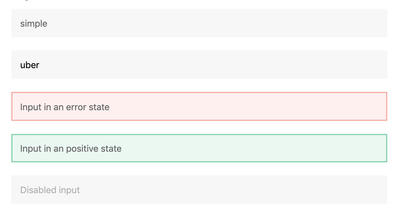
As part of the Base Web 7 release, we've updated the Input component visuals, and introduced a Large size.
Many components have been changed to have non-rounded corners.
As of Base Web v7.2.1, if you would like to preserve the pre-v7 round corners, you can do so by customizing your theme with a few new variables:
  const theme = {
    borders: {
      // use these values to preserve rounded corners look
      useRoundedCorners: true,
+     buttonBorderRadius: '4px',
+     inputBorderRadius: '4px',
+     popoverBorderRadius: '8px',
+     surfaceBorderRadius: '4px',
    }
  };
Components that were unchanged in v7 will still respect the useRoundedCorners variable, but we expect this variable will soon be deprecated in a future major release.
Here is a mapping of which components each theme variable affects: