Plotly.swift is composed of two parts arranged as a pipeline. First, the code generation reads a JSON schema and transforms it into an equivalent Swift data structure. The rest of the library is then responsible for building the publicly visible API around the generated code. When the API is used to display a chart, the chart is transformed into an equivalent JSON that matches the schema. The JSON data is then passed to Plotly.js that is responsible for rendering and handling of user interactions.
The following document describes the second half of the pipeline.
This library is meant to scratch my own itching that has developed while I was goofing around working with numerical code in Swift. Hopefully, it will be also useful to others so I can justify the time sunk into the project.
As of the time of writing Swift numerical computing ecosystem has two options to create plots - Matplotlib or SwiftPlot. There are of course other choices but these two seem to be by far the most popular.
SwiftPlot has a very nice native API but it supports only a limited set of plot types. The plots themselves are rendered as static images and after a plot is created it's not possible to interact with it in any way. This drawback is easy to miss at the first sight but it quickly becomes obvious when one is doing real work. Real data are noisy and have outliers. Therefore the interesting region of the data is more often than not disproportionately small to see because the outliers blow up the scale of the graph. Zooming onto the region requires modification of the source code which quickly becomes annoying if the data are variable enough.
Matplotlib requires crossing the bridge to Python and arguably has very alien API. This is especially evident when viewed from the Swift perspective. Some people even hold a rather extreme view that it actually doesn't have any API at all... Reason why Matplotlib code is so ugly is simply age. Roots of the various plotting functions can be tracked all the way back to Matlab which was designed in the 80s. On the other hand, the code is also very concise, stable and supports literally every feature under the sun. Because of Matplotlib's popularity and rich feature set it's very hard to provide a compelling alternative. From the purely API standpoint, it would be a huge win for humanity if Matplotlib never gets ported into Swift.
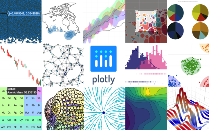
Plotly is originally a JavaScript data visualization library. It's using D3 and WebGL as rendering backends. Thanks to this design it's able to support a wide range of statistical, scientific, financial, geographic, and 3D chart types. Plotly.js is being developed and marketed by an identically named Canadian startup Plotly Inc.. Range of their commercial visualization offerings centers around the library and provides additional infrastructure to serve the charts in dashboards and or create them in a user friendly GUI. In 2015 Plotly.js was open sourced which allowed implementing bindings for other languages such as R, Python or Julia.
Plotly.js implemented a large range of configuration options to control the appearance of traces on a figure and their layout. Most of the options have reasonable defaults if they are not directly specified. This library provides a strongly typed equivalent for every option. Every trace structure and it's properties are automatically generated to be compatible. Besides compatibility the code generation also implements conformance to Encodable protocol. This protocol is part of the Swift Standard Library and allows for very simple encoding of the struct to an equivalent JSON representation.
Plotly.js figures are defined by a declarative JSON array. The top-level data property contains an array of the traces present in the figure. There are 30+ types of traces currently implemented. The most popular examples are Scatter, Bar, Histogram and Surface. Besides data there's another top-level property called layout. This is an object that specifies properties of the figure that are independent of a particular trace. Examples of such properties are size of the figure, axis extent, markers and ticks, legend, background color, subplots and many more.
The following code an example of a Swift code that creates a simple figure with a scatter trace and the generated JSON representation of the figure.
let figure = Figure(
  data: [
    Scatter(
      name: "Scatter Trace",
      x: [1, 2, 3, 4],
      y: [10, 15, 13, 17]
    )
  ],
  layout: Layout(
    title: "Figure with a Scatter Trace"
  )
)
{
"data" : [
{
"type" : "scatter",
"name" : "Scatter Trace"
"x" : [1, 2, 3, 4],
"y" : [10, 15, 13, 17],
}
],
"layout" : {
"title" : {
"text" : "Figure with a Scatter Trace"
}
}
}Besides the automatically generated portion of the code, there's a relatively small hand written layer of helper objects and also code for displaying and doing I/O.
Following Swift documentation is really helpful to understand how are the Swift trace objects encoded to JSON.
Plotly.py serves the same purpose and has the same goals as Plotly.swift but it targets Python instead. This paper very nicely explains how it works under the hood. It also implements two-way communication with Plotly.js which isn't currently done for Swift.
Library exposes the targets required for building in the package manifest file. It can be built and executed from within XCode by opening Package.swift file or with Swift Package Manager tools on the command line.
swift build
swift test