图文并茂总结7个工作中常用的css3案例,带你了解冷门却实用的特性! #15
Labels
Comments
|
大拇指 |
|
太牛了 |
|
简直就是救星,正好项目中需要。 |
哪个场景啊? |
Sign up for free
to join this conversation on GitHub.
Already have an account?
Sign in to comment
前言
最近看了《css 揭秘》这本神书,学到了很多技巧,工作中遇到的一些问题在这本书中得到了很好的解决。这篇文章也不是把书中的内容随便抄一下就拿来给大家说,我会在此基础上向外扩展一些,请求大家理性评论!另外,有几个案例是我工作中遇到过的比较棘手的问题的解决方案,总结出来让大家有个印象,万一哪天你也要实现同样的需求呢?😁
我会从以下 4 个纬度介绍各个案例:
DJ, drop the beat! 🎤
使用变量
currentColor减少重复代码需求描述
border-color、color,还有一个具有透明度的同色背景。尝试方案
我相信任何一个前端开发者都能很快实现这个需求,不知道大家怎么样的,我在之前一直都是以下代码快速实现:
index.html 文件:index.scss 文件:index.js 文件:是的,就是那么朴实无华,缺点也暴露无遗:
#333和#0069ff。如果有一天产品说把这个那个颜色改一下,细心点的你多动动手指也没啥问题,改就改了,但是这种方式很不“程序员”。针对这个问题我们直接使用预处理器(SASS/LESS)的变量就完事了:
index.scss 文件:咋一看已经是很好的实现方式了,但是也有缺点:
color单独设置一个变量,仅仅只有它使用,我还要专门为其定义一个变量就显得代码很臃肿;good-click这个类名后,我要把color、border-color、background全都重新设置一遍;这个时候,css 原生变量
currentColor即可大显身手了。改进方案
变量
currentColor能拿到本元素的color属性的值,如果没有显示设置,拿的将会是父元素的color属性的值,由此类推。借助这个特性,我们即可优化上述代码:index.scss 文件:现在看起来是不是好多了,我每次要更改颜色,只需要将此元素的
color属性更改即可,不需要再重新写一堆重复的属性,当然,原生的 css 以及功能强大的 sass/less 都还是无法支持rgba(currentColor, 0.1)这种写法,我还去官方提了个 issue ,官方也给了很好的回复,有兴趣的同学可以看看。所以现在我只能添加一个
::before来模拟背景色块,真正做到只改color属性,即可改全部颜色。现在大家就可以在 React 或 Vue 中通过状态来控制改变颜色的类名添加与否并设置
color属性,以此来完美地进行颜色的快速变换了~多说一句,如果我们直接使用
ele.style.color = '#fff'这种操作 dom 的形式来改变字体颜色,在未使用currentColor的情况下,我们是没法操作伪元素的,也就改变不了伪元素的background、border-color等其他与字体颜色一致的属性,所以这时候currentColor的优势就更明显了~在线演示
使用变量 currentColor 减少重复代码 - codepen
完美的带小箭头的聊天框
需求描述
border、背景色background、阴影、带边框的小三角箭头。border-radius。尝试方案
给该元素加个伪元素,背景色与聊天框背景色一致,再给该伪元素添加上、左同色边框,绝对定位调整位置,再来个
border-top-left-radius: 3px,最后transform: rotate(-45deg)旋转一下,代码如下:index.html 文件:index.scss 文件:可以达到现在下面的效果:

细心的你一定发现了,这个小三角指示箭头是没有阴影的,如果我给其加上与主体元素一致的
box-shadow,又因为这个属性不能像border-color一样分别给各边设置为透明,结果就会像下面这样:这已经是无法满足具有相同阴影的要求了,而且大家如过想一下就知道,在我主体元素不设
padding或设的很小的情况下,小三角的背景色会将我们的文字挡住,这种方案直接宣布失败!改进方案
针对以上的问题,我们进行一步步改造。
首先,我们考虑到主体元素不设置
padding的情况,为了防止内容被我们的小三角背景色覆盖,我们可通过加一个伪元素::before,利用border来画成一个三角形,代码如下:现在是这个样子:

注意,这里的小三角已经是没有右边部分的了,解决了我们不设置
padding时导致内容被遮挡的问题。但是这样就没有办法实现边框,毕竟你已经是使用边框做出来的三角形了。那我们就再使用一个伪元素呗,
::after安排上了。接下来为大家提供一个思路:采用尝试方案中的方式再画一个正方形做旋转,但是不为其设置背景色,只设置其border,调整下位置即可。可以看到,代码中我设置上和左的
border-color为inherit,表示继承父级元素的border-color,因我注释那部分的写法不被识别,所以我们新增了几行代码实现,利用inherit可以在颜色更改时少写颜色值的重复代码,与currentColor想要达到的目的是一致的。现在,越来越接近我们的目标:

这里小三角还是没有阴影,因为
box-shadow并不会作用于伪元素,解决方案就是使用filter属性,drop-shadow接受的参数和box-shadow基本一致,我们替代它即可:现在已经完美实现~
在线演示
实现一个完美的带小箭头的聊天框 - codepen
利用 grid 实现完美的水平铺满、间隔一致的自适应布局
需求描述
尝试方案
这个问题从我入职第一份工作之后困扰了我接近半年,我基本还是惯性思维,一眼看过去就是
flex弹性盒子一把梭,于是我有了以下这种方案:index.html 文件:index.scss 文件:可以看到,我会为每个子元素都设置
margin-top以及margin-right来固定他们之间的间距,但是因为每一行最右边的子元素也有margin-right,为了补偿这个,我就将父元素的padding-right去掉了,这样做的坏处太多了,需要自己去计算,做补偿,而且右边有时候容纳不下一个完整的子元素,就会导致换行而留下一大片白。。为了能用弹性盒子做到想要的效果,我已经把阮一峰老师的Flex 布局教程:语法篇看烂了。。根本没法实现最佳最想要的效果,以上只是我多次尝试之后唯一能接受的方案,我就这么个方案用了好多次。
直到有一天,我又遇到了这种布局需求,我辛辛苦苦用 js 去硬算他们之间的间距,算是实现了想要的效果,但是真的非常繁琐,我就受不了了。这个时候我又偶遇了阮一峰老师的CSS Grid 网格布局教程,谢天谢地,采用
Grid可完美实现以上需求!改进方案
首先我们需要给容器指定为
grid网格布局,就像flex一样:接着要为其划分列数,
grid-template-columns属性可定义每一列的列宽,假如代码如下,我们将容器划分成3列,每列宽度为容器的100px:但是这个时候我们看到的效果会是下面这样:
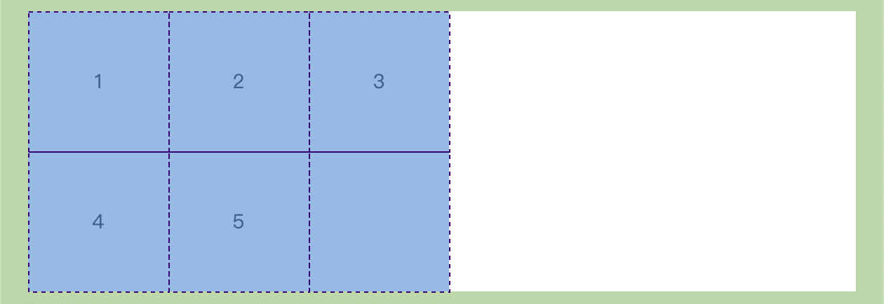
子元素并没有把父元素占满,这显然不是我们想要的效果,幸亏有
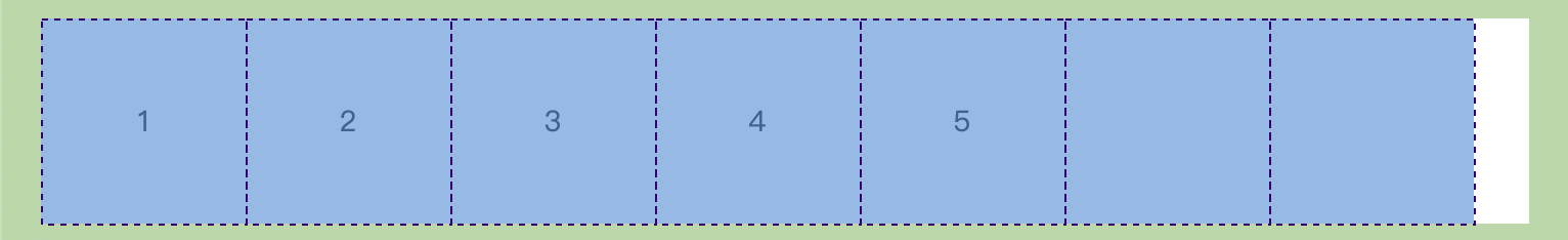
repeat()函数帮助我们简化重复值, 它接受两个参数,第一个参数是重复的次数,第二个参数是所要重复的值 。上面的代码完全可用以下代码代替:当然,这只是第一步,我们还需要借助
auto-fill关键字,在我们需要容器能尽可能容纳子元素时,就需要用到它,表示自动填充,我的理解是repeat()接受了这个auto-fill的参数时,会去自动计算容纳的数量,就好像你事先算出来这个容器能容纳多少子元素,然后把这个“多少”传给该函数一样。这时候代码如下:现在图形如下,已经越来越接近我们的目标了:
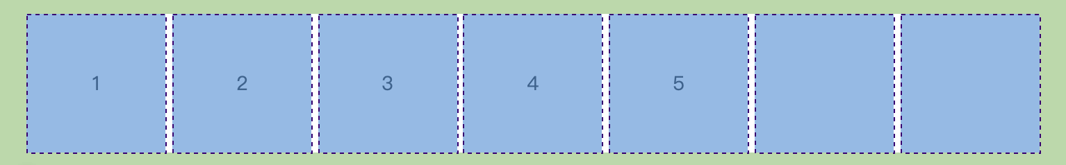
但是很显然,右边有一个空隙,
justify-content属性拯救我们,它整个内容区域在容器里面的水平位置,当我设置其为space-between时,意味着子元素之间的间隔相等,而子元素与容器边框之间没有间隔。不过子元素之间还是没有间隔,简单设置一下属性
gap即可,它是column-gap和row-gap的合并简写,分别表示列与列和行与行之间的间距,现在代码如下:由此简单的几行代码就已经完美实现了我们想要的效果:
不过
grid网格布局的兼容性不是很好,点此查看支持的浏览器列表~在线演示
利用 grid 实现完美的水平铺满、间隔一致的自适应布局 - codepen
间距可调整的虚线框
需求描述
border-radius。尝试方案
其实我一直很迷惑为什么 css3 不提供一些能调整虚线框的必要属性,默认的 dash-border 经常会和 ui 所需要的虚线框要求会不一致,既然官方不支持,我们只能自己寻找一些解决方案。
这个解决方案看似很多,其实每一种解决方案都会有一定的局限性,选择最合适的就是最好的,具体我列出了以下几条:
border-image和自定义的图片来进行虚线框的生成,该方案在 stackoverflow 查到的,我个人也尝试了下,但是修改起来特别麻烦,我第一感觉就是不会采用这种方案,有兴趣的可以看下:Brew your own border with border-image。4个绝对定位的“伪元素”来模拟,代码示例如下:index.html 文件:index.scss 文件:其实其思想很简单,就是
4个矩形,每个矩形加上渐变背景,并repeat即可模拟虚线效果,其间距、比例可根据我们设定的变量去调整。但是它的弊端非常大,就是无法调整

border-radius,即没有圆角!这里向大家展示只是为了抛砖引玉,万一你有更好的想法,或者你不需要圆角,那就可以用这个方案。效果如下:改进方案
其实我们借助 svg 就能比较不错的实现自定义虚线框,如果不想自己写 svg 的朋友可以直接在这个网站进行调整和生成:Customize your CSS Border ,但如果你稍微了解一些 svg 的用法,也完全可以自己实现,如果你想了解一下,可阅读这篇文章:SVG入门—如何手写SVG
代码如下:
index.html 文件:index.scss 文件:可通过
stroke-width调整虚线框宽度,stroke-dasharray调整比例及长度、间距,stroke-dashoffset调整偏移值。tips:svg 方案在一些比较老的安卓机上会不兼容,即使在新的机型上,也会出现一些表现差异,虽然在 web 端支持 svg 的浏览器上表现是正常的,但若考虑到移动端用户群体时,使用请慎重。
在线演示
实现一个间距可调的虚线框 - codepen
自定义复选框
需求描述
disabled状态复选框样式也可以自定义。尝试方案
很显然,当我们使用默认的
input.checkbox方案时,是没有办法改变其样式的,而且在不同浏览器之间,其表现也不一致,代码如下:index.html 文件:index.scss 文件:在 chrome 下表现为:

在 firefox 下表现为:

在 safari 下与在 firefox 下一致。
如果任由这种情况的发生,你们 ui 可能会找产品经理和你打一架~🐶
改进方案
我们可以在不改变上面尝试方案中的 html 结构,只需 css 即可做到!给每一个 label 标签添加一个伪元素
::before作为复选框!首先,我们给这个伪元素添加必要样式,使其符合 ui 的设计:
现在的拙劣效果如下:

我们发现,默认的复选框还是存在的,我们怎么做到将其隐藏而不破坏其可访问性呢(即不能使用
display: none)?现在点击我们自定义的复选框是没有任何效果的,接下来借助 css 的相邻兄弟选择器对 checked 状态、disabled 状态分别设置样式即可:
可以看到,经过此番处理后,我们可以完全自主地去设计复选框样式,比如我在上面选中时,呈现了一张对勾的图片:
background-image: url("https://s1.ax1x.com/2020/10/11/0cUbi4.png");,这极大地方便了我们对其呈现形式的掌控。除此之外,你还可以设置
input[type="checkbox"]:focus时的样式哦,赶快试试吧!在线演示
自定义复选框 - codepen
交互式图片对比效果
需求描述
尝试方案
css3 中引入了
resize属性,该属性可以不通过 js 就可以改变设置该属性的元素的宽度width,大家一定使用过textarea标签把?那个右下角的可拖拽更改长宽的东西就是该属性的功劳。实际上,所有标签都可以设置该属性!于是,简单的几段代码就可以达到交互式图片对比效果,虽然和我们想要实现的效果有点差异,但如果要求不高的话,就采用它吧:
index.html 文件:index.scss 文件:我们利用一个伪元素

::before来对右下角的拉伸图标进行覆盖,以便于自定义样式,现在效果如下:这个方案弊端就是右下角的可拖拽图标无法更改位置和大小,即使我们利用伪元素去覆盖,但是和我们需求中所需要的效果也相差甚远,于是我们不得不借助 js 了!
改进方案
在上述方案中增加一个
span标签用于画我们的拖拽竖条,紧接着按照上述方案先将两张照片的位置和大小调好:index.html 文件:index.scss 文件:现在效果如下:

初步的效果出来了,接下来增加可拖拽改变水平宽度的功能。首先需要先在两张图片交际出添加一个竖形的条状,用于拖拽位置,更改
class='handler'样式:注意中间的透明竖形条状即是我们可拖拽的位置:

接下来写我们的 js 脚本,首先通过原生 js 方法找到三个 dom 节点:
index.js 文件:然后我们还需要获得
image-slider这个最外层元素相对页面左边的距离,我们定义为变量leftX,并在鼠标于handler元素上按下时计算该值:用一张图来解释说明下:

然后在给
window对象添加一个mousemove的监听事件,该回调用于改变handler位置和before-image的宽度:目前为止,我们拖拽
handler已经能实现所需的效果,但是无法停止,我们需要添加一个鼠标按键抬起的监听事件,需要注意的是不能在handler上添加,比如:handler.onmouseup,必须在window对象上添加,具体为什么,大家可以动手试试就知道了:到此为止,就已经完美实现了该效果,大家还可以在
handler上做更多工作,使其用户体验达到更好~在线演示
交互式图片对比效果 - codepen
透明度渐变层代替滚动条提示
需求描述
尝试方案
首先很明确的是,先将内容滚动条搞出来:
index.html 文件:index.scss 文件:现在效果如下:
接下来为滚动范围的顶部和底部都先加上我们所需要的渐变层,通过父容器的
::before和::after伪元素来实现,同时动态为list-wrapper这个元素增加两个类名,用于控制渐变层的显隐:但是我们想要达到的效果是:一旦滚动条不是最顶部,顶部就要有渐变层;一旦滚动条不是最底部,底部就要有渐变层。现在完全是写死在两头,需要通过简单的 js 脚本来判断 ul 元素的滚动条的位置:
index.js 文件:最后再将原生滚动条隐藏,OK!
顺带说一句,在 codepen 中滚动条隐藏不了,本地调试时可以,我也不晓得啥问题~
改进方案
实际上上述方案是我看《css揭秘》之后想到的,在这本书中,讲到了利用两层
background以及background-attachment属性来进行渐变层的实现,但是我按书中实现之后,发现效果并不完美,甚至可以说有很大缺陷!我想了好久还是觉得用 js 方便,css 看起来是无法实现我想要的效果的!所以上述方案就是最终改进方案,《css揭秘》中的方法我实在不敢认同,不过关于
background-attachment属性的介绍倒是给我学到了~在线演示
透明度渐变层代替滚动条提示 - codepen
结语
虽然标题写了是 css3,但是还是难免涉及到了 js,我的目的是希望有同类需求的小伙伴能通过本篇文章得到帮助。欢迎各位理性讨论~如果有更好的方法,请大佬们务必不吝赐教!如果你已经看到此处,干脆点个赞再走吧~
The text was updated successfully, but these errors were encountered: