| meta | related | features | |||||||||||||||||||
|---|---|---|---|---|---|---|---|---|---|---|---|---|---|---|---|---|---|---|---|---|---|
|
|
|
The bottom sheet is a modified v-dialog that slides from the bottom of the screen, similar to a v-bottom-navigation.

::: success
This feature was introduced in v3.4.0 (Blackguard)
:::
Whereas a bottom navigation component is for buttons and specific application level actions, a bottom sheet is meant to contain anything.
| Component | Description |
|---|---|
| v-bottom-sheet | Primary Component |
The recommended components to use inside of a v-bottom-sheet are:
| Element / Area | Description |
|---|---|
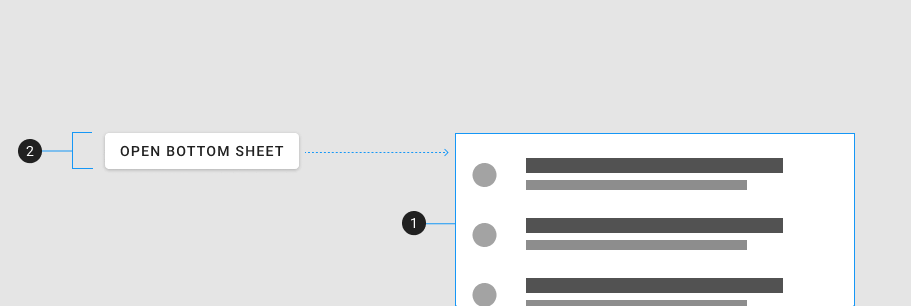
| 1. Container | The bottom sheet is a dialog that animates from the bottom of the screen |
The v-bottom-sheet component is a modified v-dialog that slides from the bottom of the screen. It is used for elevating content above other elements in a dialog style fashion. The bottom sheet can be controlled using the v-model prop or through the activator slot.
The following code snippet is an example of a basic v-bottom-sheet component:
<v-bottom-sheet>
  <v-card
    title="Bottom Sheet"
    text="Lorem ipsum dolor sit amet consectetur, adipisicing elit. Ut, eos? Nulla aspernatur odio rem, culpa voluptatibus eius debitis."
  ></v-card>
</v-bottom-sheet>The v-bottom-sheet component has access to all of the props available in v-dialog.
The v-model (or model-value) controls the visibility of the bottom sheet:
This also works in tandem with the activator slot.
With the inset prop, reduce the maximum width of the content area on desktop to 70%. This can be further reduced manually using the width prop.
The v-bottom-sheet component has access to all of the slots available in v-dialog.
| Slot | Description |
|---|---|
| 1. Default | The default slot |
| 2. Activator | The activator slot is used to open the bottom sheet |
::: info The activator slot is not required when using the v-model prop. :::
The following are a collection of examples that demonstrate more advanced and real world use of the v-bottom-sheet component.
Using a inset bottom sheet, you can make practical components such as this simple music player.
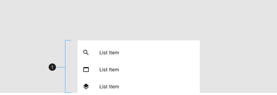
By combining a functional list into a bottom sheet, you can create a simple 'open in' component.