Graphics Contrast #9
Comments
 allanj-uaag
changed the title
allanj-uaag
changed the title
|
@allanj-uaag Could you edit the SC text so the bullet work please? It's rather difficult to read at the moment. |
|
I left a lot of feedback on #10, most of which are applicable to this SC as well, so I won't repeat them.
I don't think explicitly mentioning the possibility of a conforming alternate version in this SC is right. It gives the impression that that might not be the case for other criteria. I would much prefer adding a note that points this out, if we want to mention it at all. |
|
|
Thanks @jnurthen, and to anyone looking at this, there is one critical principle that needs to be understood & agreed, and then things like wider text and the examples can be refined. It also defines the difference between this SC and the interactive one. From my email to the WCAG-WG list: I think there is a reasonable way to approach this, which I tested by presenting it to 8 people in our design team. They didn’t go pale or get angry, and after a couple of examples it seemed quite reasonable. We obviously haven’t conveyed it in the SC text well enough yet, but if a few of the respondents could read this and think through the objections, I think we can clear that stumbling block: Graphics Contrast Testing Explanation The nub of it is that the test should be: For each element of a graphic required for understanding, it is discernible. In that page I work through a couple of the examples to show what’s needed. It is also worth noting that the current “1.4.1 Use of Color“ catches most current “difficult” examples, the contrast aspect would help catch the remaining ones. I’ve worked through a dozen examples, I’m happy to tackle more so long as they pass the color-alone SC and are different from ones I’ve already done. |
|
After a catchup call, a slight refinement to the SC text is:
That uses 'essential' instead of 'important', adds 'for understanding the content', updates the 'thicker' definition, and adds photographs/paintings as an exception. |
|
I've made some changes to the SC, the latest is available here, or the exact version at this time. This slightly updates the SC text (as per comment above) and improves the description and examples. There are a few things I'll call out for particular people: Thick / stroke widthAddressing comments from @joshueoconnor @jnurthen @michael-n-cooper and Michael Gower The text example has been moved out of the description into a section "Notes on how the contrast and thickness were derived" to prevent confusion. The flowerpot example has been updated so the 'thin' one has more contrast than the 'thick' one. Immediate surroundings & multiple coloursAddressing comments from @awkawk, Kathleen, Rachael, MichaelG & James There were several comments around how you define a graphical element, and how different colours interact. I think the "are essential for understanding the content" part of the SC should address this, and the new examples (showing pass/NA/fail) should also help. That was also the topic of my "critical principle" email, and feedback from James & @WilcoFiers indicates that has been addressed by the further examples. I've just come across the WAI-ARIA graphical objects concept, which I'm exploring as a potential spec to align with, but it at least indicates that it is definable. For Bruce - We've added an exclusion for pictures and paintings. It isn't that well defined in WCAG 2.0, not enough to point to or copy, but hopefully that's enough. PX as unit for thicknessFor Wilco and MichaelC We've had the pixel/PT discussion recently regarding the definition of large text in 1.4.3. We weren't allow to change the use of PT in the definitions of 2.0, but going forward we should use PX because:
Note that we mean the "CSS pixel" rather than "Device pixel", which as PPK's various publications make clear is the better unit to use. Perhaps that could be clearer in the description? I've also added to the testing procedure to ensure that the image tested is the smallest possible at the default zoom level. Important vs essentialFor Andrew and Wilco: |
|
Adding a couple of comments from Bruce Bailey:
Definite improvement, I've replaced the current exclusion with:
I'm not sure about that, I think we need to be clear about what is needed for testing this, as 1.4.3. says "of text", we need an "of XXXX". I'm getting in touch with one of the editors of ARIA graphics module as that includes similar definitions. However, I would have to munge two of the definitions together (graphic object and symbol) as it should cover both those levels. E.g. If other people are happy that the SC does not need to have a glossary definition of "graphical element" linked directly from the SC text, then I don't feel strongly about it being a glossary definition, but we do need something for the understanding document. |
|
Amelia Bellamy-Royds replied to me and kindly allowed me to quote her entirely:
I have updated the SC text with 'graphical object' and the new definition. Dec 13th version of the SC text. |
|
@alastc You currently have a couple spots in the Description section where you revert back to "graphical element", but otherwise looking good. |
Current DRAFT 15 Dec 2016SC ShortnameInformational Graphic Contrast (Minimum) (Please note: this SC is separate from the Interactive Element Contrast (Minimum) SC. SC TextThe visual presentation of graphical objects that are essential for understanding the content have a contrast ratio of at least 4.5:1 against their immediate surrounding background, except for the following:
Suggested Priority LevelLevel AA Related Glossary additions or changes
What Principle and Guideline the SC falls within.Principle 1, Guideline 1.4DescriptionThe intent of this success criterion is to apply the contrast requirements to important graphical elements in a similar way that it is applied to text in 1.4.3 Contrast (Minimum). If a graphic is needed to understand the content or functionality of the webpage then it should be perceivable for people with low vision or other impairments. The term "graphical object" is intended to apply to stand-alone icons such as a print icon (with no text), and the important parts of a more complex diagram such as each line in a graph. Not every graphical object needs to have sufficient contrast with its surroundings, only those that are required to understand what the graphic is conveying. Graphics that are very thin are harder to perceive, therefore have a higher contrast requirement of 4.5:1. Graphics that are thicker or are solid shapes have a lower requirement of 3:1. The term essential information is used so that many graphics do not need to meet the contrast requirements. If a person needs to perceive a graphic, or part of a graphic (a graphical object) in order to understand the content it should have sufficient contrast. That is not a requirement for:
For designers developing icons that need to be perceived clearly, the following is an example of several sizes of icon having sufficient contrast at different sizes. The thicker lines (3px or more) have 3:1 contrast (#949494 on #FFFFFF), the small lines (2px or less) need a darker grey (#777777 on #FFFFFF).
BenefitsThe intent of this Success Criterion is to provide enough contrast for graphics that convey important information so they can be perceived by people with moderately low vision (who do not use contrast-enhancing assistive technology). People with low vision often have difficulty perceiving graphics that have insufficient contrast. This can be exacerbated if the person has a color vision deficiency that lowers the contrast even further. Providing a relative luminance (lightness) difference of 4.5:1 or greater can make these items more distinguishable when the person does not see a full range of colors and does not use assistive technology. Examples
Pie ChartsPie charts make a good case study for this success criteria, the following pie charts are intended to convey the proportion of market share each browser has. NB: The actual figures are made up, these are not actual market shares. Fail: The following pie chart has labels for each slice (so passes 1.4.1 Use of Color), but in order to understand the proportions of the slices you must discern the edges of the slices (the graphical objects conveying essential information), and the contrast between the slices is not over 3:1. 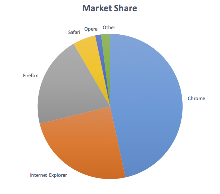 Not applicable: The following pie chart has visible labels and values that convey equivalent information to the graphical objects (the pie slices): 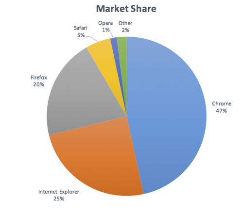 Pass: The following pie chart has visible labels, and sufficient contrast around and between the slices of the pie chart (the graphical objects): 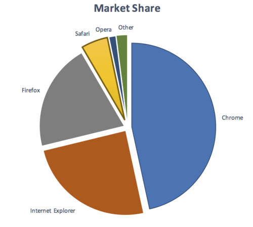 Note that on the last example, the spaces between the small slices is less than 3px wide, therefore those slices need a 4.5:1 contrast ratio against the white background. Many other examples have been worked through on different graphic types. Notes on how the contrast and thickness were derivedThe contrast levels are transferred directly from the current 1.4.3 Contrast (Minimum). The size of 3px for 'thicker' was selected as it aligns with the large-text requirement of 1.4.3 Contrast (Minimum). The following images show 24px (large) text, and a zoomed in view of a 24px word to show the pixels that make it up. The "i" character is 3 pixels wide.  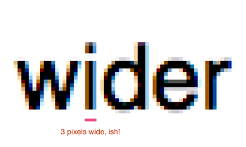 TestabilityFor each graphic that conveys important information:
Expected Results
See Graphical element examples for specific examples. TechniquesExisting Relevant Techniques for 1.4.3
New Techniques
Related Information on LVTF WIKI |
allanj-uaag
changed the title
|
I'm not sure where to comment on the Graphics Contrast Testing Explanation, so I'll included it here. |
|
I suggest adding an exception that covers the text equivalent you list later inside the content:
This is a crucial exception to understand, but it needs to be phrased clearly and explicitly, and I think listed at the top as a clear exception is the way to do this. When it comes to techniques, I also would like a bit more language around this second point, as I'm not comfortable with someone hunting around for the information elsewhere on the page. It needs to be more obvious and explicit. Consider the verbiage about proximity in these general techniques: " G73: Providing a long description in another location with a link to it that is immediately adjacent to the non-text content"; "G74: Providing a long description in text near the non-text content, with a reference to the location of the long description in the short description" |
|
I'd like to understand what folks perceive as the limit of the definition of "essential for understanding the content" |
|
In one of the examples, it states there is a pharmacy website warning icon:
I'm not clear on why the two colors used in the image need to have a 4.5:1 ratio between them. What does it matter if the icons colors do not have sufficient contrast amongst themselves? I don't think you can say that part of an icon contains "semantic meaning", in the same way a piece of a pie chart does. As long as the icon is distinguishable from the background to a sufficient contrast shouldn't it pass? |
|
@DavidMacDonald , yes I would see an overlap between the first bullet in #36 and this SC. |
 allanj-uaag
changed the title
allanj-uaag
changed the title
allanj-uaag
changed the title
allanj-uaag
changed the title
|
can we add a technique to achive this via personalization |
|
That's certainly possible (and doesn't affect the upcoming pull request), but it would be equivalent to an alternative version I think? Or at least it wouldn't be a required technique. |
|
Kim wrote (in the survey):
It aligns with the text-contrast one, with a similar exception for 3:1 for thicker lines/objects. Please have a look through the examples linked in the description above, I found doing those really helped make sure it was feasible. |
|
I just need some more clarity on this. Let's consider on online examination of a course in medical college, and students are given this http://i.imgur.com/qsSD0VH.png or http://i.imgur.com/aUwHwwk.png Over here, we can't have proper labelling because its an exam. Would this fly as an exception according to this SC? It's not clear, because it clearly has semantic value and its not for aesthetic purposes, can't be labelled and further info can't be provided anywhere on the page or even linked to it (because its an exam page), is not part of a logo or brand name - Yet, I still feel this should be exempted from the SC. In the field of online exams we might have a lot of these cases where we can't change the diagram (Especially in the medical fieled where accuracy is especially important). We can't label them because sometimes the questions are about identifying the labels according to the diagram. What do we do in this case? |
|
see pull request #100 |
|
Updated the issue description to reflect the FPWD text and reopening issue. |
|
Consider qualifying graphical objects with 'that have no significant text within' (or the like. This will make the normative requirement more explicit. |
|
Hi @spanchang, This has come up before, we started out with an explicit reference to text, but we had comments to remove that aspect. The reasoning was that part of being ‘essential’, means that you have to discern the graphical object to understand the content/functionality. If there is text that says the same thing (and meets WCAG), then the graphic is not essential. If we call out text as an exception, we'd need to specify that it isn't just any text, it is text that fulfils the same purpose as the graphic. Otherwise people could embed any old text into a complex graphic and bypass the SC. Assuming that there is a reasonable explanation of what 'essential' means for this SC (I've been drafting an example here), can you live with not calling that out in the SC text? It would help to keep the SC text concise and accurate. |
|
I'm wondering if "Graphical objects - Parts of graphics required to understand the content," needs to "Graphical objects - Parts of graphics required to understand the content or purpose" as graphical elements may perform a function that may not be clear due to illegibility/poor contrast etc. |
Current version of SC and Definitions
Open issues and Surveys
(Links to surveys require W3C Member access)
Open issues: SC Status page
Success Criteria (SC) Shortname
Graphics Contrast
SC Text
The visual presentation of graphical objects that are essential for understanding the content or functionality have a contrast ratio of at least 4.5:1 against the adjacent color(s), except for the following:
Suggested Priority Level
Level AA
Related Glossary additions or changes
What Principle and Guideline the SC falls within.
Principle 1, Guideline 1.4Description
The intent of this success criterion is to apply the contrast requirements to important graphical elements in a similar way that it is applied to text in 1.4.3 Contrast (Minimum).
If a graphic is needed to understand the content or functionality of the webpage then it should be perceivable for people with low vision or other impairments.
The term "graphical object" is intended to apply to stand-alone icons such as a print icon (with no text), and the important parts of a more complex diagram such as each line in a graph. Not every graphical object needs to have sufficient contrast with its surroundings, only those that are required to understand what the graphic is conveying.
Graphics that are very thin are harder to perceive, therefore have a higher contrast requirement of 4.5:1. Graphics that are thicker or are solid shapes have a lower requirement of 3:1.
The term essential information is used as many graphics do not need to meet the contrast requirements. If a person needs to perceive a graphic, or part of a graphic (a graphical object) in order to understand the content it should have sufficient contrast. That is not a requirement for:
For designers developing icons that need to be perceived clearly, the following is an example of several sizes of icon having sufficient contrast at different sizes.
The thicker lines (3px or more) have 3:1 contrast (#949494 on #FFFFFF), the small lines (2px or less) need a darker grey (#777777 on #FFFFFF).
Benefits
The intent of this Success Criterion is to provide enough contrast for graphics that convey important information so they can be perceived by people with moderately low vision.
People with low vision often have difficulty perceiving graphics that have insufficient contrast. This can be exacerbated if the person has a color vision deficiency that lowers the contrast even further. Providing a relative luminance (lightness) difference of 4.5:1 or greater can make these items more distinguishable when the person does not see a full range of colors and does not use assistive technology.
Examples
Pie Charts
Pie charts make a good case study for this success criteria, the following pie charts are intended to convey the proportion of market share each browser has. NB: The actual figures are made up, these are not actual market shares.
Fail: The following pie chart has labels for each slice (so passes 1.4.1 Use of Color), but in order to understand the proportions of the slices you must discern the edges of the slices (the graphical objects conveying essential information), and the contrast between the slices is not over 3:1.
Not applicable: The following pie chart has visible labels and values that convey equivalent information to the graphical objects (the pie slices):
Pass: The following pie chart has visible labels, and sufficient contrast around and between the slices of the pie chart (the graphical objects):
Note that on the last example, the spaces between the small slices is less than 3px wide, therefore those slices need a 4.5:1 contrast ratio against the white background.
Many other examples have been worked through on different graphic types.
Notes on how the contrast and thickness were derived
The contrast levels are transferred directly from the current 1.4.3 Contrast (Minimum).
The size of 3px for 'thicker' was selected as it aligns with the large-text requirement of 1.4.3 Contrast (Minimum).
The following images show 24px (large) text, and a zoomed in view of a 24px word to show the pixels that make it up. The "i" character is 3 pixels wide.
Testability
For each graphic that conveys important information:
Expected Results
See Graphical element examples for specific examples.
Techniques
Existing Relevant Techniques for 1.4.3
New Techniques
Related Information on LVTF WIKI
The text was updated successfully, but these errors were encountered: