
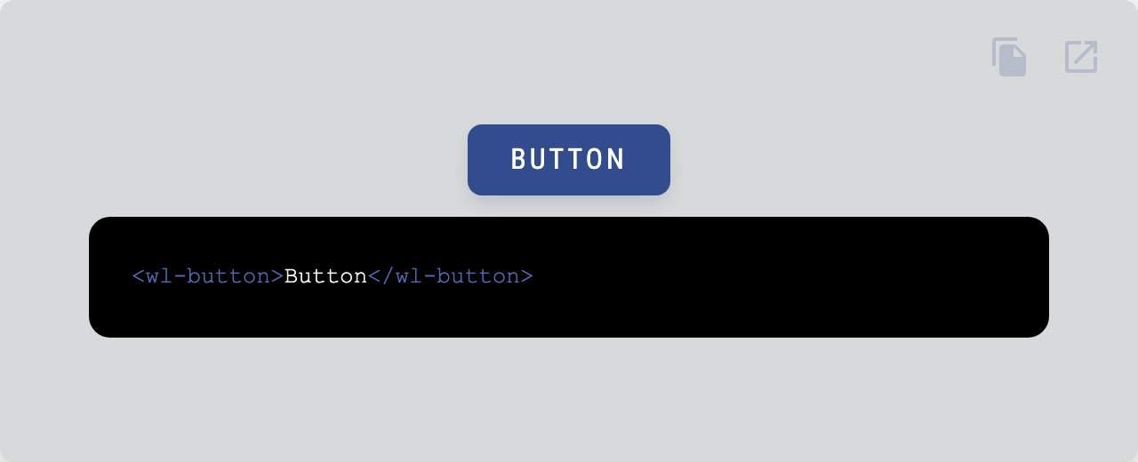
Allow users to take actions, and make choices, with a single tap.
| Property | Attribute | Type | Default | Description |
|---|---|---|---|---|
disabled |
disabled |
boolean |
false | Disables the element. |
fab |
fab |
boolean |
false | Makes the button round and squared. |
flat |
flat |
boolean |
false | Makes the button flat. |
inverted |
inverted |
boolean |
false | Inverts the colors of the button. |
name |
name |
string |
Name of the native form element. | |
noRipple |
noRipple |
boolean |
false | Deactivates the ripple. |
outlined |
outlined |
boolean |
false | Makes the button outlined. |
readonly |
readonly |
boolean |
false | Makes the element readonly (disabled but tabbable) |
required |
required |
boolean |
false | Makes the element required in a form context. |
role |
role |
AriaRole |
"button" | Role of the button. |
type |
type |
"button" | "submit" |
"submit" | Type of the button. |
value |
value |
string |
"" | Value of the form element. |
| Property | Description |
|---|---|
--button-bg |
Default background. |
--button-bg-active |
Background on :active. |
--button-bg-active-flat |
Background on :active when flat attribute is present. |
--button-bg-disabled |
Background when disabled. |
--button-bg-hover |
Background on :hover. |
--button-border-outlined |
Border when outline attribute is present. |
--button-border-radius |
Border radius. |
--button-color |
Default color. |
--button-color-active |
Color on :active. |
--button-color-disabled |
Color when disabled. |
--button-color-hover |
Color on :hover. |
--button-fab-size |
Size of the button when fab attribute is present. |
--button-font-family |
Font family. |
--button-font-size |
Font size. |
--button-letter-spacing |
Letter spacing. |
--button-padding |
Padding. |
--button-shadow-color |
Default shadow color. |
--button-shadow-color-hover |
Shadow color on hover. |
--button-transition |
Transition. |
| Name | Description |
|---|---|
| Default content. |
Go here to try the demo.
 |
|
|---|---|
| Andreas Mehlsen | You? |
Licensed under MIT.