Web design lacks contrast #123
Comments
|
(by gunchleoc) How about the following:
|
|
(by franku) http://wave.webaim.org/report#/wl.widelands.org I have WAVE also installed as a firefox add on. This tool is not very exact, imho, but better than nothing.
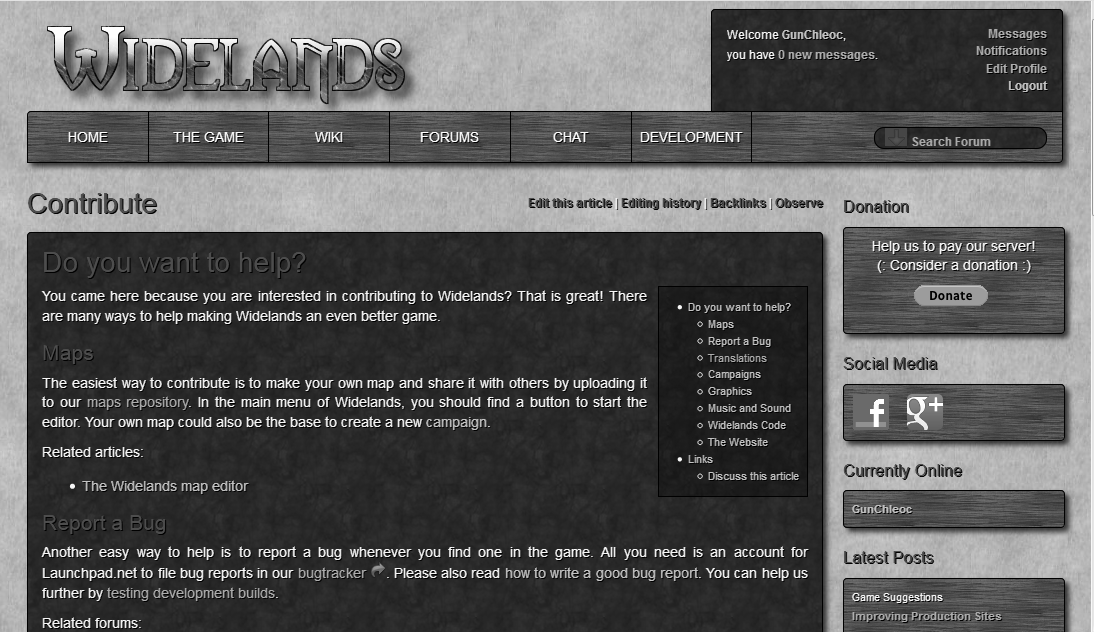
The problem with this is that the green header is used both on dark and bright background. So making it brighter will reduce contrast against the bright background. Making it darker is vice versa. For a solution we need to make different colors depending on the background.
I don't like that... but if it helps... IMHO the general problem of the website is: Too many colors. |
|
(by gunchleoc) |
|
(by franku)
Not really. If there is consensus to have dark background only for bright text it makes things easier. Of course the other way around would fit also. Sooner or later we may have to rethink the current design of the webpage. I am not sure if i am the right person for this :-) |
I just showed our homepage to a friend who is somewhat vision impaired. He could not read the green headers at all, and distinguishing between normal text and links was also a big problem for him.
Imported from Launchpad using lp2gh.
The text was updated successfully, but these errors were encountered: