Questions about the plotting of relability diagrams #21
Comments
|
@izmailovpavel may have the notebook still, but try plotting on a log scale for x. Also double check that your signs are correct as they potentially could be flipped. |
|
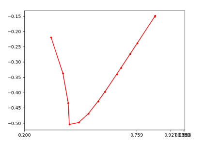
Thank you! I have tried log scale but it seems a little bit strange, maybe I should define a proper transformation for the xsticks. |
|
Hey @Codefmeister, something seems strange in how your xticks are arranged. Here's our code for making the plots styles = {name: (label, color) for (name, label, _, color) in new_methods().name_marker_pairs}
methods = {'SWAG-Cov', 'SWA-temp', 'SWA-Drop', 'SGD', 'SWAG-Diag', 'Laplace-SGD', 'SGLD'}
from matplotlib.ticker import FormatStrFormatter
class CustomScale(mscale.ScaleBase):
name = 'custom'
eps = 0.002
def __init__(self, axis, **kwargs):
mscale.ScaleBase.__init__(self)
self.thresh = None #thresh
def get_transform(self):
return self.CustomTransform(self.thresh)
def set_default_locators_and_formatters(self, axis):
pass
class CustomTransform(mtransforms.Transform):
input_dims = 1
output_dims = 1
is_separable = True
def __init__(self, thresh):
mtransforms.Transform.__init__(self)
self.thresh = thresh
def transform_non_affine(self, a):
return -np.log(1 + CustomScale.eps - a)
def inverted(self):
return CustomScale.InvertedCustomTransform(self.thresh)
class InvertedCustomTransform(mtransforms.Transform):
input_dims = 1
output_dims = 1
is_separable = True
def __init__(self, thresh):
mtransforms.Transform.__init__(self)
self.thresh = thresh
def transform_non_affine(self, a):
return 1 + CustomScale.eps - np.exp(-a)
def inverted(self):
return CustomScale.CustomTransform(self.thresh)
mscale.register_scale(CustomScale)
fig, axes = plt.subplots(figsize=(37, 8), nrows=1, ncols=4)
plt.subplots_adjust(wspace=0.3, bottom=0.25)
def calibration_plot(results, ds, model):
for method, curve in sorted(results.items()):
#print(method, 'YN'[int(curve is None)])
if method not in methods:
continue
label, color = styles[method]
if curve is not None:
plt.plot(curve['confidence'], curve['confidence'] - curve['accuracy'], linewidth=4, marker='o', markersize=8,
color=color, label='%s' % (label), zorder=3)
plt.plot(np.linspace(0.1, 1.0, 100), np.zeros(100), 'k--', dashes=(5, 5), linewidth=3, zorder=2)
plt.gca().set_xscale('custom')
ticks = 1.0 - np.logspace(np.log(0.8), np.log(0.002), 6, base=np.e)
plt.xticks(ticks, fontsize=22)
plt.yticks(fontsize=22)
plt.gca().yaxis.set_major_formatter(FormatStrFormatter('%.2f'))
plt.gca().xaxis.set_major_formatter(FormatStrFormatter('%.3f'))
plt.margins(x=0.03)
plt.ylabel('Confidence - Accuracy', fontsize=28)
plt.xlabel('Confidence (max prob)', fontsize=28)
plt.title('%s %s' % (model, ds), fontsize=28, y=1.02)
plt.grid()
plt.sca(axes[0])
calibration_plot(load_dict('./data/calibrations/c100_wrn_new.pkl'), 'CIFAR-100', 'WideResNet28x10')
plt.sca(axes[1])
calibration_plot(load_dict('./data/calibrations/stl_wrn.pkl'), 'CIFAR-10 $\\rightarrow$ STL-10', 'WideResNet28x10')
plt.sca(axes[2])
calibration_plot(load_dict('./data/calibrations/imagenet_densenet161.pkl'), 'ImageNet', 'DenseNet-161')
plt.sca(axes[3])
calibration_plot(load_dict('./data/calibrations/imagenet_resnet152.pkl'), 'ImageNet', 'ResNet-152')
#plt.sca(axes[1])
handles, labels = axes[0].get_legend_handles_labels()
leg = plt.figlegend(handles, labels, fontsize=28, loc='lower center', bbox_to_anchor=(0.43, 0.0), ncol=6)
for legobj in leg.legendHandles:
legobj.set_linewidth(6.0)
legobj._legmarker.set_markersize(12.0)
plt.savefig('./pics/calibration_curves.pdf', format='pdf', bbox_inches='tight')
plt.show()It was originally written by @timgaripov. |
|
For another paper, I used this code to plot the calibration curves, which is a lot simpler: plt.figure(figsize=(3, 3))
def plot_calibration(arr):
plt.plot(arr["confidence"], arr["accuracy"] - arr["confidence"],
"-o", color=arr["color"], mec="k", ms=7, lw=3)
# plot_calibration({**matt_arr["deep_ensemble_calibration"], "color": de_color})
plot_calibration({**new_calibration_arr["deep_ensemble"].item(), "color": de_color})
plot_calibration({**new_calibration_arr["sgld"].item(), "color": sgld_color})
plot_calibration({**new_calibration_arr["sgld_mom_clr_prec"].item(), "color": sgld_hot_color})
plot_calibration({**matt_arr["hmc_calibration"], "color": "orange"})
# plot_calibration({**matt_arr["sgld_calibration"], "color": sgld_color})
# plot_calibration({**matt_arr["sgld_hot_calibration"], "color": sgld_hot_color})
plt.hlines(0., 0., 1., color="k", linestyle="dashed")
plt.xticks(fontsize=14)
plt.yticks(fontsize=14)
plt.xlabel("Confidence", fontsize=16)
plt.ylabel("Accuracy - Confidence", fontsize=16)
plt.grid()
plt.xlim(0.35, 1.05)
plt.savefig("calibration_curve.pdf", bbox_inches="tight") |
|
Thanks for your kindness. It's very helpful. |
Sign up for free
to join this conversation on GitHub.
Already have an account?
Sign in to comment
Hello, Thanks for your great code.

But while plotting the relability diagram according to your paper, i met some problems.
The sticks of my plotting are in a huddle.
Could you plz give the plotting code for reference?
Thanks!
The text was updated successfully, but these errors were encountered: