


WoltModalSheet is designed to revolutionize the use of Flutter modal sheets. Built with Wolt-grade design quality and used extensively in Wolt products, this UI component offers a visually appealing and user-friendly modal sheet with multiple pages, motion animation for page transitions, and scrollable content within each page.
- Examples
- Features
- Understanding the page elements
- Designer's Collaboration Guide
- Customizable Animations
- Usage of WoltModalSheet Pages
- In-Modal Navigation
- Getting started
- CupertinoApp support
- Usage
- Additional information
You can review the usage examples of repository by clicking on the links.
Traverse through numerous pages within a single sheet.
Greater flexibility with scrollable content per page, accommodating large content effortlessly.
The modal sheet adjusts to fit all screen sizes, appearing as a dialog on larger screens and as a bottom sheet on smaller screens, guided by user-specified conditions.
Engage users with dynamic motion animation for page transitions and scrolling.
| Pagination | Scrolling |
|---|---|
 |
 |
The library showcases examples of both imperative and declarative navigation patterns to display modal sheet on screen.
User input can dynamically shape the modal sheet's page list.
Pages in the Wolt Modal Sheet offer a customizable look and the page components
are provided with an instance of WoltModalSheetPage class. The API provides a
way
to manage the state among the page components to be used with popular libraries
such as Bloc and Provider
Each element within the WoltModalSheet has a role to play, offering context, navigational assistance, and explicit action prompts to the user. By understanding these elements and their roles, you can fully harness the power of WoltModalSheet and create an intuitive and engaging user experience.
The structure is organized across layers on the z-axis:
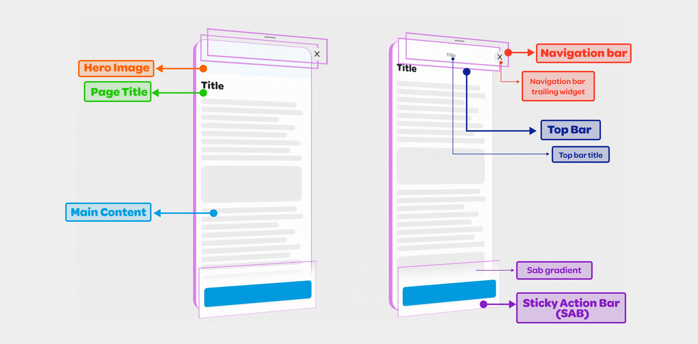
By employing these various layers, you can create an interactive and visually
appealing interface that resonates with users. Each layer contributes to the
overall coherence of the page, serving a specific purpose and enhancing the
overall user experience.
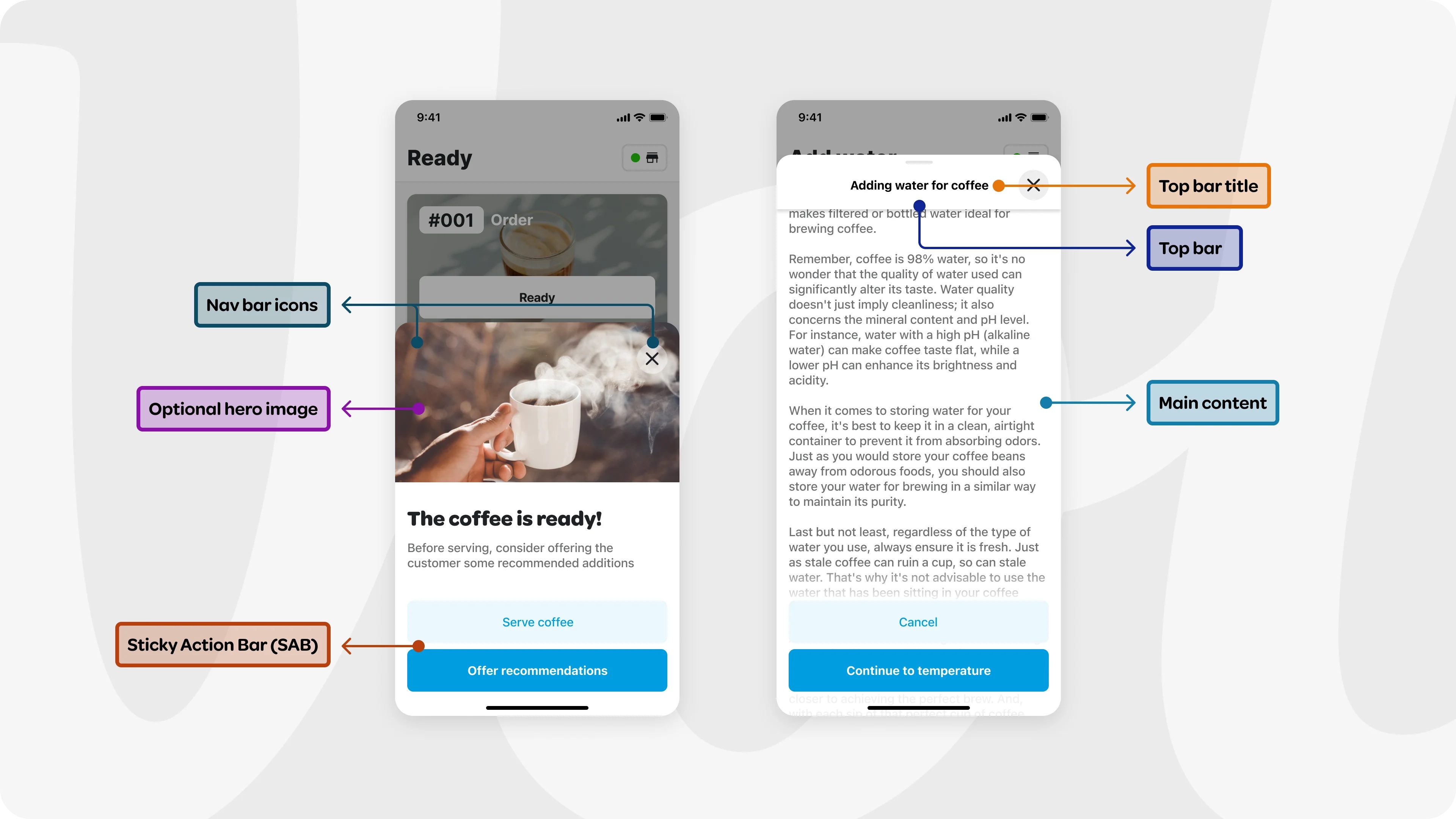
The navigation bar has a transparent background, and resides at the top of
the sheet, situated directly above the top bar on the z-axis. It includes
two specific widgets: the leading and the trailing. The leading widget
usually functions as the back button, enabling users to navigate to the
previous page. The trailing widget often serves as the close button, utilized to
close the modal sheet. The middle area is reserved and left empty for the
visibility of the top bar title.
The navigation bar widgets provide clear and intuitive navigational control,
differentiating themselves from the top bar by focusing specifically on
directional navigation within the interface.
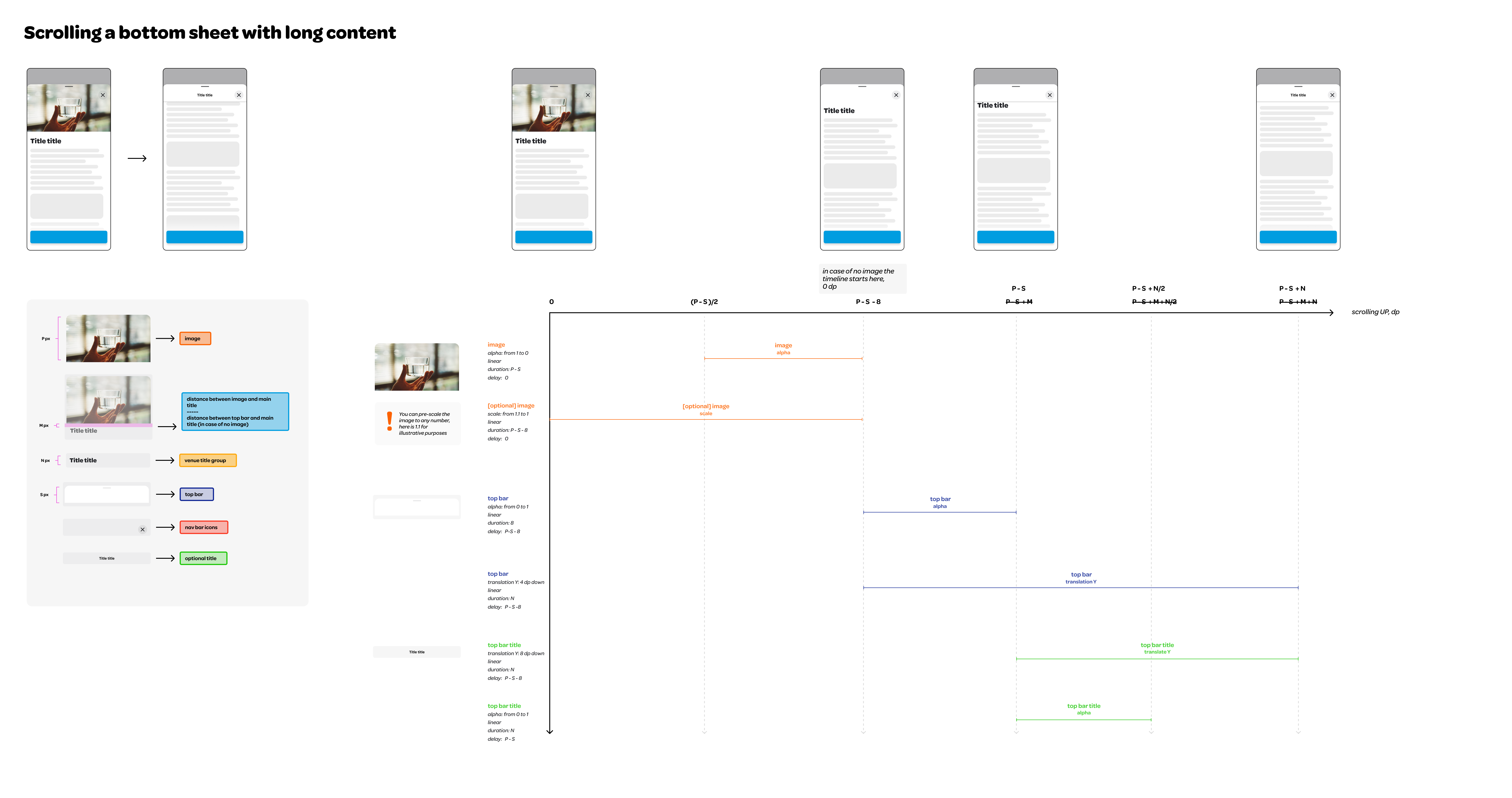
The top bar layer sits above the main content layer and below the navigation
bar layer in z axis. It helps users grasping the context by displaying an
optional title. In scenarios where the sheet is filled with content
requiring scrolling, the top bar becomes visible as the user scrolls, and
replaces the page title. At this point, the top bar adopts a 'sticky'
position at the top, guaranteeing consistent visibility.
The top bar widget has a flexible design. When hasTopBarLayer is set to
false, the top bar and the top bar title will not be shown. If
isTopBarLayerAlwaysVisible set to true, the top bar will be always visible
regardless of the scroll position.
A custom top bar widget can be provided using the topBar field. In this
case, the topBarTitle field will be ignored, and will not be displayed.
The navigation bar widgets overlay above the top bar, and when the default
top bar widget is used in the page, the top bar title is symmetrically
framed between the leading and trailing navigation bar widgets.
The Sticky Action Bar (SAB) guides the user towards the next step. Anchored to the bottom of the view, the SAB elevates above the content with an optional gentle gradient. This position guarantees that the action remains visible, subtly hinting to the user that there is more content to be explored below the fold by scrolling.
An optional Hero Image can be positioned at the top of the main content. This element immediately grabs the user's attention, effectively conveying the primary theme or message of the content.
An optional page title above the main content provides users with a quick understanding of what to expect from the page. As the user scrolls, this title becomes hidden, at which point the top bar title continues to serve this context-providing purpose.
The main content delivers information according to the user need. It can be scrollable to handle larger content. The content is built lazily to improve the performance.
Here is an example that shows all the modal sheet elements in use:
To ensure seamless collaboration between designers and developers, we have provided a Figma file dedicated to the WoltModalSheet package. This resource aims to guide designers through the process of creating and handing over designs that leverage the WoltModalSheet's capabilities effectively.
-
Example Design Specifications: Detailed design guidelines and specifications mirroring those used internally at Wolt. These specs illustrate how to prepare designs for development handoff, ensuring a smooth transition from design to implementation.
-
Modal Types Specifications: This section showcases specifications for different modal types, including dialog and bottom sheet modals. It covers essential details like dimensions, layout of elements, and visual arrangements, providing clear instructions for replicating these styles in your projects.
-
Motion Animation Specs for Modal Interactions: To complement the static design aspects, this section demonstrates motion animation specifications for pagination and scrolling interactions. It includes guidelines for animating transitions between modal sheet pages and within the content scroll, enabling designers to specify dynamic, engaging user experiences.
By integrating this Figma file into your design process, you can:
-
Align on Design Language: Ensure that your application's design language and the modal sheet's functionality are in harmony, providing a consistent user experience.
-
Facilitate Design Handoff: Use the provided specifications as a reference point for design handoff, minimizing misunderstandings and streamlining the development process.
-
Inspire Creative Solutions: Leverage the examples and specifications as a source of inspiration for implementing innovative design solutions.
Developers can customize the page scrolling and pagination animations by
providing an instance of WoltModalSheetAnimationStyle class to
WoltModalSheetThemeData.
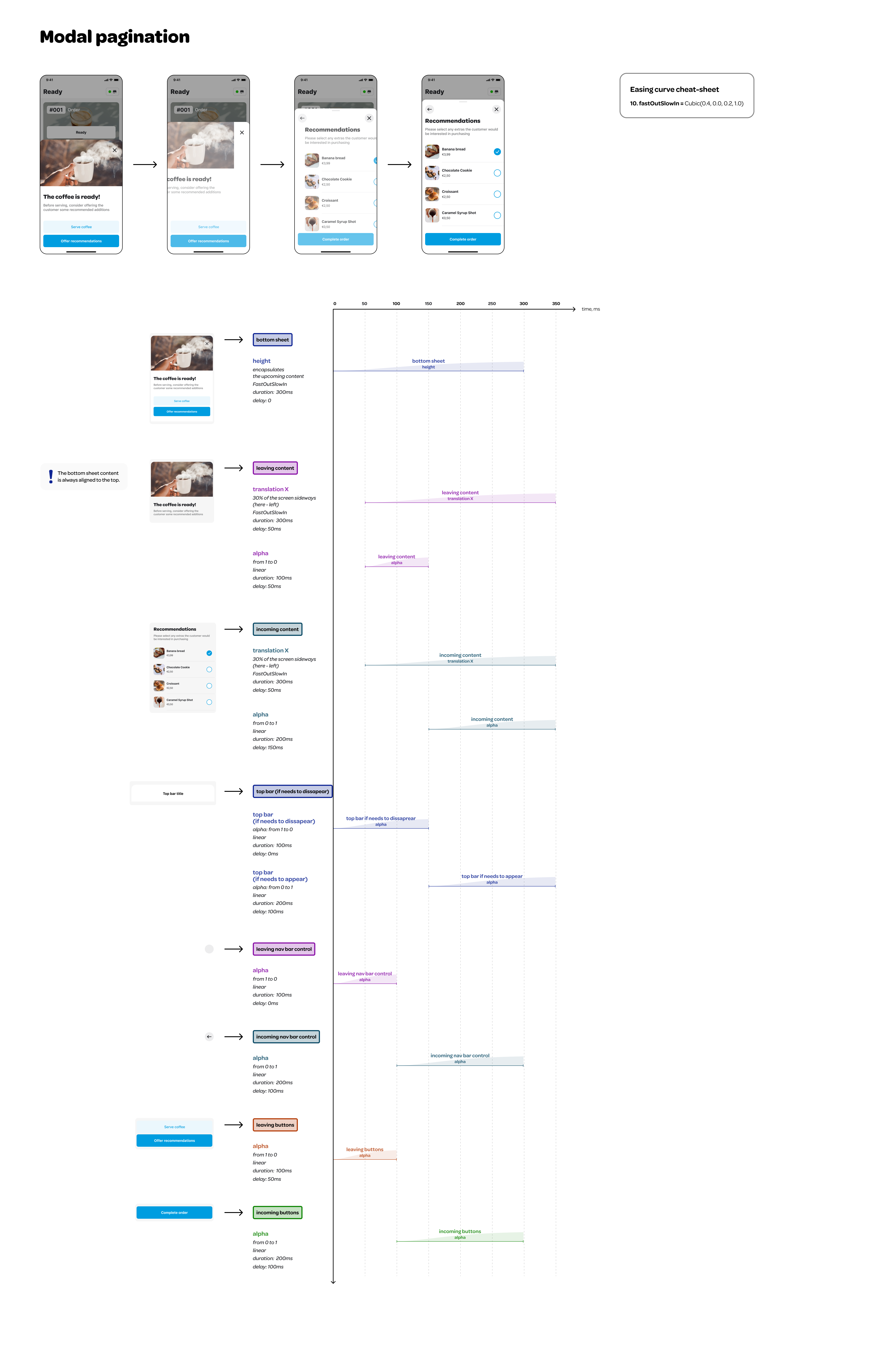
WoltModalSheetThemeData(
  animationStyle: WoltModalSheetAnimationStyle(
    paginationAnimationStyle: WoltModalSheetPaginationAnimationStyle(
      mainContentIncomingOpacityCurve: const Interval(
        150 / 350,
        350 / 350,
        curve: Curves.linear,
      ),
      modalSheetHeightTransitionCurve: const Interval(
        0 / 350,
        300 / 350,
        curve: Curves.fastOutSlowIn,
      ),
      incomingSabOpacityCurve: const Interval(
        100 / 350,
        300 / 350,
        curve: Curves.linear,
      ),
      // Define additional pagination animation styles as needed.
    ),
    scrollAnimationStyle: WoltModalSheetScrollAnimationStyle(
      heroImageScaleStart: 1.0,
      heroImageScaleEnd: 0.9,
      topBarTitleTranslationYInPixels: 8.0,
      topBarTranslationYInPixels: 4.0,
      // Define additional scroll animation styles as needed.
    ),
  ),
),The WoltModalSheet library provides three primary classes for constructing
modal sheet pages: WoltModalSheetPage, SliverWoltModalSheetPage, and
NonScrollingWoltModalSheetPage. Understanding the use cases and
functionalities of these classes is key to creating performant,
easy-to-construct modal sheets.
SliverWoltModalSheetPage is designed for complex and dynamic content
layouts within a modal sheet. It leverages the power of Flutter's Sliver
widgets to provide flexible and efficient scrolling behaviors.
SliverWoltModalSheetPage(
  mainContentSlivers: [
    SliverList(
      delegate: SliverChildBuilderDelegate((BuildContext context, int index) {
        // Your list items
      }),
    ),
    // Other sliver widgets...
  ],
  // Additional page elements like pageTitle, topBarTitle, etc.
)
WoltModalSheetPage provides a simpler alternative for pages that primarily consist of a single widget or a straightforward layout. It automatically wraps the child widget in a SliverToBoxAdapter, making it suitable for use in sliver-based scrollable layouts.
Key Features:
- Simplicity: Ideal for single-widget content or basic layouts.
- No Sliver Overhead: Automatically handles the wrapping of non-sliver widgets into slivers.
- Ease of Use: Simplifies the process of creating modal sheet pages without needing to deal with slivers directly.
WoltModalSheetPage(
 child: MyCustomContentWidget(),
 pageTitle: Text('My Page Title'),
 // Other properties...
)
NonScrollingWoltModalSheetPage is designed to display content which is
flexible in height but unlikely to require scrolling. This class is ideal
for content that adapts to the available vertical space within the modal
sheet's maximum height, but is unlikely to exceed that height and require
scrolling.
Key Features:
- Adaptability: Designed for content with flexible height but fixed or intrinsic dimensions.
- Flex Layout: Can utilize the Flex layout model of a Column for effective space management.
- Non-Scrolling: Best for content that fits within the modal sheet's maximum height without needing scrolling.
Warning: If there is a risk that the content's height might exceed the modal sheet's maximum height, leading to overflow, it is recommended to use SliverWoltModalSheetPage or WoltModalSheetPage instead. These classes provide scrolling capabilities to handle larger content effectively using slivers.
NonScrollingWoltModalSheetPage(
 child: MyFlexibleHeightWidget(),
 // Additional properties...
)
This class extends SliverWoltModalSheetPage, offering a streamlined approach to handle non-scrolling content within a modal sheet.
When deciding which class to use for your modal sheet, consider the following guidelines:
-
WoltModalSheetPage: Choose this for simpler content layouts, especially when working with a single widget. It's best suited for straightforward layouts that don't require the complexities of Slivers.
-
SliverWoltModalSheetPage: Opt for this class when your modal sheet requires complex scrolling behaviors or needs to display a long list of items. It's ideal for dynamic content layouts that benefit from the advanced capabilities of Flutter's Sliver widgets.
-
NonScrollingWoltModalSheetPage: This class is best when your content is flexible in height but unlikely to require scrolling. It’s perfect for modal sheets where the content fits within the modal's maximum height without the need for scrollable behavior. Use this for content with fixed or intrinsic dimensions that need to adapt to available vertical space.
The package provides in-modal navigation capabilities, allowing for dynamic transitions and stack manipulations directly within the modal. This section details how to utilize these features effectively in your applications.
he following methods facilitate the addition, removal, and modification of pages within the navigation stack. These functionalities allow you to dynamically adapt the navigation stack based on user interactions without disrupting the currently displayed page.
You can append one or more pages to the navigation stack. This feature is particularly useful for preloading pages or preparing navigation paths for future steps without changing the currently displayed page.
WoltModalSheet.addPages(context, [newPage1, newPage2, newPage3]);
WoltModalSheet.of(context).addPages([newPage1, newPage2, newPage3]);

WoltModalSheet.addPage(context, newPage1);
WoltModalSheet.of(context).addPage(newPage1);These methods allow you to replace or remove specific pages within the stack. If the page being modified is currently visible, appropriate adjustments are made to ensure seamless navigation.
When you need to update or change the content of a specific page within the stack, this method allows you to replace any page by its identifier without altering the rest of the stack.
WoltModalSheet.replacePage(context, pageId, newPage);
WoltModalSheet.of(context).replacePage(pageId, newPage);This method enables you to selectively remove a page from the navigation stack using its identifier. If the page being removed is the currently displayed page, it will remove the page and adjust the currently displayed page accordingly. If it is not the current page, it is removed from the stack without impacting the current view.
WoltModalSheet.removePage(context, pageId);
WoltModalSheet.of(context).removePage(pageId);This method updates the navigation stack by either adding new pages or replacing all subsequent pages depending on the position of the current page. If the current page is the last in the stack it simply appends the new pages. However, if the current page is not the last, it replaces all pages following it with the new ones. This functionality is particularly useful for adapting the user's navigation path dynamically based on their interactions with the currently displayed page or when making adjustments to previously made decisions.
WoltModalSheet.addOrReplacePages(context, [newPage1, newPage2, newPage3]);
WoltModalSheet.of(context).addOrReplacePages([newPage1, newPage2, newPage3]);

WoltModalSheet.addOrReplacePage(context, newPage);
WoltModalSheet.of(context).addOrReplacePage(newPage);This subsection details the methods for moving within the modal's navigation stack, allowing users to navigate through pages effectively.
Navigate within the modal stack using specific methods to move directly to a desired page. You can go to the next or previous page, jump to a page at a specific index in the page list, or navigate to a page by its unique identifier.
// Move to the next page
bool movedNext = WoltModalSheet.showNext(context);
bool movedNext = WoltModalSheet.of(context).showNext();

// Move to the previous page
bool movedPrevious = WoltModalSheet.showPrevious(context);
bool movedPrevious = WoltModalSheet.of(context).showPrevious();

// Jump directly to a page at a specific index
bool navigatedByIndex = WoltModalSheet.showAtIndex(context, 2);
bool navigatedByIndex = WoltModalSheet.of(context).showAtIndex(2);

// Navigate to a page by its unique identifier
bool navigatedById = WoltModalSheet.showPageWithId(context, pageId);
bool navigatedById = WoltModalSheet.of(context).showPageWithId(pageId);Using push methods, you can add one or more new pages to the end of the navigation stack and navigate to the first of the newly added pages.
WoltModalSheet.pushPages(context, [newPage1, newPage2, newPage3]);
WoltModalSheet.of(context).pushPages([newPage1, newPage2, newPage3]);
WoltModalSheet.pushPage(context, newPage);
WoltModalSheet.of(context).pushPage(newPage);Using pop method, you can remove the last page of the navigation stack. If the user is on the last page, the method will navigate to the previous page.
bool popped = WoltModalSheet.pop(context);
bool popped = WoltModalSheet.of(context).pop();ValueNotifier<int> pageIndexNotifier and
ValueNotifier<WoltModalSheetPageListBuilder> pageListBuilderNotifier can
also be utilized for in-modal navigation and setting the modal navigation
stack. These notifiers dynamically manage the visible page index
and the page list, enhancing flexibility in response to the state changes.
ValueNotifier<int> pageIndexNotifier controls the visible page index,
enabling transitions between pages based on user interactions or other events.
// Example of setting up a modal with navigation between pages controlled by
// a ValueNotifier<int>.
final pageIndexNotifier = ValueNotifier(0); // Initializes the page index

WoltModalSheet.show(
  context: context,
  pageListBuilder: (modalSheetContext) => [
    PageOne(onNextButtonPressed: () => pageIndexNotifier.value = 1),
    PageTwo(onBackButtonPressed: () => pageIndexNotifier.value = pageIndexNotifier.value - 1),
  ],
  pageIndexNotifier: pageIndexNotifier,  // Tracks and updates the displayed page
);
ValueNotifier<WoltModalSheetPageListBuilder> pageListBuilderNotifier
manages updates to the modal's page list based on user interactions or other
app state changes. This is useful when implementing Navigator 2.0 for
declarative navigation scenarios. It is not suggested to mix the usage of
this notifier with the imperative navigation methods provided by the package.
final pageIndexNotifier = ValueNotifier(0); // Initializes the page index
final pageListBuilderNotifier = ValueNotifier((context) => [
  PageOne(onNextButtonPressed: () => pageIndexNotifier.value++),
  PageTwo(onBackButtonPressed: () => pageIndexNotifier.value--),
]);

WoltModalSheet.showWithDynamicPath(
  context: context,
  pageListBuilderNotifier: pageListBuilderNotifier,
  pageIndexNotifier: pageIndexNotifier,  // Dynamically updates the navigation stack
);To use this plugin, add wolt_modal_sheet as a dependency in your pubspec.yaml file.
In the package, certain Material widgets rely on retrieving Material localizations information from the widget tree. However, Material localizations are not inherently available in CupertinoApp, leading to potential errors. To mitigate this issue, if your application utilizes CupertinoApp rather than MaterialApp, it is needed to incorporate a default Material localization delegate into your application configuration.
CupertinoApp(
localizationsDelegates: const <LocalizationsDelegate<dynamic>>[
DefaultMaterialLocalizations.delegate,
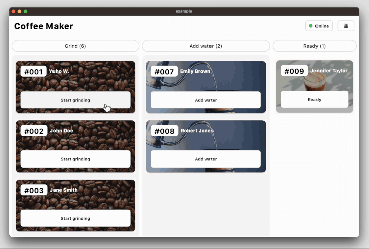
],)To see its usage, please check coffee maker example app.
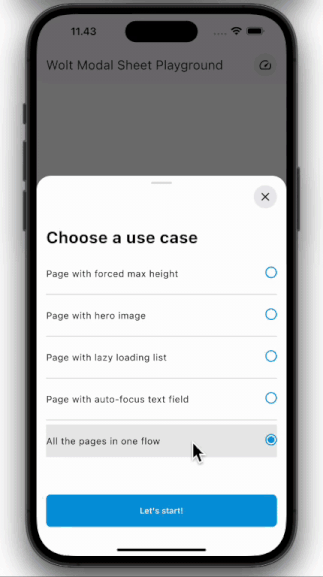
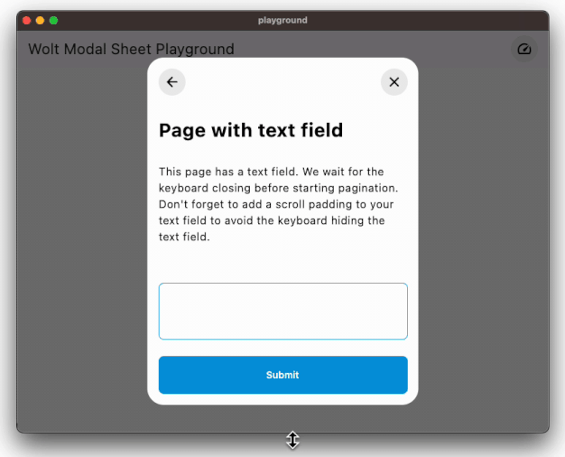
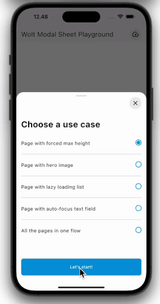
This package has 4 example projects.
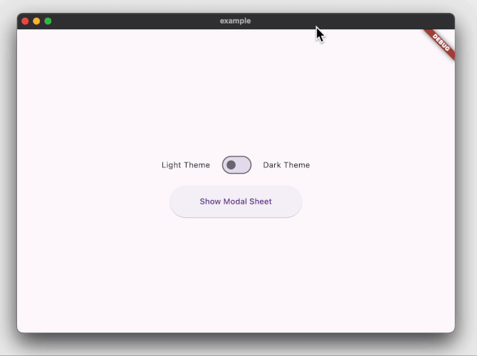
The example app demonstrates how to display a two-pages modal sheet that can be customized for dark and light themes using WoltModalSheetThemeData theme extension.
@override
Widget build(BuildContext context) {
final pageIndexNotifier = ValueNotifier(0);
SliverWoltModalSheetPage page1(BuildContext modalSheetContext, TextTheme textTheme) {
return WoltModalSheetPage(
hasSabGradient: false,
stickyActionBar: Padding(
padding: const EdgeInsets.all(_pagePadding),
child: Column(
children: [
ElevatedButton(
onPressed: Navigator.of(modalSheetContext).pop,
child: const SizedBox(
height: _buttonHeight,
width: double.infinity,
child: Center(child: Text('Cancel')),
),
),
const SizedBox(height: 8),
ElevatedButton(
onPressed: WoltModalSheet.of(modalSheetContext).showNext,
child: const SizedBox(
height: _buttonHeight,
width: double.infinity,
child: Center(child: Text('Next page')),
),
),
],
),
),
topBarTitle: Text('Pagination', style: textTheme.titleSmall),
isTopBarLayerAlwaysVisible: true,
trailingNavBarWidget: IconButton(
padding: const EdgeInsets.all(_pagePadding),
icon: const Icon(Icons.close),
onPressed: Navigator.of(modalSheetContext).pop,
),
child: const Padding(
padding: EdgeInsets.fromLTRB(
_pagePadding,
_pagePadding,
_pagePadding,
_bottomPaddingForButton,
),
child: Text(
'''
Pagination involves a sequence of screens the user navigates sequentially. We chose a lateral motion for these transitions. When proceeding forward, the next screen emerges from the right; moving backward, the screen reverts to its original position. We felt that sliding the next screen entirely from the right could be overly distracting. As a result, we decided to move and fade in the next page using 30% of the modal side.
''',
)),
);
}
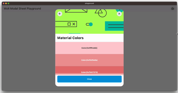
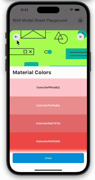
SliverWoltModalSheetPage page2(BuildContext modalSheetContext, TextTheme textTheme) {
return SliverWoltModalSheetPage(
pageTitle: Padding(
padding: const EdgeInsets.all(_pagePadding),
child: Text(
'Material Colors',
style: textTheme.headlineMedium!.copyWith(fontWeight: FontWeight.bold),
),
),
heroImage: Image(
image: NetworkImage(
'https://raw.githubusercontent.com/woltapp/wolt_modal_sheet/main/example/lib/assets/images/material_colors_hero${_isLightTheme ? '_light' : '_dark'}.png',
),
fit: BoxFit.cover,
),
leadingNavBarWidget: IconButton(
padding: const EdgeInsets.all(_pagePadding),
icon: const Icon(Icons.arrow_back_rounded),
onPressed: WoltModalSheet.of(modalSheetContext).showPrevious,
),
trailingNavBarWidget: IconButton(
padding: const EdgeInsets.all(_pagePadding),
icon: const Icon(Icons.close),
onPressed: Navigator.of(modalSheetContext).pop,
),
mainContentSlivers: [
SliverGrid(
gridDelegate: const SliverGridDelegateWithFixedCrossAxisCount(
crossAxisCount: 2,
mainAxisSpacing: 10.0,
crossAxisSpacing: 10.0,
childAspectRatio: 2.0,
),
delegate: SliverChildBuilderDelegate(
(_, index) => ColorTile(color: materialColorsInGrid[index]),
childCount: materialColorsInGrid.length,
),
),
SliverList(
delegate: SliverChildBuilderDelegate(
(_, index) => ColorTile(color: materialColorsInSliverList[index]),
childCount: materialColorsInSliverList.length,
),
),
],
);
}
return MaterialApp(
themeMode: _isLightTheme ? ThemeMode.light : ThemeMode.dark,
theme: ThemeData.light(useMaterial3: true).copyWith(
extensions: const <ThemeExtension>[
WoltModalSheetThemeData(
heroImageHeight: _heroImageHeight,
topBarShadowColor: _lightThemeShadowColor,
modalBarrierColor: Colors.black54,
mainContentScrollPhysics: ClampingScrollPhysics(),
),
],
),
darkTheme: ThemeData.dark(useMaterial3: true).copyWith(
extensions: const <ThemeExtension>[
WoltModalSheetThemeData(
topBarShadowColor: _darkThemeShadowColor,
modalBarrierColor: Colors.white12,
sabGradientColor: _darkSabGradientColor,
dialogShape: BeveledRectangleBorder(),
bottomSheetShape: BeveledRectangleBorder(),
mainContentScrollPhysics: ClampingScrollPhysics(),
),
],
),
home: Scaffold(
body: Builder(
builder: (context) {
return Column(
mainAxisAlignment: MainAxisAlignment.center,
children: [
Row(...),
ElevatedButton(
onPressed: () {
WoltModalSheet.show<void>(
context: context,
pageListBuilder: (modalSheetContext) {
final textTheme = Theme.of(context).textTheme;
return [
page1(modalSheetContext, textTheme),
page2(modalSheetContext, textTheme),
];
},
modalTypeBuilder: (context) {
final size = MediaQuery.sizeOf(context).width;
if (size < _pageBreakpoint) {
return WoltModalType.bottomSheet;
} else {
return WoltModalType.dialog;
}
},
onModalDismissedWithBarrierTap: () {
debugPrint('Closed modal sheet with barrier tap');
Navigator.of(context).pop();
},
maxDialogWidth: 560,
minDialogWidth: 400,
minPageHeight: 0.0,
maxPageHeight: 0.9,
);
},
child: const SizedBox(
height: _buttonHeight,
width: _buttonWidth,
child: Center(child: Text('Show Modal Sheet')),
),
),
],
);
},
),
),
);
}The code snippet above produces the following:
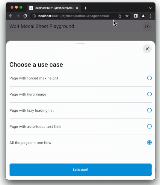
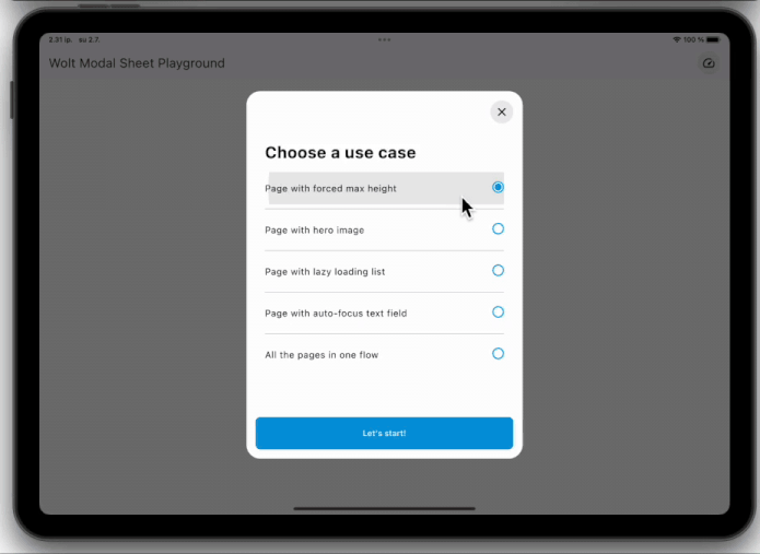
The playground app demonstrates how to imperatively show the modal sheet. The purpose of this module is to play and experiment with various use cases.
The playground_navigator2 has the same content with the playground app but the modal sheet is shown using Navigator 2.0 (Router API) in a declarative way.
Finally, the coffee_maker app demonstrates how to manage the state among the page components with an opinionated use of the Provider state management library.
The code snippet demonstrates how to decorate the modal sheet with a change notifier provider so that the page components can be rebuilt according to the current state:
  void _onCoffeeOrderSelectedInAddWaterState(
      BuildContext context, String coffeeOrderId) {
    final model = context.read<StoreOnlineViewModel>();

    WoltModalSheet.show(
      context: context,
      decorator: (child) {
        return ChangeNotifierProvider<StoreOnlineViewModel>.value(
          value: model,
          builder: (_, __) => child,
        );
      },
      pageListBuilder: (context) {
        return [
          AddWaterDescriptionModalPage.build(coffeeOrderId),
          WaterSettingsModalPage.build(coffeeOrderId)
        ];
      },
      modalTypeBuilder: _modalTypeBuilder,
    );
  }
- Design Philosophy: Dive into the creative thought process behind WoltModalSheet's functionality in our blog post . Explore how we tackled the design challenges to create an intuitive and responsive experience.
- Insights from FlutterCon'23 talk: We delved into both the design and developmental facets of this package at the FlutterCon'23 conference. Catch the enlightening recording of his talk to understand the nuances.
- Flutter&Friends talk: This is a lightening talk given at the Flutter&Friends conference on September'23. It covers the design guidelines and best practices by showing real-world examples highlighting what to do—and what not to do. It also covers the technical details of the implementation. The recording of the talk can be found here.