...
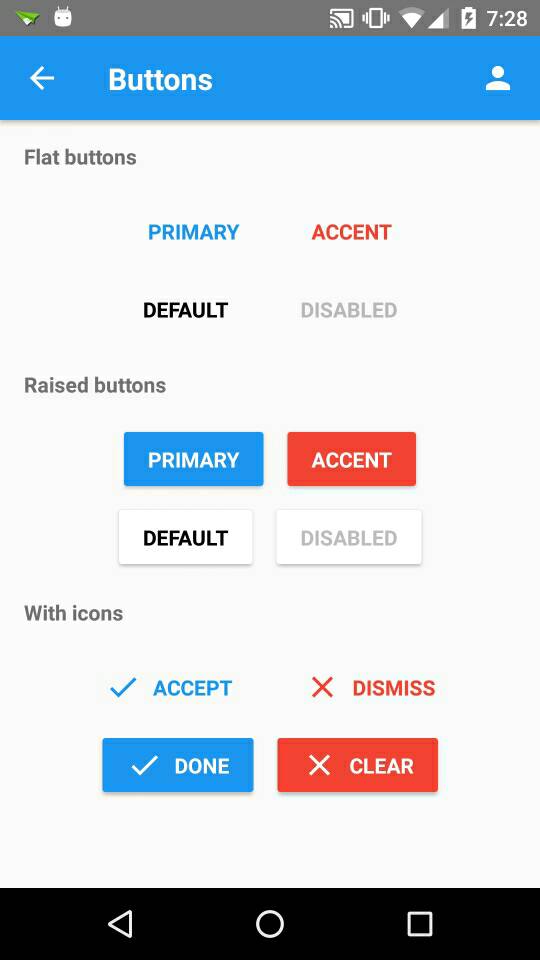
import { Button } from 'react-native-material-ui';
...
render() {
<View>
<Button primary text="Primary" /> // flat button with primary color
<Button accent text="Accent" /> // flat button with accent color
<Button raised primary text="Primary" /> // raised button with primary color
<Button disabled text="Disabled" /> // disabled button
</View>
}const propTypes = {
/**
* If true button will be disabled
*/
disabled: PropTypes.bool,
/**
* If true button will be raised
*/
raised: PropTypes.bool,
/**
* If the button should have primary color
*/
primary: PropTypes.bool,
/**
* If the button should have accent color
*/
accent: PropTypes.bool,
/**
* Called when button is pressed. Text is passed as param
*/
onPress: PropTypes.func,
/**
* Called when button is long pressed. Text is passed as param
*/
onLongPress: PropTypes.func,
/**
* Text will be shown on button
*/
text: PropTypes.string.isRequired,
/**
* Button text will be in uppercase letters
*/
upperCase: PropTypes.bool,
/**
* If specified it'll be shown before text
*/
icon: PropTypes.oneOfType([
PropTypes.string,
PropTypes.element
]),
/**
* Name of Icon set that should be use. From react-native-vector-icons
*/
iconSet: PropTypes.string,
/**
* You can override any style for this button
*/
style: PropTypes.shape({
container: View.propTypes.style,
text: Text.propTypes.style,
}),
};
const defaultProps = {
icon: null,
onPress: null,
onLongPress: null,
primary: false,
accent: false,
disabled: false,
raised: false,
upperCase: true,
iconSet: null,
style: {},
};