...
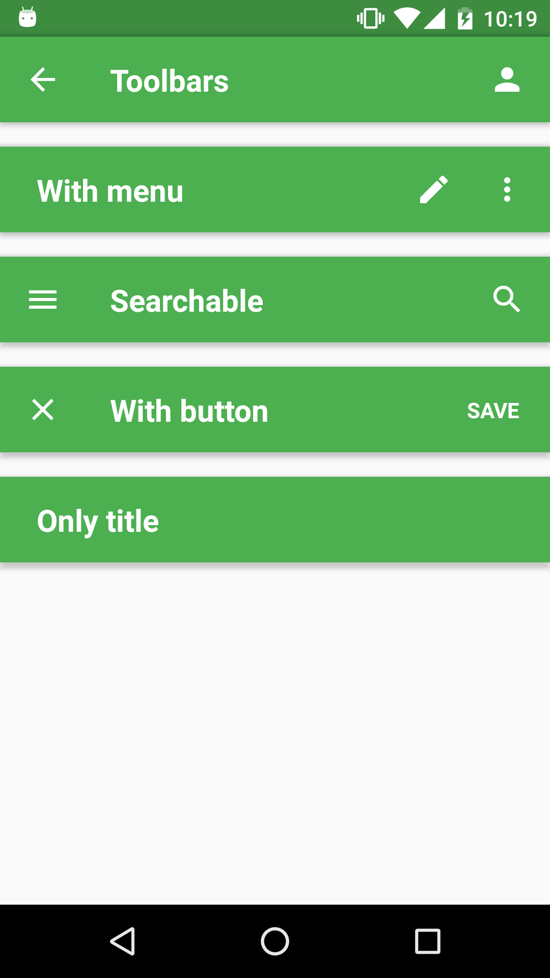
import { Toolbar } from 'react-native-material-ui';
...
render() {
<Toolbar
leftElement="menu"
centerElement="Searchable"
searchable={{
autoFocus: true,
placeholder: 'Search',
}}
rightElement={{
menu: {
icon: "more-vert",
labels: ["item 1", "item 2"]
}
}}
onRightElementPress={ (label) => { console.log(label) }}
/>
}const propTypes = {
/**
* Indicates if search is active or not
*/
isSearchActive: PropTypes.bool,
/**
* When you want to activate search feature you have to pass this object with config of search.
*/
searchable: PropTypes.shape({
/**
* Called when search text was changed.
*/
onChangeText: PropTypes.func,
/**
* Called when search was closed.
*/
onSearchClosed: PropTypes.func,
/**
* Called when action to close search was requested.
*/
onSearchCloseRequested: PropTypes.func,
/**
* Called when search was opened.
*/
onSearchPressed: PropTypes.func,
/**
* Called when user press submit button on hw keyboard
*/
onSubmitEditing: PropTypes.func,
/**
* Will shown as placeholder for search input.
*/
placeholder: PropTypes.string,
/**
* Indicates when input should be focused after the search is opened.
*/
autoFocus: PropTypes.bool,
/**
* Enable auto-capitalize for search input
*/
autoCapitalize: PropTypes.string,
/**
* Enable auto-correct for search input
*/
autoCorrect: PropTypes.bool,
/**
* Override default search icon
*/
icon: PropTypes.string,
}),
/**
* You can override any style for the component via this prop
*/
style: PropTypes.shape({
container: Animated.View.propTypes.style,
leftElementContainer: View.propTypes.style,
leftElement: Text.propTypes.style,
centerElementContainer: Animated.View.propTypes.style,
titleText: Text.propTypes.style,
rightElementContainer: View.propTypes.style,
rightElement: Text.propTypes.style,
}),
/**
* Just alias for style={{ rightElement: {}, leftElement: {}}}
*/
iconProps: PropTypes.shape({
size: PropTypes.number,
color: PropTypes.string,
}),
/**
* This size is used for each icon on the toolbar
*/
size: PropTypes.number,
/**
* DEPRECATED: (use style prop instead)
* If it's true, the toolbar has elevation set to 0 and position absolute, left, right set to 0.
* This prop will be deprecated probably, because it's not pretty clear what it does. I use
* it during the animation of toolbar, but I can use the style prop that is much more obvious.
*/
translucent: PropTypes.bool,
/**
* Wether or not the Toolbar should show
*/
hidden: PropTypes.bool,
/**
* Called when centerElement was pressed.
* TODO: better to rename to onCenterElementPress
*/
onPress: PropTypes.func,
/**
* Will be shown on the left side.
*/
leftElement: PropTypes.oneOfType([
PropTypes.element,
PropTypes.string,
]),
/**
* Called when leftElement was pressed.
*/
onLeftElementPress: PropTypes.func,
/**
* Will be shown between leftElement and rightElement. Usually use for title.
*/
centerElement: PropTypes.oneOfType([
PropTypes.element,
PropTypes.string,
]),
/**
* Will be shown on the right side.
*/
rightElement: PropTypes.oneOfType([
/**
* Whatever you want to have on the right side
*/
PropTypes.element,
/**
* One action (name of icon). Alias for ['icon1'].
*/
PropTypes.string,
/**
* For many actions: ['icon1', 'icon2', ...]
*/
PropTypes.arrayOf(PropTypes.string),
/**
* For actions and menu. The menu will be shown as last one icon.
*/
PropTypes.shape({
actions: PropTypes.arrayOf(
PropTypes.oneOfType([
PropTypes.element,
PropTypes.string,
]),
),
menu: PropTypes.shape({
icon: PropTypes.string,
labels: PropTypes.arrayOf(PropTypes.string),
}),
}),
]),
/**
* Called when rightElement was pressed.
*/
onRightElementPress: PropTypes.func,
/**
* Theme
*/
theme: PropTypes.any,
};