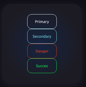
- Card
- Input
- Text
- Checkbox
- Selectbox
- Button
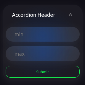
- Accordion
- Accordion Header
- Image
Card component similar div html element.
- width => Card width
- height => Card height
- child => Card content
- blurColor => Card radial blur color (default:rgba(48,118,234,0.2))
- onClick => Card onClick Funtion
-
<Card width='250px' height='250px' />

-
<Card width="250px" height="250px"
   child={
     <div style={{width:"100%", height:"100%",display:"flex",flexDirection:"column",justifyContent:"center", alignItems:"center"}}>
      <Button width='100px' height='50px' color={Colors.buttons.primary} textContent="Primary" />
      <Button width='100px' height='50px' color={Colors.buttons.secondary} textContent="Secondary" />
      <Button width='100px' height='50px' color={Colors.buttons.danger} textContent="Danger"/>
      <Button width='100px' height='50px' color={Colors.buttons.succes} textContent="Succes" />
     </div>
   }
/>

-
<Card width='250px' height='250px' blurColor="rgba(78, 242, 154,0.3)"/>


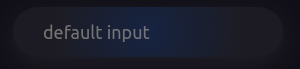
Input for text or number values.
- width
- height
- placeholder (default: default input)
- icon => TextInput right icon or button
- type (text/number)
-
<TextInput width="250px" height="30px" />

-
<TextInput width="250px" height="30px"placeholder="Example Placeholder" />

-
<TextInput width="250px" height="30px" icon={<AiOutlineSearch size="28px" color="#32a852" />} />

-
<TextInput width="250px" height="30px" type="text" />

- name
- onChange
-
<Checkbox name="Checkbox Example" />

-
<Checkbox name="Checkbox Example" onChange={checkboxOnChange} />
  const checkboxOnChange = () => {
      alert("checkbox is changed");
  };

- items
- onChange
-
<Select items={["test1", "test2", "test3"]} />
- Before

- After

- Selected

-
  <Select
   items={["test1", "test2", "test3"]}
   onChange={selectBoxOnChange}
  />
  const selectBoxOnChange = (v) => {
      alert(`Selectbox selected value ${v}`);
  };


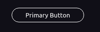
- width
- height
- color
- onClick
- textColor => Hover Text Color
- textContent => Button Name
-
<Button width="150px" height="30px" textContent="Primary Button" />

-
<Button
  width="150px"
  height="30px"
  textContent="Secondary Button"
  color={Colors.buttons.secondary}
/>

-
<Button
  width="150px"
  height="30px"
  textContent="Danger Button"
  color={Colors.buttons.danger}
  textColor="blue"
/>

-
<Button
  width="150px"
  height="30px"
  textContent="Danger Button"
  color={Colors.buttons.danger}
  onClick={()=>alert('Hello World')}
  textColor="blue"
/>


- width
- height
- src
-
<Image
  width="300px"
  height="300px"
  src="https://images.unsplash.com/photo-1593642532871-8b12e02d091c?ixlib=rb-1.2.1&ixid=MnwxMjA3fDF8MHxwaG90by1wYWdlfHx8fGVufDB8fHx8&auto=format&fit=crop&w=1112&q=80"
/>


- child
-
<Accordion width="250px" height="40px" />

-
<Accordion
  width="250px"
  height="100px"
  child={
   <>
      <TextInput placeholder="min" />
      <TextInput placeholder="max" />
      <Button
          width="100%"
          height="40px"
          textContent="Submit"
          color={Colors.buttons.succes}
      />
  </>
  }
 />
- After
- Before