An advanced alerts and pickers with js.
$ npm install react-native-alert-pickers
$ react-native link react-native-alert-pickersAll APXXXPickers or APXXXAlerts aren't support props while config.
For example:
/// Bad use
<APColorPicker mode="hls" ref={r => (this.picker = r)} />

/// Good use
<APColorPicker ref={r => (this.picker = r)} />
- 配置(Configuration)
| 属性名称(Properties Name) | 值或类型(Values or Types) | 是否必需(Required) | 描述(Description) |
|---|---|---|---|
| mode | "rgb", "rgba"(默认/Default), "rgb-hex", "rgba-hex", "hsl", "hsla" | NO | 是否以 16 进制显示 |
| cancelButton | APButton | NO | 设置取消按钮 |
| selectButton | APButton | NO | 设置选择按钮 |
- 方法(Method)
/**
* @param colorPickerConfig: The picker's config
* refrence `Configuration`
*/
show({ colorPickerConfig?: APColorPickerConfig })
- Usage
// import module
import { APColorPicker } from "react-native-alert-pickers"

// Use
render() {
    return (
      <View style={{ flex: 1, justifyContent: "center" }}>
        <APColorPicker ref={r => (this.picker = r)} />
      </View>
    );
  }

// Show picker
_onShow = () => {
	// Normal
	this.picker.show()
	// Use keyword `global`
	// global.picker.show()

	// maybe you want to show with "hsla", easy...
	// this.picker.show({ mode: "hsla" })
	// also, if you want to set `cancelButton`
	// this.picker.show({ cancelButton: { title: "Oh, Amazing!", font: { color: "skyblue" } } })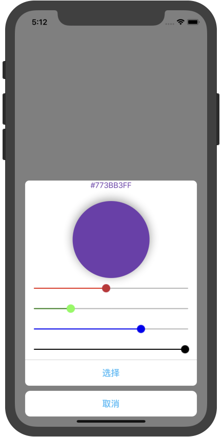
}- Results
The mode is "rgba" or "hlsa":

- 配置(Configuration)
| 属性名称(Properties Name) | 值或类型(Values or Types) | 是否必需(Required) | 描述(Description) |
|---|---|---|---|
| cancelButton | APButton | NO | 设置取消按钮 |
| searchBar | APSearchBar | NO | 设置搜索框 |
| onSelected | ({ name: string, phoneNumber: string}) => void | NO | 回调函数 |
- 方法(Method)
/**
* @param contactPickerConfig: The picker's config
* refrence `Configuration`
*/
show({ contactPickerConfig?: APContactPickerConfig })
- Usage
// import module
import { APContactPicker } from "react-native-alert-pickers"

// Use
render() {
    return (
      <View style={{ flex: 1, justifyContent: "center" }}>
        <APContactPicker ref={r => (this.picker = r)} />
      </View>
    );
  }

// Show picker
_onShow = () => {
  // Normal
  this.picker.show()
  // Use keyword `global`
  // global.picker.show()

  // add some config
  // this.picker.show({ #your_configuration# })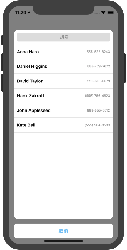
}- Results

- 配置(Configuration)
| 属性名称(Properties Name) | 值或类型(Values or Types) | 是否必需(Required) | 描述(Description) |
|---|---|---|---|
| mode | "country"(默认/Default), "phoneCode" | NO | 显示模式 |
| cancelButton | APButton | NO | 设置取消按钮 |
| searchBar | APSearchBar | NO | 设置搜索框 |
| onSelected | ({ code: string, name: string, dial_code: string }) => void | NO | 回调函数 |
- 方法(Method)
/**
* @param localePickerConfig: The picker's config
* refrence `Configuration`
*/
show({ localePickerConfig?: APLocalePickerConfig })
- Usage
// import module
import { APLocalePicker } from "react-native-alert-pickers"

// Use
render() {
    return (
      <View style={{ flex: 1, justifyContent: "center" }}>
        <APLocalePicker ref={r => (this.picker = r)} />
      </View>
    );
  }

// Show picker
_onShow = () => {
  // Normal
  this.picker.show()
  // Use keyword `global`
  // global.picker.show()

  // add some config
  // this.picker.show({ #your_configuration# })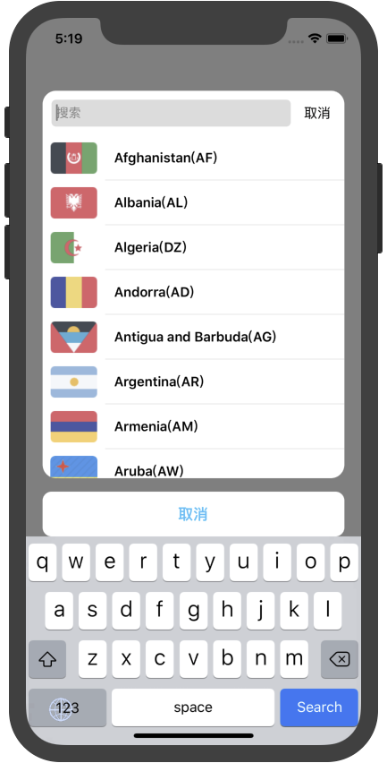
}- Results
mode: phoneCode
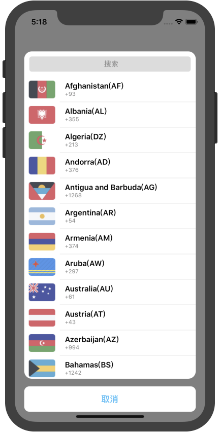

mode: country

- 配置(Configuration)
| 属性名称(Properties Name) | 值或类型(Values or Types) | 是否必需(Required) | 描述(Description) |
|---|---|---|---|
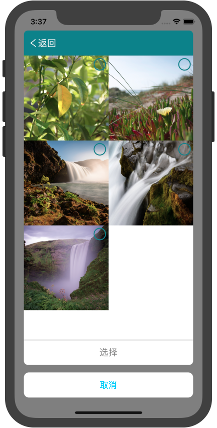
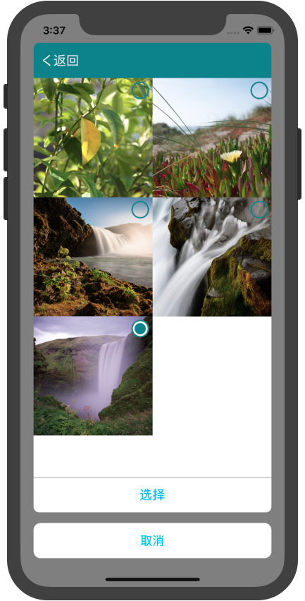
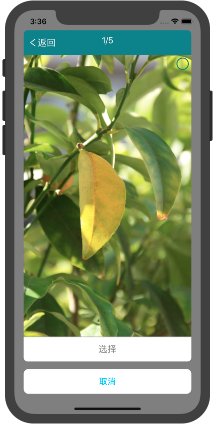
| provider | "system"(默认/Default), "self" | NO | 图片提供者 |
| horizontal | true/false | NO | 是否水平展示图片 |
| images | [image] | NO | 图片数组,在 provider="self"下赋值 |
| selectMode | "single", "multiple" | NO | 单选或多选 |
| selectTitle | "选择" | NO | 选择按钮的标题 |
| cancelTitle | "取消" | NO | 取消按钮的标题 |
| onSelected | (images) => void | NO | 回调函数,返回选中的图片 |
- 方法(Method)
/**
* @param imagePickerConfig: The picker's config
* refrence `Configuration`
*/
show({ imagePickerConfig?: APImagePickerConfig })
- Usage
// import module
import { APImagePicker } from "react-native-alert-pickers"

// Use
render() {
    return (
      <View style={{ flex: 1, justifyContent: "center" }}>
        <APImagePicker ref={r => (this.picker = r)} />
      </View>
    );
  }

// Show picker
_onShow = () => {
  // Normal
  this.picker.show()
  // Use keyword `global`
  // global.picker.show()

  // add some config
  // this.picker.show({ #your_configuration# })
}- Results

- 配置(Configuration)
| 属性名称(Properties Name) | 值或类型(Values or Types) | 是否必需(Required) | 描述(Description) |
|---|---|---|---|
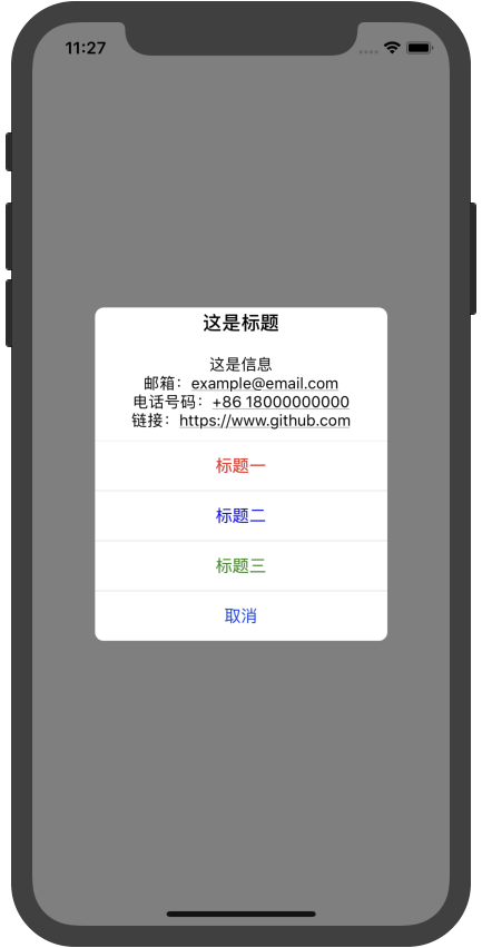
| mode | "alert"(默认/Default), "action-sheet" | NO | 提示模式 |
| title | string | NO | 提示之标题 |
| message | string | NO | 提示之信息 |
| alertButtons | [APButton] | NO | 提示之按钮数组 |
| cancelIndex | 0 | NO | 取消按钮在按钮数组中的下标 |
- 方法(Method)
/**
* @param alertConfig: The picker's config
* refrence `Configuration`
*/
show({ alertConfig?: APAlertConfig })

// Convenience methods
alert({ alertConfig?: APAlertConfig })
actionSheet({ alertConfig?: APAlertCofnig})
- Usage
// import module
import { APAlert } from "react-native-alert-pickers"

// Use
render() {
    return (
      <View style={{ flex: 1, justifyContent: "center" }}>
        <APAlert ref={r => (this.alert = r)} />
      </View>
    );
  }

// Show picker
_onShow = () => {
  // Normal
  this.alert.show()
  // Use keyword `global`
  // global.alert.show()

  // add some config
  // this.alert.show({ #your_configuration# })
}- Results
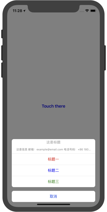
- 配置(Configuration)
| 属性名称(Properties Name) | 值或类型(Values or Types) | 是否必需(Required) | 描述(Description) |
|---|---|---|---|
| icon | APImage | NO | 图片 |
| title | string | NO | 提示之标题 |
| message | string | NO | 提示之信息 |
| alertButtons | [APButton] | NO | 提示之按钮数组 |
| textFields | [APTextField] | NO | 提示之输入框数组 |
- 方法(Method)
/**
* @param textFieldAlertConfig: The picker's config
* refrence `Configuration`
*/
show({ textFieldAlertConfig?: APTextFieldAlertConfig })

/**
* Animation for your URL request
*/
startAnimating()
stopAnimating()

/**
* @param callback: exec your func when dismissed
*/
dismiss((values: object?) => {})
- Usage
// import module
import { APTextFieldAlert } from "react-native-alert-pickers"
// Use
render() {
return (
<View style={{ flex: 1, justifyContent: "center" }}>
<APTextFieldAlert ref={r => (this.alert = r)} />
</View>
);
}
// Show picker
_onShow = () => {
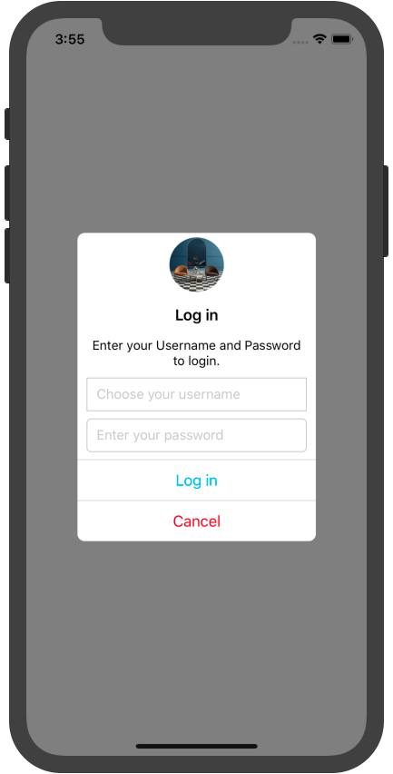
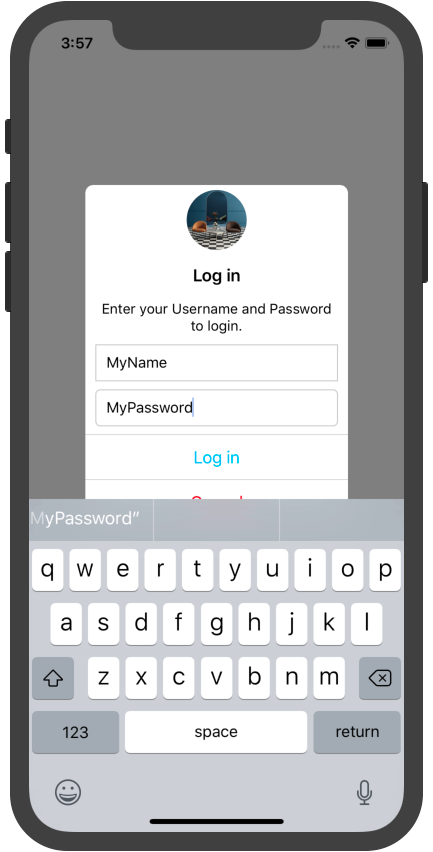
this.alert.show({
icon: { source: require("./interior_design_1.jpg") },
title: "Log in",
message: "Enter your Username and Password to login.",
textFields: [
{
key: "username",
config: { placeholder: "Choose your username" },
borderStyle: { borderRadius: 0 }
},
{
key: "password",
config: { placeholder: "Enter your password" }
}
],
alertButtons: [
{ title: "Log in", onPress: () => {
/// TODO1: your request
this.alert.startAnimating()
...urlRequest
this.alert.dismiss(values => navigate('authed'))
/// TODO2: get values only
this.alert.dismiss(values => console.log(JSON.stringify(values)))
} },
{ title: "Cancel", font: { color: "red" }, onPress: () => this.alert.dismiss() }
]
})
}
// the vals format is associated with textFields key, eg: { username: "", password: "" }- Results
| 属性名称(Properties Name) | 值或类型(Values or Types) | 是否必需(Required) | 描述(Description) |
|---|---|---|---|
| color | "black" | NO | 字体颜色 |
| fontSize | 17 | NO | 字体大小 |
| fontWeight | 300 | NO | 字体粗细 |
| textAlign | "center", "left", "right" | NO | 字体排列 |
| 属性名称(Properties Name) | 值或类型(Values or Types) | 是否必需(Required) | 描述(Description) |
|---|---|---|---|
| source | image's source | NO | 图片资源 |
| style | image's style | NO | 图片风格 |
| 属性名称(Properties Name) | 值或类型(Values or Types) | 是否必需(Required) | 描述(Description) |
|---|---|---|---|
| font | APFont | NO | 按钮之字体设置 |
| title | string | NO | 按钮之标题 |
| style | view's style | NO | 按钮之 style |
| enable | true/false | NO | 按钮之使能(和失能) |
| disabledColor | "gray" | NO | 按钮之失能时标题的颜色 |
| activeOpacity | 0.8 | NO | 按钮之点击透明度 |
| onPress | (title) => void | NO | 按钮之点击回调 |
| leftImage | APImage | NO | 按钮之左视图 |
| rightImage | APImage | NO | 按钮之右视图 |
| 属性名称(Properties Name) | 值或类型(Values or Types) | 是否必需(Required) | 描述(Description) |
|---|---|---|---|
| key | string | NO | 输入框之 key |
| font | APFont | NO | 按钮之字体设置 |
| config | object | NO | 输入框的配置 |
| regular | string | NO | 正则表达式 |
| leftImage | APImage | NO | 输入框之左视图 |
| rightImage | APImage | NO | 输入框之右视图 |
| borderStyle | APBorderStyle | NO | 输入框之边框设置 |
| 属性名称(Properties Name) | 值或类型(Values or Types) | 是否必需(Required) | 描述(Description) |
|---|---|---|---|
| barWidth | "100%" | NO | 搜索框宽度 |
| tintColor | "rgb(220, 220, 220)" | NO | 搜索框背景色 |
| backgroundColor | "white" | NO | 搜索条背景色 |
| textField | APTextField | NO | 搜索输入框 |
| cancelTitle | "取消" | NO | 取消按钮的标题 |
| 属性名称(Properties Name) | 值或类型(Values or Types) | 是否必需(Required) | 描述(Description) |
|---|---|---|---|
| borderWidth | 1 | NO | 边框宽度 |
| borderColor | "black" | NO | 边框颜色 |
| borderRadius | 0 | NO | 边框四角弧度 |