A completed project starting from a proposal to finish for US Flu Surveillance Data Review.
- (09/25) Created template version A with initial sketch materials
- (10/02) Refine the proposal with defined components, tasks, interaction details and schedule
- (10/09) Update progress for first week at 1/4.
- (10/17) Update progress for second week at 2/4.
- (10/23) Update progress for third week at 3/4.
- (10/29) Update progress for third week at 4/4.
- (10/30) Complete the project results update and future discussions.
The data (Weekly U.S. Flu Surveillance dataset) to visualize in this project is a multi-year flu patient visits data collected by healthcare providers across the United States, who participated in the Influenza-like Illness Surveillance Network (ILINet). Weekly U.S. Influenza Surveillance Reports are generated from the ILINet Program, which presents an interactive FluView visualization of the data. In this project, the data visualization is using multiple panels with interactive features to reveal more details about the data in order to answer the questions related to the data more intuitively and effectively.
At the prototyping stage, an overview of this data using color and sized dots were created. In the plot, the higher total visits or percentage values are corresponding to bigger circle size for each data point. Data from different years were color coded differently. It showed a clear pattern of peaks with big circle sizes in February and December period for multiple-years of data.

Another newer visualization view closer to the targeted visualization was to use average values' line chart as below:

The following tasks and questions will drive the visualization and interaction decisions for this project:
- Q1: What are the national illness (flu) weekly pattern from 2015-2019?
- Q2: What are the peak and its duration variations over the years?
- Q3: When and where is the highest illness (flu) ratio state wise from 2015-2019 by week or month, year?
- Q4: Which State has the most illness patient, or ratio?
- Q5: What are the patient to health care professional (HCP) ratio across the states?
- Q6: Can the visualization allow user to narrow down their focus to individual states?
The initial visualization ideas were documented in the following three sketches to illustrate the design of the intended visualization.
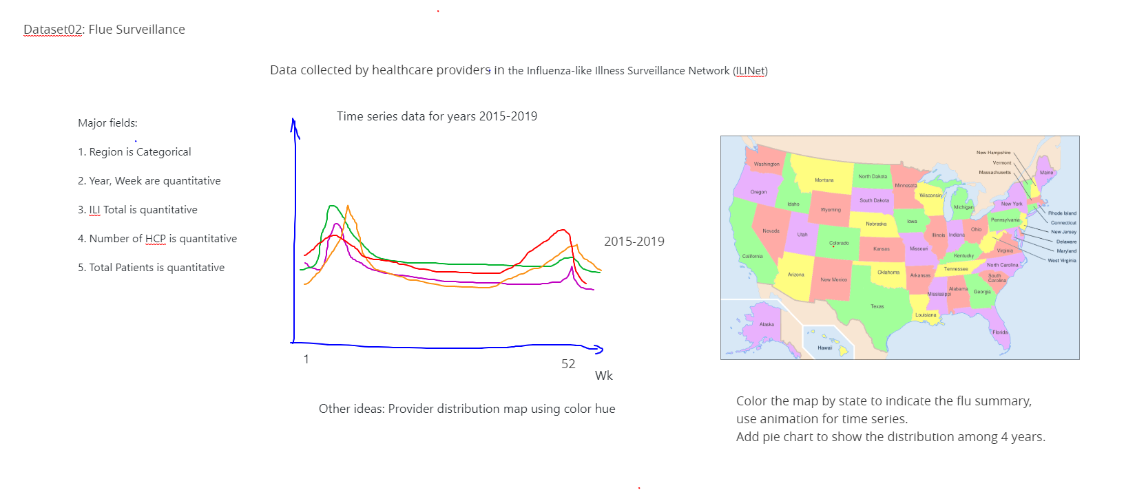
In the first page, two major visuals are proposed. On the left is the time series line plot, the Y-axis can be the national total values or averages over weekly data. On the right side is a US map showing state level of any interesting values as a choropleths map.

The 2nd page proposes to group states into limited (5-10) groups so that the colors are more distinct. Further statistics base on those groups can be presented as bar charts to answer top 10 or bottom 10 questions.

The 3rd page proposes in the last plot to replace bar chart with line chart to display the trend of top states number changes over time. It helps to understand whether the conditions on those top states are getting better or worse. This page also proposes the interactive elements so that different data can be visualized and more detailed data are presented on demand.
- During the course I learned a many useful tools about visualization techniques based on JavaScripts. The vega-list-api is a simple and effective high-level interface that yield nice results. But the lack of examples and documentation up-to-date make it a less favorable choice.
- D3.js and React with Svg seems to be powerful tools that can achieve any visualization tasks. I used them during the course and built more confidence to implement my project using them. In my plan, I want to visualize the data on the map and other different plots combined. The D3.js and React framework allow me to achieve more complex logics and calculate the derived data easily to be visualized.
- So my decision to conduct my project is to use D3.js and React and void to use vega-lite and vega-lite-api given they may not be compatible or integrated easily.
- Put multiple visuals together in one page.
- More complex calculations to prepare the visualization data.
- Add proper trigger to update the corresponding visualization.
- Add legends on bar charts and maps and need to highlight them.
In this project, the following interactions are implemented. Only the first one is explained in details. Others are similar and relatively straight forward to understand. It is critical to maintain the consistency among them.
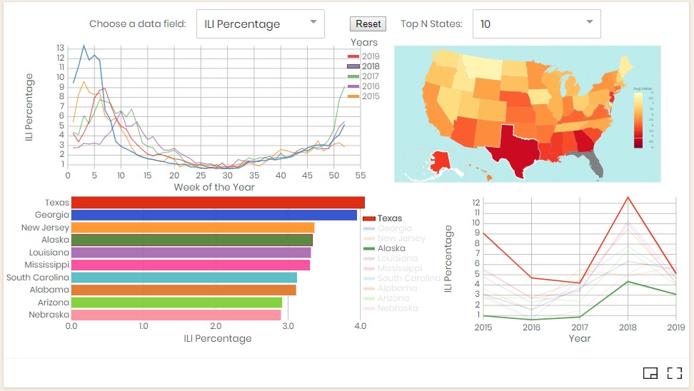
- From chart, hover or select a year, update map and other charts
- In time series chart, 5 lines with different colors are displayed indicating the average values on different year, i.e., 2015-2019. If user move the mouse cursor and hover on one of the line, a tooltip will show up to display the year on the line. At the same time, the data for this particular year is selected and used in the other visualization plots. When the mouse hover is removed, the data used will return to the full dataset.
- When user click on the line, or its legend, it indicates a particular year is selected over the data of all years. Even when the mouse hover is removed, only the data from that given year is used. The map will display a different color for different states to reflect the average values calculated for each state. Because of the limited space, only the top 10 states are selected to show in the bar chart and trending line chart. Their data are based on the year of selection.
- To remove the selection, click Reset button.
- So when year's hover and selection are changing, the data will be recalculated and the bar chart will be updated accordingly. Since the top 10 states are changed, their trend plot will be updated accordingly as well.
- From map, hover or select a state, update chart
- Choose from data menu, select different data field
- Press the button, reset selection and data reset to all years
- From bar chart, hover or select a state, update map's highlight, also updates trending chart
- From trending chart, hover or select a state, same as 5
- From map, hover or select a state, any year, but only for states belong to the top 10 states, same as 5
- Choose from Top N State menu to reduce the number of states in the bar chart and trend chart
- Show tooltip when mouse hover lines, bars, or state on maps, also including any legends if applicable
In the following table, I classify and schedule the tasks into several components and steps. There are total 4 weeks to complete the project. I assumed a 4-days (about 4h per-day) per week workload, for the total of 16 days. So all tasks were roughly distributed into 5 categories into 4 weeks (see below). The 6th session is for future work. Later, at the last week of the execution of the plan, I added an additional section to track all small tasks to improve the fix implemented features, which extended the total estimation a little bit. However, the execution time is less and makes up some of the differences so that the project is completed on time.
- Choropleths map and legend, color choice (Planned: Wk 1) (Done by Wk 2)
- Other charts (Wk 1: 3 days) (Done by Wk 2)
- a. Different year line chart
- b. Top 10 bar chart for aggregation
- c. Top 10 line chart for trend
- Data Preparation, Filtering, Calculation, Grouping (Wk 2,3: 3+1=4 days) (Done by Wk 2)
- Multi-view plot assembly (Wk 1,2: 1+1=2 days) (Done by Wk 1)
- Interactions among views (Wk 3,4: 3+4=7 days) (Done by Wk 4)
- Future or additional improvements (N/A)
- Additional improvement and bug fixes (Wk 4: 1.5 days) (Done by Wk 4)
Based on the plan above, I captured the activities on each item and added the progress information by the end of each week. Some items are done in one shot, but a few challenging ones have changes made for multiple weeks. In the end, all tasks are done, including a new section of tasks added in the last week's polishing stage. The total estimation of time extended from 16.0 days to 19.5 days, and the actual execution time is about 17.5 days. There is a small discrepancy when calculated by weekly progress. I didn't try to fix it because the first a few weeks maybe record some calculations a bit differently. Overall, the following table demonstrated a relatively accurate plan estimation and execution time line, with tasks priority adjusted along the way.
| Cat. No. | Task No. | Action Item | Estd. Time (day) | Actu. Time (day) | Whether the task is challenging and how |
|---|---|---|---|---|---|
| C1 | 1 | Map - Already show US map by states | 0.5 | D0.5wk1 | Done |
| C1 | 2 | Display a value using choropleths map | 0.5 | D0.5wk1 | Done |
| C1 | 3 | Show color bar and legend on map | 0.5 | D1.5(P0.3wk3)(P1.2wk4) | Yes,Done |
| C2 | 1 | Line chart by years, show correct legend | 0.5 | D1.0wk2 | Done |
| C2 | 2 | Bar chart to show top 10 states | 0.5 | D0.8(P0.3wk1)(P0.5wk2) | Yes,Done |
| C2 | 3 | Line chart to show trend for top 10 states | 0.5 | D0.5wk2 | Done |
| C12 | - | Total for C1 and C2 | 3.0 | T4.8(P1.3wk1)(P2.0wk2)(P0.3wk3)(P1.2wk4) | NA |
| C3 | 1 | Data loading with multiple files | 0.2 | D0.2wk1 | Done |
| C3 | 2 | Derived data calculation like ratio | 0.0 | 0.0 | Dropped |
| C3 | 3 | Data filtering based on all views | 1.5 | D1.5wk2 | Done |
| C3 | 4 | Filtering top 10 states data | 1.5 | D2.0(P0.3wk1)(P0.7wk2)(P0.2wk3)(P0.8wk4) | Yes,Done |
| C3 | - | Total for C3 | 3.2 | D3.7(P0.5wk1)(P2.2wk2)(P0.2wk3)(P0.8wk4) | NA |
| C4 | - | Put multiple (4) views together using D3 | 2.0 | D1.5wk1 | Done |
| C5 | 1 | From chart, select a year, update map | 0.5 | D0.5wk3 | Done |
| C5 | 2 | From map, select a state, update chart | 0.5 | D0.5wk3 | Done |
| C5 | 3 | Add a menu, select different data field | 0.5 | T0.5(P0.2wk1)(P0.5wk2) | Done |
| C5 | 4 | Add a button, reset data to all years | 0.5 | D0.5wk3 | Done |
| C5 | 5 | From bar chart, select a state, update map | 0.5 | D0.5wk3 | Done |
| C5 | 6 | From bar chart, deselect any state, show top 10 states | 0.5 | D0.5wk3 | Done |
| C5 | 7 | From trend chart, select a year, update map for top 10 states and give year | 1.0 | D1.0(P0.5wk3)(P0.5wk4) | Done |
| C5 | 8 | From trend chart, deselect any year, update map for top 10 states for all years | 1.0 | D1.0(P0.5wk3)(P0.5wk4) | Done |
| C5 | 9 | Show tooltip when mouse hover lines, bars, or state on maps | 1.0 | D1.0wk3 | Done |
| C5 | - | Total for C5 | 6.0 | T5.7(P0.2wk1)(P4.5wk3)(P1.0wk4) | NA |
| C6 | 1 | There are some more interactions can be defined, or blocked in this project | 0.0 | 0.0 | No |
| C6 | 2 | Expand one plot to the whole canvas and hide the rest. And toggle to bring back original views. | 0.0 | 0.0 | No |
| C6 | 3 | The flu season is centered in winter, so it would be really nice if the cycle starts from the week 40 and ends on week 39 in the next year. Should be easy to shift the data but need to worry about the legend changes which may not be trivial to do. So far the plot matches calendar year which is also useful. | 0.0 | 0.0 | No |
| C7 | 1 | Used a different project for US map to show Hawaii and Alaska | 0.1 | D0.1wk3 | Done |
| C7 | 2 | Added a Top N States menu to determine number of top states to show because 10 is too many | 0.2 | D0.2wk3 | Done |
| C7 | 3 | Need to change circle legends to line shape for line charts | 0.2 | D0.2wk4 | Done |
| C7 | 4 | Highlight a state by its border color, not using opacity | 0.2 | D0.2wk4 | Done |
| C7 | 5 | Choose a better color combination for lines and bar charts | 0.2 | D0.3wk4 | Done |
| C7 | 6 | Bug fix: When click or hover on the map, the state must be in the top list. Otherwise, no change. | 0.3 | D0.5wk4 | Done |
| C7 | 7 | Bug fix: Highlight bar chart malfunctions due to render order. | 0.3 | D0.3wk4 | Done |
| C7 | - | Total for C7 | 1.5 | T1.8(P0.3wk3)(P1.5wk4) | NA |
| C8 | - | Total for all | 19.5 | Total Time:17.5(3.5wk1)(4.7wk2)(5.3wk3)(4.5wk4)Total by week:18.0 | NA |

- Four Panel View The visualization is composed of 4 panels. The first line plot displays annual average patient visits percentage or other values from the dataset on weekly bases. It demonstrates the pattern for different years. The second plot is a choropleths map shows the geographical distribution over the US including Alaska and Hawaii. The third plot is a bar chart shows the top 10 or N states. It gives the user more quantitative information and a list of top states by name. This leads to the fourth plot to show the yearly trending pattern of these states using a colorful line chart, using the same color scheme used by bar chart for different states.

- Different Year The 4 panels of data visualization are internally connected. User can use mouse to hover and select objects to interact with them, and the views will be updated accordingly. This image demonstrates a state that user selected a year (2019) which is highlighted and then hover the mouse on year 2018. On the first chart, both years lines are highlighted and others are greyed out. It is easy to compare between them. The underline data used follows the hovered year (2018) because it needs to be updated with the mouse move. When the hover is removed, the data will fallback to year (2019) because it has been selected. Only by click Reset button, this selection will be removed, and data goes back to the original full data mode.
- Different State This image demonstrates that the trending plot can use selection and hover to compare the trends of two states on the top N state list. First, the year 2018 has been selected, and then the state Texas has been selected. When mouse hovers on Alaska, both lines are show in solid colors while other states are grayed out. We can also notice that both states are highlighted in choropleths map with a white border, and their value levels show up in the legend color bar as two line-indicators. The map may need to be zoomed in order to see them clearly.
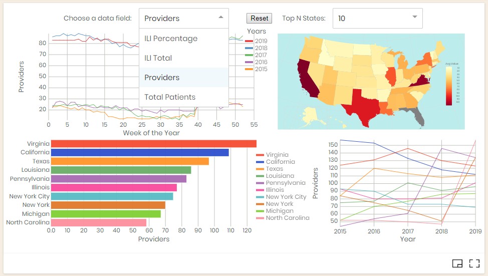
- Different Data Fields The top menu "Choose a data field" allows the user to select different fields from the dataset. Their meaning will be interpolated accordingly.

- Choose Top N States Because the 10 states and lines in both bar chart and line chart may seems a little bit busy. This menu allows the user to change the number of states to their desired numbers.
The future items including some items from the above schedule table. And a few more tasks that worth to consider are listed below:
-
There are some more interactions can be defined, or blocked in this project. The overall interactions among different visual components are satisfactory. They are consistent and no major flaws as concerned before. For time series data, it might be nice if we can add animation to automatically cycle through the data by time.
-
Expand one plot to the whole canvas and hide the rest. And toggle to bring back original views. This is worth to do because 1/4 of the screen sometimes not enough to see details, especially for the map. But in single view modes, the interactions are not visible. There maybe some logic need to be adjusted accordingly.
-
The flu season is centered in winter, so it would be really nice if the cycle starts from the week 40 and ends on week 39 in the next year. Should be easy to shift the data but need to worry about the legend changes which may not be trivial to do. So far the plot matches calendar year which is also useful. It is nice to be able to horizontally shifting the cyclic data. The effects may not be much different.
-
Derived data calculation like ratio We may want to add additional information like patient to healthcare provider ratio that can be derived from the original data. That will involve some menu changes.
-
Add Pan and Zoom capability in the map view Because the map is relatively small, allow zoom and pan can allow user to review more details. And it can be reset together by the Reset button.
-
Some nice to have performance improvements so that derived data doesn't have to be recalculated each time. The data loading and map drawing has been optimized. Other optimization may have limited effects because during interaction, the parameters are changing and the updates are often necessary.
(The End)