UI-improvement: Divide the options tabs into different sections #7180
Comments
|
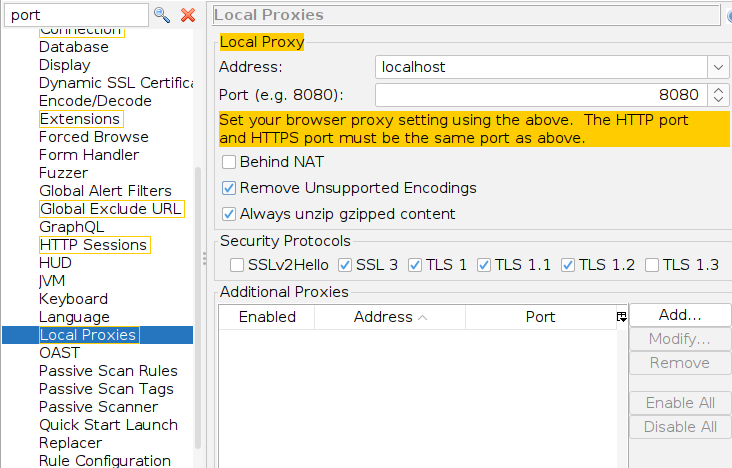
I don't necessarily disagree, but there is a search in the top left 😀
|
|
Yeah, that can be helpful sometimes, but not always. I mean, your solution is practical, but a UI needs to be comfortable and not take too much efforts or thinking from the user. and I think the options tab can improve on that. |

|
Also, most tabs have a "gear" icon which takes you to the right Options tab. |
That's a nice feature too, but I don't think it can be a replacement for grouping the tabs (I'm assuming that doing that change would be too difficult coding-wise, since there's a base for tab groups which is currently used to group them all under 'options', but maybe I'm wrong).
I think that changing the background instead of a stroke (like the highlights in the tab itself) can be better and blend well with the current UI.
|
|
FWIW I would have no problem grouping the options as long as we can come up with a sane set of groupings. |
|
Ok, what do you think about the categories I've suggested above?
Maybe we should also consider making sub-categories for some of them (like in the scanner), if that's possible. I think that each category/sub-category should have between 3-6 items. I think that this is esp. important for new users, because as developers or experienced user you just know where to find exactly what you need. But for me as a new user (and I guess other new users as well) walking into the app and trying to see what configs are available for the app - it's kind of overwhelming to see that unrelated 40+ tabs only sorted alphabetically (as they say - UI is like a joke, if you have to explain it it's not good enough). |
|
Some panels are already being moved (under a Network panel, you can check in the weeklies). |
Is your feature request related to a problem? Please describe.
Hi ZAP devs!
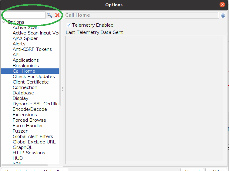
Currently the options window groups all the tabs under the same category named 'options'.
That makes it very hard to navigate through it and find what you want to config, given that there are 40+ tabs.
Grouping them into different categories can be very helpful.
Describe the solution you'd like
A basic grouping I can think of:
Describe alternatives you've considered
Using google to find what tab has the config I need
Screenshots
Illustration of current situation:

Additional context
No response
Would you like to help fix this issue?
The text was updated successfully, but these errors were encountered: