IUI is a simple JavaScript Web Framework, used to create Widgets for your User Interface quickly. It aims at minimising the use of JavaScript in UI Creation and manupulation, giving more responsibility on HTML. IUI provides custom HTML tags which can be directly embeded anywhere in the template. IUI requires JQuery to function.
You can provide the CDN url include IUI in your website as a object on window for faster coding.
<script src="http://cdn.jsdelivr.net/gh/ishaananuraag/IUIjs/versions/IUI.all.js"></script>You can use the following requirejs configuration to code using IUI Framework.
require.config({
	paths:{
		'IUI':'http://cdn.jsdelivr.net/gh/ishaananuraag/IUIjs/versions/IUI.all'
	}
});
require(['IUI'],function(IUI){
	...
		//Your main Code here
	...
});Custom tags provided by IUI can be directly inserted in HTML. All the attributes of the tag will be passed as options to to the IUI Component which is created.
By calling the IUI.makeUI() API, the given template will be rendered in into the desired UI with IUI Components attached. The styling attributes for the widget can be directly passed as attributes to the IUI custom tag which will be appended to inline style. This API return an object of Container which is further discussed below.
<body>
  ...
	<Widget id="new-widget" class="widget-class"
		height="3rem" width="4rem" background-color="black"
		border-radius="0.5em">
	</Widget>
  ...
</body>var container=IUI.makeUI();<body class="i-ui-container">
...
<div class="i-ui-widget widget-class" id="new-widget"
style="height: 3rem; width: 4rem; background-color: black; border-radius: 0.5em;">
</div>
...
</body>This API renderes the given Object and returns an Container Object. Usage:
...
	IUI.makeUI([Object ][[,] Model]);
...
Where Model is the object being being to the UI created and Object can be:
-
Element | JQuery - Javascript Element or JQuery Object of the parent Element containing the IUI custom tags. The given will be converted to Container Object which is returned. If JQuery Object contains more than one element, then the elements are wrapped in a div which is returned as Container Object.
-
TemplateString - Template String containing the IUI custom tags which needs to be rendered. Passing single widget in the TemplateString will not render the widget as it will be considered as Container.
-
[Element|JQuery|WidgetString] - If a single widget needs to be rendered, the Element, JQuery Object or its String should be passed enclosed in an Array.
Components are the objects which can be created using IUI. Components can bind to and trigger events. The events can be bounded with the Component during component creation or can be created and bind separately using EventGroup.
The basic types of Components which can be created using IUI:
- Widget
- Container
- Overlay
- ObservbleModel
- Template
Widgets are IUI Component which are first rendered in javascript and then attached to the DOM to reduce reflow and allow faster UI Creation. The name of the Widget is same as it's TagName. Widgets can be extended to create new Widgets with properties of old Widget and extended properties.
Widgets can be indentified bu class i-ui-widget and can be accessed by uiWidget attribute of it's Elemenet Object.
The basic options* which can be passed to FormLabel are:
- enabled {Boolean} - The enable state of the widget.
- isattached {Boolean} - Wether the widget is attached to the DOM or not.
The basic APIs Provided by Widget are:
- enable( {Boolean} ) - enabled or disables the Widget.
Handler to Events can be provided as attribute to Widget with same name as the event. The handlers can be of type:
  ...
	<Widget event="function(e){ ... }"></Widget>
	<Widget event="WindowFunction()"></Widget>
	<Widget event="console.log(e)"></Widget>
	<Widget event="WindowFunctionReference"></Widget>
...IUI Components can be bound with Observable Models using IUI Template. An IUI Template is enclosed in double colons (::) and can be a variable name or an executable statement which evaluates to a value. The template will be evaluated using the model given to IUI.makeUI() API. If model attribute is directly given as mapping, two way binding takes place. All the variables provided in template should exist in the given model.
Any change in the given model will directly change the options of the IUI Components which can be handled by implement the _handler(option name)Change() API. Basic change handlers are implemented by the Widgets and Containers.
Styles passed as attributes to the IUI custom Tags can aso be bound to the Widget.
  ...
	<FormLabel text="::nameNLS::"></FormLabel>
	<FormLabel text="::ageNLS::"></FormLabel>
... ...
var nlsObject={
nameNLS: 'name',
ageNLS: 'age'
}
IUI.makeUI(nlsObject);
... ...
<div class="i-ui-widget i-ui-formlabel">Name</div>
<div class="i-ui-widget i-ui-formlabel">Age</div>
...- FormLabel
- InputBox
- NumericInputBox
- DropDown
- ComboBox
- Button
- ToggleButton
- SubmitButton
- Radio
It is used to create a basic label which can be placed in Form for Widgets or inputs. The text can be set using both attribute or as content of FormLabel. The text can also be a HTML which will be rendered inside the FormLabel.
The basic options* which can be passed to FormLabel are:
- text {String} - Text to be displayed as label or HTML String.
<FormLabel text="Name"></FormLabel>
<FormLabel>Age</FormLabel>It is used to create a basic input box, which can be used to take input from user.
Events : change
The basic options which can be passed to InputBox are:
- value {String} - initial value for InputBox
- formAttribute {String} - JSON attribute for value of IForm
The basic APIs Provided by InputBox are:
- value( { undefined | value } ) - If the value is passed, this API sets the value to the InputBox. If nothing is passed it returns the current Value.
<InputBox value="initialValue" change="function(e){ console.log(e.value) }"></InputBox>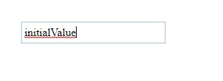
NumericInputBox is an extension to InputBox. It is used to create a input box with attached spinners. It can input both Integer and Decimal numbers.
Events : change, spin
The basic options which can be passed to NumericInputBox are:
- step {Number} - (default:1) Value with which the spinner should increase/decrease the current value
- decimal {true|false} - (default:false) Is the Number Integer or decimal(floating).
- precision {Integer} - (default:2) Precision for decimal numbers
<NumericInputBox value="3.14159" precision="5" step="0.00001" decimal="true"
		 change="function(e){ console.log(. . .) }"
		 spin="console.log(.  . .)">
</NumericInputBox>
DropDown is an extension to InputBox. It is used to create a Basic DropDown using the Data given in tag as Widget Children. Dropdown doesn't allow custom data to be entered as it's value.
Events : change
The basic options which can be passed to DropDown are:
- data {Array} - It is used for rendering of the options in the DropDown when the widget is created. It is not passed as an attribute to IUI custom tag.
- idAttribute {String} - (default:'id') The id attribute from Object in data Array to be displayed in the popup. It can also be HTML.
- textAttribute {String} - (default:'text') The text attribute from Object in data Array to be displayed in the popup. It can also be HTML.
<DropDown>
	...
	<option id="dropdown-option-a-id">Option A</option>
	<option id="dropdown-option-b-id">Option B</option>
	...
</DropDown>
Events : change
ComboBox is an extension to InputBox. It is used to create a Basic ComboBox using the Data given in tag as Widget Children. ComboBox provides a dropdown list for values. It also allows custom data to be entered as it's value.
The basic options which can be passed to ComboBox are:
- data {Array} - It is used for rendering of the options in the ComboBox when the widget is created. It is not passed as an attribute to IUI custom tag.
- idAttribute {String} - (default:'id') The id attribute from Object in data Array to be displayed in the popup. It can also be HTML.
- textAttribute {String} - (default:'text') The text attribute from Object in data Array to be displayed in the popup. It can also be HTML.
<ComboBox>
	...
	<option id="cobobox-option-a-id">Option A</option>
	<option id="cobobox-option-b-id">Option B</option>
	...
</ComboBox>
It renderes a Clickable button widget.
Events : click
The basic options which can be passed to Button are:
- text {String} - Text to be displayed as label or HTML String.
<Button text="Click Me" click="console.log('button Clicked')"></Button>
<Button click="clickHandler">Click Me</Button>
It renderes a Togglable button widget.
Events : click, toggle
The basic options which can be passed to SubmitButton are:
- text {String} - Text to be displayed as label or HTML String.
The basic APIs Provided by ToggleButton are:
- toggle( { undefined | Boolean } ) - It is used to toggle the active state of the Toggle Button. Boolean can alse be passed to set the Toggle state.
- value( { undefined | value } ) - If the value is passed, this API sets the value to the ToggleButton. If nothing is passed it returns the current Value.
<ToggleButton text="Toggle Me" click="console.log('button Clicked')"></ToggleButton>
<ToggleButton toggle="toggleHandler">Toggle Me</ToggleButton>
It renderes a Clickable button widget. This button will submit the form in which it is contained.
Events : click
The basic options which can be passed to SubmitButton are:
- text {String} - Text to be displayed as label or HTML String.
<SubmitButton text="Submit Me" click="console.log('button Clicked')"></SubmitButton>
<SubmitButton click="clickHandler">Submit Me</SubmitButton>
It is used to create a Radio button With a FormLabel attached to it. It is generally used along with RadioGroup.
The basic options* which can be passed to Radio are:
- text {String} - Text to be displayed as label or HTML String.
- checked {true|false|'checked'} - If this attriute is present, the radio will be selected.
- group {String} - The group of the radio Button.
- value {String} - The value of the radio Button.
The basic APIs Provided by Radio are:
- checked( { undefined | Boolean } ) - It is used to get the checked active state of the radio. Boolean value can alse be passed to set the checked state.
- value( { undefined | value } ) - If the value is passed, this API sets the value to the Radio. If nothing is passed it returns the current Value.
<Radio group="gender" value="1" text="male"></Radio>
<Radio group="gender" value="2" text="female" checked="checked"></Radio>
Containers are IUI Components which contains other Containers or Widgets. Containers are also rendered like widgets in which the attributes are passed as options to the Container, but unline Widgets the Container is not turned into div elements.
Every Container contains his own Widgets, therefore if There is nesting of Containers the parent Container will contain the Child container but not the widgets of the Child Container.
Whenever IUI.makeUI API is called, it returns the object of Container. Following attributes of Container are useful:
- element (Element) - element contains the element attached to the Container.
- $element (JQuery) - $element contains the JQuery Object of the element attached to the Container.
- containers (Array) - containers holds the Containers present in the element passed to the Container.
- widgets (Array) - widgets holds the Widgets present in the element passed to the Container.
If any Widget or Container has id attribute, it's named reference also gets attached to the Array. It can be accessed by container.widgets['id-attribute'] and container.containers['id-attribute'] respectively where id-attribute is the id of IUI Component.
- Container
- IFrame
- RadioGroup
- IForm
This is a generally used to structure the User Interface and separate IUI Components.
<container id="widget-container">
	<InputBox value="initialValue"></InputBox>
	<NumericInputBox id="favrouite-number"></NumericInputBox>
	<container id="buttons-container">
		<SubmitButton>Submit Me</SubmitButton>
		<Button text="Click Me"></Button>
	</container>
</container>
<container id="widget-container" class="i-ui-container">
	<div class="i-ui-widget i-ui-inputbox"><input class="i-ui-input"></div>
	<div class="i-ui-widget i-ui-numericinputbox" id="favrouite-number"> . . . </div>
	<container id="buttons-container" class="i-ui-container">
		<div class="i-ui-widget i-ui-button"> . . . </div>
		<div class="i-ui-widget i-ui-button"> . . . </div>
	</container>
</container>element: container#widget-container.i-ui-container
$element: jQuery.fn.init [container#widget-container.i-ui-container]
widgets: Array(2)
0: IUIClass {options: {…}, $element: jQuery.fn.init(1), …}
1: IUIClass {options: {…} …}
favrouite-number: IUIClass {options: {…} …}
length: 2
containers: Array(1)
0: IUIClass {widgets: Array(2), containers: Array(0), options: {…} …}
buttons-container: IUIClass {widgets: Array(2), containers: Array(0), options: {…} …}
length: 1Layout extension to Container. It just takes 100% parent Height and width and can be placed inside another div whose height is known. It is used to contain big Widgets which can span accross screens.
<Layout id="interest-radio" group='interest' formAttribute="interested" >
	<InputBox value="initialValue"></InputBox>
	<NumericInputBox id="favrouite-number"></NumericInputBox>
</Layout>
RadioGroup is used to handle Radio which contains the same group. It can be attached to the IForm with the formAttribute like any other Widget.
The basic options which can be passed to RadioGroup are:
- group - The group of the radio buttons which it contains
- orientation {'vertical'|'horizontal'} - (default:'vertical') Specifies the orientation of RadioGroup
<body>
	<RadioGroup id="interest-radio" group='interest' formAttribute="interested" >
		<radio value="yes" text="yes" checked="checked"></radio>
		<radio value="no" text="no"></radio>
	</RadioGroup>
</body>
container=IUI.makeUI()
console.log(container.containers['interest-radio'].value());yesIForm is used to contain all the Widgets in a common Form. Widgets in the IForm can be linked with the form using the formAttribute attribute option.
IForms can be nested and linked with each other using formAttribute to create nested JSON structure.
The value() API provided by IForm can be used to get JSON containing all the Widgets linked to the form with the formAttribute.
An Object containing values can also be passed to value() API of IForm to fill the values in the form directly. The Object must be of the structure of the created UI.
<Iform id="ui-form">
	<Iform formAttribute="name">
			<FormLabel text="First Name "></FormLabel>
			<InputBox formAttribute="firstName" value="Ishaan"></InputBox>
			<FormLabel text="Last Name"></FormLabel>
			<InputBox value="Singh"></InputBox>
	</Iform>
	<br>
	<FormLabel text="Age"></FormLabel>
	<NumericInputBox formAttribute="age" id="age-input" value="23"></NumericInputBox>
	<br>
	<FormLabel text="Gender"></FormLabel>
	<RadioGroup group="gender-radio" formAttribute="gender" orientation="horizontal">
			<radio value="male" text="male" checked="checked"></radio>
			<radio value="female" text="female"></radio>
	</RadioGroup>
</Iform>
container=IUI.makeUI()
console.log(container.containers['ui-form'].value());{
age: 23,
gender: 'male',
name: {
firstName: "Ishaan",
lastName: "Singh",
}
}Events can be bound to IUI Components using IUI.EventGroup. EventGroups are mapped by name. If new EventGroup with existing name is created, it will override the previous one.
Events names with their handlers are passed as key value pair in object to IUI.EventGroup while creation. The name of the EventGroup is also passed along with the events.
Components can be attached to EventGroup by using the eventgroup attribute option. IUI will automatically find the respective EventGroup and bind the component to it.
EventGroups can be created before or after makeUI() API call.
<ToggleButton eventGroup="toggle-group"></ToggleButton>var eventGroup=new IUI.EventGroup({
name: 'toggle-group',
click : function(){
// Click Handler
},
toggle: function(){
// Toggle Handler
},
persist: true // Default:false, It specifies weather the EventGroup should be available in memory after binding with an Component. If true multiple Components can get bound to the same EventGroup
});Data can also be bound to IUI Components like EventGroup using IUI.DataMart. Like EventGroups DataMart are also mapped by name. DataMart works similar to EventGroup. DataMart can also bind to EventGroup by passing eventgroup attributer to its constructor.
Components can be attached to DataMart by using the datamart attribute option.
Events : binding, load, bound
- binding - This event is triggered before loading the data to the Component. This is used to manupulate the incoming data.
- load - This event is used to bind and render the data to the IUI Component.
- bound - This event triggered after load event and is used to manupulate the DOM Elements.
DataMarts can also be created before or after makeUI() API call. DataMart will start the data fetching process after the fetch() API. If autofetch:true is passed while creation, the fetch() API is executed as soon as it is created.
<DropDown datamart="seasons-list" idAttribute="id" textAttribute="season"></DropDown>var dataMart=new IUI.DataMart({
name: 'seasons-list',
eventgroup: 'season-events',
data: [{id:'1',season:'Winter'},{id:'2',season:'Summer'},{id:'3',season:'Moonsoon'},{id:'4',season:'Spring'}], //The data to be passed to the IUI Component
persist: true // Default:false, It specifies weather the DataMart should be available in memory after binding with an Component. If true multiple Components can get bound to the same DataMart
});
dataMart.fetch(); //This will start the data fetching process.Validations can be applied to any Widget using the validations attribute of Widget Tag. A comma separated list of all the validations can be passed to the widget with the validations attribute.
IUI Provide some basic validations which can be applied to the Widgets:
- numeric
- noScript
IUI.Validator is a global validator which provides API as:
- **addRule( {String,handler} ) - This API adds a new rule String to the IUI global Validator. The handler should return true if the validation suceeds else return false.
- **validateByRule( {String,Object} ) - This API tests the rule String with the provided object. If the rule String is not present in the Validator, it returns true.
Local validator can be created by calling new IUI.Validator(). The newly created validator will have it's own rule list and can be used to validate widgets in certail scenerios.
The validate( {Validator} ) API of the widget validates the rules assigned to Widget with the given Validator. If Validator is not give, IUI Global Validator is used. This API Returns a validObbject with **value (Boolean) ** attribute and **rules (Array) **. If value is false rules Array contains the list of all failed rule cases.
> widget.validate();
> { valid:false,
	rules: ['noScript','numeric']
}//TO DO