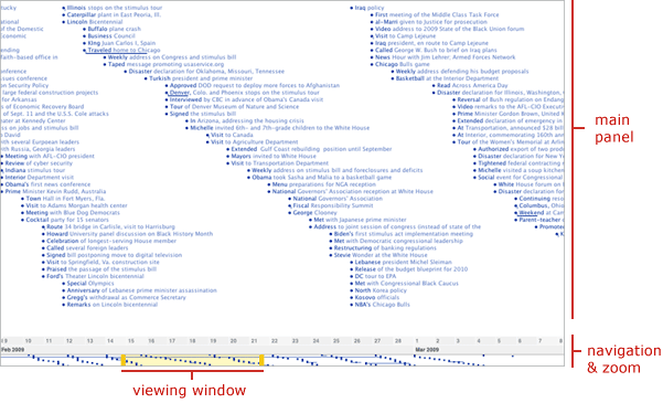
Timeline View
The timeline view is one of two temporal modes for visualizing data on TimeFlow (calendar is the other temporal view). The timeline shows two kinds of time-based events:
- point-in-time events: those that happen at a given moment in time, represented by a dot and a label
- date-range events: those events that have duration in time, represented by a horizontal line and label
- Double click: double clicking anywhere on the timeline canvas causes the visualization to zoom in
- Click and drag: clicking and dragging anywhere on the timeline canvas causes the timeline to focus solely on that time slice
- Navigation Bar: dragging the yellow handles on the navigation bar adjusts the viewing window, zooming in and out of the data set.
- Time Buttons: the time markers (years, months, days) at the bottom of the screen are interactive. Clicking on one of them causes the timeline to focus solely on that time slice.
- Zoom Out Button: each click on this button zooms out the data in the window twice
- Zoom Out 100% Button: clicking this button causes all of the data points to be visible in the timeline, providing the most zoomed out view in the application
- Diagonal: arranges data point from top to bottom in the order it happens, creating diagonal patterns. This mode makes it easy to understand exactly the order of events.
- Loose: the vertical location of data points is flexible. This mode makes it easy to see bursts of activity over time
- Graph: aggregates data points over time. For example, if there have been 30 events on one day and 15 the next, the first day will exhibit a bar that is twice as high as the one on the second day.
Timeline Navigation
Most investigative data sets are too big to fit in a single screen, so scrolling is crucial. In TimeFlow, the timeline scrolling mechanism, located at the bottom, also functions as a zoom control.
Zooming
These are the multiple ways users can perform zooming actions in the Timeline mode of TimeFlow:
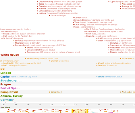
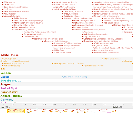
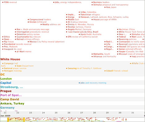
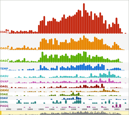
Tracks
One way to unpack extra dimensions in TimeFlow is to set “tracks” in the timeline. Tracks arrange the data according to a given category. In the First 100 Days example, we could set tracks to “location” and see all the events grouped by where they happened:
Layout
By definition, a visual timeline plots data points along a time axis. However, there is more than one way to plot the points. TimeFlow offers three different layout options. These options are visible both in the visualization itself as well as one the navigation bar at the bottom of the screen.
Left: diagonal layout.
Center: loose layout.
Right: graph layout.
Icons
Timeline mode can display two different icons: solid and outline circles. Solid circles represent positive values and outlined circles represent negative values.