This plugin requires Tailwind CSS 2.0 or later.
yarn add tailwindcss-vw-flexbox-grid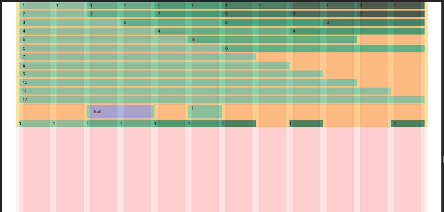
This plugin creates all the columns on the above image.
On the image a background is provided directly in the columns - this is why the columns all seem gapless. In reality (and depending on your usecase) you would put a div inside the column and begin from there.
The lowest row is a mix of columns with and without gap, which is also possible. You can see where the text is, compared to the red overlay columns.
The red overlay, is an additional layer that I use for layouting and can toggle - not included in plugin, but built with the plugin.
This plugin uses the screen key in your Tailwind config’s theme. You can choose to configure it for only some of the screens, if your grid is consistent throughout multiple screens.
Make sure the keys of the screens in your config are matching the options provided to the plugin.
// tailwind.config.js
module.exports = {
    theme: {
        screens: {
            sm: '640px',
            md: '768px',
            lg: '1024px',
            xl: '1280px',
            '2xl': '1536px',
        },
    },
    plugins: [require('@arnars/tailwindcss-vw-flexbox-grid')({})],
};<!-- Basic container -->
<div class="w-full mx-auto space-y-12 min-w-page max-w-page">
<!-- Row (only room for 4 columns below :md) -->
<div class="row md:hidden">
<div class="col col-2">Column</div>
<div class="col col-1 indent-left-1">Column with left indent</div>
</div>
<!-- Row (only room for 6 columns below :lg) -->
<div class="row hidden md:flex">
<div class="col col-2">Column</div>
<div class="col col-2 indent-right-1">Column with right indent</div>
</div>
<!-- Row (room for 12 columns) -->
<div class="row hidden lg:flex">
<div class="col col-6">Column</div>
<div class="col-gapless col-gapless-2">Column without gaps</div>
<div class="col col-4">Column</div>
</div>
</div>In the default options 4 screens are configured. All screen-related variables are in Arrays, where the index is corresponding the screen index.
const defaultOptions = {
    // Choose which screens to change settings for
    screens: [null, 'md', 'lg', '2xl'],
    // Number of column for different screens
    columns: [4, 6, 12, 12],
    // Page widths for different screens (if anything else but pixels, set as string. Pixels will be converted to em)
    pageWidths: ['100vw', '100vw', '100vw', 1536],
    // Column gaps for different screens
    columnGaps: [12, 12, 12, 12],
    // Page gaps for different screens
    pageGaps: [12, 12, 12, 12],
    // Page max width
    pageMaxWidth: 1536,
    // Page min width
    pageMinWidth: 320,
};
All of the above can be changed via an object provided to the plugin in tailwind.config.js like so:
// tailwind.config.js
module.exports = {
    plugins: [
        require('@arnars/tailwindcss-vw-flexbox-grid')({
            // Add options here
        }),
    ],
};.row {
/* Handy wrapper for columns */
}
.col {
/* Configuration class - needs to be there if you use col-x */
}
.col-gapless {
/* Configuration class - needs to be there if you use col-gapless-x */
}
.col-x {
/* Column - The x decides the width of your column */
}
.col-half {
/* Column - Half width of all cols in all screens */
}
.col-full {
/* Column - Full width of all cols in all screens */
}
.col-gapless-x {
/* Column - The x decides the width of your column */
}
.col-gapless-half {
/* Column - Half width of all cols in all screens */
}
.col-gapless-full {
/* Column - Full width of all cols in all screens */
}
.indent-left-x {
/* Indentation for columns - The x decides how many columns you want to indent */
}
.indent-right-x {
/* Indentation for columns - The x decides how many columns you want to indent */
}
.indent-left-half {
/* Indentation for columns - Half width of all columns */
}
.indent-right-half {
/* Indentation for columns - Half width of all columns */
}
.indent-left-0 {
/* Indentation for columns - Reset indentation */
}
.indent-right-0 {
/* Indentation for columns - Reset indentation */
}.gap-padding {
/* Sets the current gap width as padding */
}
.gap-padding-x {
/* Sets the current gap width as padding - left / right */
}
.gap-padding-y {
/* Sets the current gap width as padding - top / bottom */
}
.gap-margin {
/* Sets the current gap width as margin */
}
.gap-margin-x {
/* Sets the current gap width as margin - left / right */
}
.gap-margin-y {
/* Sets the current gap width as margin - top / bottom */
}When using .col-x, box-sizing is set to content-box and padding is used to archieve the gap-effect.
This is because I would like to be able to use the .indent-left/right-x which works with margin.
When using .col-gapless-x, no gap is needed and box-sizing is set to border-box.
It often makes sense to add a child div to the column-div in order to avoid overriding essential behavior.