A highlights a few powerful lines of CSS that do some serious heavy lifting and help you build robust modern layouts.
This project is implementation of creating simple usefull layout with simple usefull CSS property. Background use-cases of this project is based on this link https://1linelayouts.glitch.me/. And i try to implement that use-cases with real design reference from UI Design Daily, so hopefully it can be more easily understand how to create that cases.
Getting the design from UI Design Daily.
UI Design Daily is free, Open-source UI design resources updated daily.
Here's some design reference to create some layouts :
Here's some of tech-stack that used in development process :
| List | Description |
|---|---|
| Gulp | A toolkit to automate & enhance your workflow. Using it as task runner. |
| AtomicCSS | Utility first CSS like inline styles, offers single-purpose units of style, but applied via classes. |
| SASS | CSS-preproceccor. Using it to tackle undefined CSS-property in Atomizer such as grid, aspect-ratio, etc. |
| Vercel | Serverless hosting for host websites and web services that deploy instantly and scale automatically – all without any configuration. |
Here's some cases that i choosed based on reference from glitch
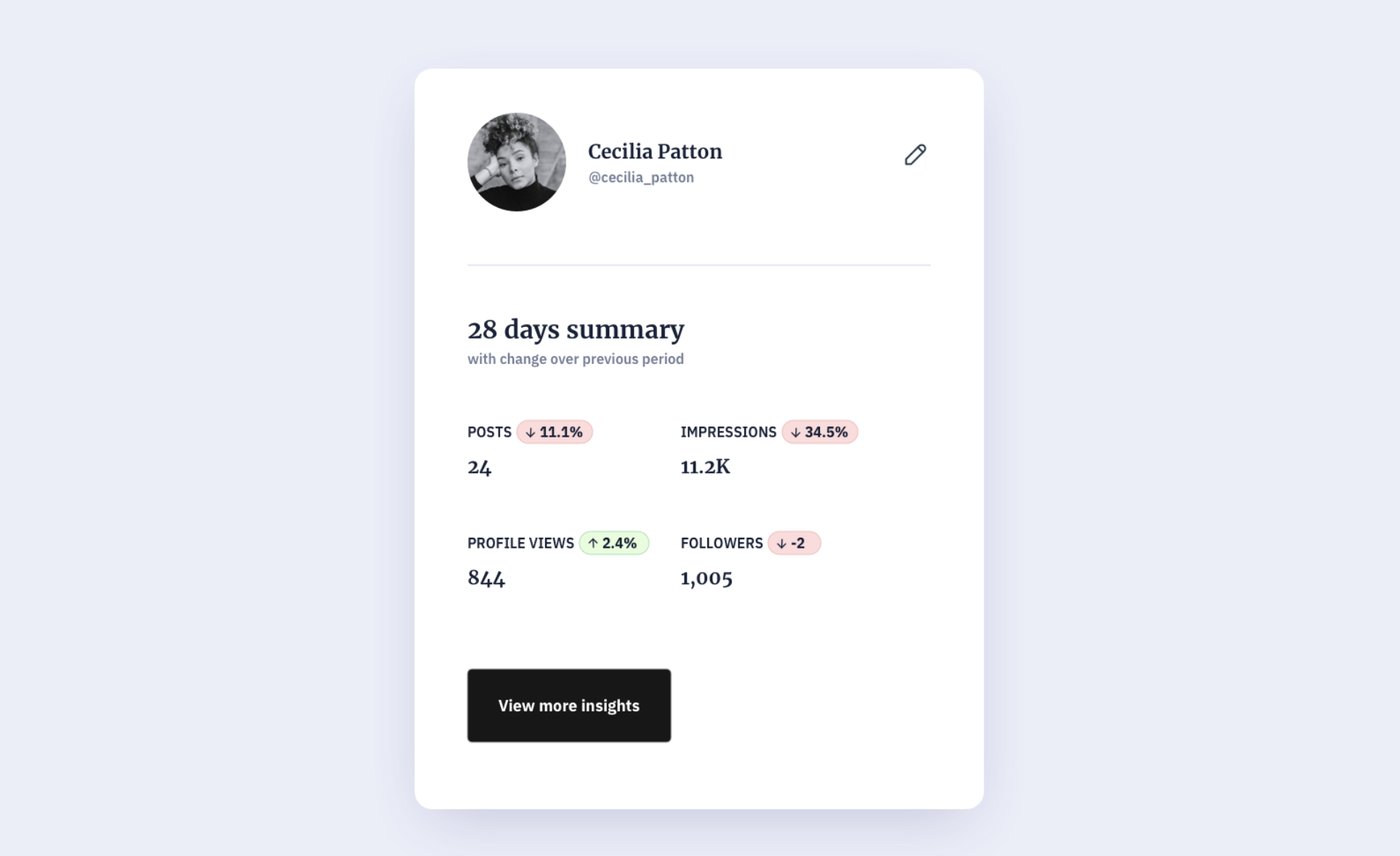
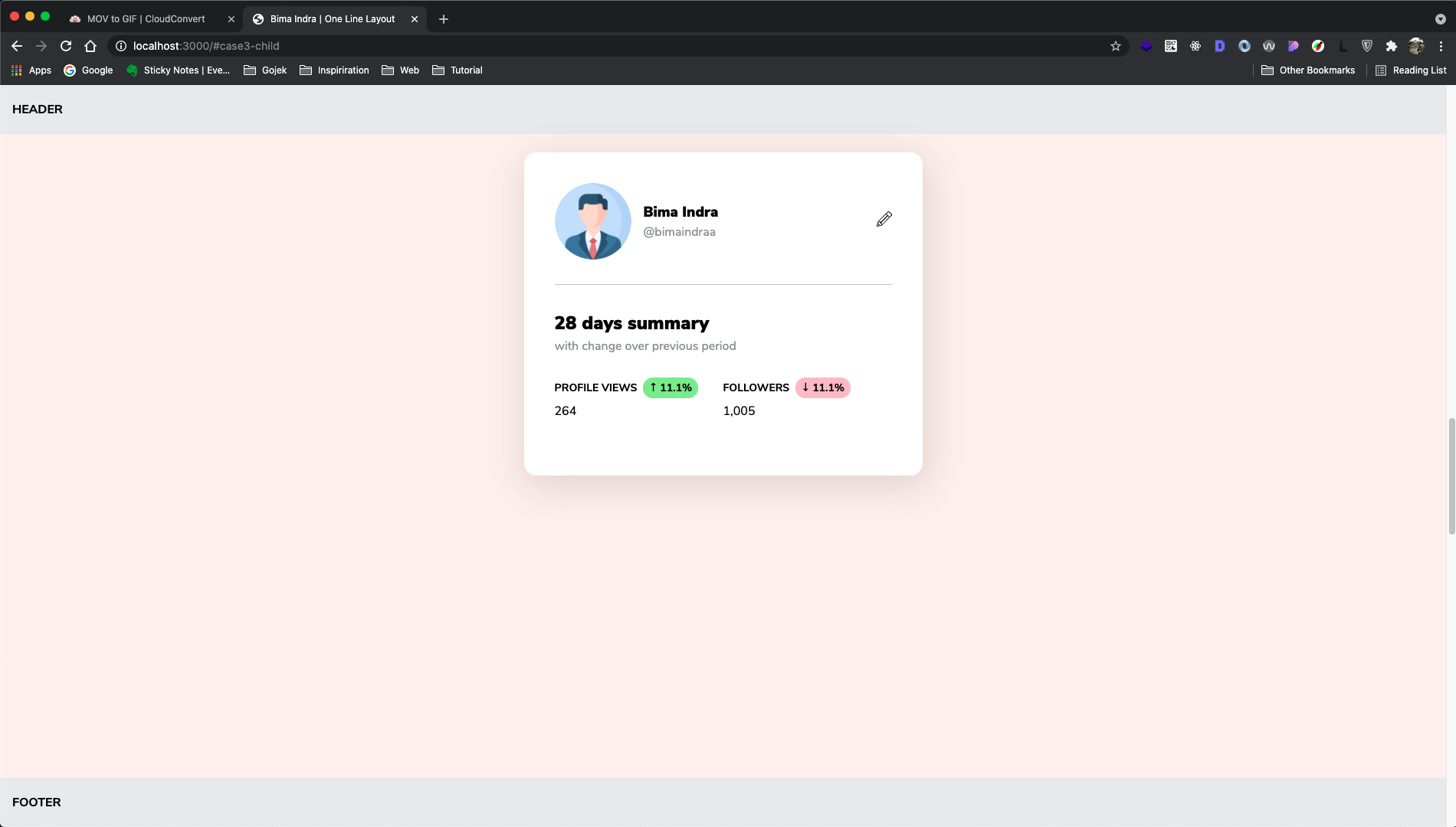
This feature is to make the content has vertical & horizontal centered using CSS property grid also place-items: center
In any case, we create Centering Content layout either using absolute with transform combination, using margin: auto in some cases, or using flexbox But, now we can tackle this case more easily using css grid This is because grid supports for creating layout with 2 dimensional. Check it
Here's the shortcode
.l-center-content {
    display: grid;
    place-items: center;
}
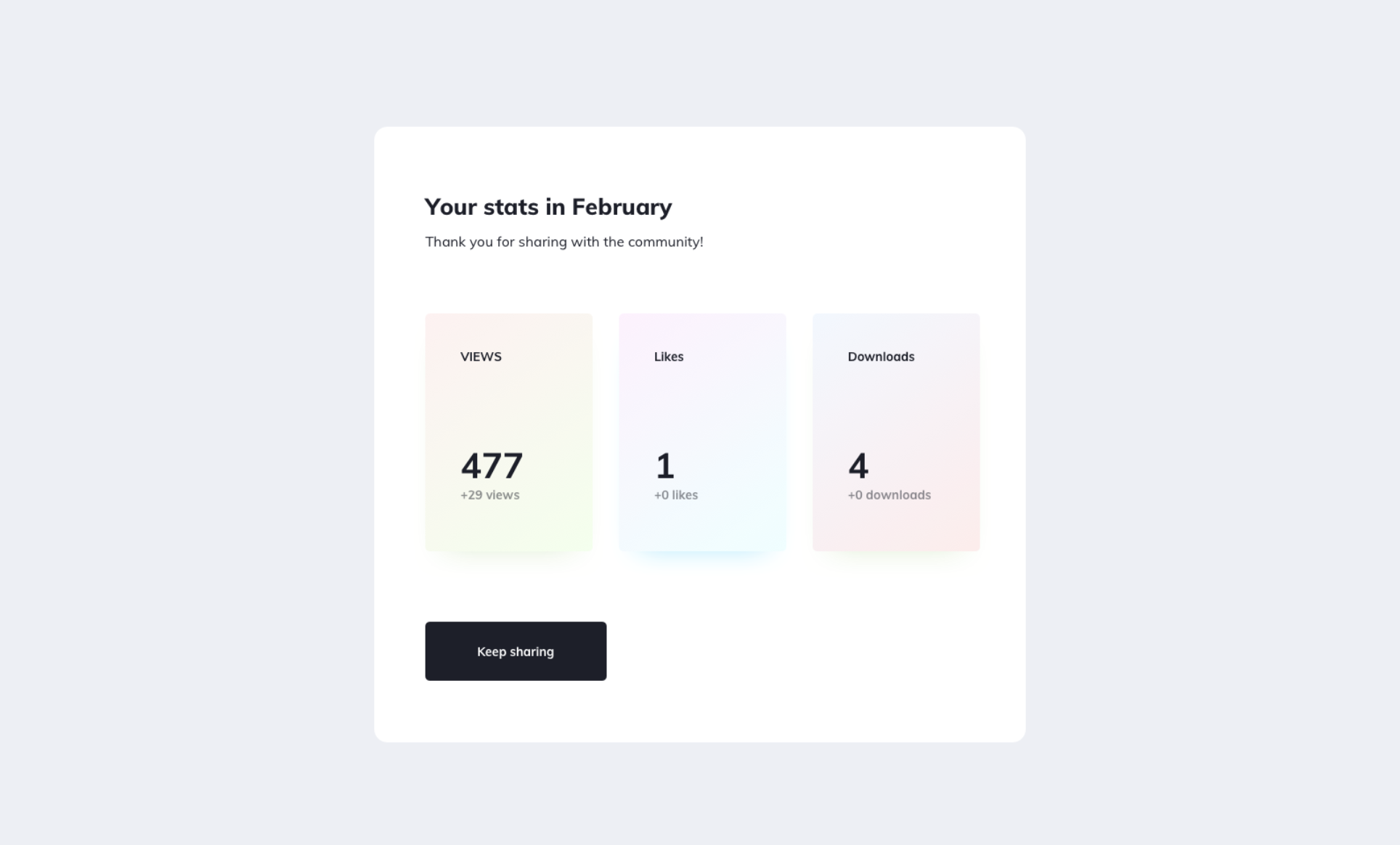
This feature is to make the content has fixed width, stacked when on the mobile screen, also spanning into the same line.
Here's the shortcode
.l-deconstructed-pancake {
    display: flex;
    flex-wrap: wrap;
    justify-content: center;
}

.l-deconstructed-pancake__item {
    flex: 0 1 220px;
    margin: 0 8px;
}

.l-deconstructed-pancake__item--stretch {
    flex: 1 1 220px;
}
This feature is to make the content has same dimension.
This case is very suitable when we create common layout that contains header, content, footer. It's gonna make header and footer stick in their position eventho the content is not fully cover the viewport. It can tackle issue if the website doesn't has any content to show such as search not found.
Here's the shortcode
.l-pancake-stack {
    display: grid;
    grid-template-rows: auto 1fr auto;
}
Here's the shortcode
.l-ram {
    display: grid;
    grid-gap: 1rem;
    grid-template-columns: repeat(auto-fit, minmax(150px, 1fr));
}
This feature is maintain ratio of content using CSS property aspect-ratio
Sometimes we create ratio content using combination between padding-top and position:absolute But, now we can create that case with only simple CSS code.
Here's the shortcode
.l-ratio-16x9 {
    aspect-ratio: 16 / 9;
}
Clone this repository.
Enter directory of project
cd one-line-layouts...then install dependency
npm installor
yarn installRun local development
npm run serveor
yarn serveBuild for development env
npm run devor
yarn devBuild for production env
npm run buildor
yarn build