Basics
Field Day is a plugin for Movable Type that lets you add more fields to the MT interface. How is it different from MT's built-in "Commercial Pack" implementation of custom fields?
- You can define fields for templates, assets, comments, and blogs, as well as system-wide fields.
- Linked object field types let you connect any supported object type to any other.
- By organizing fields into groups and allowing multiple instances of each group, you can allow users to associate an unlimited amount of data with a given object.
Any user with System Administrator permissions can edit all Field Day settings. In addition, by default, any user who has the Blog Administrator for a given blog can view and modify all blog-level Field Day settings for that blog.
Depending on how your MT installation and permissions are set up, you may want to disallow Blog Administrators from changing Field Day settings. You can do this via the system-wide Plugin Settings screen.
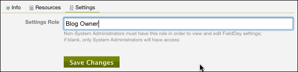
Under the settings for Field Day is a Settings Role option. Set this to blank if you want only System Administrators to be able to modify blog-level Field Day settings; or set it to the name of a different role to allow only users with that role for a given blog to change Field Day settings.
For a given blog-level type of object (i.e. Entries or Comments), you can designate one blog's Field Day fields to be the system-wide default. Any blog that doesn't have its own set of fields defined for that object type, and has not specifically been set to override the default fields, will use the fields from the default blog.
- To use a set of fields from a given blog as the default: When viewing the field settings for the object type in question, click the Use [Blog Name] Settings as Default link under Configure in the left-hand column.
- To remove a blog's settings as the default: When viewing the field settings that have been set as default, click the Remove [Blog Name] Settings as Default link under Configure in the left-hand column.
- To apply the default blog's settings to a given blog: When viewing the field settings for the object type in question, click the Use Default Settings link under Configure in the left-hand column.
- To override default settings: When viewing the field settings for the object type in question, you will see a message that begins, "This blog is using the default Field Day settings from the blog [Blog Name]" and an Override Default Settings button. Click that button to stop the blog from using the default blog's fields for this object type. You should then be able to create fields and groups specific to this blog (although you do not need to do so).
Field Day can coexist peacefully with MT's own implementation of custom fields. In fact, it's probably preferable to use the core functionality for User fields unless you need features for those fields that only Field Day provides, because this will allow the fields to work with Community functionality out of the box.
Field Day allows you to define custom fields for most of the types of objects in Movable Type, as well as global System fields.
- Configured From: Preferences > Asset Fields at the blog level
- Where Fields Appear: Edit Asset screen for an individual asset
- Configured From: Preferences > Blog Fields at the System Overview level
- Where Fields Appear: Preferences > General at the blog level
- Configured From: Preferences > Category Fields at the blog level
- Where Fields Appear: Edit Category screen for an individual category
- Configured From: Preferences > Comment Fields at the blog level
- Where Fields Appear: Edit Comment screen for an individual comment
- Configured From: Preferences > Entry Fields at the blog level
- Where Fields Appear: Edit Entry screen for an individual entry
- Configured From: Preferences > Folder Fields at the blog level
- Where Fields Appear: Edit Folder screen for an individual folder
- Configured From: Preferences > Page Fields at the blog level
- Where Fields Appear: Edit Page screen for an individual page
- Configured From: Preferences > System Fields at the System Overview level
- Where Fields Appear: Preferences > General at the System Overview level
- Configured From: Preferences > Template Fields at the blog level
- Where Fields Appear: Edit Template screen for an individual template
- Configured From: Preferences > User Fields at the System Overview level
- Where Fields Appear: Edit User screen for an individual user
When you initially configure a set of Field Day fields, you will see an empty list. Click the Add Field button to add a new field to the list.
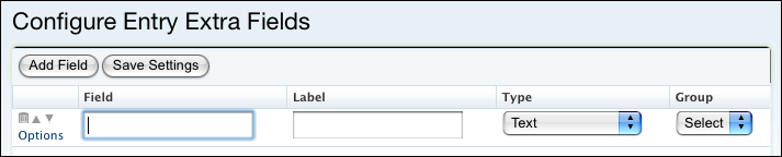
Each field has the following settings:
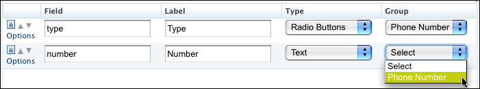
- Field: The field's identifier. This will be used to specify the field in template tags. It must be unique within this set of fields, and can only contain letters, numbers, and underscores. It's case-sensitive, so it's recommended to make all field names lower-case.
- Label: The text that's (optionally) displayed with the field on the editing screen. Type: The type of field, as described below.
- Group: The group to which this field belongs; groups are configured separately. Groups and instances are discussed in more detail below.
To the left of each field are several controls:
- Delete (trash can): Deletes this field. For fields that have already been saved, a lock icon appears; you must first click on the lock to get the trash can to appear. This is to prevent the accidental deletion of fields, which can result in the loss of already-entered data.
- Move up (up arrow): Swaps this field with the field above it.
- Move down (down arrow): Swaps this field with the field below it.
- Add (green plus sign): Adds an instance at the end of the list.
- Options: Display the options for this field, which vary depending on the field type. (The options will also pop up automatically when you change a field's type.)
Groups will appear in the order specified in the Configure Groups listing; within groups, and for ungrouped fields, fields will appear in the order in which they're displayed on the Configure Fields screen.
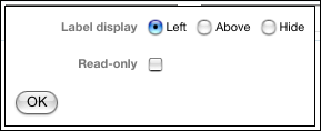
Most types of fields have their own set of specific options, which are described below. In addition, all fields share two options:
- Label display: Controls whether the field's label will be displayed on the editing screen, and its position relative to the field itself.
- Read-only: If checked, this field will be displayed on the editing screen but will not be modifiable by the user. This might be used, for example, in a case where fields are automatically populated with data from some external source.
Field Day field types are very flexible, and new types can be added simply by dropping a directory into the plugin's installation. Hence, a given MT instance might not have exactly this set of types. The various Linked field types are discussed separately in the next section.
A simple HTML checkbox.
- Value stored: "on" or nothing.
- Options: none.
A calendar date, which the user enters by selecting the year, month, day of the month, and (optionally) time of day from dropdown menus.
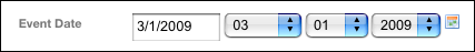
The user can also enter the date by clicking on a calendar icon and clicking on a date in a JavaScript-based popup calendar, or (optionally) by typing it into a text field.
A date field can be displayed in any desired format on a publishing template by
using the MTFormatDate tag.
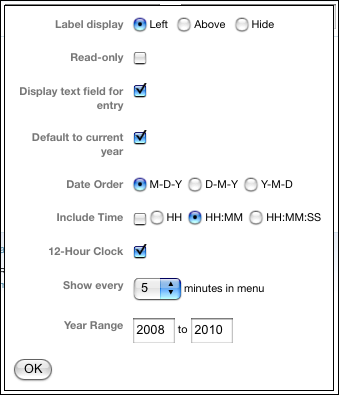
- Value stored: A timestamp in the format used by Movable Type for its own date fields: YYYYMMDDHHmmss.
-
Options:
- Display text field for entry: If enabled, a text field will be included to the left of the menus; the user can enter a text date in a variety of formats, such as "2/12/09" or "2/12" or "feb 13 2010", which will be parsed in order to set the Y/M/D menus.
- Default to current year: If enabled, the current year will be pre-selected in the year menu.
- Date Order: The order in which the year, month, and day menus will appear on the entry editing screen. This does not affect the format of the stored timestamp value.
- Include Time: Controls whether hour, minute, and second menus will appear on the entry editing screen. If this option is not selected, the stored timestamps will use 000000 for the time.
- HH/HH:MM/HH:MM:SS: If the time is included, controls whether a menu for the hour, menus for the hour and minute, or menus for the hour, minute, and second will be displayed.
- 12-Hour Clock: If the time is included, lets you display a menu of 12 hours and an additional AM/PM menu.
- Show every __ minutes in menu: If the time is included and a menu of minutes is displayed, lets you limit which minute options display in the menu. For example, selecting 15 will result in a menu containing 00, 15, 30, and 45.
- Year Range: Controls which year options will appear in the dropdown menu of years.
A File field holds the name of an uploaded file. If the user has Upload File permission for the weblog being edited, a file upload field will be displayed along with the field.
If a filename is stored in the field when an existing entry is edited, Field Day will display the existing filename and a link to the file (relative to the URL path specified in the settings). If the file is an image (that is, if the filename has an image-type extension like .jpg or .gif), the image will be displayed.
If a file is uploaded and a filename is also entered into the field, that filename will be used. If the field is left blank, the uploaded file will be named according to the Filename setting, described below.
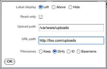
- Value stored: The name of the file.
-
Options:
-
Upload path: An absolute path to the location on your server where you want uploaded files to be stored. This might be something like
/home/myaccount/mysite.com/userfiles/pdfs. -
URL path: The path relative to your site's web root, or a full URL and path, that will allow a web browser to display the uploded file. For example,
/userfiles/pdfs. This will be used in displaying and/or linking to the file on the entry editing screen, and by theMTFileURLPathtag. -
Filenames: Controls how uploaded files will be named on the server. For all options except Keep, the name of the field, preceded by an underscore, will be inserted into the filename; this allows you to have multiple File type fields without naming conflicts.
- Keep means the filename will not be altered at all, except that a number will be appended if the file already exists. Since the name of an uploaded file can be very long, or irrelevant, or contain punctuation characters, this option is not recommended unless you're sure your users know what they're doing.
-
Dirify means the existing filename will be used, but "dirified": punctuation will be removed, spaces converted to underscores, and the name will be lowercased. So Mom's garden;
Zinnias/dahlias.jpgwill becomemoms_garden_zinniasdahlias_field5.jpg. - ID means the filename will be based on the numeric ID of the entry being edited.
- Basename means the filename will be based on the basename of the entry being edited.
-
Upload path: An absolute path to the location on your server where you want uploaded files to be stored. This might be something like
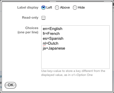
A set of radio buttons in which the user can click on a single item.
You can define each choice presented to the user as a key/value pair, using the format key=value. The key will be stored in the database, but the value will be displayed to the user on the entry screen.
Without key/value pairs, if you change the text of a choice, the next time the user "edits" an entry with that choice selected, it will no longer be selected because the text stored in the database no longer matches. Using this feature lets you change the displayed values with impunity without worrying about existing entries.
- Value stored: The selected item's key (if using key/value pairs) or value.
-
Options:
- Choices (one per line): The items that will appear in the set of radio buttons.
A dropdown menu from which the user can select an item.
You can define each choice presented to the user as a key/value pair; see Radio Buttons, above.
- Value stored: The selected item's key (if using key/value pairs) or value.
-
Options:
- Choices (one per line): The items that will appear in the menu.
A single-line enterable field.
- Value stored: The entered text.
-
Options:
- Width: The width of the input field, in pixels.
- Max. chars: The maximum number of characters that can be entered into the field. Note that this simply restricts the input length by adding a maxlength to the form element, and does not actually impose a limit on the database side (i.e., if an object is created through other means).
A multi-line enterable field.
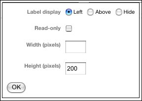
- Value stored: The entered text.
-
Options:
- Width: The width of the input field, in pixels.
- Height: The height of the input field, in pixels.
Field Day lets you define fields that can link any object in the system to any other, or to multiple objects. The value actually stored in the database is simply the ID of the linked object.
When you define a linked object field, the user will see a dropdown menu of the selected type of objects. This list can be limited by various criteria depending on the object type, as listed below. In addition, some linked object types (currently, Linked Entry, Linked Page, and Linked Asset) support an "autocomplete" selection method: the user can type part of the object's title or name, and select an object from a list of matching items.
-
Asset
- Blog: Only assets belonging to the selected blog will be shown.
- Asset Type: Only assets of the selected media type will be shown.
-
Blog
-
Limit by Blog Field: Specified in
key=valueformat; only blogs where the fieldkeymatches the valuevaluewill be shown.
-
Limit by Blog Field: Specified in
-
Category
- Blog: Only categories belonging to the selected blog will be shown.
- Category IDs: Only the categories with the specified comma-delimited list of IDs will be shown.
- Include Subcategories: If enabled, subcategories of the categories in the Category IDs list will also be shown.
- Entry
- Blog: Only entries belonging to the selected blog will be shown.
- Category IDs: Only entries assigned to the specified comma-delimited list of category IDs will be shown.
- Include Subcategories: If enabled, entries assigned to subcategories of the categories in the Category IDs list will also be shown.
- Limit to Most Recent: Only the most recent N entries will be shown.
- Published Only: Only Published entries will be shown.
-
Folder
- Blog: Only folders belonging to the selected blog will be shown.
- Folder IDs: Only the folders with the specified comma-delimited list of IDs will be shown.
- Include Subfolders: If enabled, subfolders of the folders in the Folder IDs list will also be shown.
- Page
- Blog: Only pages belonging to the selected blog will be shown.
- Folder IDs: Only pages assigned to the specified comma-delimited list of folder IDs will be shown.
- Include Subfolders: If enabled, pages assigned to subfolders of the folders in the Folder IDs list will also be shown.
- Published Only: Only Published pages will be shown.
-
Template
- Blog: Only templates belonging to the selected blog will be shown.
-
User
- Active Only: Only Active users will be shown.
When a linked object field's Allow Autocomplete option is enabled, instead of a menu of objects, an enterable text field will be displayed.
When the user types into this field, Field Day searches for objects of the linked type whose content matches the entered text, and displays them in a list. Clicking on an item in this list selects that item as the linked object for this field.
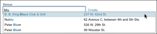
In some cases, the object's title or label alone may not be enough information for the user to identify which object they want to select. The Autocomplete Display Fields option in a linked object field's settings can be used to specify additional fields that will be displayed in the listing of matches. This comma-separated list can include core MT fields and Field Day extra fields.
When a linked object is selected, its label (title or name) is displayed in the text field, which becomes disabled; the user must click the Change link to clear this selection, which enables the field so the user can type a new value to search for.
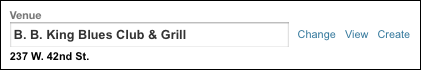
The View link next to a selected linked object will open that object's editing screen in Movable Type.
For Linked Entry and Linked Page fields, you can allow users to create the linked items directly from the editing screen for the linking object, without having to navigate to a different blog or screen. This feature will be available if the Allow Create option is enabled in the field's settings.
When the user clicks the Create link next to a linked object field, a form will appear below the field.
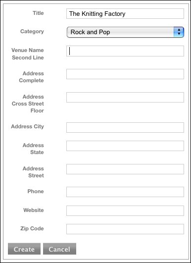
Clicking Save causes the object to be saved (pending any required or unique fields, as described below). The form then disappears and the newly created object becomes the selected linked object.
Several options in the field settings control the appearance and behavior of the in-place creation form:
-
Create Fields: A comma-separated list of field names that will be included in the form. These can be either core MT fields (
title,text,text_more,category) or Field Day fields. If no fields are specified, this defaults totitle,text. - Required Fields: A comma-separated list of field names; all fields specified will be required to be filled in before the created object is saved, or it will not be saved and an error message will be shown.
- Unique Fields: A comma-separated list of field names; when the user tries to create an object, the value in each field specified will be checked against existing objects. If a match is found, the existing object will be used instead, and no new object will be created.
For Linked Asset fields, you can allow users to upload a file and create a new asset directly from the editing screen for the linking object. This feature will be available if the Allow Upload option is enabled in the field's settings.
The workflow for this is a little different from in-place creation for linked entries and pages, in that there is no option to upload an individual asset immediately; instead, the file(s) will be uploaded and the asset(s) created when the linking object is saved.
Several options in the field settings control the appearance and behavior of the in-place upload form:
- Upload Fields: A comma-separated list of field names that will be included in the form. These can be either core MT fields or Field Day fields.
- Overwrite Existing Files: If enabled, an uploaded file with the same name as an existing file will overwrite it. If not, the uploaded file will have a number appended to its name to make it unique, so the existing file will be preserved.
- Upload Path: The path to the directory where uploaded files will be written. This can include MT format specifiers and template tags.
- Relative to Site Path: If enabled, the Upload Path will be treated as relative to the Site Path of the blog in which the asset is created.
- URL Path: The partial URL to be used for uploaded files. This will be stored with the created asset. It can include MT format specifiers and template tags.
- Relative to Site URL: If enabled, the URL Path will be treated as relative to the Site URL of the blog in which the asset is created.
In many situations, it's useful to attach multiple sets of data to a single object: for example, storing several phone numbers for a contact, or several locations for an entry that represents an organization. Doing this by simply adding several fields, or sets of fields, is not ideal; you might not have enough in all circumstances, and the additional fields will clutter the user interface in cases where you don't have that much data.
Field Day's approach to this is to let you organize fields into groups, and permit the user to add any number of instances of a given group.
Note that to allow multiple instances of a field, it must be in a group; if you need multiple instances of a single field, simply create a group that contains only that field. (You may want to use the "Hide" option for the field's label display setting, so the group and field don't have redundant labels.)
You must create a group before you can assign fields to it. Navigate to the Field Day configuration for the object type and blog you want to work with, and click the Groups link under Configure in the left-hand navigation column.
Click the Add Group button to add a new group.
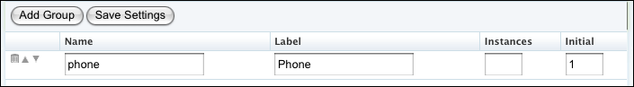
Each group has the following settings:
- Name: The group's identifier. This will be used to specify the group in template tags. It must be unique within this set of groups, and can only contain letters, numbers, and underscores. It's case-sensitive, so it's recommended to make all group names lower-case.
- Label: The text that's displayed in the field group's header on the editing screen.
- Instances: The maximum number of allowed instances. Leave this blank to allow an unlimited number of instances.
- Initial: If multiple instances are allowed, the number of instances that will be displayed when a new object is first created.
Once a group is defined, you can return to the Extra Fields configuration section and the group will appear in the menu in the Group column for each field. Select a group to assign a given field to it.
When the user edits an object that has a multi-instance field group defined, they will see at least one instance of the group. The group's label is displayed as a header above all instances (rather than being repeated for each instance).
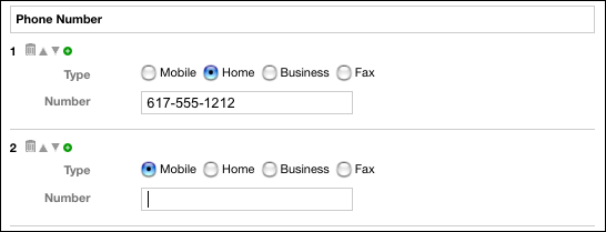
To the left of each instance, the number of the instance is displayed, along with several controls:
- Delete (trash can): Deletes this instance (you cannot delete the only instance of a group).
- Move up (up arrow): Swaps this instance with the instance above it.
- Move down (down arrow): Swaps this instance with the instance below it.
- Add (green plus sign): Adds an instance at the end of the list.
-
mt:[object]FieldGroup: Loops through all instances of the specified group for the current [object] in context.group="foo"-
instances="value"(the number of instances if you wish to impose a limit)
-
mt:[object]Field: Loops through all instances of the specified field for the current [object] in context.field="foo"-
instances="value"(the number of instances if you wish to impose a limit)
-
mt:[objects]ByValue: Loops through all [object] objects that match the criteria. Can combine attributes, i.e. ge and le for "between (inclusive)"-
field="foo": the field to match on -
eq="value1"(equal to) -
eq1="value2"(OR equal to, pass eq2, eq3, etc.) -
ne="value"(NOT equal to) -
ne1="value2"(AND not equal to, pass ne2, ne3, etc.) -
like="value"(contains) -
not_like="value"(does not contain) -
lt="value"(less than) -
le="value"(less than or equal to) -
gt="value"(equal to) -
ge="value"(greater than or equal to)
-
All take field="foo" or group="foo", implicit if within a loop, required otherwise; pass instance="i" to access a specific instance.
-
mt:[object]FieldValue: The value of the field for the object in context (Radio buttons and select menus configured using key/value pairs takeshow_key="1"to output key instead of value.) -
mt:[object]FieldLabel: The label of the field -
mt:[object]FieldI: The instance number of the field within a loop (mt:Fieldormt:FieldGroup) -
mt:[object]FieldCount: The total number of instances of the field for the object in context -
mt:[object]FieldGroupLabel: The label of the group -
mt:[object]FieldGroupI: The instance number of the group within a loop (mt:FieldGroup) -
mt:[object]FieldGroupCount: The total number of instances of the group
-
mt:[object]IfField: True if at least one instance of this field has a value for the object in context -
mt:[object]IfFieldGroup: True if at least one field within any instance of this group has a value for the object in context
-
mt:[object A]Linked[object B]: Loops through all[object B]objects that are linked to the[object A]in context-
field="foo"(the linking field) -
sort_by="instance": to preserve object order in a field group
-
-
mt:[object A]Linking[object B]: Loops through all[object B]objects that link to the[object A]in context-
field="foo"(the linking field)
-
-
[object A]and[object B]can be the same type. - For
*Entriestags, you can pass some of the same arguments you can pass tomt:Entries:lastn,sort_by,sort_order,author,category, [others]
mt:[object A]IfLinked[object B]mt:[object A]IfLinking[object B]
-
mt:FormatDate: Container tag that builds its contents, assuming the contents are a YYYYMMDDhhmmss timestamp (i.e., the output of amt:EntryFieldValue field="mydatefield"tag), then formats them according to the passed format string.-
format="string": the desired output format, using MT's standard codes
-