A slider UI component for Phaser.io Javascript library
slider = new phaseSlider(game); //make sure to have slider publicly available
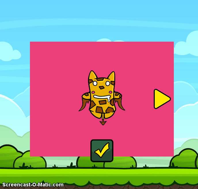
And then simply construct your slider in the main function of your game or anywhere else
slider.createSlider({
    customSliderBG: false,
    mode: "horizontal",
    sliderBGAlpha: 0.8,
    width: 500,
    height: 400,
    x: game.width / 2 - 500 / 2,
    y: game.height / 2 - 400 / 2,
    objects:[block1, block2, block3, block4, block5]
  });
View examples: Advanced example | Simple example
General Options:
- mode: Type of movement for the slides (default horizontal, vertical-from-bottom, vertical-from-top)
- width: The width of the slider (default 500 pixels)
- height: The height of the slider (default 400 pixels)
- x The x position of the slider (default 0)
- y The y position of the slider (default 0)
- objects An array of sprites or groups that will be the slides (added as they appear on the array left->right)
- animationDuration: This sets the speed of the animation while sliding (default: 600ms)
- animationEasing: The easing applied to the sliding animation (default Phaser.Easing.Cubic.Out)
- sliderBG A single color to paint the background of the slider (default #35d2e0)
- customSliderBG A cache value to serve as a background for the slider (default false)
- sliderBGAlpha The alpha value for the slider background (default 1)
- customHandleNext A cache value for the the right arrow (if omited the liv has a build-in image to place)
- customHandlePrev A cache value for the the left arrow (if omited the liv has a build-in image to place)
- showHandles Whether or not to show arrows for slider navigation (default true)
- onNextCallback A callback function to be called when the slider navigates forward (default false)
- onPrevCallback A callback function to be called when the slider navigates backwards (default false)
- autoAnimate If we want the slider to aumatically rotate the slider (default false)
- animationDelay The delay between slide change when autoAnimate is set to true (default 2s)
- modal Add a black modal behind the slider (default false)
- modalAlpha The amount of alpha (opacity) for the slider modal (default 0.7)
- staticElements The static elements that need to be added but not move (default [])
- onPrePrevCallback The function to call `before` the slider moves to the `previous` slide (default false)
- onPreNextCallback The function to call `before` the slider moves to the `next` slide (default false)
- onAfterPrevCallback The function to call `after` the slider moves to the `previous` slide (default false)
- onAfterNextCallback The function to call `after` the slider moves to the `next` slide (default false)
API Functions
- createSlider | Creates the slider object and the slides
- startSlider | Starts the automatic rotation of the slider if autoAnimate is set to true
- stopSlider | Stops the automatic rotation of slides
- moveToSlide | Navigate to specific slide index (args: index:Number, animated:Boolean)
- goToNext | Navigate to the next slide
- goToPrev | Navigate to the previous slide
- getCurrentIndex | Receive the current slide index
- hideSlider | Render the slider not visible (the slider will not be able to receive input events)
- showSlider | Render the slider visible
Please let me know if you come across some bug or have something to contribute