Adds a descriptive popover to Payload field labels (using React Tiny Popover).
  yarn add payload-label-popover
  #OR
npm i payload-label-popoverImport the plugin and add it to your payload configuration file.
// Add the plugin to the "plugins" array in your payload config
{
// ... Rest of payload config
plugins: [labelPopoverPlugin({})]
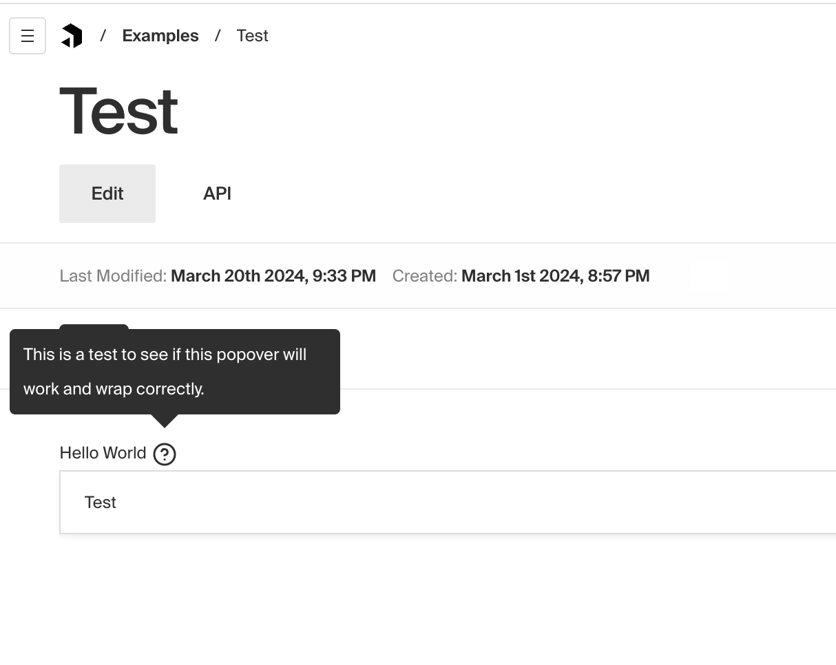
}// Enable a popover on a field using the `custom` object
const Examples: CollectionConfig = {
slug: 'examples',
admin: {
useAsTitle: 'title',
},
fields: [
{
type: 'text',
name: 'title',
label: 'Hello World',
custom: {
labelPopover: 'This is a test to see if this popover will work and wrap correctly.',
showLabelPopover: true,
},
},
],
}
export default ExamplesYou can also use a custom component to render content inside of the popover.
// CustomPopoverContent.tsx
import React from 'react'

type Props = {
  data: string
}

export const CustomPopoverContent: React.FC<Props> = props => {
  const { data } = props
  return <div style={{ color: 'yellow' }}>{data}</div>
}
Then import and pass the component to the 'labelPopover' property in your field config.
      custom: {
        labelPopover: LabelContent({ data: 'HELLO WORLD!!!' }),
        showLabelPopover: true,
}Pull requests are welcome. For major changes, please open an issue first to discuss what you would like to change.