A small, simple and customizable cookie consent bar for use in React applications.

Demo: https://mastermindzh.github.io/react-cookie-consent/
Example branch: https://github.com/Mastermindzh/react-cookie-consent/tree/example


- Installation
- Using it
- Props
- Debugging it
- Why are there two cookies? One of which named "Legacy"
- Styling it
- contributor information
- Projects using react-cookie-consent
npm install react-cookie-consentor use yarn:
yarn add react-cookie-consentYou can import the cookie bar like this:
import CookieConsent from "react-cookie-consent";If you want to set/remove cookies yourself you can optionally import Cookies (straight from js-cookie) like this:
import CookieConsent, { Cookies } from "react-cookie-consent";Then you can use the component anywhere in your React app like so:
<CookieConsent>This website uses cookies to enhance the user experience.</CookieConsent>You can optionally set some props like this (next chapter will show all props):
<CookieConsent
  location="bottom"
  buttonText="Sure man!!"
  cookieName="myAwesomeCookieName2"
  style={{ background: "#2B373B" }}
  buttonStyle={{ color: "#4e503b", fontSize: "13px" }}
  expires={150}
>
  This website uses cookies to enhance the user experience.{" "}
  <span style={{ fontSize: "10px" }}>This bit of text is smaller :O</span>
</CookieConsent>
One of the props (onAccept) is a function, this function will be called after the user has clicked the accept button. You can provide a function like so:
<CookieConsent
  onAccept={() => {
    alert("Accept was triggered by clicking the Accept button");
  }}
></CookieConsent>
If the decline button is enabled then the (onDecline) prop function can be used, this function will be called after the user has clicked the decline button. You can enable the button and provide a function like so:
<CookieConsent
  enableDeclineButton
  onDecline={() => {
    alert("nay!");
  }}
></CookieConsent>| Prop | Type | Default value | Description |
|---|---|---|---|
| location | string, "top", "bottom" or "none" | "bottom" | Syntactic sugar to easily enable you to place the bar at the top or the bottom of the browser window. Use "none" to disable. |
| children | string or React component | Content to appear inside the bar | |
| disableStyles | boolean | false | If enabled the component will have no default style. (you can still supply style through props) |
| hideOnAccept | boolean | true | If disabled the component will not hide it self after the accept button has been clicked. You will need to hide yourself (see onAccept) |
| buttonText | string or React component | "I understand" | Text to appear on the button |
| declineButtonText | string or React component | "I decline" | Text to appear on the decline button |
| cookieName | string | "CookieConsent" | Name of the cookie used to track whether the user has agreed. |
| cookieValue | string or boolean or number | true | Value to be saved under the cookieName. |
| declineCookieValue | string or boolean or number | false | Value to be saved under the cookieName when declined. |
| setDeclineCookie | boolean | true | Whether to set a cookie when the user clicks "decline" |
| onAccept | function | () => {} |
Function to be called after the accept button has been clicked. |
| onDecline | function | () => {} |
Function to be called after the decline button has been clicked. |
| debug | boolean | undefined | Bar will be drawn regardless of cookie for debugging purposes. |
| expires | number | 365 | Number of days before the cookie expires. |
| extraCookieOptions | object | {} |
Extra info (apart from expiry date) to add to the cookie |
| overlay | boolean | false | Whether to show a page obscuring overlay or not. |
| containerClasses | string | "" | CSS classes to apply to the surrounding container |
| buttonClasses | string | "" | CSS classes to apply to the button |
| buttonWrapperClasses | string | "" | CSS classes to apply to the div wrapping the buttons |
| declineButtonClasses | string | "" | CSS classes to apply to the decline button |
| buttonId | string | "" | Id to apply to the button |
| declineButtonId | string | "" | Id to apply to the decline button |
| contentClasses | string | "" | CSS classes to apply to the content |
| overlayClasses | string | "" | CSS classes to apply to the surrounding overlay |
| style | object | look at source | React styling object for the bar. |
| buttonStyle | object | look at source | React styling object for the button. |
| declineButtonStyle | object | look at source | React styling object for the decline button. |
| contentStyle | object | look at source | React styling object for the content. |
| overlayStyle | object | look at source | React styling object for the overlay. |
| disableButtonStyles | boolean | false | If enabled the button will have no default style. (you can still supply style through props) |
| enableDeclineButton | boolean | false | If enabled the decline button will be rendered |
| flipButtons | boolean | false | If enabled the accept and decline buttons will be flipped |
| ButtonComponent | React component | button | React Component to render as a button. |
| sameSite | string, "strict", "lax" or "none" | none | Cookies sameSite attribute value |
| cookieSecurity | boolean | undefined | Cookie security level. Defaults to true unless running on http. |
| ariaAcceptLabel | string | Accept cookies | Aria label to set on the accept button |
| ariaDeclineLabel | string | Decline cookies | Aria label to set on the decline button |
Because the cookie consent bar will be hidden once accepted, you will have to set the prop debug={true} to evaluate styling changes:
<CookieConsent debug={true}></CookieConsent>Note: Don't forget to remove the debug-property for production.
The short story is that some browsers don't support the SameSite=None attribute. The modern browsers force you to have SameSite set to something other than none.
So react-cookie-consent fixes this like so:
- set the fallback cookie (e.g -legacy) first, this will always succeed (on all browsers)
- set the correct cookie second (this will work on modern browsers, fail on older ones)
This happens on lines 186-192
When checking the cookie it'll do it in reverse. If the regular cookie exists, it'll use that. If no regular cookie exists it'll check whether the legacy cookie exists. If both are non-existent no consent was given.
The long story can be found here: pull-request#68
You can provide styling for the bar, the button and the content. Note that the bar has a display: flex property as default and is parent to its children "content" and "button".
The styling behaves kind of responsive. The minimum content width has been chosen to be "300px" as a default value. If the button does not fit into the same line it is wrapped around into the next line.
You can style each component by using the style, buttonStyle and contentStyle prop. These will append / replace the default styles of the components.
Alternatively you can provide CSS classnames as containerClasses, buttonClasses and contentClasses to apply predefined CSS classes.
You can use disableStyles={true} to disable any built-in styling.
<CookieConsent style={{ background: "red" }}></CookieConsent><CookieConsent buttonStyle={{ fontWeight: "bold" }}></CookieConsent>You can pass predefined CSS classes to the components using the containerClasses, buttonClasses and contentClasses props. The example below uses bootstrap classes:
<CookieConsent
  disableStyles={true}
  location={OPTIONS.BOTTOM}
  buttonClasses="btn btn-primary"
  containerClasses="alert alert-warning col-lg-12"
  contentClasses="text-capitalize"
>
  This website uses cookies to enhance the user experience.{" "}
  <span style={{ fontSize: "10px" }}>This bit of text is smaller :O</span>
</CookieConsent>
Which results in:

If you enable the decline button you can pass along the "flipButtons" property to turn the buttons around:
<CookieConsent enableDeclineButton flipButtons>
  Flipped buttons
</CookieConsent>
Which results in:

You can add more cookie options using the extraCookieOptions parameter like so:
<CookieConsent extraCookieOptions={{ domain: "myexample.com" }}>cookie bar</CookieConsent>
If you're crazy enough you can even make a rainbow colored bar:
<CookieConsent
  buttonText="OMG DOUBLE RAINBOW"
  cookieName="myAwesomeCookieName2"
  style={{
    background: "linear-gradient(to right, orange , yellow, green, cyan, blue, violet)",
    textShadow: "2px 2px black",
  }}
  buttonStyle={{
    background: "linear-gradient(to left, orange , yellow, green, cyan, blue, violet)",
    color: "white",
    fontWeight: "bolder",
    textShadow: "2px 2px black",
  }}
>
  This website uses cookies to enhance the user experience.{" "}
  <span style={{ fontSize: "10px" }}>This bit of text is smaller :O</span>
</CookieConsent>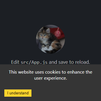
You can also generate a page-obfuscating overlay that will prevent actions other than interacting with the cookie consent button(s).
<CookieConsent location="bottom" cookieName="myAwesomeCookieName3" expires={999} overlay>
  This website uses cookies to enhance the user experience.
</CookieConsent>When making a PR please think about the following things:
- Update the ChangeLog (or include what you did in the PR and I'll add it, up to you)
- No need to build or update the package.json. I will do both on release.
- Please don't change code convention / style
The list below features the projects which use react-cookie-consent (that I know off):