Available on Dev Challenges
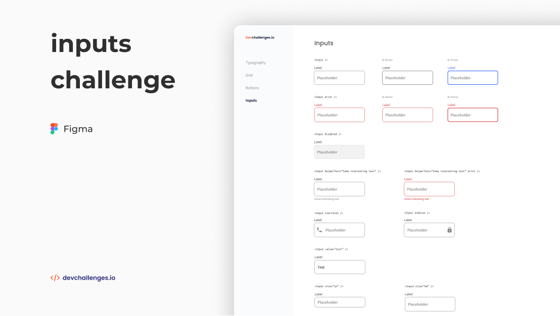
Challenge: Create a reusable input with all the states in the design and a page displaying all the states. You can work on the same project with other design system challenges. Use Front-end libraries like React or Vue. Don’t look at the existing solution. Fulfill user stories below:
- User story: I can see error state
- User story: I can choose to disable input
- User story: I can choose to have helper text
- User story: I can choose to have an icon on the left or right (Use Google Icon and at least 5 variants)
- User story: I can have different input sizes
- User story: I can have different colors
- User story: I can choose to have input take the width of the parent
- User story: I can have multiline input like a
textarea- User story: When I hover or focus, I can see visual indicators
- User story: I can still access all input attributes
- User story (optional): Show input in a similar way like the design or use Storybook. Otherwise, showing the input in multiple states is enough
Available on Dev Challenges
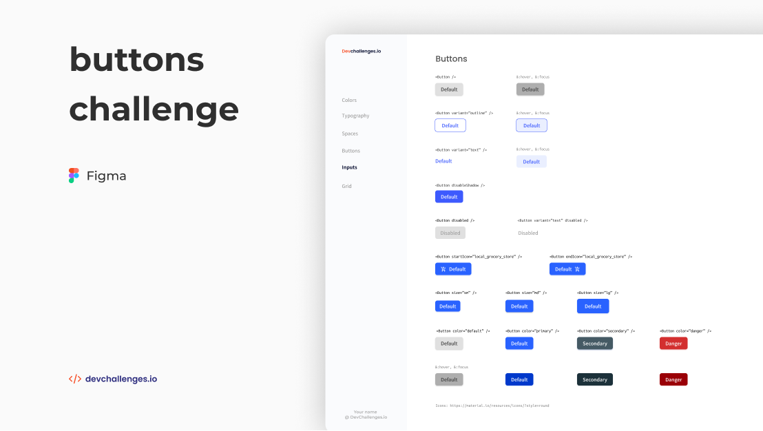
Challenge: Create a reusable button with all the states in the design and a page displaying all the states. You can work on the same project with other design system challenges. Use Front-end libraries like React or Vue. Don’t look at the existing solution. Fulfill user stories below:
- User story: I can see different button types:
default,outlineandtext- User story: I can choose to disable
box-shadow- User story: I can choose to disable button
- User story: I can choose to have an icon on the left or right (Use Google Icon and at least 5 variants)
- User story: I can have different button sizes
- User story: I can have different colors
- User story: When I hover or focus, I can see visual indicators
- User story: I can still access all button attributes
- User story (optional): Show button in a similar way like the design or use Storybook. Otherwise, showing the button in multiple states is enough