The Napp Appearance Module extends the Appcelerator Titanium Mobile framework with a global styling functionality. Napp Appearance use the power of iOS UIAppearance on Titanium UI components. This module is iOS only and iOS5+.
The module is licensed under the MIT license.
Find the newest version in the dist folder.
Simply add the following lines to your tiapp.xml file:
<modules>
    <module platform="iphone">dk.napp.appearance</module>
</modules>
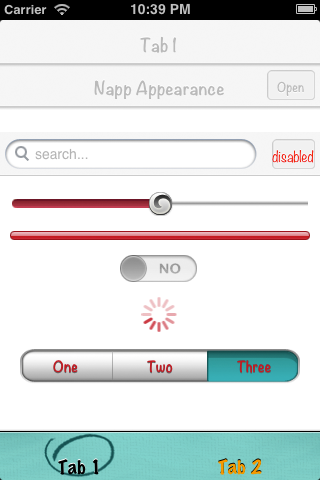
For more detailed code examples take a look into the example app.
The module has only one method. Use this is the very beginning of your app to style UI component throughout the entire app.
All the below parameters are all optional. Just specify what you need.
var NappAppearance = require('dk.napp.appearance');
NappAppearance.setGlobalStyling({
	navBarTitle:{
		color:"#bababa",
		shadowColor: "#fff",
		shadowOffset: {
			x:0,
			y:-1
		},
		font:{
			fontSize:17,
			fontFamily:"Noteworthy-Bold"
		}
	},
	barButton:{
		color:"#bbb",
		shadowColor: "#ffffff",
		shadowOffset: {
			x:0,
			y:1
		},
		font:{
			fontSize:12,
			fontFamily:"Noteworthy-Bold"
		},
		selected: {
			//button is pressed
			color:"#333",
			shadowColor: "#999",
			shadowOffset: {x:0,y:1},
			font:{
				fontSize:12,
				fontFamily:"Noteworthy-Bold"
			}
		},
		backgroundImage:"/images/btn.png",
		backgroundSelectedImage:"/images/btn.png",
		backgroundDisabledImage:"/images/btn.png",
		tintColor:"#cacaca",
		titlePositionOffset:{x:0, y:2}
	},
	doneButton:{
		backgroundImage:"/images/btn-done.png",
		backgroundSelectedImage:"/images/btn-done.png",
		backgroundDisabledImage:"/images/btn-done.png",
	},
	backButton:{
		backgroundImage:"/images/backbtn.png",
		backgroundSelectedImage:"/images/backbtn.png",
		backgroundDisabledImage:"/images/backbtn.png",
		titlePositionOffset:{x:0, y:2}
	},
	navBar:{
		//shadowImage:"/images/navBarShadow.png",
		backgroundImage:"/images/navBar.png",
		tintColor: "#FF0000"
	},
	slider:{
		leftTrackImage:"/images/slider_min.png",
		rightTrackImage:"/images/slider_max.png",
		thumbImage:"/images/slider_thumb.png"
	},
	progressBar:{
		//use either colors or images
		progressTintColor:"#CD1625",
		trackTintColor:"#ececec",
		//progressImage:"/images/image.png",
		//trackImage:"/images/image.png"

	},
	pageControl:{
		currentPageIndicatorTintColor:"#CD1625",
		pageIndicatorTintColor:"#ececec"
	},
	switchBar:{
		onTintColor:"#CD1625",
		tintColor:"#ececec",
		thumbTintColor:"#aaaaaa",
		onImage:"/images/switch_on.png",
		offImage:"/images/switch_off.png"
	},
	tabBar:{
		backgroundImage:"/images/tabBar.png",
		backgroundSelectedImage:"/images/tab_select_indicator.png",
		// normal state
		color:"#ff9900",
		shadowColor: "black",
		shadowOffset: {
			x:0,
			y:-1
		},
		font:{
			fontSize:20,
			fontFamily:"Marker Felt"
		},
		// selected state
		selected: {
			color:"#000000",
			shadowColor: "#ffffff"
		}
	},
	toolbar:{
		tintColor:"#CD1625",
		//backgroundImage:"/images/toolbar.png",
	},
	searchBar:{

		//search bar
		backgroundImage:"/images/navBar.png",

		//search field
		searchFieldBackgroundImage:"/images/image.png",
		searchFieldHighlightedBackgroundImage:"/images/image.png",
		searchFieldBorderWidth: "1dp",
		searchFieldBorderColor: "#ff0000",
		searchFieldBorderRadius: "4dp",

		//cancel button
		cancelTitlePositionOffset:{x:0, y:3},

		//normal
		cancelTitle:"hit it",
		cancelButton: {
			color:"#333",
			shadowColor: "#fff",
			shadowOffset: {x:0,y:-1},
			font:{
				fontSize:14,
				fontFamily:"Noteworthy-Light",
				fontWeight:"bold"
			}
		},

		//disabled
		cancelTitleDisabled: "disabled",
		cancelButtonDisabled: {
			color:"red"
			//add a few or many properties..
		},

		//selected
		cancelTitleSelected: "Hitted",
		cancelButtonSelected: {
			color:"blue",
			shadowColor: "#999",
			shadowOffset: {x:0,y:1},
			font:{
				fontSize:12,
				fontFamily:"Noteworthy-Bold"
			}
		}
	},
	activityIndicator:{
		color:"#CD1625"
	},
	segmentedControl:{
		//use either tintColor or images
		//tintColor:"#CD1625",
		backgroundImageUnselected:"/images/segcontrol_uns.png",
		backgroundImageSelected:"/images/segcontrol_sel.png",

		dividerImageUnselectedUnselected:"/images/segcontrol_uns-uns.png",
		dividerImageSelectedUnselected:"/images/segcontrol_sel-uns.png",
		dividerImageUnselectedSelected:"/images/segcontrol_uns-sel.png",
		color:"#CD1625",
		shadowColor: "#666",
		font:{
			fontSize:14,
			fontFamily:"Noteworthy-Bold" //look at http://iosfonts.com/
		},
		shadowOffset: {
			x:0,
			y:1
		}
	},
	tableView:{
		sectionIndexColor:"#333",
		sectionIndexBackgroundColor:'#33000000',
		sectionIndexTrackingBackgroundColor:"#ddd",
		HeaderFooterTintColor:"#333"
	},
	popOver:{
		backgroundImage:"/image/popover_navbar.png",
		backgroundImageLandscape:"/image/popover_navbar_landscape.png"
	}
}); v.1.2.8
- Update Ti SDK to 4.1.0.GA
- Add conditional checks to avoid null values being set
- Add backbutton tintColor which will set the backbutton arrow color
v.1.2.5
- Support for ARC & a few minor changes. Thanks to @benbahrenburg
v.1.2
- Support for
tabBartext customization. Thanks to @mpociot
v.1.1.2
- Support for
doneButtonwhenstyle: Ti.UI.iPhone.SystemButtonStyle.DONEis set forTi.UI.BUTTON
v.1.1.1
- Support
tintColorin UINavigationBar
v.1.1
- BREAKING CHANGES: SearchBar & BarButton reimplemented. look at the example code.
- Added selected, disabled stages at Button and SearchBar cancel button.
- Added TableView and PopOver UIAppearances.
- Added TitlePositionOffset to adjust custom fonts in NavBar & Buttons.
- Bugfixes.
v.1.0
- Initial implementation.
Mads Møller
web: http://www.napp.dk
email: mm@napp.dk
twitter: @nappdev
Copyright (c) 2010-2013 Napp ApS

Permission is hereby granted, free of charge, to any person obtaining a copy
of this software and associated documentation files (the "Software"), to deal
in the Software without restriction, including without limitation the rights
to use, copy, modify, merge, publish, distribute, sublicense, and/or sell
copies of the Software, and to permit persons to whom the Software is
furnished to do so, subject to the following conditions:

The above copyright notice and this permission notice shall be included in
all copies or substantial portions of the Software.

THE SOFTWARE IS PROVIDED "AS IS", WITHOUT WARRANTY OF ANY KIND, EXPRESS OR
IMPLIED, INCLUDING BUT NOT LIMITED TO THE WARRANTIES OF MERCHANTABILITY,
FITNESS FOR A PARTICULAR PURPOSE AND NONINFRINGEMENT. IN NO EVENT SHALL THE
AUTHORS OR COPYRIGHT HOLDERS BE LIABLE FOR ANY CLAIM, DAMAGES OR OTHER
LIABILITY, WHETHER IN AN ACTION OF CONTRACT, TORT OR OTHERWISE, ARISING FROM,
OUT OF OR IN CONNECTION WITH THE SOFTWARE OR THE USE OR OTHER DEALINGS IN
THE SOFTWARE.