A semicircle progress bar for React applications.
Use the package manager npm to install react-semicircle-progressbar.
npm install react-semicircle-progressbarimport React from 'react';
import SemiCircleProgress from 'react-semicircle-progressbar';
function App() {
return (
<div>
<SemiCircleProgress
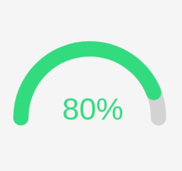
percentage={80}
size={{
width: 200,
height: 200,
}}
strokeWidth={10}
strokeColor="#f00"
/>
</div>
);
}
export default App;| Property | Type | Description |
|---|---|---|
| strokeWidth | number | The width of the progress bar line in pixels |
| strokeLinecap | "butt" | "round" | "square" | The type of end cap for the progress bar line ("butt", "round", or "square") |
| percentage | number | The percentage of the progress bar filled |
| percentageSeperator | string | The separator to use between the percentage and label text (default is "of") |
| size | { width: number, height: number } | The size of the progress bar in pixels |
| strokeColor | string | The color of the progress bar line in CSS |
| fontStyle | { fontSize: string, fontFamily: string, fontWeight: string, fill: string } | The style of the label text |
| hasBackground | boolean | The background of the progress bar |
| bgStrokeColor | string | The color of the progress bar background line in CSS |