
A multi-platform React Native sectioned menu.
This component has been deprecated. Use it at your own risk.
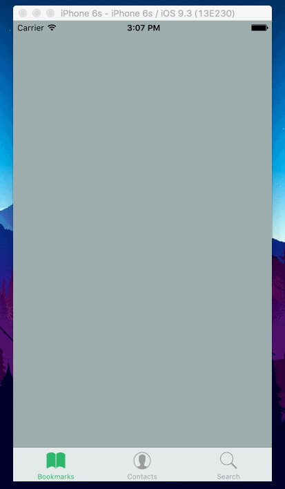
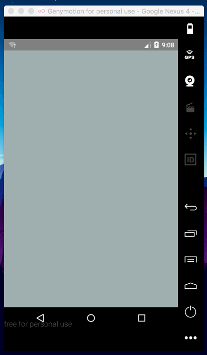
$ npm i --save-dev react-native-section-menuTo render a basic menu, take the following code as an example. It will render a green header in Android with a drawer-based animation and a TabBar navigation for iOS. You can combine this component with react-native-vector-icons to fully customize the icons of your menu.
import { Menu } from 'react-native-section-menu'

class MyMenu extends React.Component {
  render () {
    return (
      <Menu
        header={<View style={{height: 150, backgroundColor: '#27ae60'}} />}
        initialEntry={0}
        tintColor='#27ae60'
        entries={[
          {
            id: 0,
            element: <View style={{flex: 1, backgroundColor: '#95a5a6'}} />,
            title: 'Bookmarks',
          },
          {
            id: 1,
            element: <View style={{flex: 1, backgroundColor: '#2c3e50'}} />,
            title: 'Contacts',
          },
          {
            id: 2,
            element: <View style={{flex: 1, backgroundColor: '#ecf0f1'}} />,
            title: 'Search',
          }
        ]}
      />
    )
  }
}| Prop | Type | Description |
|---|---|---|
entries |
Array<Entry> |
An array of menu entries. |
| Prop | Type | Description |
|---|---|---|
id |
number |
A numeric identifier. |
title |
string |
The title of the section. |
element |
element |
The element to render in the section. |
| Prop | Type | Description |
|---|---|---|
initialEntry |
number |
A number to mark the entry to render by default. |
| Prop | Type | Description |
|---|---|---|
TabBarIOS.propTypes |
You can pass all the props. Docs here. |
| Prop | Type | Description |
|---|---|---|
itemComponent |
func |
Pass here Icon.TabBarItemIOS to use react-native-vector-icons TabBar item. |
iconName |
string |
The react-native-vector-icons icon name. |
selectedIconName |
string |
The react-native-vector-icons selected icon name. |
iconSize |
number |
The react-native-vector-icons icon size. |
| Prop | Type | Description |
|---|---|---|
DrawerLayoutAndroid.propTypes |
DrawerLayoutAndroid available props. |
|
containerStyle |
View.propTypes.style |
The style of the parent container view. |
header |
node |
Optional header to display above the menu list. |
| Prop | Type | Description |
|---|---|---|
androidIcon |
node |
A React node to render as an icon. |
androidBackground |
TouchableNativeFeedback.propTypes.background |
The background effect of the entry section. |
tintColor |
string |
The tint color of the selected entry. |
MIT
Please open an issue or send a PR
Álvaro Medina Ballester amedina at apsl.net.
Dani Sastre dsastre at apsl.net