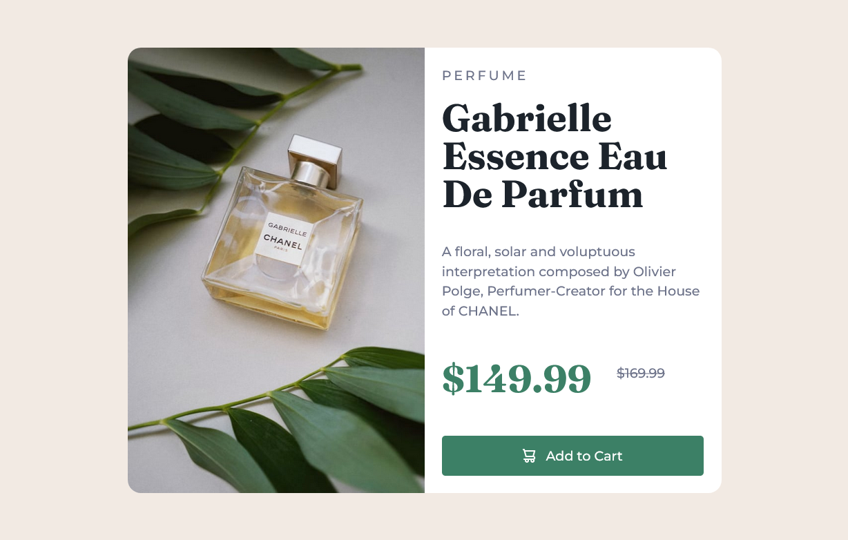
This is a solution to the Product preview card component challenge on Frontend Mentor.
Users should be able to:
- View the optimal layout depending on their device's screen size
- See hover and focus states for interactive elements
- Solution URL: Add solution URL here
- Live Site URL: https://golden-dolphin-05dcd8.netlify.app/
- Semantic HTML5 markup
- CSS custom properties
- Flexbox
- CSS Grid
- Mobile-first workflow
- CUBE CSS methodology
I used this as a simple project to explore CUBE CSS. Specifically in this project I've used fluid typography and space scales to keep a visual rhythm and have subtly bigger text on larger screens.
I had attempted to use the principles of intrinsic design, and avoid media queries. However, that conflicts with using the <picture> element for art direction. The picture element needs a media query to know when to serve which aspect ratio of image. To avoid this happening at a different point to the layout changing from vertical to horizontal, I had to use a media query with the same breakpoint for both. This makes the implementation less resiliant to how the component would be used within the page. However, I don't see any way around this. Even container queries wouldn't solve the <picture> issue.
I've used a lot of CSS custom properties here. One use I particularly like is for setting up default transition properties. This allowed me to override just the motion animation for users with prefers-reduced-motion. Many CSS resets switch off all animations in this case, but here this still allows opacity and color changes to have transitions, giving a more elegant result.
- CUBE CSS - I followed the broad ideas of CUBE to keep the CSS organized.
- Utopia - I used Utopia to generate the fluid size and spacing scales.
- Github - Alex Marshall
- Frontend Mentor - @AlexKMarshall
- Twitter - @AlexKMarshall1
