Misse told us to build a Sundial for Introduction to Astrophysics, with no prior instruction. Here's how we did it!
Keep in mind these facts:
- You need to design your Sundial according to your Latitude. Therefore, you can't just copy and paste mine!
- Your Gnomon (the triangle!) needs to be constructed with special angles. More on that later.
- Your Sundial can also indicate the day of the year (heck!). For that we need to include curves called the Analemma.
Here's the finished product. There's more in our pdf (link)!

Yeah, I get it, the times do not match! I actually made a mistake in signs in the original code. The Dial is actually off by 17m11sec as calculated. Forgive!
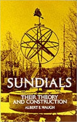
You can find all the theory that's required from this book (that's what I used):
|
It'll tell you more on the Analemma, the Equation of Time, how to build your Gnomon and all you need to know to come up with and operate my code 😉
At the complete end of the project, you're looking to produce a diagram like this:

(You'll have to actually split the sheet into 2 if your Gnomon is thick, along the faint black vertical line if you can see, but that's explained in the book!)
I will assume you have read the book, but concepts you should have known I write them with Caps so you can still follow.
Disclaimer:
The code itself will not give you this image! Each script of code will give you a piece of the image as a graphic (.svg). But you'll have to assemble all manually in Adobe Illustrator🤮, Affinity Designer😁 or Inkscape😏.
A next section shows you how.
And add a rectangle to know how to place Gnomon, and a faint black vertical line so you can split page!
The exact reasoning behind the codes is in the PDF, but I gave you 3 scripts:
- plot - Dial.py
This is straightforward. The script gives you the face of a Sundial.
Red lines denote Hours, Blue lines denote Half-Hours and Yellow lines Quarter-Hours.
The fainter Grey lines are the minute lines.
The angles in the Dial have been calculated using the Latitude of your country. - plot - LongitudinalCorrection.py
A Sundial never gives the same time as your watch.
The time is off because of 2 reasons.
Different people will correct these discrepancies differently. (I'm not saying, "..will correct these errors differently." According to some people, the Sundial Time is the ultimate form of time and Clock Times are futility, but let us please keep all debates aside!)
One discrepancy your Longitude causes it. The Book tells you why, and by what value, but the discrepancy is constant. Every day of every year at every hour it is the same. The discrepancy says, "instead of reading the time 17:46, read it 10 minutes more late". Read 17:56, that is.
But instead of reading 5:50 then adding 10 minutes, why not call it 6:00 and paint it red instead! [GIF Animation]:
The other discrepancy I'm afraid is uncorrectable by layman means. It is due to the Equation of Time. I have imagined that rotatable system would need be built with the hour lines made of magnetisable iron thin bars, made to attract or repel each other by a programmable electro-magnet. A system far beyond my intellectual means.
Let it be a purely intellectual pursuit, for truth be told, the amount of technology put into this correction, we're far better off using a good old digital watch!
Please note! You will use plotLongitudinalCorrection.py instead of plotDial.py. Because both give the same result, except that in one the lines are coloured differently. - plot - Analemma.py
The path the tip of the shadow will take during any day. These curves will have to be carefully placed on the Dial. This script only gives the curves, but using clever geometry, we will know exactly how to place 'em.

Follow book instructions for your ware, but I use Affinity Designer.
How you place the curves on the Dial face makes use of this Principle:
Of all the curves in the Analemma the middle of all of 'em is mathematically a straight line.
We know the distance of this straight line from our Sundial's Point of Convergence.
Which is the horizontal line on our Dial face where all hour lines converge.
Code plotAnalemma.py even outputs this distance in the Terminal. I used the formula featured prominently at the top of the Analemma's code:
The Distance of the Equinox line from Horizontal through Origin is 0.05568962772057622 metres.
. . . .
There are two horizontal lines on your curves.(Including the one through the Origin, called 'Point of Convergence' on the DialFace.)
There are two horizontal lines your DialFace.
(One through Point of Convergence, the other which you will draw above the Point of Conv. at the distance displayed.)
These two line pairs are the same.
And by simply aligning the two pairs, we'd have resized each graphic to fit onto the other.
In practice, ..
You can find beautiful colours for your project at Coolors.co! But we hope the colours that we chose were already beautiful enough! 😇