We acquired the dataset from the following website on Kaggle: https://www.kaggle.com/mylesoneill/game-of-thrones
battle_data <- read.csv("battles.csv", stringsAsFactors=FALSE)
- Changing the name "Brotherhood without the Banners" to just "Brotherhood" because the original name created awkward margin spacing in the charts and graphs.
battle_data$attacker_1[23] <- "Brotherhood"
- Changed all empty string values "" to NA in order to count the number of NA's in the dataset easier. There are built in functions to calculate how many NA values are in a dataframe, but not for empty strings.
battle_data[battle_data == ""] <- NA"
- Some values were missing in the dataset so we added values in based on the wikipage of Game of Thrones
battle_data$defender_1[30] <- "Town of Saltpans"
battle_data$attacker_outcome[38] <- "loss"
battle_data$battle_type[38] <- "siege"
- ggplot2
- gridExtra
- Every value in the defender_3 and defender_4 columns is NA. Almost every value in the defender_2 column is NA.
> sum(is.na(battle_data$defender_2)) == nrow(battle_data)
[1] FALSE
> sum(is.na(battle_data$defender_3)) == nrow(battle_data)
[1] TRUE
> sum(is.na(battle_data$defender_4)) == nrow(battle_data)
[1] TRUE
- There were 19 different columns out of 25 which had more than one NA value.
for(i in 1:ncol(battle_data)) {
  if (any(is.na(battle_data[,i]))) {
    print(c(col_names[i], sum(is.na(battle_data[,i]))))
  }
}
[1] "attacker_king" "2"
[1] "defender_king" "3"
[1] "attacker_2" "28"
[1] "attacker_3" "35"
[1] "attacker_4" "36"
[1] "defender_2" "36"
[1] "defender_3" "38"
[1] "defender_4" "38"
[1] "battle_type" "1"
[1] "major_death" "1"
[1] "major_capture" "1"
[1] "attacker_size" "14"
[1] "defender_size" "19"
[1] "attacker_commander" "1"
[1] "defender_commander" "10"
[1] "summer" "1"
[1] "location" "1"
[1] "note" "33"
These are the following categories used to describe the data along with their data type and examples of the data:
> str(battle_data)
'data.frame':	38 obs. of  25 variables:
 $ name              : chr  "Battle of the Golden Tooth" "Battle at the Mummer's Ford" "Battle of Riverrun" "Battle of the Green Fork" ...
 $ year              : int  298 298 298 298 298 298 298 299 299 299 ...
 $ battle_number     : int  1 2 3 4 5 6 7 8 9 10 ...
 $ attacker_king     : chr  "Joffrey/Tommen Baratheon" "Joffrey/Tommen Baratheon" "Joffrey/Tommen Baratheon" "Robb Stark" ...
 $ defender_king     : chr  "Robb Stark" "Robb Stark" "Robb Stark" "Joffrey/Tommen Baratheon" ...
 $ attacker_1        : chr  "Lannister" "Lannister" "Lannister" "Stark" ...
 $ attacker_2        : chr  "" "" "" "" ...
 $ attacker_3        : chr  "" "" "" "" ...
 $ attacker_4        : chr  "" "" "" "" ...
 $ defender_1        : chr  "Tully" "Baratheon" "Tully" "Lannister" ...
 $ defender_2        : chr  "" "" "" "" ...
 $ defender_3        : logi  NA NA NA NA NA NA ...
 $ defender_4        : logi  NA NA NA NA NA NA ...
 $ attacker_outcome  : chr  "win" "win" "win" "loss" ...
 $ battle_type       : chr  "pitched battle" "ambush" "pitched battle" "pitched battle" ...
 $ major_death       : int  1 1 0 1 1 0 0 0 0 0 ...
 $ major_capture     : int  0 0 1 1 1 0 0 0 0 0 ...
 $ attacker_size     : int  15000 NA 15000 18000 1875 6000 NA NA 1000 264 ...
 $ defender_size     : int  4000 120 10000 20000 6000 12625 NA NA NA NA ...
 $ attacker_commander: chr  "Jaime Lannister" "Gregor Clegane" "Jaime Lannister, Andros Brax" "Roose Bolton, Wylis Manderly, Medger Cerwyn, Harrion Karstark, Halys Hornwood" ...
 $ defender_commander: chr  "Clement Piper, Vance" "Beric Dondarrion" "Edmure Tully, Tytos Blackwood" "Tywin Lannister, Gregor Clegane, Kevan Lannister, Addam Marbrand" ...
 $ summer            : int  1 1 1 1 1 1 1 1 1 1 ...
 $ location          : chr  "Golden Tooth" "Mummer's Ford" "Riverrun" "Green Fork" ...
 $ region            : chr  "The Westerlands" "The Riverlands" "The Riverlands" "The Riverlands" ...
 $ note              : chr  "" "" "" "" ...
Note: the defenders_3 and defenders_4 column are full of NA values and are thus labeled as having a logical datatype.
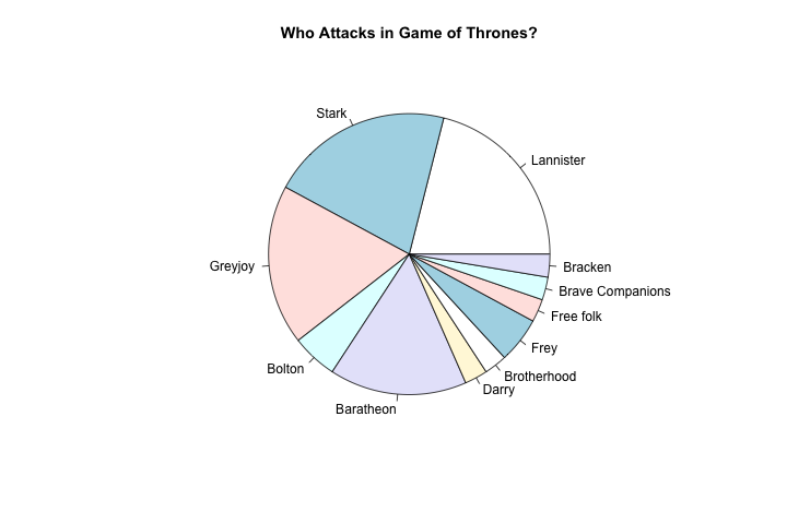
- Out of 38 total battles, the houses of Stark and Lannister are the two that lead battles the most with each launching a total of 8
- Following them, Greyjoy launched the third most with 7
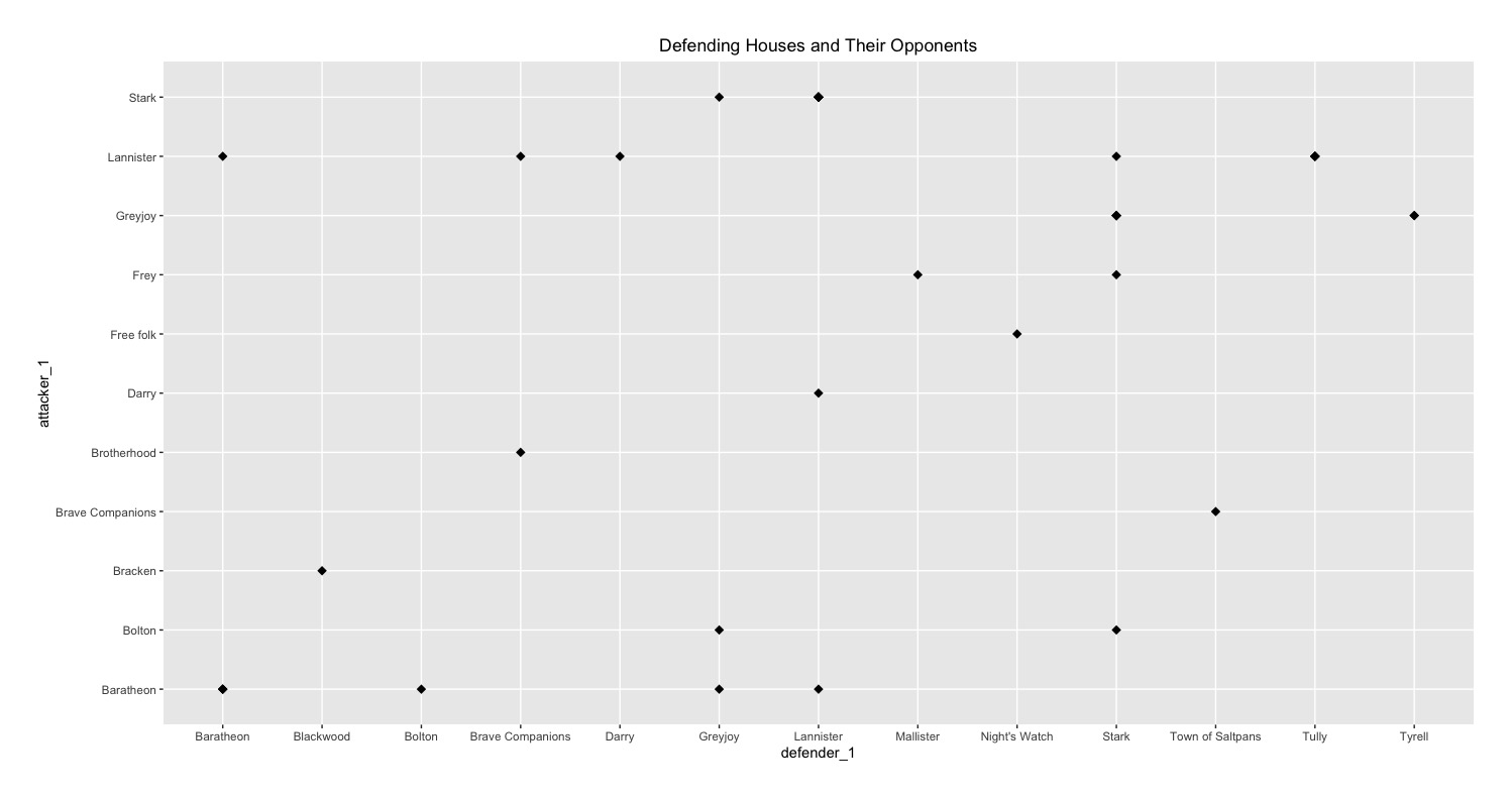
- The second graph graph dictates which houses have fought each other over the years
- The second graph does not show the number of battles that were fought between each house
outcome_graph <- ggplot(battle_data, aes(attacker_1, fill=attacker_outcome)) +
  geom_histogram(stat="count", width=0.5) +
  labs(x="House", title="Battle Outcome of Attacking Houses") +
  theme(axis.text.x = element_text(angle = 60, hjust = 1))

type_graph <- ggplot(battle_data, aes(attacker_1, fill=battle_type)) +
  geom_histogram(stat="count", width=0.5) +
  labs(x="House", title="Battle Types of Attacking Houses") +
  theme(axis.text.x = element_text(angle = 60, hjust = 1))

grid.arrange(outcome_graph, type_graph, ncol = 2)
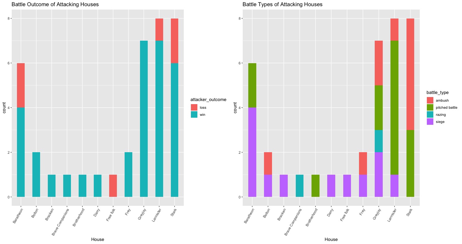
- These two graphs show which attack types the different houses of Westeros used over the three years
- For example, the first graph shows that Baratheon used siege attack the most and Lannister used pitched battle the most
- The second graph shows which attack type was used the most overall in Westeros over all of the different houses
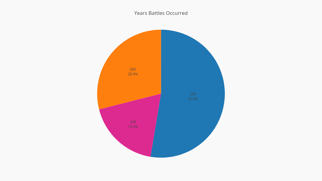
- A total of 38 battles were fought between the years of 298-300
> years_fought <- unique(battle_data$year)
> years_fought
[1] 298 299 300
> total_attacks <- nrow(battle_data) - sum(is.na(battle_data$attacker_1))
> total_attacks
[1] 38
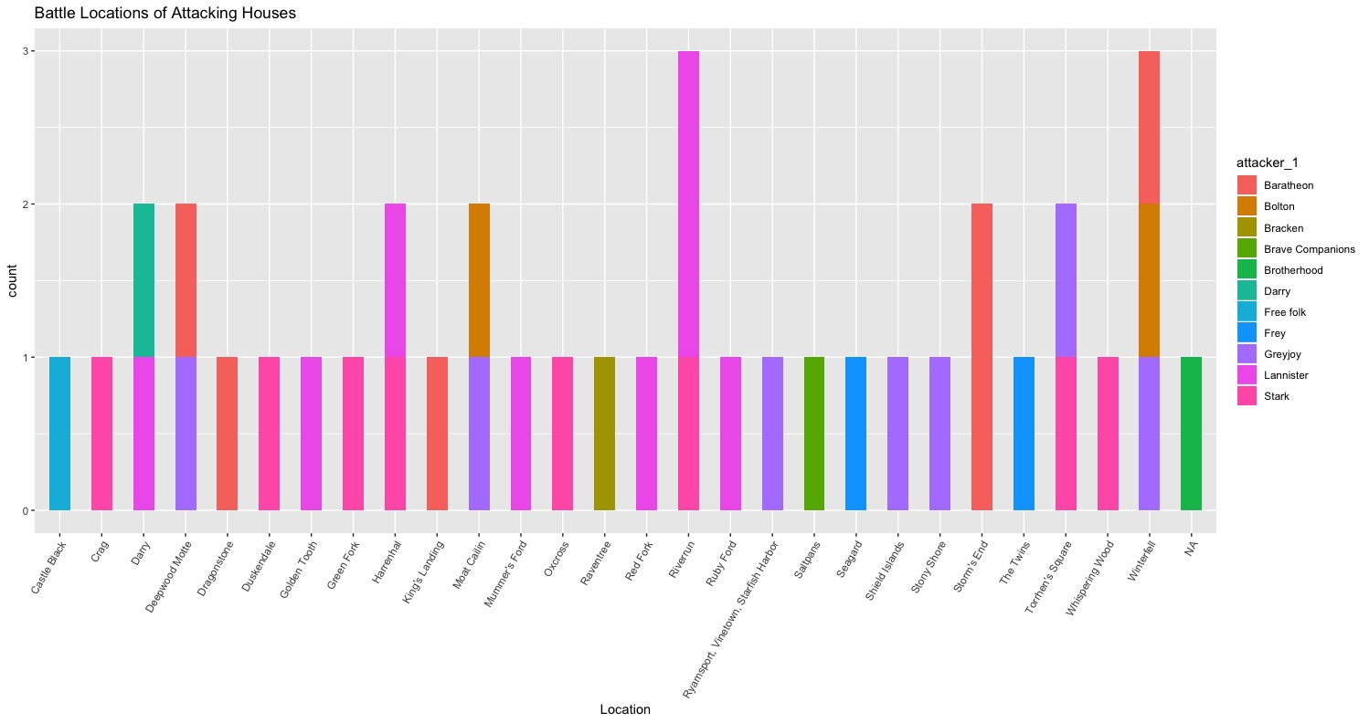
ggplot(battle_data, aes(location, fill=attacker_1)) +
  geom_histogram(stat="count", width=0.5) +
  labs(x="Location", title="Battle Locations of Attacking Houses") +
  theme(axis.text.x = element_text(angle = 60, hjust = 1))
- Most of the houses who fought more than one battle in the three years also fought in more than one location (except for Baratheon who fought only in the region called Storm's End)
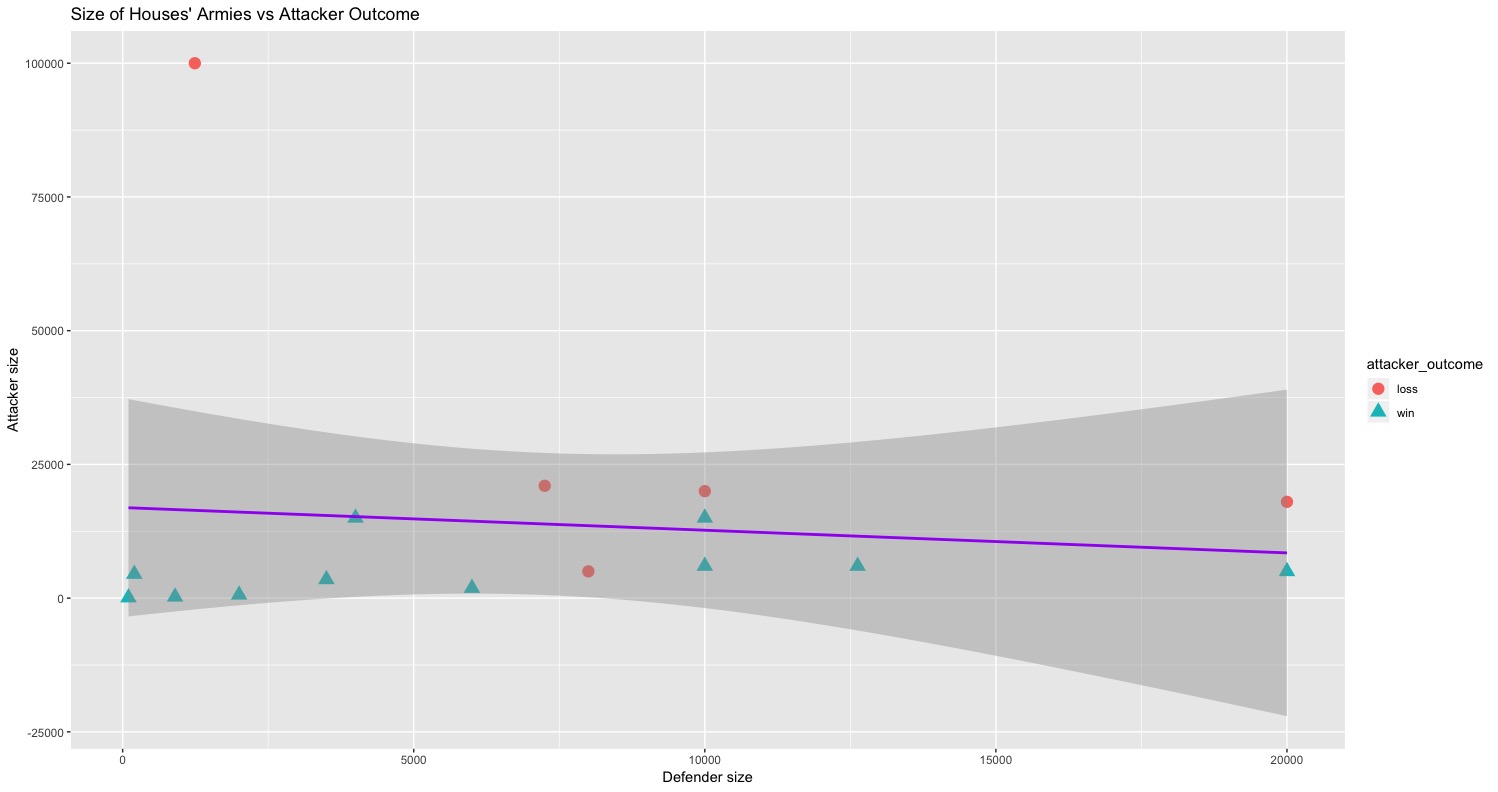
ggplot(battle_data, aes(defender_size, attacker_size)) +
  geom_point(aes(color = attacker_outcome, shape = attacker_outcome), size = 4) +
  geom_smooth(method=lm , color="purple", se=TRUE) +
  labs(x="Defender size", y="Attacker size", title="Size of Houses' Armies vs Attacker Outcome")
- The purple regression line models the relationship between the size of the defender armies and the size of the attackers armies regardless of battle outcome
- The linear regression line shows a negative relation between defender army sizes and attacker army sizes
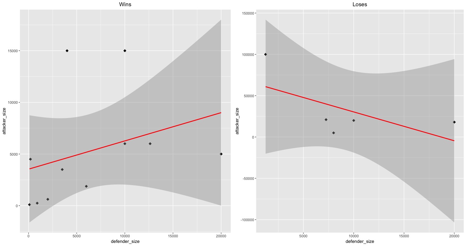
win <- subset(battle_data, attacker_outcome == "win")
lose <- subset(battle_data, attacker_outcome == "loss")

theme(plot.title = element_text(hjust = 0.5))
plot1 <- ggplot(win, aes(x = defender_size, y = attacker_size)) +
           geom_point(shape = 18, size = 3) +
           geom_smooth(method=lm , color="red", se=TRUE) + ggtitle("Wins") +
           theme(plot.title = element_text(hjust = 0.5))
plot2 <- ggplot(lose, aes(x = defender_size, y = attacker_size)) +
           geom_point(shape = 18, size = 3) +
           geom_smooth(method=lm , color="red", se=TRUE) + ggtitle("Loses") +
           theme(plot.title = element_text(hjust = 0.5))

grid.arrange(plot1, plot2, ncol=2)
- The red regression line models the relationship between the size of the defender armies and the size of the attackers armies in relation to battle outcome
- There is a positive relationship between the the size of the defender armies and the size of the attackers armies when the attacking house wins
- There is a negative relationship between the size of the defender armies and the size of the attackers armies when the attacking house loses
- This shows that when the size of the attackering houses armies are smaller than that of the defending armies, the attacking houses tend to win
- The confidence interval for both army size graphs are very large and sometimes the range of the values stretch far beyond the actual range of the values of the graph
- This could be because that although the points fit a general trend, they are quite varied
- In addition, the outliers/residual points differ from the "normal" points, or the other points which fit the general trend, by values reaching 10,000 (which is a lot)!
- According to Peters Rule of Thumb, there should be at least 10 observations per variable or covariate (which of course depends on the situation. There are only four points in the second army size graph labeled "Loss" so extrapolating an accurate linear regression line is difficult.
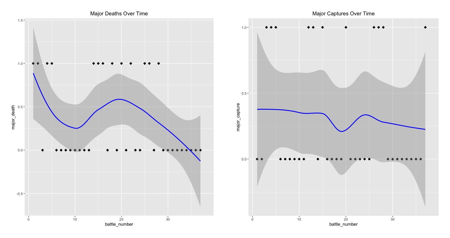
- The first graph shows whether major characters' deaths occurred over time over the course of 38 unique battles
- This graph shows an overall decline in occurances of major deaths over the course of three years
- The second graph shows whetther major captures in battles occured over time over the course of 38 unique battles
- The second graph shows an overall small decline in occurances of major captures in battle over the course of three years