A customizable jetpack compose library for building onboarding screen quickly and easily


- Materials - Used libraries
- Installation - How to install
- Usage - How to use
- OnBoardingScreen Parameters - Customizing
- Developers - Developers
- License - License
- Jetpack compose
- Material 3
- Accompanist Pager
Add the following code to your project's root settings.gradle file:
groovy - settings.gradle
repositories {
    maven { url "https://jitpack.io" }
}
kotlin - settings.gradle.kts
repositories {
    maven ( url = "https://jitpack.io" )
}
Next, add the dependency below to your module's build.gradle file:
groovy - build.gradle(:module-name)
dependencies {
    implementation "com.github.B-L-Studios:OnBoarding-compose:LATEST_VERSION"
}
kotlin - build.gradle.kts(:module-name)
dependencies {
    implementation("com.github.B-L-Studios:OnBoarding-compose:LATEST_VERSION")
}- Create a list of OnBoardingPages using
OnBoardingPageclass:
val onBoardingPages = listOf(
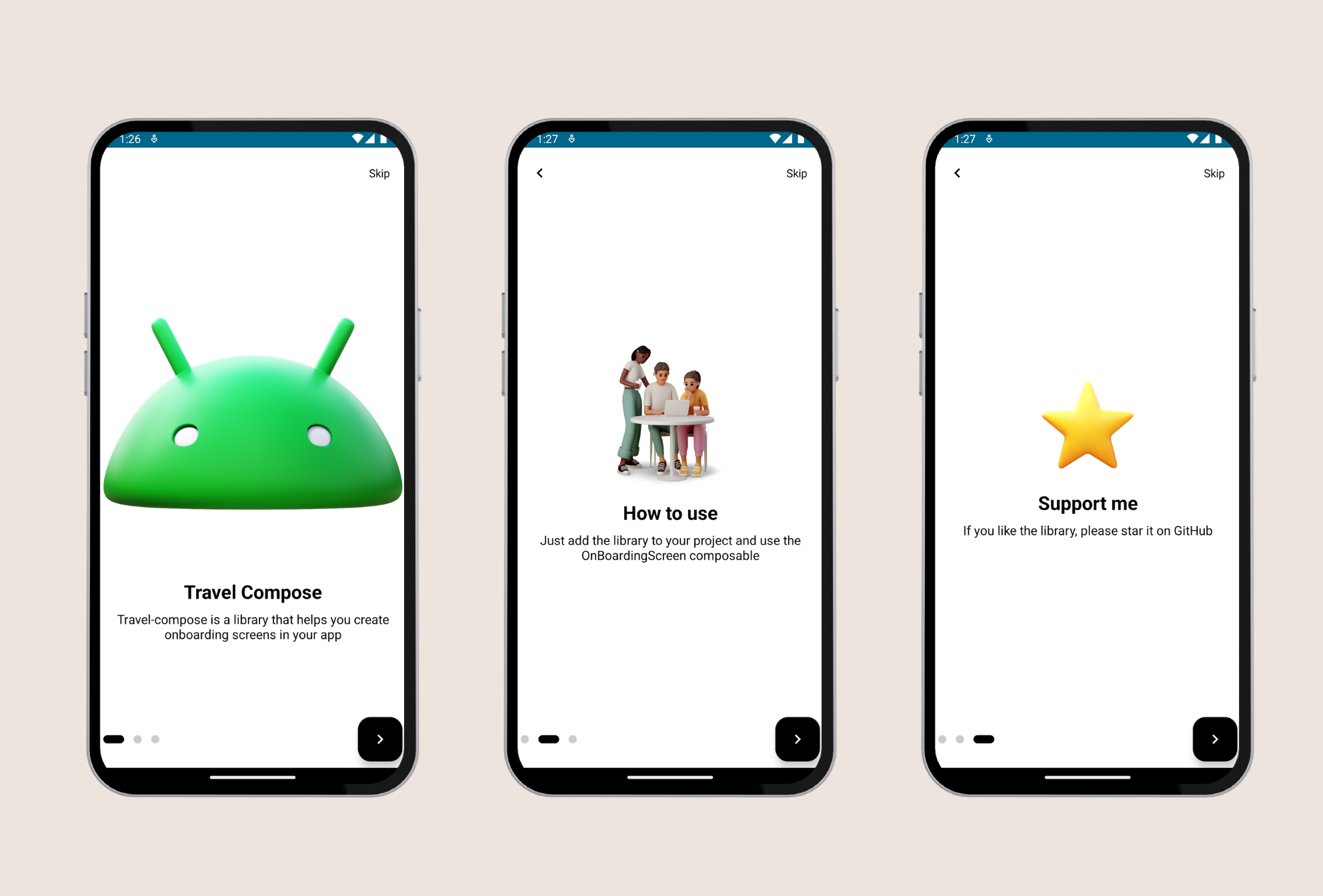
OnBoardingPage(
image = R.drawable.android,
title = "Travel Compose",
description = "Travel-compose is a library that helps you create onboarding screens in your app",
),
OnBoardingPage(
image = R.drawable.team,
title = "How to use",
description = "Just add the library to your project and use the OnBoardingScreen composable",
),
OnBoardingPage(
image = R.drawable.star,
title = "Support me",
description = "If you like the library, please star it on GitHub",
),
)- Add your list to
OnBoardingScreenclass and use it for the OnBoardingView:
OnBoardingScreen(
    items = onBoardingPages,
    onNextClicked = {}
)
Example is in the source code.
| Name | Type | Default |
|---|---|---|
| items | List<OnBoardingPage> |
REQUIRED |
| skipText | String |
"Skip" |
| skipTextStyle | TextStyle |
|
| selectedIndicatorColor | Color |
Black |
| unSelectedIndicatorColor | Color |
LightGray |
| indicatorHeight | Dp |
10.dp |
| spaceBetweenIndicators | Dp |
12.dp |
| onNextClicked | () -> Unit |
REQUIRED |
| nextButtonShape | Shape |
RoundedCornerShape(16.0.dp) |
| nextButtonBackgroundColor | Color |
Black |
| nextButtonIconColor | Color |
white |
| imageModifier | Modifier |
Modifier |
| imageScale | ContentScale |
ContentScale.Fit |
| titleModifier | Modifier |
Modifier |
| titleStyle | TextStyle |
|
| titleAlign | TextAlign |
TextAlign.Center |
| descriptionModifier | Modifier |
Modifier |
| descriptionStyle | TextStyle |
|
| descriptionAlign | TextAlign |
TextAlign.Center |
| spaceBetweenImageAndTitle | Dp |
16.dp |
| spaceBetweenTitleAndDescription | Dp |
8.dp |
| contentPadding | Dp |
8.dp |
Copyright 2023 Louay Labidi

Licensed under the Apache License, Version 2.0 (the "License");
you may not use this file except in compliance with the License.
You may obtain a copy of the License at

   http://www.apache.org/licenses/LICENSE-2.0

Unless required by applicable law or agreed to in writing, software
distributed under the License is distributed on an "AS IS" BASIS,
WITHOUT WARRANTIES OR CONDITIONS OF ANY KIND, either express or implied.
See the License for the specific language governing permissions and
limitations under the License.
If you like the library, consider starring and sharing it with your colleagues.