
On November 10 - the day that campaigners highlight a woman on an average wage stops being paid relative to their male counterparts - we published a special feature allowing users to "Find out what the gender pay gap is in your area".
- Analysis: mean and median dates women 'stop being paid' by local authority region
- ONS: Annual Survey of Hours and Earnings: 2017 provisional and 2016 revised results
- ONS: Explore the gender pay gap by occupation
- Interactive map: Find out what the gender pay gap is in your area
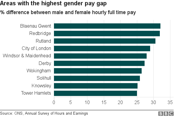
- Bar chart: Areas with the highest gender pay gap
- Bar chart: Areas where the gender pay gap is most towards women
- Multiple bar chart: The pay gap in high-earning occupations

Chris Love took the data from this repo and made a scatterchart showing the distribution of pay inequality by area, followed by an interactive Tableau dashboard complete with a full working calendar that updated to reflect the area selected.
Depending on whether you use a mean average or a median average, the pay gap can be either 14% or 9%. Our story included an analysis by Robert Cuffe, BBC News Head of Statistics explaining the choice to use a mean average. He said:
"Both [averages] come from the Office for National Statistics. They use different averages. The 9% figure uses the middle (median) number. The 14% figure uses the mean average. The mean can be pushed up by very a small number of high values. If Bill Gates walks into your local pub, the mean wealth there will shoot up by millions, but the median won't change much.
"The ONS prefer 9% for that reason but campaigners say that the average should reflect the gaps across all of society.
"Whether equal pay day lands on 10 November (mean), 27 November (median) or on a different day in your area, this analysis shows that there are few places in the UK where it lands on 31 December."