Align ticks in at-risk count table #747
Conversation
Update lifelines fork
…labels, explicitly pop kwargs to allow tick labels configuration
|
This is pretty darn exciting! I'll review and test it locally now |
|
Great work, I appreciate the detail PR post as well! In diagnosing this, I've also turned up a few other bugs as well, so thanks for turning my attention to this! |
|
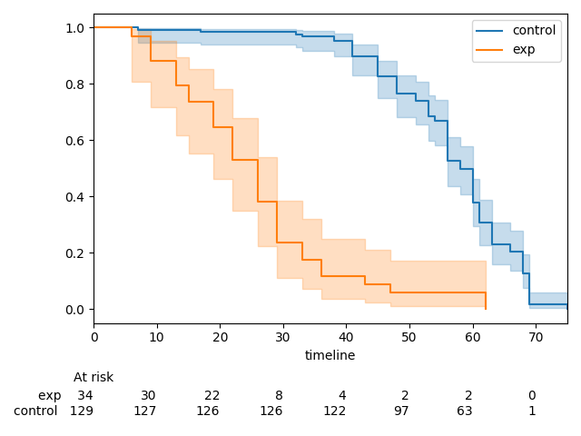
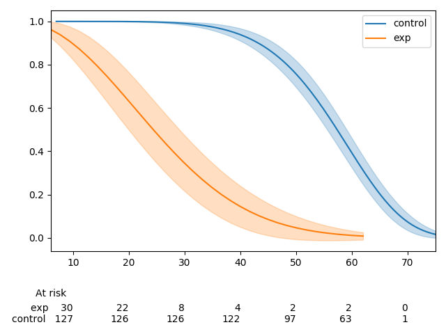
Actually, I did find one bug. If you change the from lifelines.datasets import load_waltons
from lifelines import KaplanMeierFitter, WeibullFitter
from lifelines.plotting import add_at_risk_counts
import matplotlib.pyplot as plt
waltons = load_waltons()
T = waltons['T']
E = waltons['E']
ix = waltons['group'] == 'control'
kmf_control = WeibullFitter()
kmf_control.fit(waltons.loc[ix]['T'], waltons.loc[ix]['E'], label='control')
kmf_exp = WeibullFitter()
kmf_exp.fit(waltons.loc[~ix]['T'], waltons.loc[~ix]['E'], label='exp')
ax = plt.subplot(111)
ax = kmf_control.plot_survival_function(ax=ax)
ax = kmf_exp.plot_survival_function(ax=ax)
add_at_risk_counts(kmf_exp, kmf_control, ax=ax)
plt.show()master
branch
|


|
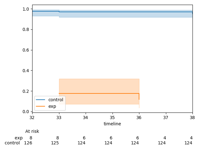
From what I can tell, it has to do with the Edit: the problem is that we write the labels on the first tick, but this tick location is assigned to 0, and if the lower-bound of xlim is greater than 0, that tick is never shown. A solution is to skip ticks that will never be shown, and then on the first shown tick ( greater than lower-bound), write the labels. Ex code that works:
|
|
Hey, thanks for taking a look so quickly! The Weibull fitter example is really useful. I think a good way to cover both cases is to take the Any idea why the |
The xlim automatically set by mpl after we provide mpl the data to plot. In all cases, the x-variable is the |
👍 seems like a good solution |
|
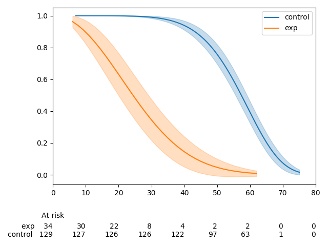
Ok, I changed how the Here is boilerplate code for the plots below. Default
Setting
|


looks great! Thanks for this attention to detail! |
|
Great! Thanks for your help and great work! |
Currently,
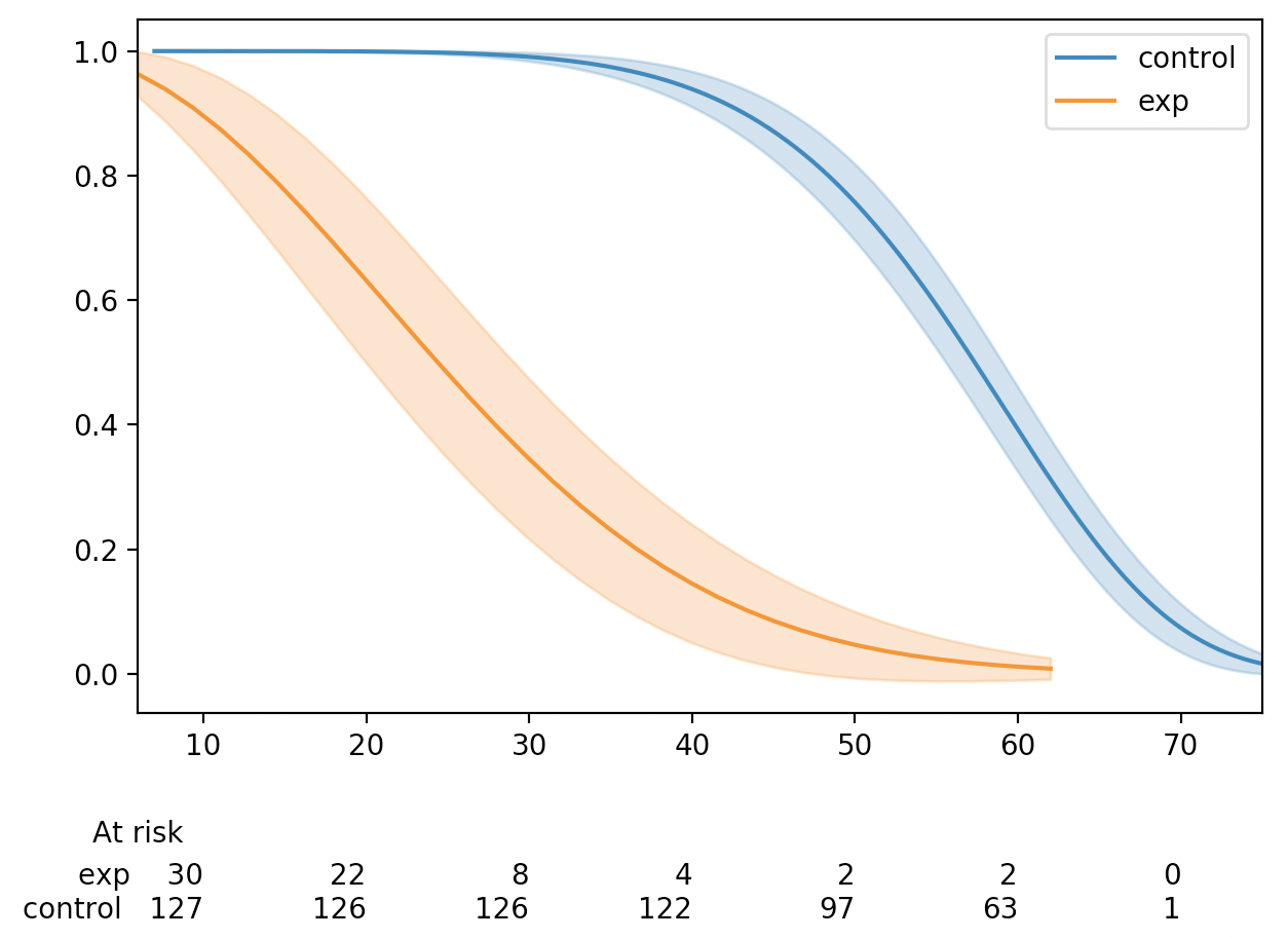
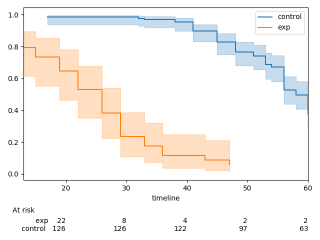
add_at_risk_countsgenerates a set of xticks that get added to a separate axes object below the original axes. In some cases the ticks can be mis-aligned due to differences in how thexlimandxticksobjects from the initial axes object being passed in are used to generate the new axes object.The documentation has a good example of this, which can be reproduced with the code below.
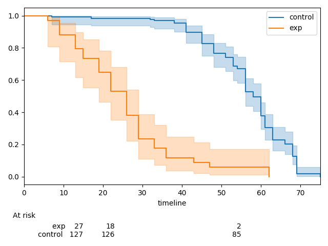
There is one extra tick in the at-risk counts than in the plot. This can be fixed by re-ordering how the
xlimandxticksobjects are created.This MR does three things:
kwargsto be passed in toadd_at_risk_countsthat can be passed into theset_xticklabelsmethod (e.g.fontsize)Before
After