- Live website -(https://carlospwd-stats-card.netlify.app/)
Users should be able to:
- View the optimal layout depending on their device's screen size
- Semantic HTML5 markup
- CSS custom properties
- Flexbox
- CSS Grid
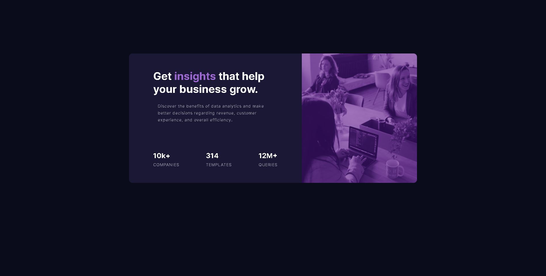
I used grids to format my image and content box which I found to be very helpful. I also included the image into my project by using background image which was very interesting and useful.
.context {
	margin: 10% auto;
	width: 90%;
	display: grid;
	grid-gap: 0;
	grid-template-areas:
		"image"
		"wrapper";
}

.wrapper {
	grid-area: wrapper;
	text-align: center;
	border-radius: 0 0 0.75rem 0.75rem;
	padding: 2rem 0.7rem 2.5rem;
	background-color: rgb(26, 24, 54);
}

.image {
	grid-area: image;
	min-height: 250px;
	border-radius: 0.75em 0.75em 0 0;
	background-image: url(../images/image-header-desktop.jpg);
	background-size: cover;
	background-repeat: no-repeat;
	background-blend-mode: soft-light;
	background-color: rgb(112, 51, 142);
}I want to continue learning about grid and flex-box. these two tools were extremely useful. I still have some trouble debugging some bugs and knowing what looks good asthetically but I feel like I just need some more practice.
- Build a Responsive Grid CSS Website Layout From Scratch - This helped me understand how to use grids and flexbox to organize my website. I also learned about some new vs code extentions such as prettier which helped make my code look neat and organised aswell.
- Website - Carlos Perez
- Frontend Mentor - @Carlos-A-P
- Twitter - @WDCarlosP