public class CollapsingToolbarLayout
extends FrameLayout
java.lang.Object
   ↳ 	android.view.View
  	   ↳ 	android.view.ViewGroup
  	  	   ↳ 	android.widget.FrameLayout
  	  	  	   ↳ 	com.google.android.material.appbar.CollapsingToolbarLayout
CollapsingToolbarLayout is a wrapper for Toolbar which implements a collapsing app bar. It is designed to be used as a direct child of a AppBarLayout.
可折叠式标题栏,CollapsingToolbarLayout是一个作用于Toolbar基础之上的布局,它也是由Design Support库提供的。CollapsingToolbarLayout可以让Toolbar的效果变得更加丰富,不仅仅是展示一个标题栏,而是能够实现非常华丽的效果。它继承自FrameLayout,通常用来在布局中包裹一个Toolbar,以实现一个可以折叠的Toolbar。它需要是AppBarLayout的直接子View,这样才能发挥出效果。
可以看到有这样几个效果:
1、背景图片渐渐消失变为主题颜色 2、FloatingActionButton在滑到顶部的时候消失了 3、左上角的箭头保持不动 4、title在滑到顶部的时候自动调整位置和大小
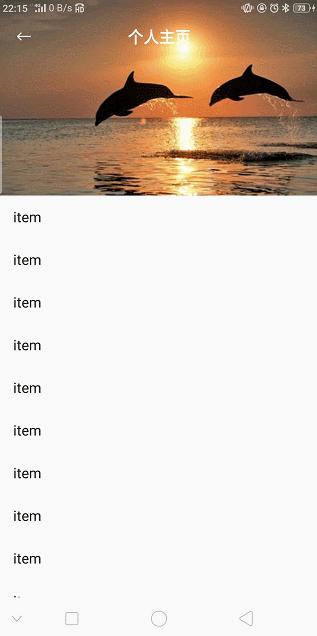
这个高级版的标题栏将是由普通的标题栏加上图片组合而成的。
CollapsingToolbarLayout包含以下特性:
-
Collasping title(可折叠标题)
当布局完全可见时,这个标题比较大;当折叠起来时,标题也会变小。标题的外观可以通过expandedTextAppearance和collapsedTextAppearance属性来调整。
-
contentScrim
设置当CollapsingToolbarLayout完全折叠后的背景颜色,即Toolbar的颜色
-
expandedTitleMarginStart
设置扩张时title与左边的距离
-
Status bar scrim(状态栏纱布)
也是根据是否滚动到临界点,来决定是否显示。可以通过setStatusBarScrim(Drawable)方法来设置。这个特性只有在Android 5.0及其以上版本,我们设置fitSystemWindows为ture时才能生效。
-
Parallax scrolling children(视差滚动子 View)
子View可以选择以“视差”的方式来进行滚动。(视觉效果上就是子 View 滚动的比其他 View 稍微慢些)
-
Pinned position children
子View可以选择固定在某一位置上。
<?xml version="1.0" encoding="utf-8"?>
<androidx.coordinatorlayout.widget.CoordinatorLayout xmlns:android="http://schemas.android.com/apk/res/android"
    xmlns:app="http://schemas.android.com/apk/res-auto"
    xmlns:tools="http://schemas.android.com/tools"
    android:layout_width="match_parent"
    android:layout_height="match_parent"
    android:fitsSystemWindows="true"
    tools:context=".activity.PersonInfoActivity">

    <com.google.android.material.appbar.AppBarLayout
        android:id="@+id/app_bar"
        android:layout_width="match_parent"
        android:layout_height="@dimen/app_bar_height"
        android:fitsSystemWindows="true"
        android:theme="@style/Theme.JetpackSample.AppBarOverlay">

        <com.google.android.material.appbar.CollapsingToolbarLayout
            android:layout_width="match_parent"
            android:layout_height="match_parent"
            app:contentScrim="?attr/colorPrimary"
            android:id="@+id/toolbar_layout"
            android:fitsSystemWindows="true"
            app:layout_scrollFlags="scroll|exitUntilCollapsed|snap"
            app:statusBarScrim="@android:color/transparent">
            <ImageView
                android:layout_width="match_parent"
                android:layout_height="match_parent"
                android:fitsSystemWindows="true"
                android:scaleType="centerCrop"
                android:src="@mipmap/ic_launcher"
                app:layout_collapseMode="parallax"
                app:layout_collapseParallaxMultiplier="0.6"/>
            <androidx.appcompat.widget.Toolbar
                android:id="@+id/toolbar"
                android:layout_width="match_parent"
                android:layout_height="?attr/actionBarSize"
                app:layout_collapseMode="pin"
                app:popupTheme="@style/Theme.JetpackSample.PopupOverlay"
                app:title=""/>
        </com.google.android.material.appbar.CollapsingToolbarLayout>
    </com.google.android.material.appbar.AppBarLayout>

    <androidx.core.widget.NestedScrollView
        android:layout_width="match_parent"
        android:layout_height="match_parent"
        app:layout_behavior="@string/appbar_scrolling_view_behavior">

        <TextView
            android:layout_width="wrap_content"
            android:layout_height="wrap_content"
            android:layout_margin="@dimen/text_margin"
            android:text="@string/large_text" />

    </androidx.core.widget.NestedScrollView>

    <com.google.android.material.floatingactionbutton.FloatingActionButton
        android:id="@+id/fab"
        android:layout_width="wrap_content"
        android:layout_height="wrap_content"
        android:layout_marginEnd="@dimen/fab_margin"
        app:layout_anchor="@id/app_bar"
        app:layout_anchorGravity="bottom|end"
        app:srcCompat="@android:drawable/ic_dialog_email" />

</androidx.coordinatorlayout.widget.CoordinatorLayout>
我们在 XML 文件中为 CollapsingToolBarLayout 的 layout_scrollFlags 指定为 scroll|exitUntilCollapsed|snap,这样便实现了向上滚动的折叠效果。
app:layout_scrollFlags属性:
- scroll:将此布局和滚动时间关联。这个标识要设置在其他标识之前,没有这个标识则布局不会滚动且其他标识设置无效。
- enterAlways:任何向下滚动操作都会使此布局可见。这个标识通常被称为“快速返回”模式。
- enterAlwaysCollapsed:假设你定义了一个最小高度(minHeight)同时enterAlways也定义了,那么view将在到达这个最小高度的时候开始显示,并且从这个时候开始慢慢展开,当滚动到顶部的时候展开完。
- exitUntilCollapsed:当你定义了一个minHeight,此布局将在滚动到达这个最小高度的时候折叠。
- snap:当一个滚动事件结束,如果视图是部分可见的,那么它将被滚动到收缩或展开。例如,如果视图只有底部25%显示,它将折叠。相反,如果它的底部75%可见,那么它将完全展开。
CollapsingToolbarLayout 本质上同样是一个 FrameLayout。这里定义的大多数属性我们都是见过的,就不再解释了,只有一个app:layout_collapseMode比较陌生。它用于指定当前控件在CollapsingToolbarLayout折叠过程中的折叠模式,其中Toolbar指定成pin,表示在折叠的过程中位置始终保持不变,ImageView指定成parallax,表示会在折叠的过程中产生一定的错位偏移,这种模式的视觉效果会非常好。
上面ImageView设置了app:layout_collapseMode="parallax",该属性是控制滚出屏幕范围的效果的,具体取值如下:
-
pin
确保Toolbar在View折叠的时候仍然被固定在屏幕的顶部。
-
parallax
在内容滚动时,CollapsingToolbarLayout中的View(例如上面的ImageView)也可以同时滚动,实现视差滚动效果,通常和layout_collapseParallaxMultiplier(设置视差因子,值为0~1)搭配使用。layout_collapseParallaxMultiplier设置的值越大可以让滚动的效果更加明显。
在FloatingActionButton中主要设置了两个属性:
-
app:layout_anchor 设置这个属性可以让FloatingActionButton以某一个控件为基准调整位置,我们这里设置这个控件就是appbar
-
app:layout_anchorGravity 设置基于appbar控件的位置,我们这里设置了end|bottom|right
FloatingActionButton这个控件通过app:layout_anchor这个设置锚定在了AppBarLayout下方。FloatingActionButton源码中有一个Behavior方法,当AppBarLayout收缩时,FloatingActionButton就会跟着做出相应变化。
上面用到了设置fitsSystemWindows属性,这里简单介绍一下。
根据官方文档,如果某个View 的fitsSystemWindows 设为true,那么该View的padding属性将由系统设置,用户在布局文件中设置的 padding会被忽略。系统会为该View设置一个paddingTop,值为statusbar的高度。fitsSystemWindows默认为false。
重要说明:
- 只有将statusbar设为透明,或者界面设为全屏显示(设置View.SYSTEM_UI_FLAG_LAYOUT_FULLSCREEN flag)时,fitsSystemWindows才会起作用。不然statusbar的空间轮不到用户处理,这时会由ContentView的父控件处理,如果用HierarchyView 工具查看,将会看到,ContentView的父控件的paddingTop将会被设置。
- 如果多个view同时设置了fitsSystemWindows,只有第一个会起作用。这是一般情况,后面会介绍特殊情况。
第一次接触fitsSystemWindows是在CoordinatorLayout控件。发现有很多诡异的地方。
- fitsSystemWindows的表现和官方文档描述的不一样。
- 有时CoordinatorLayout的子控件也会设置fitsSystemWindows属性,而且子控件的fitsSystemWindows也会有作用。
这些令我很困惑,查了些资料之后找到了原因:设置paddingTop只是fitsSystemWindows属性的默认行为,View可以对fitsSystemWindows 进行个性化。fuccccccccccccccck!!!!!!!!!
CoordinatorLayout对fitsSystemWindows的个性化。API 21 以上可以通过调用View的setOnApplyWindowInsetsListener(OnApplyWindowInsetsListener)函数,改变fitsSystemWindows的默认行为。在OnApplyWindowInsetsListener的onApplyWindowInsets函数,可以决定如何处理statusbar的空间。 重要说明:
- 在API 21以前,好像也可以重写View的某个函数达到类似效果。
- 必须将statusbar设为透明,或者界面设为全屏显示setOnApplyWindowInsetsListener才会起作用。这点很容易理解,你都没有statusbar空间,你个性化个屁啊。
CoordinatorLayout对fitsSystemWindows的个性化,关键代码:
if (ViewCompat.getFitsSystemWindows(view)) {
            // First apply the insets listener
            ViewCompat.setOnApplyWindowInsetsListener(view, insetsListener);
            // Now set the sys ui flags to enable us to lay out in the window insets
            view.setSystemUiVisibility(View.SYSTEM_UI_FLAG_LAYOUT_STABLE
                    | View.SYSTEM_UI_FLAG_LAYOUT_FULLSCREEN);
        }

final class ApplyInsetsListener implements android.support.v4.view.OnApplyWindowInsetsListener {
        @Override
        public WindowInsetsCompat onApplyWindowInsets(View v, WindowInsetsCompat insets) {
            setWindowInsets(insets);
            return insets.consumeSystemWindowInsets();
        }
    }
总结:CoordinatorLayout对fitsSystemWindows主要做了以下处理。
- 将界面设为全屏。view.setSystemUiVisibility(View.SYSTEM_UI_FLAG_LAYOUT_STABLE| View.SYSTEM_UI_FLAG_LAYOUT_FULLSCREEN);
- 自己绘制statusbar背景。setStatusBarBackground函数可以设置statusbar背景。或者在布局文件中通过app:statusBarBackground设置。
- 如果CoordinatorLayout的子View没有设置fitsSystemWindows,在layout时将子Viwe向下偏移statusbar的高度,用来显示CoordinatorLayout绘制的statusbar。如果子view设置了fitsSystemWindows,子View会覆盖CoordinatorLayout的statusbar。setStatusBarBackground设置的状态栏 将被覆盖,不再起作用。具体逻辑可参考CoordinatorLayout的layoutChild 函数。
- 调用dispatchApplyWindowInsets,让子view的behavior或子view接着处理fitsSystemWindows属性。CoordinatorLayout的很多常用的子view如AppBarLayout也对fitsSystemWindows进行了个性化处理。
Android 4.1 开始,可以将 app 的内容绘制在状态栏的下一层 (behind the status bar),并且 app 的内容区域的大小不会随着状态栏的出现和消失而自动。使用 SYSTEM_UI_FLAG_LAYOUT_FULLSCREEN 即可实现这种效果。
将 app 的内容绘制在状态栏的下一层时,app 自己负责保证 UI 中的重要内容不被状态栏遮挡(例如,地图应用中的控件不应被状态档遮挡)。否则可能导致应用不可用。大部分时候通过在 XML 文件中添加 android:fitsSystemWindows=true 可以解决这个被遮挡导致不可用的问题。这个属性用于告知父节点要为 system windows 保留一些 padding。通过截图说明一下使用 fitsSystemWindows=true 和使用 fitsSystemWindows=false 的区别。

Material 包中的很多类,比如 DrawerLayout、CoordinatorLayout及AppBarLayout等等,并不是仅仅将 fitsSystemWindows 用于控制是否让父节点要为 system windows 保留一些 padding,还用来控制是否修改状态栏背景!
记住这几点:
-
fitsSystemWindows是深度优先的。顺序很重要,it’s the first View that consumes the insets that makes a difference -
Insets are always relative to the full window - 布局前就添加了 inset,所以在为父节点添加 padding 时其实并不知道 view 的位置
-
padding 会被
fitsSystemWindows=true覆盖 - 同一个 view 上使用fitsSystemWindows=true后 padding 相关的属性无效