Loading Widget
| Loading Widget Example Page | Loading Widget Test Page |
|---|---|
 |
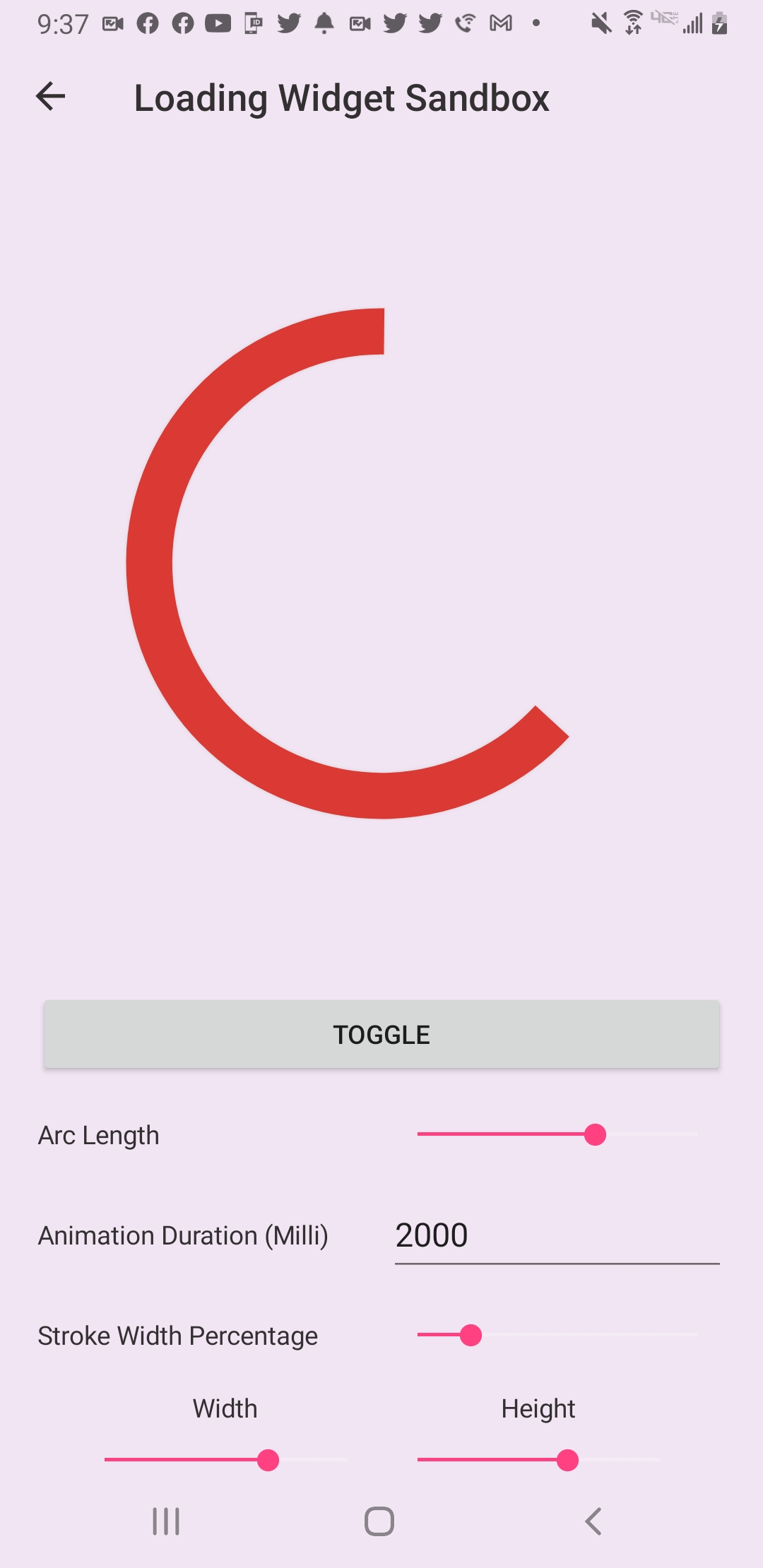 |
The Loading Widget is designed to show an infinite loading cycle. This can be used when your app is making a web request and its unknown how long it will take for the targeted resources to return and be populated into the user interface.
A simple example of implementing the Loading Widget into your xaml is as follows:
<lilWidget:LoadingWidget VerticalOptions="CenterAndExpand"
                         ArcColor="#DB3A34"/>
Here we are providing a ArcLength value of 180° which will make our arc's length be half of a circle.
A more customized implementation would look as follows:
 <lilWidget:LoadingWidget VerticalOptions="CenterAndExpand"
                          WidthRequest="100"
                          HeightRequest="100"
                          ArcLength="180"
ArcColor="#DB3A34"/>The ArcColor property determines the color of the loading arc. Updating this value will force a the Loading Widget to redraw itself.
The Duration property determines how long it will take for one full revolution or cycle of loading arc. The default value is one second.
The StrokeWidth property determines the width of the loading arc.
When resizing the widget the actual strokewidth being used behind the scene will change. A ratio/percentage of the provided strokewidth and the widgets total width is taken when the property is set. Therefore when resizing the actual strokewidth value being used can be changed to help keep the desired look.
The ShadowColor property determines the color of the shadow used around the loading arc.
The IsAnimating property determines whether the animation is running. You will most likely want to set this to true inside OnAppearing and to false when loading is not longer needed. IMPORTANT: Remember to set IsAnimating to false inside OnDisappearing when leaving the page if the loading widget's animation is still running.
The ArcLength property determines the length in degrees of the loading arc. For example setting this property the value of 180° will be half of a circle or half of 360°. Therefore, your loading widget's arc will take up half of the loading circle.
- The acceptable range of values for ArcLength are 0 to 359 [0,359] inclusive. Attempting to assign values outside this range will result in a
System.Reflection.TargetInvocationException. This is in-place because testing found that values outside the acceptable range result in weird artifacting and flickering.