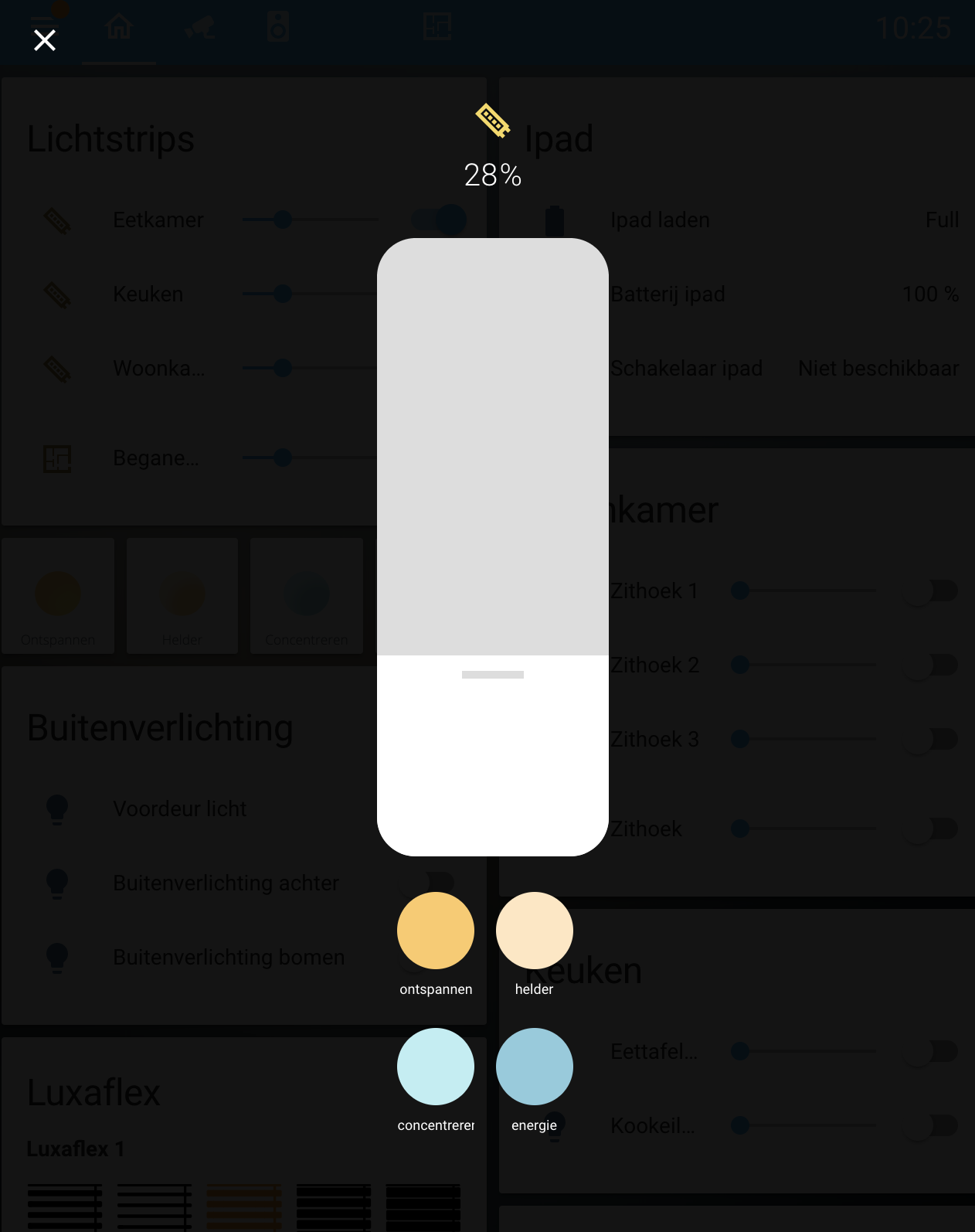
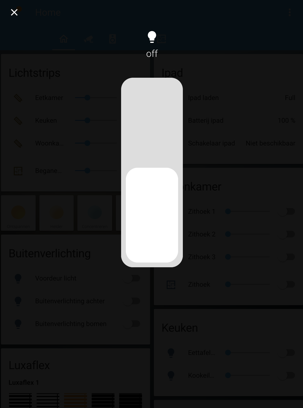
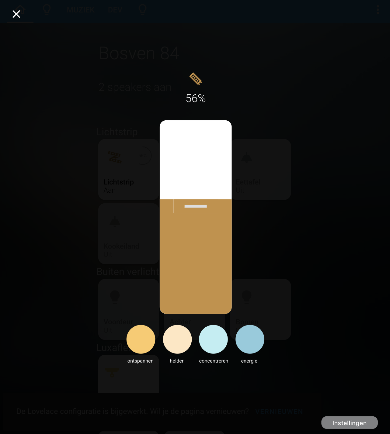
Popup lovelace card with brightness slider and optional scene selection or a light switch for lights without brightness. Can be used in combination with thomas loven browser_mod or custom pop-up card or in combination with my homekit style card: https://github.com/DBuit/Homekit-panel-card

HACS installation:
Go to the hacs store and use the repo url https://github.com/DBuit/light-popup-card and add this as a custom repository under settings.
Add the following to your ui-lovelace.yaml:
resources:
  url: /hacsfiles/light-popup-card/light-popup-card.js
  type: module
Manual installation: Copy the .js file from the dist directory to your www directory and add the following to your ui-lovelace.yaml file:
resources:
  url: /local/light-popup-card.js
type: module| Name | Type | Required | Default | Description |
|---|---|---|---|---|
entity |
string | Required | Entity of the light | |
icon |
string | optional | mdi:lightbulb |
It will use customize entity icon or from the config as a fallback it used lightbulb icon |
fullscreen |
boolean | optional | true | If false it will remove the pop-up wrapper which makes it fullscreen |
hideIcon |
boolean | optional | true | hide icon above slider or switch |
hideState |
boolean | optional | true | hide state above slider or switch |
offStates |
array | optional | - "off" | Array of states that will make the switch appear to be off |
onStates |
array | optional | - "on" | Array of states that will make the switch appear to be on |
actions |
object | optional | actions: |
define actions that you can activate from the pop-up. |
actionSize |
string | optional | 50px |
Set the size of the action buttons default 50px |
actionsInARow |
number | optional | 3 | number of actions that will be placed in a row under the brightness slider |
brightnessWidth |
string | optional | 150px | The width of the brightness slider |
brightnessHeight |
string | optional | 400px | The height of the brightness slider |
switchWidth |
string | optional | 150px | The width of the switch |
switchHeight |
string | optional | 400px | The height of the switch |
borderRadius |
string | optional | 12px | The border radius of the slider and switch |
sliderColor |
string | optional | "#FFF" | The color of the slider |
sliderColoredByLight |
boolean | optional | false | Let the color of the slider change based on the light color, this overwrites the sliderColor setting |
sliderThumbColor |
string | optional | "#ddd" | The color of the line that you use to slide the slider |
sliderTrackColor |
string | optional | "#ddd" | The color of the slider track |
switchColor |
string | optional | "#FFF" | The color of the switch |
switchTrackColor |
string | optional | "#ddd" | The color of the switch track |
settings |
boolean | optional | false | When it will add an settings button that displays the more-info content |
settingsPosition |
string | optional | bottom |
set position of the settings button options: top or bottom. |
displayType |
string | optional | auto |
set the type of the card to force display slider of switch options: slider or switch. |
brightnessTransitionEnabled |
boolean | optional | false |
set to true to enable brightness transition. |
brightnessTransitionTime |
string | optional | 0.5 |
set the duration the transition for the brightness should take default is 0.5 sec. |
To show actions in the pop-up you add actions: in the config of the card follow bij multiple actions.
These actions are calling a service with specific service data. For people that used the services: before can still activate scenes look at the first example below. Besides a service call you can set the action parameter to fire-dom-event to open another popup for example
actions:
  - action:call-service
    service: scene.turn_on
    service_data:
      entity_id: scene.energie
    color: "#8BCBDD"
    name: energie
  - action:call-service
    service: homeassistant.toggle
    service_data:
      entity_id: light.voordeurlicht
    name: voordeur
    icon: mdi:lightbulb
  - action: fire-dom-event
    name: test
    browser_mod:
      command: popup
      title: 'My Title'
      card:
        type: 'custom:mini-graph-card'
        entities:
          - weather.weersverwachting
The name option within a scene is optional
Example configuration in lovelace-ui.yaml with use of browser_mod (https://github.com/thomasloven/hass-browser_mod). To use the style part you also need to install card_mod (https://github.com/thomasloven/lovelace-card-mod)
popup_cards:
  light.beganegrond:
    title: ""
    style:
      $: |
        .mdc-dialog .mdc-dialog__container {
          width: 100%;
        }
        .mdc-dialog .mdc-dialog__container .mdc-dialog__surface {
          width:100%;
          box-shadow:none;
        }
      .: |
        :host {
          --mdc-theme-surface: rgba(0,0,0,0);
          --secondary-background-color: rgba(0,0,0,0);
          --ha-card-background: rgba(0,0,0,0);
          --mdc-dialog-scrim-color: rgba(0,0,0,0.8);
          --mdc-dialog-min-height: 100%;
          --mdc-dialog-min-width: 100%;
          --mdc-dialog-max-width: 100%;
        }
        mwc-icon-button {
          color: #FFF;
        }
    card:
      type: custom:light-popup-card
      entity: light.beganegrond
      icon: mdi:led-strip
      actionsInARow: 2
      brightnessWidth: 150px
      brightnessHeight: 400px
      switchWidth: 150px
      switchHeight: 400px
      actions:
        - action:call-service
          service: scene.turn_on
          service_data:
            entity_id: scene.ontspannen
          color: "#FDCA64"
          name: ontspannen
        - action:call-service
          service: scene.turn_on
          service_data:
            entity_id: scene.helder
          color: "#FFE7C0"
          name: helder
        - action:call-service
          service: scene.turn_on
          service_data:
            entity_id: scene.concentreren
          color: "#BBEEF3"
          name: concentreren
        - action:call-service
          service: scene.turn_on
          service_data:
            entity_id: scene.energie
          color: "#8BCBDD"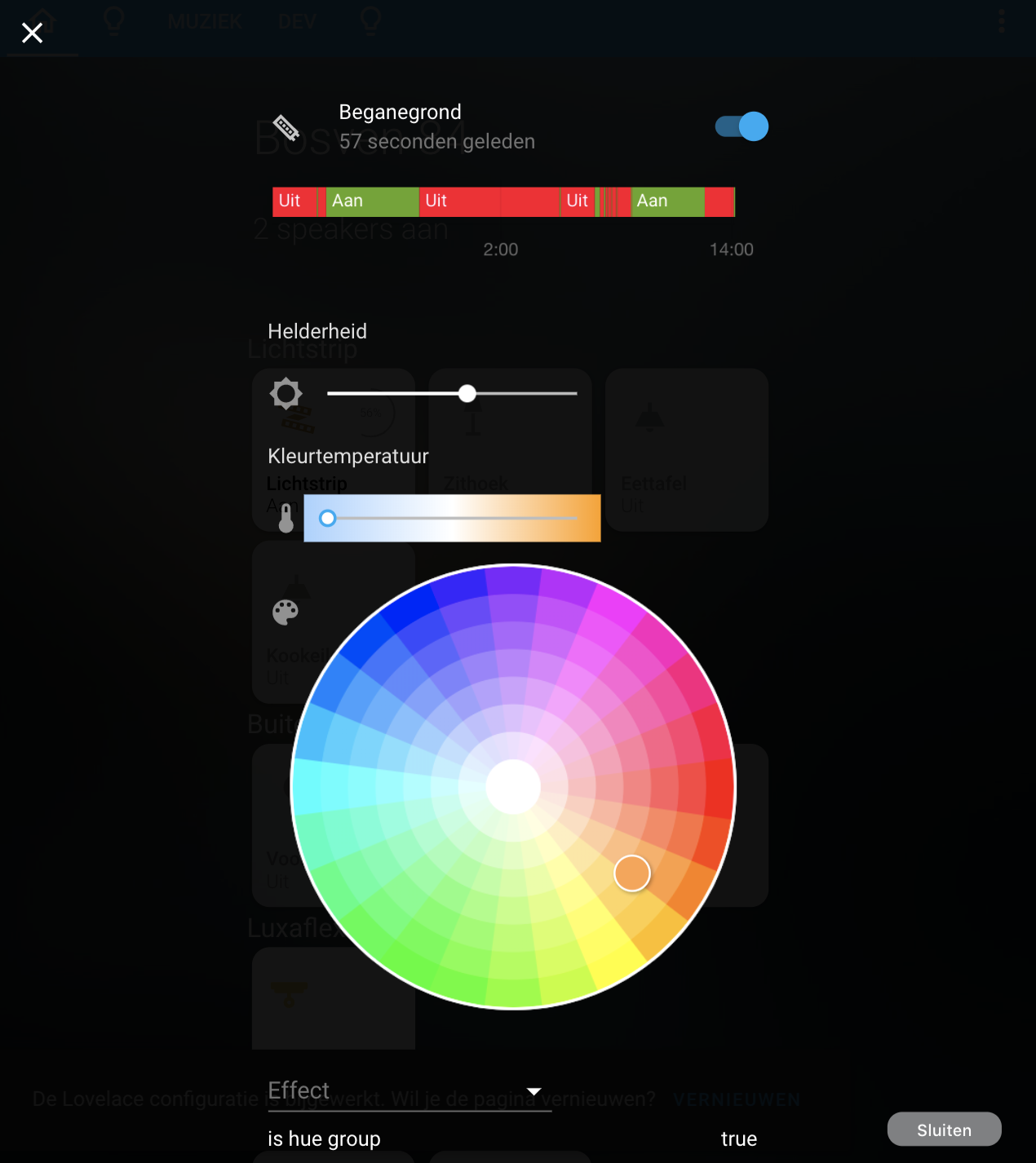
name: energieWhen settings added to your configuration this will display an extra button in the bottom right corner that when clicked switches the popup with any other localace card rendered to give you extra controls.
Default the button show the text Settings and when on the settings page it show an close button with the text Close.
Both text can be overwritten as shown in configuration below
card:
  type: custom:light-popup-card
  entity: light.beganegrond
  settings:
    openButton: Instellingen
    closeButton: Sluiten
First you enable the settings like above and then set a custom settingsCards by adding settingsCard to your configuration.
Than you set the configuration for the card and overwrite the styles under de settingsCard. See configuration example below
card:
  type: custom:light-popup-card
  entity: light.beganegrond
  settings:
    openButton: Instellingen
    closeButton: Sluiten
  settingsCard:
    type: entities
    cardOptions:
      entities:
        - light.beganegrond
        - light.zithoek
        - light.eettafel
        - light.kookeiland
    cardStyle: |
      background-color:#FFF;