
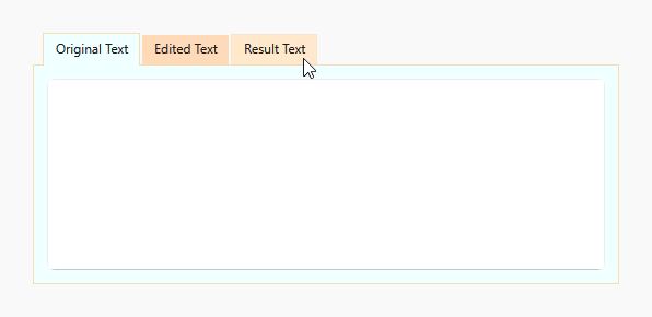
This example demonstrates how to customize the background color of tabs based on their state (selected, focused, hovered).
The following properties are used:
- DXTabItem.NormalBackgroundTemplate
- DXTabItem.HoverBackgroundTemplate
- DXTabItem.SelectedBackgroundTemplate
- DXTabItem.FocusedBackgroundTemplate
<dx:DXTabControl Name="tabControl" BackgroundTemplate="{StaticResource TabControlBackground}">
    <dx:DXTabControl.ItemContainerStyle>
        <Style TargetType="dx:DXTabItem">
            <Setter Property="HoverBackgroundTemplate" Value="{StaticResource TabItemHoverBackground}"/>
            <Setter Property="NormalBackgroundTemplate" Value="{StaticResource TabItemNormalBackground}"/>
            <Setter Property="SelectedBackgroundTemplate" Value="{StaticResource TabItemSelectedBackground}"/>
            <Setter Property="FocusedBackgroundTemplate" Value="{StaticResource TabItemFocusedBackground}"/>
        </Style>
    </dx:DXTabControl.ItemContainerStyle>
    <dx:DXTabItem Header="Original Text">
        <TextBox/>
    </dx:DXTabItem>
    <dx:DXTabItem Header="Edited Text">
        <TextBox/>
    </dx:DXTabItem>
    <dx:DXTabItem Header="Result Text">
        <TextBox/>
    </dx:DXTabItem>
</dx:DXTabControl>