Demo page: https://dimanoid.github.io/ngx-dm-table/
Install the library and dependecies:
npm i -S @angular/cdk @dimanoid/ngx-dm-table
Add module to imports:
import { DmTableModule } from '@dimanoid/ngx-dm-table';

@NgModule({
    declarations: [
        AppComponent
    ],
    imports: [
        BrowserModule, BrowserAnimationsModule, CommonModule,
        .......
        DmTableModule  // <-------
    ],
    bootstrap: [AppComponent]
})
export class AppModule { }<dm-table>
<!-- see DmColumnDirective below -->
<dm-column></dm-column>
<dm-column></dm-column>
<dm-column></dm-column>
<!-- optional header for groups -->
<ng-template #groupHeader
let-row="row"
let-rowIndex="ri"
let-group="group"> <!-- group: DmTableRowsGroup -->
</ng-template>
<!-- optional footer for groups -->
<ng-template #groupFooter
let-row="row"
let-rowIndex="ri"
let-group="group"> <!-- group: DmTableRowsGroup -->
</ng-template>
</dm-table>| Property | Description | Type | Default value |
|---|---|---|---|
[data] |
Array of rows to display | any[] |
|
[trackBy] |
trackBy function that will be used in *cdkVirtualFor |
(index: number, item: T) => any |
|
[itemSize] |
Row height in pixels, minimum if rows has variable height | number |
MIN_ITEM_SIZE (30) |
[moveableColumns] |
Whether table columns can be reordered by drag-n-drop or not | boolean |
true |
[(colsOrder)] |
Array of row's IDs defining the current display order, can be changed if [moveableColumns] is set to true |
string[] |
|
(colsOrderChange) |
Callback executed when [colsOrder] is changed |
EventEmitter<string[]> |
|
[(colsWidth)] |
Hashmap of columns widths, object where key is column ID and value is width in pixels | { [id: string]: number } |
|
(colsWidthChange) |
Callback executed when [colsWidth] is changed |
EventEmitter<{ [id: string]: number }> |
|
[colsVisibility] |
Hashmap of columns visibility, object where key is column ID and value is boolean indicating if this column should be displayed | { [id: string]: boolean } |
|
[externalSort] |
If true no internal sort will be performed, just change value and display |
boolean |
false |
[(sort)] |
Column ID and order used for internal sorting | DmTableSort |
|
(sortChange) |
Callback executed when [sort] is changed |
EventEmitter<DmTableSort> |
|
[defaultColumnConfig] |
Default config for columns, can be overriden in column's definition | DmTableColumnConfig |
|
[tableClass] |
CSS classes that will be added to the <table> tags (header, body and footer tables) |
string |
|
[rowClasses] |
Hashmap where key is CSS classes that will be added to row's <tr> tag if value function will return true |
{ [className: string]: (row: { [colId: string]: any },index: number,group: DmTableRowsGroup) => boolean } |
|
(headerClick) |
Fires when table header is clicked | EventEmitter<DmTableHeaderEvent> |
|
(headerContextMenu) |
Fires when table header is right-clicked | EventEmitter<DmTableHeaderEvent> |
|
(rowClick) |
Fires when table row is clicked | EventEmitter<DmTableRowEvent> |
|
(rowContextMenu) |
Fires when table row is right-clicked | EventEmitter<DmTableRowEvent> |
|
[rowsDragEnabled] |
Enable DragEvents on rows | boolean |
false |
(rowDragStart) |
Fires (if rowsDragEnabled = true) when table row gets ondragstart event. |
EventEmitter<DmTableRowDragEvent> |
|
(rowDragEnd) |
Fires (if rowsDragEnabled = true) when table row gets ondragend event. |
EventEmitter<DmTableRowDragEvent> |
|
[rowsDropEnabled] |
Enable DropEvents on rows | boolean |
false |
(rowDrop) |
Fires (if rowsDropEnabled = true) when table row gets ondrop event. |
EventEmitter<DmTableRowDragEvent> |
|
[rowDropAllowed] |
Callback function that determines if the dragged object can be dropped on this row | (event: DmTableRowDragEvent) => boolean |
() => true |
<dm-column>
    <ng-template #header></ng-template> <!-- optional header template for column -->

    <!-- optional cell template for column -->
    <ng-template #cell
        let-row="row"
        let-dmColumnDirective="ct"
        let-colIndex="ci"
        let-rowIndex="ri">
    </ng-template>

    <!-- OR -->
    <ng-template #cell let-cellValue></ng-template>

    <ng-template #footer></ng-template> <!-- optional footer template for column -->
</dm-column>| Property | Description | Type |
|---|---|---|
[colId] |
Unique ID of the column | string |
[colIdAlias] |
Alternative ID of the column that can be used to match the current sort | string |
[title] |
Column header title string, will be displayed if no #header template is defined |
string |
[pinnable] |
Not yet implemented | boolean |
[sortable] |
Whether the table can be sorted by this column or not | boolean |
[resizable] |
Whether this column can be resized or not | boolean |
[flexible] |
Should be set for the column that will "accumulate" all the size change first, if not set the last column will be marked as flexible, if more then one column set as flexible last one will be used | boolean |
[whitespace] |
This will be set as a value of the CSS property whitespace for every cell in this column |
string |
[minWidth] |
Minimum width of the column in pixels, column will not be shrinked less then this value | number |
[maxWidth] |
Maximum width of the column in pixels, column will not be expanded more then this value | number |
[frozen] |
Not yet implemented | 'left' | 'right' | 'no' |
[headerTooltip] |
This will be set as a title of column's header tag |
string |
[headerClass] |
CSS classes that will be added to column's header <th> tag |
string |
[cellClass] |
CSS classes that will be added to column's cell <td> tag |
string |
[cellClasses] |
Hashmap where key is CSS classes that will be added to cell's <td> tag if value function will return true |
{ [className: string]: (row: { [colId: string]: any },colId: string,rowIndex: number,colIndex: number,group: DmTableRowsGroup) => boolean } |
[footerClass] |
CSS classes that will be added to column's footer <td> tag |
string |
[sort] |
Type of data for internal sort or custom sort function | 'string' | 'number' | 'boolean' | ((a: any, b: any) => number) |
export interface DmTableSort {
    colId: string;
    order: number;
}export class DmTableColumnConfig {
pinnable: boolean = false;
sortable: boolean = false;
resizable: boolean = true;
whitespace: string = 'normal';
minWidth: number;
headerClass: string;
cellClass: string;
footerClass: string;
sort: 'string' | 'number' | 'boolean' | ((a: any, b: any) => number);
constructor(json?: any) { }
}export interface DmTableHeaderEvent {
colId: string;
index: number;
first: boolean;
last: boolean;
event: MouseEvent;
}export interface DmTableRowEvent {
index: number;
row: any;
event: MouseEvent;
}export interface DmTableRowDragEvent {
index: number;
row: any;
event: DragEvent;
}export interface DmTableRowsGroup {
index: number;
first: number;
last: number;
rows: any[];
data: any;
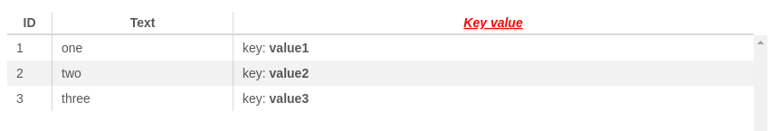
}<dm-table class="ngx-dmt-stripes"
[data]="[
[1, 'one', { key: 'value1' }],
[2, 'two', { key: 'value2' }],
[3, 'three', { key: 'value3' }]
]"
[colsWidth]="{ 0: 50 }"
[defaultColumnConfig]="{ minWidth: 200 }">
<dm-column title="ID"
minWidth="50" maxWidth="150"
sortable="true" sort="number">
</dm-column>
<dm-column title="Text" sortable="true" sort="string"></dm-column>
<dm-column>
<ng-template #header>
<div>
<i style="color: red">
<u>Key value</u>
</i>
</div>
</ng-template>
<ng-template #cell let-item>
<div>
key: <b>{{ item['key'] }}</b>
</div>
</ng-template>
</dm-column>
</dm-table>