FlatUIKit is a collection of iOS components styled with the "Flat UI" aesthetic that we created while building Grouper for iPhone. Its design inspiration comes from Flat UI and Kyle Miller. Styling is implemented via categories on/drop-in replacements for existing UIKit components, so integrating it into your project is very straightforward.
FlatUIKit can be installed via Cocoapods. Simply add
pod 'FlatUIKit'to your Podfile. If you don't use Cocoapods you're welcome to use git submodules, or simply download it and include it in your project manually.
Note that FlatUIKit requires the CoreText framework as well as iOS > 6.0.
FUIButton is a drop-in subclass of UIButton that exposes the additional properties buttonColor, shadowColor, cornerRadius, and shadowHeight. Note that if you set any of these, you have to set all of them.
myButton.buttonColor = [UIColor turquoiseColor];
myButton.shadowColor = [UIColor greenSeaColor];
myButton.shadowHeight = 3.0f;
myButton.cornerRadius = 6.0f;
myButton.titleLabel.font = [UIFont boldFlatFontOfSize:16];
[myButton setTitleColor:[UIColor cloudsColor] forState:UIControlStateNormal];
[myButton setTitleColor:[UIColor cloudsColor] forState:UIControlStateHighlighted];
FUISegmentedControl is a drop-in subclass of UISegmentedControl that exposes the additional properties selectedColor, deselectedColor, selectedFont, deselectedFont, selectedFontColor, deselectedFontColor, dividerColor and cornerRadius. Note that if you set any of these, it is recommended that you set all of them.
mySegmentedControl.selectedFont = [UIFont boldFlatFontOfSize:16];
mySegmentedControl.selectedFontColor = [UIColor cloudsColor];
mySegmentedControl.deselectedFont = [UIFont flatFontOfSize:16];
mySegmentedControl.deselectedFontColor = [UIColor cloudsColor];
mySegmentedControl.selectedColor = [UIColor amethystColor];
mySegmentedControl.deselectedColor = [UIColor silverColor];
mySegmentedControl.dividerColor = [UIColor midnightBlueColor];
mySegmentedControl.cornerRadius = 5.0;FUISwitch is not a subclass of UISwitch (UISwitch is too inflexible to subclass), but rather a reimplementation that exposes all of the methods of UISwitch. In addition, it also provides access to its underlying on/off UILabels and other subviews.
mySwitch.onColor = [UIColor turquoiseColor];
mySwitch.offColor = [UIColor cloudsColor];
mySwitch.onBackgroundColor = [UIColor midnightBlueColor];
mySwitch.offBackgroundColor = [UIColor silverColor];
mySwitch.offLabel.font = [UIFont boldFlatFontOfSize:14];
mySwitch.onLabel.font = [UIFont boldFlatFontOfSize:14];
Similar to FUISwitch, FUIAlertView is a reimplemenation of UIAlertView that exposes all of UIAlertView's methods (and delegate methods, with the FUIAlertViewDelegate protocol), but with far greater flexibility in UI customization. All of its child UILabels, UIViews, and FUIButtons can be customized at will.
FUIAlertView *alertView = [[FUIAlertView alloc] initWithTitle:@"Hello"
                                                      message:@"This is an alert view"
                                                     delegate:nil cancelButtonTitle:@"Dismiss"
                                            otherButtonTitles:@"Do Something", nil];
alertView.titleLabel.textColor = [UIColor cloudsColor];
alertView.titleLabel.font = [UIFont boldFlatFontOfSize:16];
alertView.messageLabel.textColor = [UIColor cloudsColor];
alertView.messageLabel.font = [UIFont flatFontOfSize:14];
alertView.backgroundOverlay.backgroundColor = [[UIColor cloudsColor] colorWithAlphaComponent:0.8];
alertView.alertContainer.backgroundColor = [UIColor midnightBlueColor];
alertView.defaultButtonColor = [UIColor cloudsColor];
alertView.defaultButtonShadowColor = [UIColor asbestosColor];
alertView.defaultButtonFont = [UIFont boldFlatFontOfSize:16];
alertView.defaultButtonTitleColor = [UIColor asbestosColor];
[alertView show];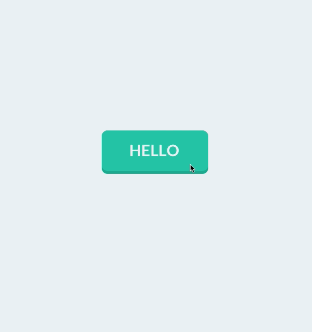
To provide flat UISliders, UIProgressViews and UISteppers, we simply provide categories on UISlider/ProgressView/UIStepper to automatically configure their appearance with appropriate colors/corner radii. This makes for zero-friction integration with your existing project:
[mySlider configureFlatSliderWithTrackColor:[UIColor silverColor]
                              progressColor:[UIColor alizarinColor]
                                 thumbColor:[UIColor pomegranateColor]];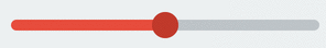
[myProgressView configureFlatProgressViewWithTrackColor:[UIColor silverColor]
                              progressColor:[UIColor alizarinColor]];

[myStepper configureFlatStepperWithColor:[UIColor wisteriaColor]
                        highlightedColor:[UIColor wisteriaColor]
                           disabledColor:[UIColor amethystColor]
                               iconColor:[UIColor cloudsColor]];
To customize bar button items for your entire application (including back buttons), UIBarButtonItem+FlatUI provides a class method which leverages the UIBarButtonItem appearance proxy to do this in one step:
[UIBarButtonItem configureFlatButtonsWithColor:[UIColor peterRiverColor]
                              highlightedColor:[UIColor belizeHoleColor]
                                  cornerRadius:3];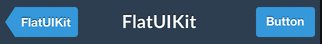
However, this might cause rendering issues with controllers that are pushed from actionsheets, sharesheets or links in webviews. To prevent this behavior, scope the customized bar buttom items to your controllers:
[UIBarButtonItem configureFlatButtonsWithColor:[UIColor peterRiverColor]
                              highlightedColor:[UIColor belizeHoleColor]
                                  cornerRadius:3
whenContainedIn:[YourViewController class]];As above, we provide a category on UINavigationBar to configure it flatly with a single color:
[self.navigationController.navigationBar configureFlatNavigationBarWithColor:[UIColor midnightBlueColor]];You can modify the backgroundColor and selectedBackgroundColor of a UITableViewCell without losing the rounded corners. The cell will copy the UITableView's separator color. The separator height is exposed as separatorHeight and the radius as cornerRadius.
UITableViewCell *cell = ...;
[cell configureFlatCellWithColor:[UIColor greenSeaColor]
                   selectedColor:[UIColor cloudsColor]
                 roundingCorners:corners];

cell.cornerRadius = 5.0f; // optional
cell.separatorHeight = 2.0f; // optional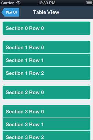
Like some other flat components, we simply provide a category to automatically configure a popover appearance for iPad by only having to set a background color.
popover = [[UIPopoverController alloc] initWithContentViewController:nc];
[popover configureFlatPopoverWithBackgroundColor: [UIColor midnightBlueColor] cornerRadius:3];
popover.delegate = self;
[popover presentPopoverFromRect:button.frame inView:self.view permittedArrowDirections:UIPopoverArrowDirectionAny animated:YES];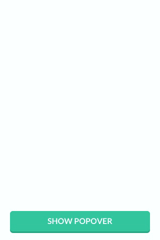
For convenience, FlatUIKit includes the colors defined at Flat UI Colors. You can see examples of these colors in the code/components above. Using them is as simple as:
#import <FlatUIKit/UIColor+FlatUI.h>
UIColor *myColor = [UIColor turquoiseColor];FlatUIKit comes bundled with Lato, a clean, beautiful open font. More info on Lato can be found here. It is included in FlatUIKit automatically; you can use it as follows:
#import "UIFont+FlatUI.h"
UIFont *myFont = [UIFont flatFontOfSize:16];
Contributions are totally welcome. We'll review all pull requests and if you send us a good one/are interested we're happy to give you push access to the repo. Or, you know, you could just come work with us.