Multi view usability findings and recommendations: Regulation to resource flow
About these findings
- Date presented to the eRegulations team: 2022-04-21
- Report exported from Dovetail (CMCS Dovetail account required 🔒)
- Note: video snippets not included in this version for privacy reasons
Next steps
Our product manager is using the recommendations to create stories and plan sprints for implementing the tested features.
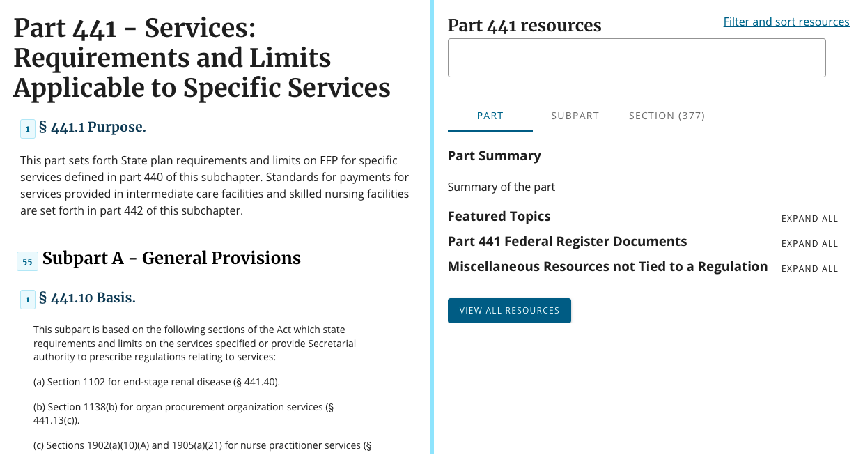
Informed by prior research studies, the eRegulations team has been designing and prototyping improvements to the (CMCS-internal-for-now) eRegulations website. We’ve created three design concepts and want to learn what works and what doesn’t work well for intended users and why, so we can decide which concepts to revise and move forward with.
Concept A (view prototype)
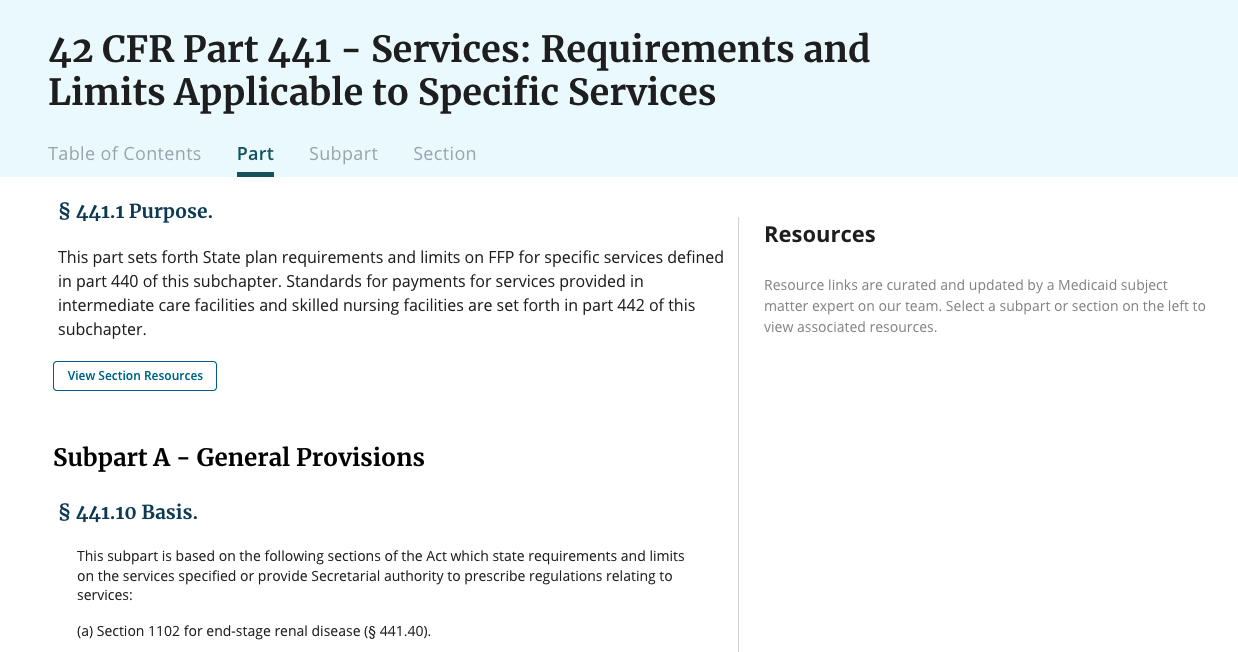
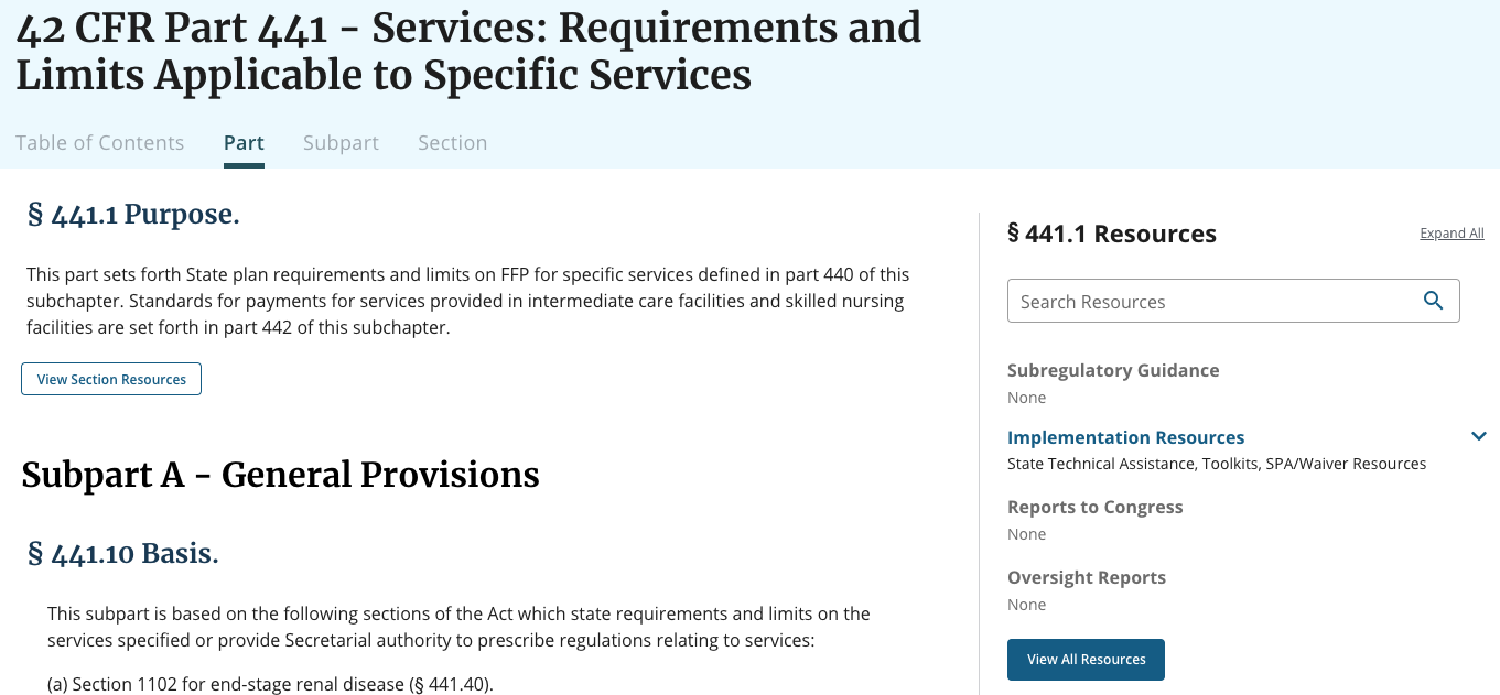
Regulation content page
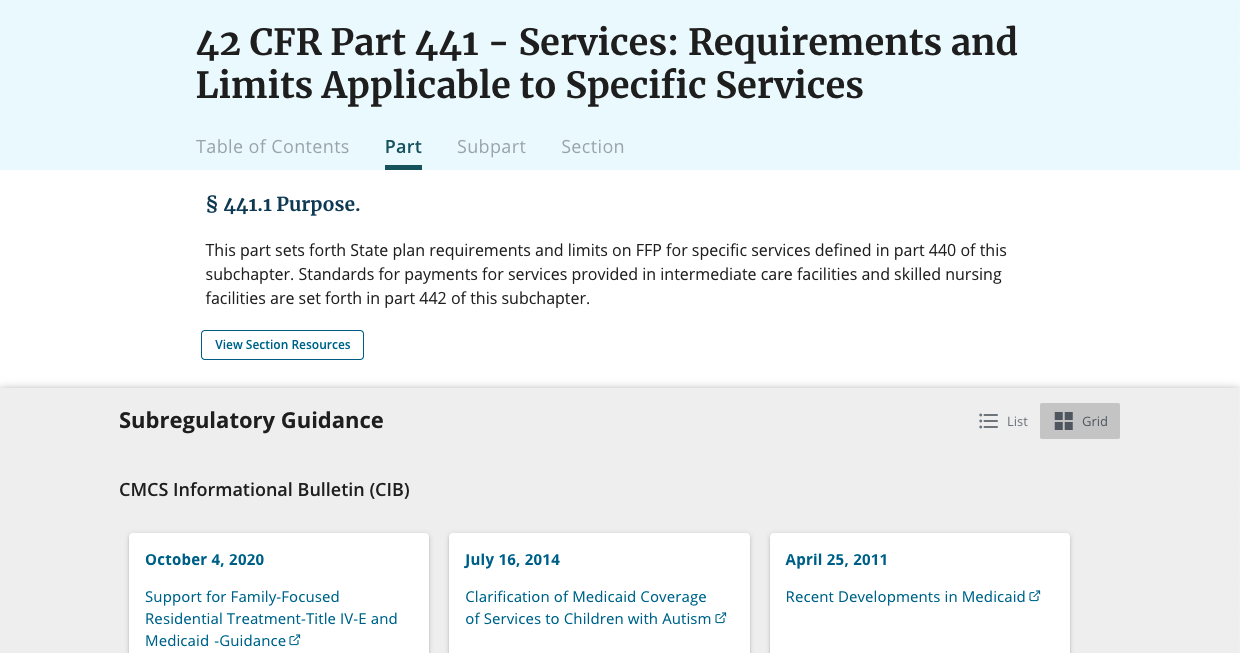
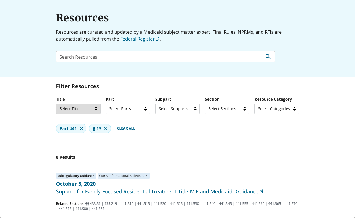
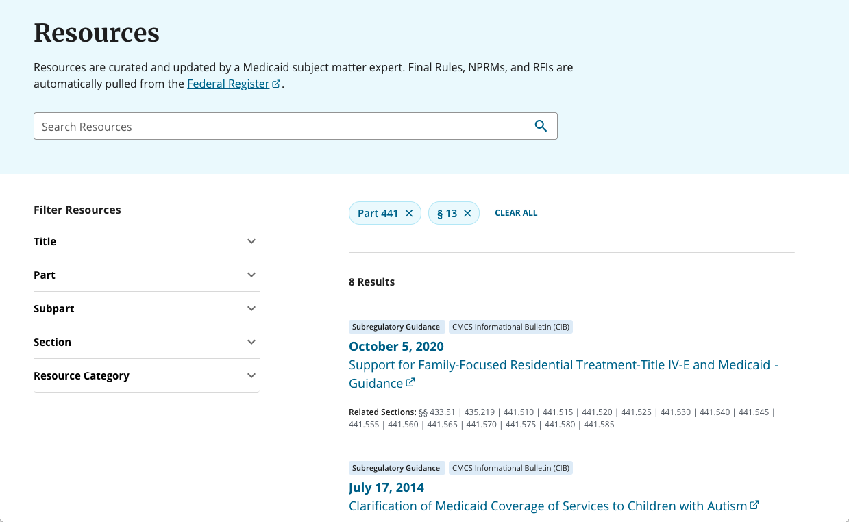
Resources page
Concept B (view prototype)
Regulation content page
Resources page
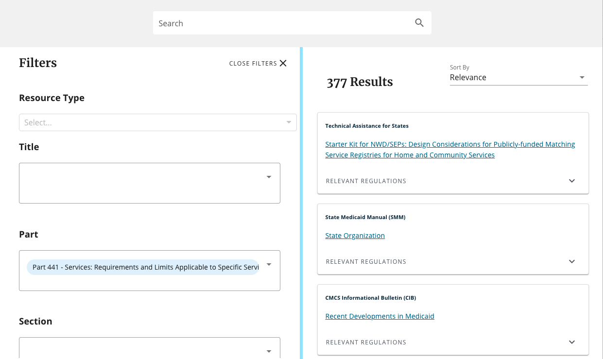
Concept C (view prototype)
Regulation content page
Resources page
- Figuring out how to find subregulatory guidance
- Offering supplemental resources at the section level (as opposed to only at the subpart level)
- Understanding the connection between the regulation text and supplemental resources
- Understanding the connection between the regulation content page and the pre-filtered resources page
- Filtering the resources page
- Toggling between list and grid views
- The ‘View Section Resources’ button could be easier to access and more closely connected to its regulation section
- The sidebar’s ‘View All Resources’ button was confusing
- The subpart filter could be adjusted to make it more obvious that it’s optional
- The ‘related section’ links were too prominent for some, resulting in information overload
- It’s unclear what we meant by ‘related’
- Several participants wanted to use search to filter (searching wasn’t functional in the prototype, but we plan to offer this feature)
Tasks 1–5 were the same across concepts, and tasks 6 and 7 were unique to each concept.
| Task 1: Find subregulatory guidance doc | Success | Partial | Error |
|---|---|---|---|
| Concept A | 5/5 | - | - |
| Concept B | 5/5 | - | - |
| Concept C | 5/5 | - | - |
| Task 2: Understand relationship between regulation & resources | Success | Partial | Error |
| Concept A | 5/5 | - | - |
| Concept B | 3/3 | - | - |
| Concept C | 2/3 | - | 1/3 |
| Task 3: Understand why resources page was pre-filtered | Success | Partial | Error |
| Concept A | 4/5 | 1/5 | - |
| Concept B | 5/5 | - | - |
| Concept C | 2/4 | 2/4 | - |
| Task 4: Apply filters | Success | Partial | Error |
| Concept A | 5/5 | - | - |
| Concept B | 5/5 | - | - |
| Concept C | 4/5 | 1/5 | - |
| Task 5: Understand ‘related section/relevant regulation’ links | Success | Partial | Error |
| Concept A | 3/5 | 2/5 | - |
| Concept B (didn't ask, identical to Concept A) | - | - | - |
| Concept C | 2/5 | 3/5 | - |
- Task 1: All 5 participants were able to find subregulatory guidance
-
Task 2: The majority of participants were able to understand the relationship between the regulation and resources
- Across concepts, most participants easily understood they were viewing resources for a specific regulation section and were able to name the section
- When viewing Concept C, P2 thought the sidebar resources were for the whole part
-
Task 3: The majority of participants were able to understand why the resources page was pre-filtered
- Across concepts, most participants easily understood the page was pre-filtered because they navigated to the page from a regulation section
- When viewing Concept A, P1 was unsure how results on the resources page differed from the resources on the regulation content page, but they understood after interacting with the page
- When viewing Concept C, P3 and P5 were unsure if the results were for a specific regulation section or the whole part
-
Task 4: All 5 participants were able to successfully apply filters
- Across concepts, 3 participants (P1, P4, P5) wanted to use search to filter because searching for a keyword or phrase is faster than applying filters
-
Task 5: The majority of participants were able to understand the ‘related section/relevant regulations’ links
- When viewing Concept A (identical to Concept B), the majority of participants assumed the resource impacted the related sections
- When viewing Concept C, the majority of participants assumed the resource mentioned the relevant regulations
- Across concepts, the majority of participants understood that clicking on a ‘related section/relevant regulations’ link would take them to the regulation text
| Tasks | Success | Partial | Error |
|---|---|---|---|
| Task 6A: Understand drawer expand/collapse | 5/5 | - | - |
| Task 7A: Understand drawer list/grid toggle | 5/5 | - | - |
- Task 6A: All 5 participants were able to understand how to expand and collapse the resources drawer
- Task 7A: All 5 participants were able to understand how to toggle between list and grid views in the resources drawer
| Tasks | Success | Partial | Error |
|---|---|---|---|
| Task 6B: Expand sidebar categories | 4/5 | - | 1/5 |
-
Task 6B: The majority of participants were able to find the resource sidebar’s ‘Expand All’ link
- P1 and P5 initially scrolled past the link, but only P3 was unable to find the link
| Tasks | Success | Partial | Error |
|---|---|---|---|
| Task 6C: Understand numerical count on regulation content page | 3/5 | 2/5 | - |
| Task 7C: Use handlebar UI | 4/4 | - | - |
-
Task 6C: The majority of participants were able to interpret the numerical count on the regulation content page
- P4 and P5 were initially unsure about what the number represented, but they understood after interacting with it
-
Task 7C: All 4 participants who were asked, were able to easily find and use the handlebar UI
- P1 was not asked
Finding #1: When viewing regulations and related resources, people preferred requesting resources that then appeared on the right
When viewing resources alongside regulation text, the majority of participants preferred Concept B’s design, which presented the regulation on the left and the resources on the right, and only displayed the resources they requested for a specific regulation section.
The ability to see both the regulation text and resources list simultaneously, combined with reiterating the regulation section number in the sidebar heading (e.g., § 435.110 Resources), made the relationship between the two more concrete. All participants understood they were viewing resources for a specific regulation section and were able to name the section.
Across concepts, participants were able to successfully find subregulatory guidance for a specific regulation section, but the experience was more intuitive and efficient in Concept B. Although resources were not displayed by default in Concept B, the resource sidebar’s empty state informed people that resources existed, and after requesting resources for a specific regulation section, prepared them to expect to see the resources on the right.
Although we can confidently move forward with Concept B, a few revisions would improve the experience:
- A couple participants (P2, P3) struggled to locate the correct ‘View Section Resources’ button, so it needs to be easier to access and more closely connected to its associated regulation
- This also applies to the ‘View Subpart Resources’ and ‘View Part Resources’ buttons — it should be easy to distinguish between the three
- The majority of participants (P1, P2, P3) correctly assumed Concept C’s numerical count represented the number of resources associated with a section, so it could be helpful to incorporate this into Concept B
- The majority of participants (P1, P2, P4, P5) found the 'Expand All' link in Concept B's sidebar and understood what it would do, but a couple missed it at first (P1, P5). Only one participant (P3) was unable to find the link.
- The majority of participants (P2, P3, P4, P5) easily found the handlebar in Concept C and wanted to use it, so incorporating this into the revised design would be a welcome change
The ability to see the regulation text and resources list in a two-column, left-to-right layout, made the relationship between the two more concrete
Including the section number in the sidebar heading (e.g., § 435.110 Resources) helped reinforce the connection. When viewing Concepts A and B, which both reiterated the section number in the heading, all participants understood they were viewing resources for a specific regulation section and were able to name the section.
- P3 said they liked the left-to-right view better than the top-to-bottom layout because they like to see things at the same time. They also tend to move left to right, so that orientation resonated better for them.
By contrast, although the regulation text and resources could be viewed simultaneously in Concept C, the connection between the regulation text and resources was unclear to some participants.
- P5 assumed they would be able to find resources on the right, but they wondered if the resources on the right would update as they scrolled through the regulation text on the left, or if the resources would remain at the part level.
A couple participants liked aspects of Concept A’s design, but their preference was more about being able to focus on the resources (P2) or the color contrast between the white cards and gray background (P5), as opposed to the top-down arrangement of the regulation text and resources.
- P5 liked the split screen layout of C, but the visual design of A. They liked the separation between the white cards and gray background, which made it feel easier for them to navigate the content. They also mentioned wanting the ability to adjust the height of A's drawer, like they could adjust the column width in C.
- P2 liked A's drawer because if they were looking for resources, it made sense to have a screen that was focused only on the resources.
Concepts B and C both displayed resources to the right of the regulation text, but because Concept B’s sidebar was initially empty and required people to request resources, the experience was more intuitive than Concept C’s, which initially presented numerous resources that people were then required to filter down
Although resources were not displayed by default in Concept B, the resource sidebar’s empty state informed people that resources existed, and after requesting resources for a specific regulation section, prepared them to expect to see the resources on the right.
- P5 said they expected to see resources on the right because when the page loaded, they saw the 'Resources' heading on the right and the empty state message instructed them to select a regulation section on the left to view resources.
- P1 also said they expected to see resources on the right because of the empty state message.
By contrast with Concept B’s more curated resources sidebar, Concept C’s resources sidebar had too much information. Because there was more content to explore, it generally took participants longer to find the correct resource.
- P5 recalled seeing resource content on the right, but after clicking around the page, they were unsure how to get back to the original view of the resources sidebar.
- P2 said Concept C's approach felt like too much information at once, and wanted to see the content more condensed by category, so they could see everything that was available before starting to dig in.
To help make the research experience more efficient, the View Section Resources button should be easier to access and more closely connected to its associated regulation
P5 expected to be able to click on the section name to see associated resources, they also expected to see a button closer to the section name.
Due to close proximity, P3 assumed the button for the previous section was associated with the regulation section they were reviewing. To help with clicking the correct button, we could explore displaying the section number in the button label (e.g., View § 447.26 Resources) in addition to making the button easier to access.
It might also be helpful to display the number of available resources for a section or subpart, similar to Concept C. The majority of participants correctly assumed the numerical count represented the number of resources associated with a section, and those who were unsure at first understood after interacting with it. This feature is meant to have a tooltip hover state that would further clarify what it represents.
- P2 thought the number represented the number of resources for the section, and said they would have clicked on it out of curiosity.
Although the majority of participants found the 'Expand All' link in Concept B's sidebar and understood what it would do, a few missed it at first
To increase discoverability, we could explore ways to adjust the location or visual weight of the link.
- P1 had manually expanded each category before locating the 'Expand All' link.
- P5 missed the link at first, but saw it after scrolling back to the top of the sidebar
- P2 found it, but said she wasn't sure she would have noticed it without the prompt.
The majority of participants easily found the handlebar in Concept C and would want to use it
This feature could be incorporated into Concept B’s design.
- P5 said they often read documents in a split screen view, so they were familiar with the functionality and wanted to use it.
Finding #2: When viewing and filtering resources on a dedicated resources page, people preferred having the search field and filters above the results
When viewing and filtering resources on a dedicated resources page, the majority of participants (P1, P2, P5) preferred Concept A’s design, with the search field and filters above the results. The page felt familiar to participants — a couple (P4, P5) mentioned it reminded them of online shopping — and the clear separation between the search field, filters, and resources helped instruct people in how to use the page.
Although we can confidently move forward with Concept A’s layout, a few revisions would improve the experience:
- Enable participants to toggle between a list and grid view
- Adjust the subpart filter to make it clear that it’s optional
- The subpart filter was designed to be optional because we knew people wouldn’t always know the subpart associated with a particular regulation section. When viewing the resources page, every participant opened the subpart filter, but only one applied a subpart filter. This participant seemed to assume filtering by subpart was required, and while the other participants eventually assumed it was optional, they initially interacted with it. See Finding #4 for more details.
- Downplay the prominence of the related section links
- Participants appreciated having easy access to a list of related regulations for each resource, but the prominence of this information was distracting to P3. They wanted to focus on the core information for the resource first (title, date, resource type) then drill down a level, if needed. See the Finding #5 for more details.
Concept A’s top-down content hierarchy helped participants navigate the steps of filtering and getting results
The layout and clear separation between the search field, filters, and resources helped instruct people in how to use the page.
- P5 said the layout of the page and filters reminded them of shopping online, so it felt familiar and more usable to them.
- P1 said they liked the way the page was organized because it guided them to the information they should enter to filter the results.
- P2 immediately commented on the horizontal filters and said they were clear. Because the filters were at the top of the page, they were the first thing P2 saw and they described instantly knowing how to navigate the page.
Enabling participants to toggle between a list and grid view would be useful
When we tested the list/grid toggle in Concept A’s resources drawer (on the regulation content page), we learned that participant’s preference for viewing content in a list or grid was split. P1 and P4 preferred scanning from the top down in the list view, P2 and P5 preferred scanning from left to right in the grid view, and P3 said their preference depended on what they were researching.
Concept A’s resources page was designed with a list/grid toggle, but this feature was deprioritized for the testing prototype. Based on the drawer toggle’s feedback, we can conclude that this feature would be a welcome addition to the resources page.
- P3 said their preference depended on what they were doing and when looking for a specific date, the grid view made it easier for them to scan because they could see more dates at once.
- P1 liked the list view because it was easier for them to see the date of each resource. In the grid view, they would have to look left-to-right instead of top-to-bottom, and the latter was easier for them.
- P5 said they liked the grid view because it was the default, so it felt like the content was meant to be viewed in a grid. They also said the information was laid out well in each card, and the color contrast between the white cards and gray background made it easier for them to quickly scan from card to card.
Finding #3: View All Resources button is confusing, but once people see the pre-filtered resources page they understand its purpose and filtering
Intended purpose of the View All Resources button and pre-filtered Resources page
In each prototype, the View All Resources button appears at the bottom of the related resources component (drawer, sidebar, etc.) that displays all resources for the specified section. The View All Resources button takes the user to the pre-filtered Resources page, which displays all resources for all sections. When users arrive on this page, the list of resources is already filtered down to match the section they were looking under previously. So, the Resources page contains all resources, but the initial view is still filtered down.
Findings: View All Resources button
We asked people to describe what they thought the View All Resources button would do. The answers varied widely, and most participants guessed that the button would reveal additional resources related to the specific section. Assumptions included:
- The button would show more resources under the same section (most common response)
- The button would reveal all resources for the overarching part they were in
- The button would show the same resources, but in a full-page layout
- The button would open up all displayed resources as new tabs
- The button would generate a more concise list of the displayed resources
The range of answers, and the low incidence of correct assumptions (of the 12 times we asked, we got 2 mostly-right answers), indicates an issue with the clarity of this button. We should test variations of the button label to explore whether microcopy can clarify the button’s purpose.
We did not explore button findability in this round of testing, but one participant (P4) said they did not see the button at all in concept B until we pointed it out. Once we finalize layout, we can decide whether we’d like to test findability.
Findings: Pre-filtered Resources page
We asked people whether the pre-filtered resources page matched their expectations, and whether they understood why certain filters were applied to the page when they landed on it. People largely felt that the page matched their expectations, and nearly every participant correctly identified that the filters were applied because of the previous section they’d navigated from. The confusion all came from prototype C, which was incorrectly implemented (the filters only applied by part, not by section). These insights are invalidated by the prototype error.
- Test iterations on the View All Resources button label
- Consider testing View All Resources button findability once new layout is finalized
View All Resources button
When asked what they thought the View All Resources button would do, people gave a range of responses that differed from the button’s intended purpose.
- P2 said they might see additional resources related to the part they were viewing because they didn't see the Federal Register
- P3 said they would see more options beyond what was covered in the sidebar, like associated FAQs
- P4 said they would see all of the resources under the section, but on a full webpage, as opposed to the split screen view they were currently on
- P5 said it would give them a more concise list, like a bulleted list of the same resources. They also thought the button would each resource in a new tab.
Additionally, one participant had trouble finding the button in concept B.
- P4 said they didn't notice the button until the moderator pointed it out
Pre-filtered Resources page
When asked whether the pre-filtered resources page matched their expectations, nearly all users said yes.
When asked why certain filters had been applied to the page, nearly all users correctly identified that the filters were applied based on the previous section they’d navigated from.
- P2 said the page was showing results based on where she navigated from
- P4 and P5 said the page was pre-filtered by the regulation they reviewed on the prior page and it carried over
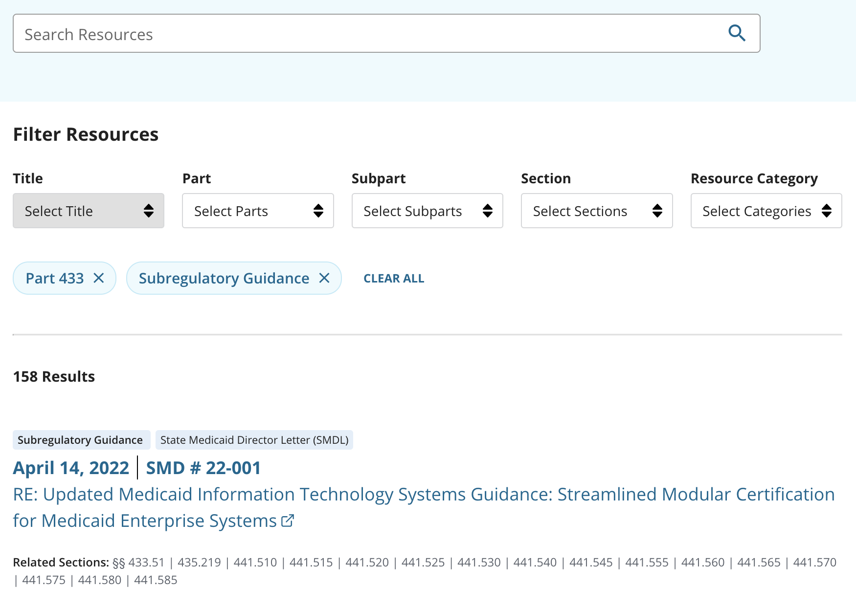
We presented three resource page concepts with filtering options intended to help policy researchers narrow in on supplemental content items:
- Keyword search box (not functional in this test)
- Location in the regulations (A and B had title/part/subpart/section; C had title/part/section)
- Resource category
- Concept C also presented options to sort the results by relevance, recency, regulation hierarchy, and resource type
Participants arrived on a resources page pre-filtered to show items relevant to the part and section that they came from. Next we asked them to find resources relevant to a different part and section, then narrow those to only a specific category of content.
We wanted to find out: which interface elements helped participants interpret and use these filters, what they thought of the filters overall, and whether we were missing anything important for helping people find relevant resources.
In general, the set of available filtering options made sense to people, and they didn’t have ideas for other types of filters they’d like to see for supplemental content.
Several participants wanted to use search as their first method of filtering, because they expected typing into the search box would be faster than clicking through the filters to apply them. People expected that searching for a citation would show resource items associated with that section.
People stumbled a little on the subpart drop-down filter in Concept A/B, which could have been because we asked them to look up resources associated with a part and section number (not a subpart). But citations are generally formatted as title + part + section, so that’s often how people navigate the regulations. Concept C didn’t have a subpart filter, and people didn’t seem to notice that it was missing.
The blue “chips” indicating selected filters made sense to people, and the “clear all” button helped them confidently choose a different filter. We didn’t get a chance to ask much about expectations for what would happen in the results if you selected multiple locations.
Most of the people who tried the results sorting options in concept C were looking for something else. Two people did talk about wanting to sort resources by date to see newest first.
We didn’t get much feedback on the search and filtering options displayed on the regulation page sidebars.
- If a person enters a citation into the keyword box (such as 433.112), display the items associated with that section
- Try alternative treatments for the “subpart” filter to ensure people know it’s optional - that you can skip it and go directly to selecting a section - or combine with section selection
- Keep the prominent “clear all” button
- We can start without results sorting options, then add sort by date, then see if the other options seem helpful. Also ok to start without search/sorting on sidebars.
- Make sure results are visible and drop-down lists work even when people are using low-resolution small laptop screens
Aspects of filtering that need further study (or at least further experimenting with a prototype):
- What do people expect to happen when they select multiple locations — do you get items associated with both of those locations, or everything in either location?
- If a person has entered filters and then enters a search keyword, does it search within the current filters, or does the keyword wipe the filters?
- When (if at all) should the subpart filter just display resources tagged to the subpart itself? When should it should resources tagged to the subpart and to any section in the subpart?
P1, P4, and P5 wanted to use search to navigate the resources page, including by typing in a citation number to find resources associated with that citation.
- P1 said they would try typing the citation number into the search field because using the filters requires more work and more clicking to get results
- P5 said they would use search if they knew the citation number and would use the filters if they weren’t sure about the exact citation
- P4 also said they would use search because it's faster
In particular, P4 was interested in being able to type in “435.110 CIB” to filter without clicking.
P2 was interested in searching by keyword, but they weren’t sure whether putting in a search would replace the current set of filters or search within the current set.
The subpart filter was designed to be optional because we knew people wouldn’t always know the subpart associated with a particular regulation section. When viewing the resources page, every participant opened the subpart filter, but only one (P3) applied a subpart filter. This participant seemed to assume filtering by subpart was required, and while the other participants eventually assumed it was optional, they initially interacted with it.
- After P3 filtered the results, they wondered if they could have gotten the same results without designating a subpart
- P4 opened the subpart filter, but didn't select a subpart because they thought the regulation they were asked to find was within the same subpart as the regulation the page was pre-filtered by
- P5 said the subpart filter threw them off because they don't usually filter by subpart. They liked that it was optional and thought some people might use it.
In Concepts A & B, which both had a noticeable 'Clear All' link, the majority of participants (P1, P3, P5) started by clearing the existing filters before applying new filters. This increased the success of getting what they wanted.
People found the resource category filter helpful, and it seemed to be labeled in a way that made sense to them.
We saw some additional ambiguity in how people interpreted “and” vs “or” in the filters.
In concept C, P1 expected the subpart filter to display “all resources for the subpart”. We didn’t follow up on exactly what they meant by that, but it seemed to mean resources related to all the sections in the subpart.
When P4 was looking at a page with an existing part filter, they selected another part (without removing the first one) and was unsure if they should have removed 435 - didn't think it would have made a difference. When two parts were showing in the “chips”, P4 expected to see resources related to either part, not just the intersection of the two parts.
People didn’t interact much with the sort options in concept C, but P2 and P3 asked for sorting by date, so that they could see the most recent items first.
Finding #5: The purpose and functionality of the Related Sections/Relevant Regulations UI is clear, and could be optimized
Testing note
We tested three prototypes with our participants. For the component discussed here, prototypes A and B (“Related Sections”) were identical, while prototype C (“Relevant Regulations”) had a different UI and different title.
Intended purpose
The purpose of the Related Sections/Relevant Regulations component is to reveal the connections between regulations and resources. This feature is unique to eRegulations and is something we want to emphasize with the multi-view layout, so we want to make sure that the connections are clear and easy to understand.
We also have an underlying goal from a content governance angle. Because the linkages between regulation and resource are all decided and implemented by humans, we want to surface the linkages so that we can increase the possibility of receiving feedback on our decisions.
Intended functionality
The functionality of the Related Sections/Relevant Regulations component is the same across prototypes A/B and C. This UI should enable people to jump directly from search results to sections within the regulation text pages. When people click on the listed section links (e.g. § 441.540), they are taken to the specific section within the subpart view, since this prototype version of eRegulations does not currently have a section view.
Findings: Understanding the purpose of the component
We asked people about the purpose of the Related Sections/Relevant Regulations components, with the goal of determining whether they could identify what the information was communicating. We found that in both prototype implementations, the majority of participants correctly assumed that this component listed sections that were related to the resource.
Deeper dive: Regulation/resource associations
The way we think of regulation/resource associations is “relevant to” or “related to”, but not necessarily directly mentioned in the resource text. Sometimes resources directly mention a section whose relevance is insignificant, and sometimes resources don’t directly mention a section but are clearly, obviously related to that section. People had a number of assumptions about the implied relationship between resource and section, and they were mostly incorrect. Assumptions included:
- This resource impacts all these related sections
- This shows any regulations associated with the resource
- These sections are mentioned in the resource
- These regulations are mentioned explicitly in the resource
Prototype C includes help text saying “This resource is linked to the following sections:” but it did not have any positive impact on user comprehension.
It is tough to figure out how to draw the line between “related enough to include” and “not related enough to warrant including.” Our team wrote an entire whitepaper (team Google Drive access required 🔒) about how we go about making these calls. Still, the relationship is not clear to our participants, so this is an area of further attention and study for us.
Findings: Clicking on section labels
We also asked people what they thought would happen if they clicked on a section label (e.g. § 441.540). In prototype A/B, all participants correctly assumed that clicking on a section label would open that regulation section within eRegulations. In prototype C, the majority of participants correctly made the same assumption, but the interaction design caused some participants to question how the sections would appear. It’s important to note that we asked participants this question while they were in the “View All Resources” splitscreen layout of prototype C, so their confusion could be resulting from the screen layout, rather than the component in isolation.
In prototype C, the Relevant Regulations component also appeared in the right panel within the standard view (i.e. before entering the “View All Resources” splitscreen layout). We did not receive any feedback on the component in this context. Since people didn’t seem to notice or use it, we are inferring that we don’t need the component in the right sidebar on prototype A/B.
Findings: UI feedback
We observed issues with a participant (P3) feeling distracted by the Related Section UI in prototype A/B. They noted that they wanted to focus on the core information for the resources first, and the related section information is a secondary need. We did not observe any similar issues with prototype C, in which the relevant regulations are hidden behind a dropdown. This indicates that the hidden UI in prototype C may be more favorable from an information overload standpoint. We were not able to directly test the A/B UI with a dropdown versus without, so this interaction needs more study in order to determine the optimal UI.
In terms of title for the component (“related sections” versus “relevant regulations”), we did not identify any strong reactions either way. We have a resource category for “related statutes” and we’ll be using “part/subpart/section” once the view switching component is implemented, so “related sections” is more consistent with other copy on the site.
We also want to improve the following UI elements:
- Add a hover state in for the section links that displays the section name
- Add link formatting
- Add UI for when we need to display a related subpart (we can tag resources as related to subparts as a whole)
- Adopt the UI of prototype A/B on the resources page
- Put the component behind a dropdown to reduce visual clutter, and test the implementation to see whether the dropdown significantly hinders discoverability
- Investigate further UI iterations that could clarify the relationship between regulation and resource as “related to” but not necessarily “explicitly mentioned in”
- Move forward with “related sections” title
- Design and implement the additional UI elements as listed above
Related Sections (A/B): Understanding the purpose of the component
When asked what the Related Sections is communicating in prototypes A/B, the majority of participants identified that the UI indicates all regulations/sections related to the resource. They did not all understand the nuance between “related to” vs “mentioned in,” however, as seen below.
- P1 assumed each resource would affect all of the related sections
- P5 thought each resource mentioned all of the related parts and sections
One participant (P3) found the UI to be unnecessarily complex - they felt that it presented too much information.
- P3 said they wanted to focus on the core information for each resource first (date, title, resource type) before drilling down to the related sections
Related Sections (A/B): Clicking on section labels
When asked what they thought would happen after clicking on a section label (e.g. § 441.540), all participants correctly assumed that the section would open.
One participant (P2) presented several options for what might happen; one of their guesses was correct, however, so the overall success rate is still strong.
- P2 thought the link might:
- Pull out excerpts
- Send them to the regulation section
- Tell them how many times the regulation section was cited
Relevant Regulations (C): Understanding the purpose of the component
When asked what the Related Sections is communicating in prototype C, the majority of participants identified that the UI indicates all regulations/sections related to the resource. Again, however, the participants did not identify the nuance of “related to” versus “explicitly mentioned in.”
- P5 assumed the relevant regulations were mentioned directly and explicitly in each resource
- P4 assumed the relevant regulations were mentioned within each resource
Relevant Regulations (C): Clicking on section labels
When asked what they thought would happen after clicking on a section label (e.g. § 441.540), the majority of participants correctly assumed that the section would open.
While the basic functionality was clear, the details of the interaction design caused some participants to question how the sections would appear. One participant (P4) guessed that the regulation would open in a new tab, while another (P5) wondered whether they would be taken back to the previous screen, and whether the filters would stay applied or not.
Less content was visible on a couple participant’s screens due to low screen resolution and screen magnification
- P2’s screen resolution was low and the bottom of the filter list (when viewing Concepts B and C) was difficult to see without a lot of scrolling
- The content on P3’s screen appeared to be magnified, which reduced the amount of content in their viewport
Test the revised designs on a variety of screen sizes, to ensure they’re easy to navigate regardless of screen size
Regulation content page
- Move forward with Concept B’s regulation content page
- Explore ways to make the View Section Resources button easier to access and more closely connected to its regulation section
- Explore ways to include a numerical count representing the number of section or subpart resources
- Explore ways to adjust the location or visual weight of the sidebar’s ‘Expand all’ link to increase its discoverability
- Iterate on the sidebar’s View All Resources button label
- Consider testing View All Resources button findability once new layout is finalized
- Consider incorporating Concept C’s handlebar UI to enable users to adjust the column width
Resources page
- Move forward with Concept A’s resources page
- If a person enters a citation into the keyword box (such as 433.112), display the items associated with that section
- Try alternative treatments for the “subpart” filter to ensure people know it’s optional — that you can skip it and go directly to selecting a section — or combine with section selection
- We can start without results sorting options, then add sort by date, then see if the other options seem helpful. Also ok to start without search/sorting on sidebars.
- Make sure results are visible and drop-down lists work even when people are using low-resolution small laptop screens
- Enable participants to toggle between a list and grid view
- Downplay the prominence of the related section links
- Consider putting the component behind a dropdown to reduce visual clutter, and test the implementation to see whether the dropdown significantly hinders discoverability
- Investigate further UI iterations of the related section links that could clarify the relationship between regulation and resource as “related to” but not necessarily “explicitly mentioned in”
Research questions
- Are people able to find and recognize the relevant guidance/supplemental content for the piece of regulation that they’re interested in?
- Are people able to understand the relationship between the regulations and the resources?
- Do they understand that resources are linked to sections? Can they tell which section a resource is linked to?
- Are people aware that resources are available, if they’re not displayed initially? (drawer and sidebar concepts)
- Do people understand the handlebar UI and do they think being able to resize the page columns is useful?
- Drawer concept: How do people react to the reading experience when the drawer is open?
- If they expand the drawer, do they find it useful to be able to expand and only focus on resources? Or is it disorienting?
- What do people think the ‘View All Resources’ button will do / where will it take them?
- When people get to the resources page (from the sidebar) do they understand why the page has been pre-filtered?
- Are people able to understand the concept of filtering accurately and can they find a specific resource?
- Do they understand the difference in scope between the resources alongside the regulations and the resource page itself?
- Are existing filter concepts suitable, or is there a need for additional filtering?
- Will people want to use the filters? How prominent should they be (hidden/exposed by default)?
- Do more people prefer the grid or list view? Are these toggles useful?
- Which concept performed better?
- Do people notice the jump-to feature in the header enough to use it?
Participants
We recruited 6 people all involved heavily in policy. We wound up with 5 participants total.