IndicativeListBox
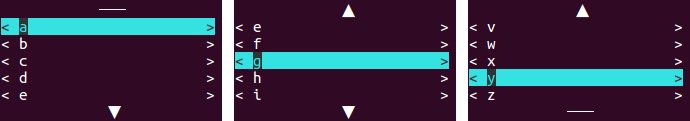
A urwid.ListBox does not make it obvious that due to limited space only a part of the list items is displayed. Therefore I've added bars at the top and bottom to indicate hidden elements.

In addition, the behavior has been changed so that the widget is more useful in combination with (vertical) containers such as urwid.Pile.
The original creator of this library is AFoeee.
-
body: list_like_object / urwid.ListWalker
Does contain the list items.
-
position= 0: int / IndicativeListBox.POSITION
Specifies the initial position. If the specified position is out of range, the next valid position is selected. -
on_selection_change= None: callable / None
A hook which is triggered when the selection changes. -
initialization_is_selection_change= False: bool
IfTrue, the hook is executed right after the initialization and every timeset_body()is called. -
modifier_key= MODIFIER_KEY.NONE: MODIFIER_KEY
Specifies a modifier that must be additionally pressed, so that the widget responds to input. For example, up becomes ctrl up.
That way the widget can be used in containers, even though those do use the same commands for navigation. -
return_unused_navigation_input= True: bool
If the list item at the top is selected and you navigate further upwards, the input is normally not swallowed by the list box, but passed on so that other widgets can interpret it. This may result in transferring the focus. -
topBar_align= "center": str
Text alignment mode – typically"left","center"or"right". -
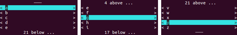
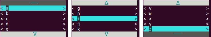
topBar_endCovered_prop= ("▲", None, None): indexable
Defines the appearance of the bar at the top when the first item is not visible. There are two color schemes, depending on whether the widget has the focus or not.
Expects anindexablelike("text", "palette_entry_when_focus", "palette_entry_when_offFocus").-
"text"is modified viastr.format(). That way"{}"is replaced by the number of hidden elements above the visible section.
Of course, this can be ignored and characters like"▼▲","ᐁᐃ","↓↑","⇩⇧"or"⬇⬆"can be used instead. -
"palette_entry_when_*"can beNoneor astrthat corresponds to a palette entry.
-
-
topBar_endExposed_prop= ("───", None, None): indexable
Defines the appearance of the bar at the top when the first item is visible. There are two color schemes, depending on whether the widget has the focus or not.
Expects anindexablelike("text", "palette_entry_when_focus", "palette_entry_when_offFocus").-
"text"markup to be displayed. -
"palette_entry_when_*"can beNoneor astrthat corresponds to a palette entry.
-
-
bottomBar_align= "center": str
See parametertopBar_align. -
bottomBar_endCovered_prop= ("▼", None, None): indexable
See parametertopBar_endCovered_prop(applied to the bottom). -
bottomBar_endExposed_prop= ("───", None, None): indexable
See parametertopBar_endExposed_prop(applied to the bottom). -
highlight_offFocus= None: str / None
Defines the color scheme of the selected list item when the widget does not have the focus. (Normally, the selection would only be highlighted as long as the widget has the focus.)
Can beNoneor astrthat corresponds to a palette entry.
These values can be passed instead of an int to methods which select list items.
-
LAST= 1
Represents the last valid index. -
MIDDLE= 2
Represents an index in the middle of the body. -
RANDOM= 3
Represents a random index.
-
get_body()-> urwid.ListWalker
Returns the body of the containedurwid.ListBox. -
body_len()-> int
Convenience method, that returns the number of elements in the body.
If the body is empty, it returns0. -
rearmost_position()-> int
Convenience method, that returns the last valid index.
If the body is empty, it returns-1. -
body_is_empty()-> bool
Convenience method, that returnsTrueif the body contains no elements. -
position_is_valid(position)-> bool
Convenience method, that returnsTrueif the passed position is a valid index.-
position: int
-
-
get_item(position)-> urwid.AttrMap / None
Returns the list item at the specified position orNoneif there is no such item.-
position: int
-
-
get_first_item()-> urwid.AttrMap / None
Convenience method, that returns the first list item orNoneif the body is empty. -
get_last_item()-> urwid.AttrMap / None
Convenience method, that returns the last list item orNoneif the body is empty. -
get_selected_item()-> urwid.AttrMap / None
Returns the selected list item orNoneif the body is empty. -
get_selected_position()-> int / None
Returns the selected position orNoneif the body is empty. -
first_item_is_selected()-> bool
Convenience method, that returnsTrueif the first list item is selected. -
last_item_is_selected()-> bool
Convenience method, that returnsTrueif the last list item is selected. -
set_body(body, *, alternative_position=None)-> None
Swaps the old list body with a new one.
An attempt is made to keep the currently selected position. If not possible the nearest valid position is selected.
It's also possible to specify an alternative position. If this position is out of range, the nearest valid position is selected.
Ifinitialization_is_selection_changewas set in the constructor, this method triggers theon_selection_changehook.-
body: list_like_object / urwid.ListWalker -
alternative_position: int / IndicativeListBox.POSITION / None
-
-
select_item(position)-> None
Select the specified position. If the position is out of range, the nearest valid postion is selected.-
position: int / IndicativeListBox.POSITION
-
-
select_first_item()-> None
Convenience method, that selects the first list item. -
select_last_item()-> None
Convenience method, that selects the last list item. -
delete_position(position)-> None
Deletes the list item at the specified position.-
position: int
-
-
delete_selected_position()-> None
Deletes the selected list item if there is one.
In the case that the body is empty nothing is done.
-
render(size, focus=False)-> urwid.Canvas
Has been overridden to perform the appearance update.-
size: iterable -
focus: bool
-
-
keypress(size, key)-> str / None
Has been overridden to interpret additional keys and, if necessary, swallow unused keystrokes.-
size: iterable -
key: str
-
-
mouse_event(size, event, button, col, row, focus)-> bool
Has been overridden to use the modified size. In addition, logic for the navigation via mouse was implemented.-
size: iterable -
event: str -
button: int -
col: int -
row: int -
focus: bool
-
-
_pass_key_to_contained_listbox(size, key)-> str / None
Passes keystrokes to the containedurwid.ListBoxand, if necessary, swallows the result.-
size: iterable -
key: str
-
-
_get_nearest_valid_position(position)-> int
If the position is in range, it will be returned. If it is out of range, the nearest valid position will be returned.-
position: int / IndicativeListBox.POSITION
-
-
_reset_highlighting()-> None
Resets the highlighted list item to its original value and causes the highlighting to be set again the next timerender()is called.
-
on_selection_change= None: callable / None
See constructor parameteron_selection_change.
-
_listbox: urwid.ListBox
The containedurwid.ListBox. -
_top_bar: urwid.AttrMap
Aurwid.Textwidget, which is wrapped in anurwid.AttrMap. -
_bottom_bar: urwid.AttrMap
See variable_top_bar. -
_topBar_endCovered_markup: str
The markup of the bar at the top when the first list item is not visible. -
_topBar_endCovered_focus: dict
During the initialization ofurwid.AttrMap, the value can be passed as non-dict. After initializing, its value can be manipulated by passing adict.
This is used to change the appearance of the bar at the top when the widget does have the focus. -
_topBar_endCovered_offFocus: dict
This is used to change the appearance of the bar at the top when the widget does not have the focus. -
_topBar_endExposed_markup: str
See variable_topBar_endCovered_markup. -
_topBar_endExposed_focus: dict
See variable_topBar_endCovered_focus. -
_topBar_endExposed_offFocus: dict
See variable_topBar_endCovered_offFocus. -
_bottomBar_endCovered_markup: str
See variable_topBar_endCovered_markup. -
_bottomBar_endCovered_focus: dict
See variable_topBar_endCovered_focus. -
_bottomBar_endCovered_offFocus: dict
See variable_topBar_endCovered_offFocus. -
_bottomBar_endExposed_markup: str
See variable_topBar_endCovered_markup. -
_bottomBar_endExposed_focus: dict
See variable_topBar_endCovered_focus. -
_bottomBar_endExposed_offFocus: dict
See variable_topBar_endCovered_offFocus. -
_highlight_offFocus: dict
See variable_topBar_endCovered_offFocus. -
_last_focus_state: bool / None
Stores the last focus state to prevent that changing the terminal size deletes the original appearance of a list item when off focus highlighted.
Nonerepresents the initialization value and indicates that an evaluation should be performed during rendering. -
_original_item_attr_map: dict / None
Stores the original appearance of the off focus highlighted list item. -
_initialization_is_selection_change: bool
See constructor parameterinitialization_is_selection_change. -
_modifier_key: MODIFIER_KEY
See constructor parametermodifier_key. -
_return_unused_navigation_input: bool
See constructor parameterreturn_unused_navigation_input.
-
up (↑) or down (↓) to move one row.
Visible rows can also be left clicked to select them. -
page up/down or mouse wheel up/down to move one list box length.
-
home or end to jump to the corresponding end.
-
The behavior can be changed by passing a
MODIFIER_KEYso that in addition to the navigation keys a corresponding modifier must be pressed. See constructor parametermodifier_key.
The module examples include an example application.
In the event that this code is a bit too complex, here are also some simpler examples.
The following examples focus on the creation of IndicativeListBox. They are actually executed in the context of the code below and can be inserted at # insert example here to make them executable.
#! /usr/bin/env python3
# -*- coding: utf-8 -*-

from urwid_picker_widgets import IndicativeListBox    # installed via pip
import urwid                                              # installed via pip

# Color schemes that specify the appearance off focus and on focus.
PALETTE = [("reveal_focus",              "black",            "light cyan",   "standout"),
           ("ilb_barActive_focus",       "dark cyan",        "light gray"),
           ("ilb_barActive_offFocus",    "light gray",       "dark gray"),
           ("ilb_barInactive_focus",     "light cyan",       "dark gray"),
           ("ilb_barInactive_offFocus",  "black",            "dark gray")]

# The list box is filled with buttons.
body = [urwid.Button(letter) for letter in "abcdefghijklmnopqrstuvwxyz"]

# Wrap the list items into an 'urwid.AttrMap', so that they have an other appearance when focused.
# Instead of an simple list-like object you can/should create a 'urwid.ListWalker'.
attr_body = [urwid.AttrMap(entry, None, "reveal_focus") for entry in body]

# insert example here

loop = urwid.MainLoop(ilb,
                      PALETTE)
loop.run()
To quit the test program, press ctrl + c.
ilb = IndicativeListBox(attr_body)
ilb = IndicativeListBox(attr_body,
                        topBar_endCovered_prop=("{} above ...", None, None),
                        bottomBar_endCovered_prop=("{} below ...", None, None))
ilb = IndicativeListBox(attr_body,
                        topBar_endCovered_prop=("ᐃ", "ilb_barActive_focus", "ilb_barActive_offFocus"),
                        topBar_endExposed_prop=("───", "ilb_barInactive_focus", "ilb_barInactive_offFocus"),
                        bottomBar_endCovered_prop=("ᐁ", "ilb_barActive_focus", "ilb_barActive_offFocus"),
                        bottomBar_endExposed_prop=("───", "ilb_barInactive_focus", "ilb_barInactive_offFocus"))
This example is not executed in the context described above, but stands alone.
#! /usr/bin/env python3
# -*- coding: utf-8 -*-

from urwid_picker_widgets import IndicativeListBox, MODIFIER_KEY    # installed via pip
import urwid                                                            # installed via pip

# Color schemes that specify the appearance off focus and on focus.
PALETTE = [("reveal_focus",              "black",            "light cyan",   "standout"),
           ("ilb_barActive_focus",       "dark cyan",        "light gray"),
           ("ilb_barActive_offFocus",    "light gray",       "dark gray"),
           ("ilb_barInactive_focus",     "light cyan",       "dark gray"),
           ("ilb_barInactive_offFocus",  "black",            "dark gray"),
           ("ilb_highlight_offFocus",    "black",            "dark cyan")]

# The list box is filled with buttons.
body = [urwid.Button(letter) for letter in "abcdefghijklmnopqrstuvwxyz"]

# Wrap the list items into an 'urwid.AttrMap', so that they have an other appearance when focused.
# Instead of an simple list-like object you can/should create a 'urwid.ListWalker'.
attr_body = [urwid.AttrMap(entry, None, "reveal_focus") for entry in body]

ilb = ilb = IndicativeListBox(attr_body,
                              modifier_key=MODIFIER_KEY.CTRL,
                              return_unused_navigation_input=False,
                              topBar_endCovered_prop=("ᐃ", "ilb_barActive_focus", "ilb_barActive_offFocus"),
                              topBar_endExposed_prop=("───", "ilb_barInactive_focus", "ilb_barInactive_offFocus"),
                              bottomBar_endCovered_prop=("ᐁ", "ilb_barActive_focus", "ilb_barActive_offFocus"),
                              bottomBar_endExposed_prop=("───", "ilb_barInactive_focus", "ilb_barInactive_offFocus"),
                              highlight_offFocus="ilb_highlight_offFocus")

pile = urwid.Pile([urwid.Text("The listbox responds only if 'ctrl' is pressed."),
                   urwid.Divider(" "),
                   urwid.Button("a button"),
                   urwid.BoxAdapter(ilb, 6),         # Wrap flow widget in box adapter
                   urwid.Button("another button")])


loop = urwid.MainLoop(urwid.Filler(pile, "top"),
                      PALETTE)
loop.run()
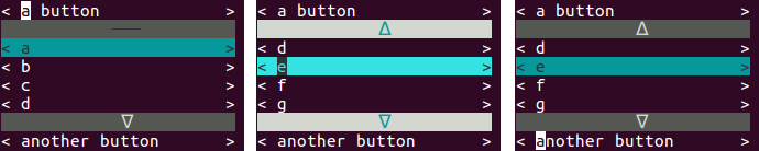
The IndicativeListBox does only respond if you press ctrl in addition to the navigation input.
To quit the test program, press ctrl + c.
-
If the selection changes and a callable was passed to the constructor, a hook is executed.
Optionally, the initialization andset_body()can also be considered as a selection change. -
To allow the selection of values even when the surrounding widget uses the same navigation keys, a
MODIFIER_KEYcan be passed. If so the widget will only respond to navigation input if the appropriate modifier is additionally pressed. (up -> ctrl up) -
return_unused_navigation_keystrokecan be used to make scrolling more convenient, as the arrow keys can be held pressed down without allowing the focus to move to the next widget. -
Every widget in
bodyis wrapped in anurwid.AttrMap. That way off-focus highlighting is enabled. -
The highlighting in
urwidis bound to the focus. This means that the selected item is only distinguishable as long as the widget has the focus.
Therefore, the off-focus highlighting is implemented by temporarily changing the color scheme of the selected item. This change is reversed as soon as the widget has the focus again, because then the regular highlighting takes effect. -
For convenience, positions that are out of range do not result in exceptions when selecting. Instead, the nearest valid position is used. (Negative values result in 0. Too large values result in the last index.)
-
The bars are really just
urwid.Textwidgets, that are wrapped inurwid.AttrMap. -
The change of the appearance takes place in the
render()method. That way it is possible to respond dynamically to changes in the size of the terminal. -
The procedure for determining which ends of the list are currently visible is a modification of
urwid.ListBox.ends_visible(). The only real difference is that in addition the number of elements above/below the displayed section is calculated.