从此开发者只用掌握一种 Button 组件,就够了。
支持圆角、边框、图标、特效、Loading 模式、高质感的 Neumorphism 风格。
主理人:纽特(coorchice.cb@alibaba-inc.com)

English | 简体中文
感觉还不错?请投出您的 Star 吧 🥰 !
-
丰富的 边角 效果
-
精美的 边框 装饰
-
渐变效果 也不在话下
-
灵活的 图标 支持
-
贴心的 Loading 模式
-
炫酷的交互 特效
-
更具空间感的 阴影
-
高质感的 Neumorphism 风格
| 参数 | 类型 | 必要 | 默认值 | 说明 |
|---|---|---|---|---|
| onPressed | VoidCallback | 是 | null | 点击回调。如果为 null,FButton 会进入不可用状态 |
| onPressedDown | VoidCallback | false | null | 按下时会回调 |
| onPressedUp | VoidCallback | false | null | 抬起时会回调 |
| onPressedCancel | VoidCallback | false | null | 按下取消时会回调 |
| height | double | 否 | null | 高度 |
| width | double | 否 | null | 宽度 |
| style | TextStyle | false | null | 文本样式 |
| disableStyle | TextStyle | false | null | 不可用文本样式 |
| alignment | Alignment | false | null | 对齐方式 |
| text | String | 否 | null | 按钮文本 |
| color | Color | 否 | null | 按钮颜色 |
| disabledColor | Color | 否 | null | FButton 不可用状态时的颜色 |
| padding | EdgeInsetsGeometry | 否 | null | FButton 内间距 |
| corner | FCorner | 否 | null | 配置 Widget 的边角 |
| cornerStyle | FCornerStyle | 否 | FCornerStyle.round | 配置 Widget 的边角样式。round-圆角,bevel-斜切 |
| strokeColor | Color | 否 | Colors.black | 边框颜色 |
| strokeWidth | double | 否 | 0 | 边框宽度。当 strokeWidth>0 时边框就会出现 |
| gradient | Gradient | 否 | null | 配置渐变色。会覆盖 color 属性 |
| activeMaskColor | Color | 否 | Colors.transparent | 按下时的蒙层颜色 |
| surfaceStyle | FSurface | false | FSurface.Flat | 表面的风格。默认 [FSurface.Flat]。详见 [FSurface] |
| 参数 | 类型 | 必要 | 默认值 | 说明 |
|---|---|---|---|---|
| clickEffect | bool | 否 | false | 是否启用点击特效 |
| hoverColor | Color | 否 | null | 鼠标悬停状态时 FButton 的颜色 |
| onHover | ValueChanged | false | null | 鼠标进入/退出组件范围时会回调 |
| highlightColor | Color | 否 | null | 触摸时 FButton 的颜色。需要 effect=true |
| 参数 | 类型 | 必要 | 默认值 | 说明 |
|---|---|---|---|---|
| shadowColor | Color | 否 | Colors.grey | 阴影颜色 |
| shadowOffset | Offset | 否 | Offset.zero | 阴影偏移 |
| shadowBlur | double | 否 | 1.0 | 阴影模糊程度,值越大,阴影范围越大 |
| 参数 | 类型 | 必要 | 默认值 | 说明 |
|---|---|---|---|---|
| image | Widget | 否 | null | 可为 FButton 配置一个图标 |
| imageMargin | double | 否 | 6.0 | 图标与文本的间距 |
| imageAlignment | ImageAlignment | 否 | ImageAlignment.left | 图标与文本的相对位置 |
| loading | bool | 否 | false | 是否进入 Loading 状态 |
| loadingWidget | Widget | false | null | loading 状态时的 Loading 小部件。会覆盖默认的 Loading 效果 |
| clickLoading | bool | 否 | false | 是否在点击 FButton 后进入 Loading 状态 |
| loadingColor | Color | 否 | null | Loading 的颜色 |
| loadingStrokeWidth | double | 否 | 4.0 | Loading 的宽度 |
| hideTextOnLoading | bool | 否 | false | Loading 状态下是否隐藏文本 |
| loadingText | String | 否 | null | Loading 状态下的文本 |
| loadingSize | double | 否 | 12 | Loading 的大小 |
| 参数 | 类型 | 必要 | 默认值 | 说明 |
|---|---|---|---|---|
| isSupportNeumorphism | bool | false | false | 是否支持 Neumorphism 风格。开启该项 [highlightColor] 将会失效 |
| lightOrientation | FLightOrientation | false | FLightOrientation.LeftTop | 当 [isSupportNeumorphism] 为 true 时有效。光源方向,分为左上、左下、右上、右下四个方向。用来控制光源照射方向,会影响高亮方向和阴影方向 |
| highlightShadowColor | Color | false | null | 开启 Neumorphism 风格后的,亮部阴影颜色 |
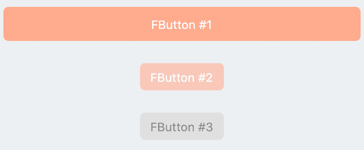
// FButton #1
FButton(
  height: 40,
  alignment: Alignment.center,
  text: "FButton #1",
  style: TextStyle(color: Colors.white),
  color: Color(0xffffab91),
  onPressed: () {},
)

// FButton #2
FButton(
  padding: const EdgeInsets.fromLTRB(12, 8, 12, 8),
  text: "FButton #2",
  style: TextStyle(color: Colors.white),
  color: Color(0xffffab91),
  corner: FCorner.all(6.0),
)

// FButton #3
FButton(
  padding: const EdgeInsets.fromLTRB(12, 8, 12, 8),
  text: "FButton #3",
  style: TextStyle(color: Colors.white),
  disableStyle: TextStyle(color: Colors.black38),
  color: Color(0xffF8AD36),

  /// 配置不可用颜色
  disabledColor: Colors.grey[300],
  corner: FCorner.all(6.0),
)
通过简单的配置 text 以及 onPressed,即可构造一个可用 FButton。
如果没有设置 onPressed,FButton 会自动被识别 未不可用状态 。此时 FButton 会有一个默认的不可用状态样式。
你也可以自由的配置 FButton 不可用状态下的样式通过 disabledXXX 属性。
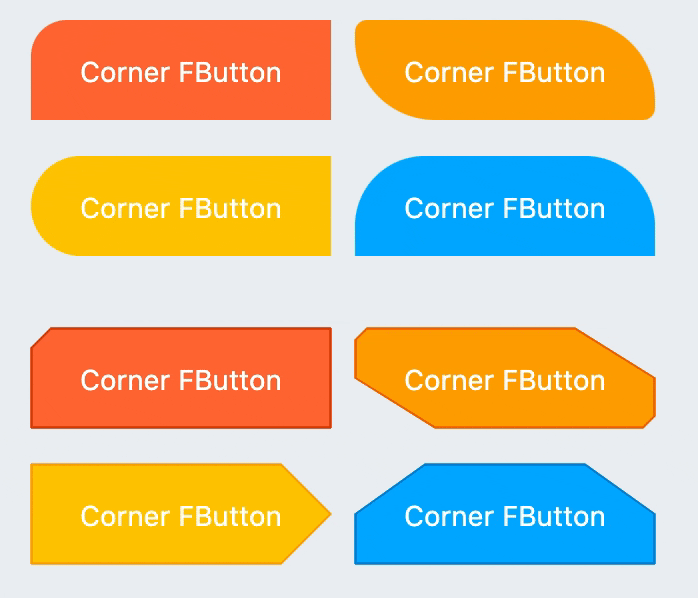
// #1
FButton(
  width: 130,
  text: "FButton #1",
  style: TextStyle(color: Colors.white),
  color: Color(0xffFF7043),
  onPressed: () {},
  clickEffect: true,

  /// 配置边角大小
  ///
  /// set corner size
  corner: FCorner.all(25),
),

// #2
FButton(
  width: 130,
  text: "FButton #2",
  style: TextStyle(color: Colors.white),
  color: Color(0xffFFA726),
  onPressed: () {},
  clickEffect: true,
  corner: FCorner(
    leftBottomCorner: 40,
    leftTopCorner: 6,
    rightTopCorner: 40,
    rightBottomCorner: 6,
  ),
),

// #3
FButton(
  width: 130,
  text: "FButton #3",
  style: TextStyle(color: Colors.white),
  color: Color(0xffFFc900),
  onPressed: () {},
  clickEffect: true,
  corner: FCorner(leftTopCorner: 10),

  /// 设置边角风格
  ///
  /// set corner style
  cornerStyle: FCornerStyle.bevel,
  strokeWidth: 0.5,
  strokeColor: Color(0xffF9A825),
),

// #4
FButton(
  width: 130,
  padding: EdgeInsets.fromLTRB(6, 16, 30, 16),
  text: "FButton #4",
  style: TextStyle(color: Colors.white),
  color: Color(0xff00B0FF),
  onPressed: () {},
  clickEffect: true,
  corner: FCorner(
      rightTopCorner: 25,
      rightBottomCorner: 25),
  cornerStyle: FCornerStyle.bevel,
  strokeWidth: 0.5,
  strokeColor: Color(0xff000000),
),
你可以为 FButton 添加圆角,通过 corner 属性。甚至,你可以单独控制每一个圆角。
默认情况下,FButton 的边角为圆角。通过设置 cornerStyle: FCornerStyle.bevel,可以获得斜角效果。
FButton 支持控件边框,前提是 strokeWidth > 0 即可获得效果 🥳。
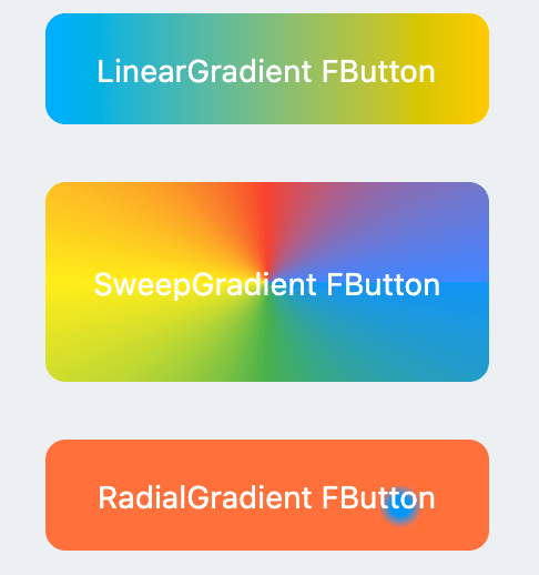
FButton(
  width: 100,
  height: 60,
  text: "#1",
  style: TextStyle(color: Colors.white),
  color: Color(0xffFFc900),

  /// 配置渐变色
  ///
  /// set gradient
  gradient: LinearGradient(colors: [
    Color(0xff00B0FF),
    Color(0xffFFc900),
  ]),
  onPressed: () {},
  clickEffect: true,
  corner: FCorner.all(8),
)
通过 gradient 属性,可以构建带有渐变色的 FButton 你可以自由构建多种类型的渐变色。
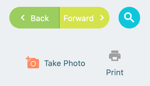
FButton(
  width: 88,
  height: 38,
  padding: EdgeInsets.all(0),
  text: "Back",
  style: TextStyle(color: Colors.white),
  color: Color(0xffffc900),
  onPressed: () {
    toast(context, "Back!");
  },
  clickEffect: true,
  corner: FCorner(
    leftTopCorner: 25,
    leftBottomCorner: 25,),

  /// 配置图标
  ///
  /// set icon
  image: Icon(
    Icons.arrow_back_ios,
    color: Colors.white,
    size: 12,
  ),

  /// 配置图标与文字的间距
  ///
  /// Configure the spacing between icon and text
  imageMargin: 8,
),

FButton(
  onPressed: () {},
  image: Icon(
    Icons.print,
    color: Colors.grey,
  ),
  imageMargin: 8,

  /// 配置图标与文字相对位置
  ///
  /// Configure the relative position of icons and text
  imageAlignment: ImageAlignment.top,
  text: "Print",
  style: TextStyle(color: textColor),
  color: Colors.transparent,
),
image 属性能够为 FButton 设置一个图片而且你能够调整图片相对与文本的位置,通过 imageAlignment。
如果按钮不需要背景,设置 color: Colors.transparent 即可。
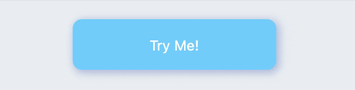
FButton(
  width: 200,
  text: "Try Me!",
  style: TextStyle(color: textColor),
  color: Color(0xffffc900),
  onPressed: () {},
  clickEffect: true,
  corner: FCorner.all(9),

  /// 配置按下时颜色
  ///
  /// set pressed color
  highlightColor: Color(0xffE65100).withOpacity(0.20),

  /// 配置 hover 状态时颜色
  ///
  /// set hover color
  hoverColor: Colors.redAccent.withOpacity(0.16),
),
通过 highlightColor 属性可以配置 FButton 的按压时的高亮颜色
hoverColor 可配置鼠标移到 FButton 范围中时的颜色,这在 Web 开发时会被用到。
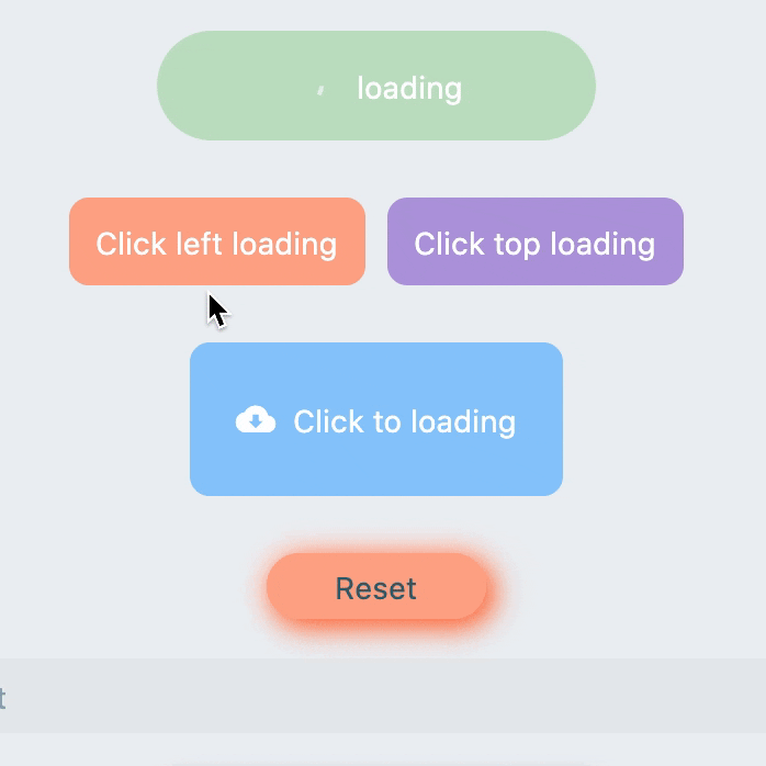
FButton(
  text: "Click top loading",
  style: TextStyle(color: textColor),
  color: Color(0xffffc900),
  ...

  /// 配置 loading 大小
  ///
  /// set loading size
  loadingSize: 15,

  /// 配置 loading 与文本的间距
  ///
  // Configure the spacing between loading and text
  imageMargin: 6,

  /// 配置 loading 的宽
  ///
  /// set loading width
  loadingStrokeWidth: 2,

  /// 是否支持点击自动开始 loading
  ///
  /// Whether to support automatic loading by clicking
  clickLoading: true,

  /// 配置 loading 的颜色
  ///
  /// set loading color
  loadingColor: Colors.white,

  /// 配置 loading 状态时的文本
  ///
  /// set loading text
  loadingText: "Loading...",

  /// 配置 loading 与文本的相对位置
  ///
  /// Configure the relative position of loading and text
  imageAlignment: ImageAlignment.top,
),

// #2
FButton(
  width: 170,
  height: 70,
  text: "Click to loading",
  style: TextStyle(color: textColor),
  color: Color(0xffffc900),
  onPressed: () { },
  ...
  imageMargin: 8,
  loadingSize: 15,
  loadingStrokeWidth: 2,
  clickLoading: true,
  loadingColor: Colors.white,
  loadingText: "Loading...",

  /// loading 时隐藏文本
  ///
  /// Hide text when loading
  hideTextOnLoading: true,
)


FButton(
  width: 170,
  height: 70,
  alignment: Alignment.center,
  text: "Click to loading",
  style: TextStyle(color: Colors.white),
  color: Color(0xff90caf9),
  ...
  imageMargin: 8,
  clickLoading: true,
  hideTextOnLoading: true,

  /// 配置自定义 loading 样式
  ///
  /// Configure custom loading style
  loadingWidget: CupertinoActivityIndicator(),
),
通过 loading 属性,可为 FButton 配置 Loading 效果。
当 FButton 处于 Loading 状态时,FButton 将会进入不可用状态,onPress 将不会再被触发,不可用样式也将被应用。
同时 loadingText 将会覆盖 text,如果它不为 null 的话。
通过 clickLoading 属性可以实现点击开始 Loading 的效果。
其中 loading 的位置会受到 imageAlignment 属性的影响。
当 hideTextOnLoading: true 时,如果 FButton 处于 loading 状态,那么其文本将会被隐藏起来。
通过 loadingWidget,开发者可以设置完全自定义的 loading 样式。
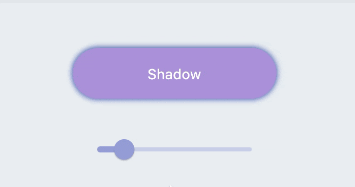
FButton(
  width: 200,
  text: "Shadow",
  textColor: Colors.white,
  color: Color(0xffffc900),
  onPressed: () {},
  clickEffect: true,
  corner: FCorner.all(28),

  /// 配置阴影颜色
  ///
  /// set shadow color
  shadowColor: Colors.black87,

  /// 设置组件高斯与阴影形状卷积的标准偏差。
  ///
  /// Sets the standard deviation of the component's Gaussian convolution with the shadow shape.
  shadowBlur: _shadowBlur,
),
FButton 允许配置阴影的颜色、大小、以及位置。
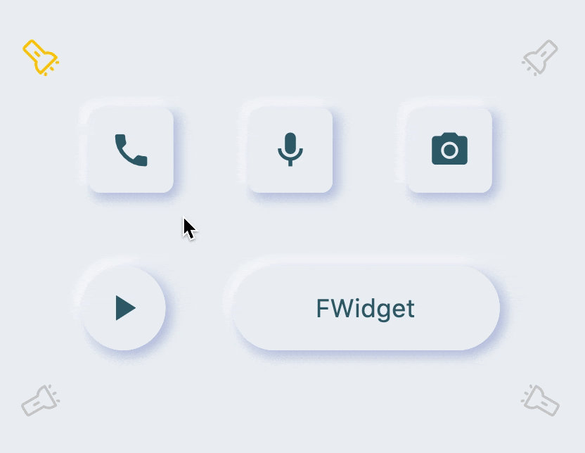
FButton(

  /// 开启 Neumorphism 支持
  ///
  /// Turn on Neumorphism support
  isSupportNeumorphism: true,

  /// 配置光源方向
  ///
  /// Configure light source direction
  lightOrientation: lightOrientation,

  /// 配置亮部阴影
  ///
  /// Configure highlight shadow
  highlightShadowColor: Colors.white,

  /// 配置暗部阴影
  ///
  /// Configure dark shadows
  shadowColor: mainShadowColor,
  strokeColor: mainBackgroundColor,
  strokeWidth: 3.0,
  width: 190,
  height: 60,
  text: "FWidget",
  style: TextStyle(
      color: mainTextTitleColor, fontSize: neumorphismSize_2_2),
  alignment: Alignment.center,
  color: mainBackgroundColor,
  ...
)
FButton 为开发者带来了不可思议的,超高质感的 Neumorphism 风格。
开发者只需要简单的通过配置 isSupportNeumorphism 参数,就可以开启和关闭 Neumorphism 风格。
如果想要调整 Neumorphism 的样式,可以通过 Shadow 相关的几个属性进行细微的调整,其中:
-
shadowColor: 配置暗部阴影
-
highlightShadowColor:配置亮部阴影
FButton 还提供了 lightOrientation 参数,甚至使得开发者能够调整关照角度,已获得不同的 Neumorphism 效果。
在项目 pubspec.yaml 文件中添加依赖:
dependencies:
  fbutton: ^<版本号>
⚠️ 注意,请到 pub 获取 FButton 最新版本号
dependencies:
  fbutton:
    git:
      url: 'git@github.com:Fliggy-Mobile/fbutton.git'
      ref: '<分支号 或 tag>'
⚠️ 注意,分支号 或 tag 请以 FButton 官方项目为准。
Copyright 2020-present Fliggy Android Team <alitrip_android@list.alibaba-inc.com>.

Licensed under the Apache License, Version 2.0 (the "License");
you may not use this file except in compliance with the License.
You may obtain a copy of the License at following link.

    http://www.apache.org/licenses/LICENSE-2.0

Unless required by applicable law or agreed to in writing, software
distributed under the License is distributed on an "AS IS" BASIS,
WITHOUT WARRANTIES OR CONDITIONS OF ANY KIND, either express or implied.
See the License for the specific language governing permissions and
limitations under the License.
感觉还不错?请投出您的 Star 吧 🥰 !
1.clone 工程到本地
2.进入工程 example 目录,运行以下命令
flutter create .
3.运行 example 中的 Demo