Is this the future of web design polymorphic?
I've been working in web design for the past decade and some would say that we have never had it so easy. The plethora of techniques we now have to layout content on the web would make most people's minds boggle. But has all this new stuff actually make our life easier or has every solution just unearthed a new set of problems?
In this article we will be looking at how layout on the web went from fixed to fluid and fluid to responsive. Asking ourslves, what's next? Examining if APIs like ResizeObserver can be used in combination with frontend frameworks to help us emulate the legendary element query. Finally we will be creating some self aware UI.
If you are well aware of the history of responsive we design then I suggest you skip the history lesson that is the next couple thousand words and jump straight to the "but now we have flexbox and media queries what more could we want" section.
A long time ago the web was static. These were simpler times, when even the most technologically advanced web sites (like facebook) required users to refresh the page by hitting the "home button" for new content; there was no pull down to refresh or infinite scrolling. Furthermore these sites tended to only render at a single fixed width because the vast majority of people interacted with these sites on a desktop computer in a browser which took up the full width of their screen.
Fifteen years ago media queries weren't really a thing, ten years ago there was no flexbox, five years ago there was no CSS grid; there just wasn't much need for these things. Everyone was quite content with a 960 pixel grid system and a few percentage widths if you were lucky.
Then the iPhone happened; a handheld device with a fully fledged web browser. It quickly became very popular. The introduction of a new device that people were consuming the world wide web on, with a screen width almost a third of the gold standard and with no physical mouse and keyboard came as quite a shock to the ecosystem.
We weren't prepared for this..
For a long time users were expected to just lump it whilst we figured out how to make our fixed width work on mobile. We didn't have the tools and techniques to accommodate this change, nor the vocabulary as designers or developers either.
Eventually, a fix came along in the form of dedicated mobile websites. These would commonly (and still do, but much less frequently) live under the m subdomain. The server would do some user agent sniffing and if it detected that the client was a handheld device then it would redirect the user to a URL like m.website.com.
This kind of hard binary switching became pretty common place for sites that didn't want to (or that couldn't afford to) build and publish dedicated native mobile applications. In fact, this approach is still actually preferred by quite a few companies, perhaps most notably facebook dot com.
Everyone was quite content with this solution for a while and the mobile web slowly became a little more tolerable. Sure, companies now had to maintain two codebases – one for mobile and one for desktop, which cost more, but not nearly as much as maintaining a native app; at least both interfaces could be written in the same languages HTML/CSS/JS and served up by the same stack.
Then the iPad happened and chaos once again ensued.
Which website do we serve to a tablet? Oriented in portrait the viewport dimensions resemble a mobile device.. but in landscape it exhibits desktop like properties. Regardless, the user agent is going to indicate that the UI was being rendered on a mobile device and so serve up the mobile version anyway. That's awkward. Everything looks all stretched out. We'd nailed the 960px layout and the 320px layout but hadn't considered all the widths in between.
We were in a bit of a stuck again. The "view the desktop version of this site" prompt became a thing; which forced the desktop version of the site to be served up even if you were browsing on mobile or tablet.
Not even Apple had figured out how to accommodate this new screen size. Their solution was to offer up a 2x button for native apps, this would scale an app intended for iPhone proportionally, in order to fill the viewport. That's awkward. Everything looks pixelated now.
Eventually some forward thinking web developers had an idea. Instead of switching subdomains based on user agent, why don't we switch layout based off of the viewport width. This seemed kinda obvious once it had been thought out loud.
If only there was some mechanism of detecting the viewport width from within CSS itself. That would be nice. Oh look, there has been "media" detection since CSS2, this allows you to define different styles for print and screen. Interesting. A few specification drafts and requests for comments later the ability to query not just the media type but the dimensions – width, height and orientation – of the viewport from within CSS was supported by most browsers.
It opened up the doors to all kinds of possibilities and layout permutations. This was lucky because soon enough there weren't just 3 screen sizes to worry about, there were quite literally hundreds.
So now that we had media queries what excuse did we have for our web sites not looking great on every device? Well to be honest, a lot of the more simple layouts common to the web – like a blogging site or those that revolved around a single column feed – were starting to look pretty good in most viewports, others were passable.
With this weight lifted, layouts started to become more and more intricate.
As developers and designers now however, it felt like there wasso much to consider now. Before, when we had dedicated mobile and desktop sites, things were pretty binary. If you were lucky, you worked in a company where there was one team dedicated for each platform. Each team would design, build and test one layout. But spinning up another team whenever a new device came out was a scalable approach. Yet the expectation for a mobile friendly interface to morph and adapt to fill available space on desktop was more real than ever.
It became apparent that this kind of polymorphic layout was a hard problem to solve. Like really hard. Even with media queries it was non trivial.
From what I could tell, the problem with media queries are twofold:
- Firstly, they are global and this really didn't align with the notion of "components" slowly being popularised by libraries like angular, vue and react. Mapping styles to markup at all the common breakpoints (360, 540, 720, 900, 1080) became unwieldy, hard to make guarantees about and thus time consuming to test.
- Secondly, they were verbose in nature by nature. Essentially media queries translate to a load of if statements. Elements were still blissfully dumb and unaware of their surroundings; their parent or siblings. This meant you had to be very prescriptive about everything.
So we prayed to the CSS gods once more. This time, they delivered us the flexbox specification. An API that seemed to promise everything.
The Flexbox Layout (Flexible Box) module (a W3C Candidate Recommendation as of October 2017) aims at providing a more efficient way to lay out, align and distribute space among items in a container, even when their size is unknown and/or dynamic.
https://css-tricks.com/snippets/css/a-guide-to-flexbox/#flexbox-background
It was a much more "flexible" way of describing layouts. Instead of prescribing exactly how some UI should be laid out on a page, we were able to set tolerable bounds. It was now possible to make children of a flex container grow or shrink to take up available space and to share space rationally amongst themselves based on values like intrinsic widths.
It felt crazy powerful. Like elements on the page had become self aware. Furthermore, these rules were not global, they were scoped to an element by selectors just like other CSS properties.
Flexbox kept us busy for a while.. teams started refactoring everything to be flex (even things that probably shouldn't have been flexed). It certainly didn't solve every problem, but it did reduce the need for media queries in a lot of instances. This seemed to make everyone happy.
However, in typical developer fashion, the more we have we have, the more we want. It seemed like the combination of media queries and flexbox – as powerful as it may be – was still not enough for some people.
Then one day someone came up with the idea of "element queries". A notion whereby developers could control the stylistic properties of an element based on its size. Not the media type, not on the size of the viewport but on the size that the element itself was being rendered within its parent. This was quite a novel thought and lined up quite conveniently with the component model that frameworks operated under the premise of (which by now almost everyone was adjusted to).
The idea spread like wildfire. It has even been claimed that "container queries" (which they became more commonly known) was and is the most requested CSS feature of all time! Well.. I hear you thinking, it does sound pretty powerful. Of course W3C thought the same and surely they got straight to implementing it? That's why you are writing this blog post.. right?
Well no. The thing is, container queries are a bit trickier to implement than you might first think. When you start to ponder about it, everything starts to get a bit loopy, and if you think about it enough, then you might go loopy too.
Imagine a scenario whereby container queries exist, you have a child element (an image) within a parent element (a div). The image element is told to be display none until the width of the parent div is less than 320px wide, then the image is told to be display block. The parent reaches 319px and the image renders, but uh oh.. the image turns out to be 480px wide! This props open the parent element making its width larger than 320px causing it to hide the image, but now the parent has no contents it reverts back to 319px showing the image again. Repeat ad infinitum.
This is perhaps a contrived example but hopefully you get the idea and can imagine how the issue might rear its ugly head in various other scenarios too.
So in short, the main issue with supporting container queries natively in CSS is that it makes creating infinite loops and cyclic dependencies all too easy. This kind of endless recursion would block up the UI thread entirely and would eventually crash the browser. No bueno.
So that's it.. we can't have nice things because of infinite loops?
Well kind of, the consensus is that container queries are probably not going to be implemented in CSS any time soon (if ever, here is the spec draft) but in typical frontend developer fashion, we could implement something similar in JavaScript.
Some developers, when they get an idea into their head, just can't get it out until they have run a few experiments themselves to prove or disprove their thesis. The idea of a container query here was no exception. Many people tried and a lot succeeded in creating an implementation that worked.
One popular example of such an implementation is EQCSS by Tommy Hodgins and Maxime Euzière. More than an implementation in fact, it is a specification that clearly outlines what the syntax should look like in order to be in keeping with similar CSS functions like media queries.
/* Element Query */
@element div and (min-width: 500px) {
  :self {
    background: lime;
  }
}
Above is a snippet from the EQCSS documentation. Notice that the @element directive works similarly to the way @media works today. What the above statement says is that, when any div on the page is larger than 500px then it should get the rule background: lime applied to itself. Easy.
Obviously this isn't valid CSS syntax (as much as some people wished it was) so a compiler was written which takes this custom syntax and transforms it into a valid CSS equivalent. At the time this plugin was written there was only one realistic way to go about finding elements in the document and applying styles to them and that was nesting document.querySelector inside of a window.resize event listener.
This was, in essence how EQCSS worked:
// On resize, scroll, input, click, mousedown + mousemove, call EQCSS.throttle.
window.addEventListener('resize', EQCSS.throttle)
window.addEventListener('input', EQCSS.throttle)
window.addEventListener('click', EQCSS.throttle)
...
It would listen out for every interaction that could possibly cause an element to change size, upon hearing such an event had fired, then check the size of all the elements on the page and see if any of them needed new styles applying.
Although it was possible to bind click or scroll event listeners to native HTML elements, there was no element level resize listener. The resize event was reserved for the window object only. This is inconvenient when trying to observe the changes of specific elements. When the window changes size you then have to check everything to see if anything you care about has changed size.
Not only is this limitation inconvenient, in the scheme of things it is pretty inefficient too. This is probably why a throttle function was employed; it would limit main thread thrashing as resize events poured in. But all of this was necessary at the time because there was literally no other way to go about it. This was the best we got and although it worked, you could feel it processing. Furthermore it didn't really protect against the dreaded infinite loops that might crash your browser.
What we needed was something like element.addEventListener('resize', callback) and for years we waited. Then in around February 2020, a wild proposal appeared titled Resize Observer.
The
ResizeObserverAPI is an interface for observing changes to Element’s size. It is an Element's counterpart to window.resize event.
Oh wowow. This is pretty much exactly what we'd been asking for. So much room for activities! It sounded great. Unfortunately it turns out that the API wasn't quite as straightforward as adding an event listener to an element.
Instead, you would create a listener to operate on a subset of elements:
// Register instructions to execute
const ro = new ResizeObserver((entries) => {
  for (let entry of entries) {
    if (entry.contentRect.width > 500)
      entry.target.style.background = 'limegreen';
  }
});
// Pass in elements to execute on
ro.observe(document.querySelector('div'));
The above snippet exhibits the same behaviour as the EQCSS example mentioned in the previous section; targeting any div over 500px wide and making its background lime green. Personally I'm not the biggest fan of this API but I'm sure it was done for good reason and to be honest it is perfectly workable. Furthermore it addresses the infinite loop issue!
As Surma from Google explains very well in his blog on this topic:
ResizeObserver has a mechanism to avoid infinite callback loops. Changes will only be processed in the same frame if the resized element is deeper in the DOM tree than the shallowest element processed in the previous callback. Otherwise, they'll get deferred to the next frame.
He offers a nice simile in a video with Jake Archibald too:
It's like reverse event bubbling ... you can only have multiple invocations of your callbacks downwards.
Strictly speaking, this won't stop infinite loops, but rather defers future looping to the next frame. Meaning that it won't block the main thread indefinitely.
So we still need to be thoughtful about how we apply ResizeObserver but at least we can be sure (or at least presume) that it is doing its job in the most efficient manner properly. This is a nice guarantee to have.
Ok. So we got exactly what we asked for; essentially a super shiny platform level implementation of container queries that allows us to efficiently apply styles to an element – based on properties like width and height – whenever an element changes size. But, that was a long story.. remind me, why did we want this again? What a great question.
Did we just make up a problem then make up a solution to it? Probably. But now that this API is supported by most modern browsers, let's explore the possibilities a bit futher.
I created responsive styles using media queries that displayed the table element correctly for browsers of different sizes. But as soon as one of those responsive tables was displayed in a template that contained a sidebar, suddenly all of my responsive breakpoints turned into responsive brokepoints. They simply didn’t account for the 200-pixel-wide sidebar, causing things to overlap and appear broken.
This is a quote from Tommy Hodgins in the article Element Queries, And How You Can Use Them Today. It highlights exactly the kind of scenario under which container queries might be prefered over media queries. In fact Tommy went much further than that, making a load of demos that demonstrate numerous applications of EQCSS; featuring but not limited to responsive aspect ratios, grids, cards, calendars, titles, media players, modals, navs, tables and icons.
This plethora of examples was enough to inspire me to make some demos for myself and write this blog post!
A lot of the EQCSS demos I found appeared to have been published quite a while ago in JS terms (like over a year). I noticed that they don't rely on a frontend framework either. Usually I'm a proponent of a dependency free approach like this but figured that most web UI I work on nowadays is powered by either react or preact, so any demos I was going to make should probably be set up to work with that kind of stack.
I like to use preact for small demos like this. The API is practically identical to that of react but the packages itself is a fraction of the size so everything loads a bit quicker. Anyway, that is besides the point, what I'm trying to get to here is that these days, if we want to register listeners like ResizeObserver on virtual dom elements then we use hooks.
After a bit of hacking, I ended up with a resize observer hook that look something like this:
const useResizeObserver = () => {
  const ref = useRef(null);
  const [state, setState] = useState({ width: 0, height: 0 });

  const ro = new ResizeObserver((entries) => {
    const { width, height } = entries[0].contentRect;
    setState({
      width: Math.round(width),
      height: Math.round(height),
    });
  });

  useEffect(() => {
    if (!ref.current) return;
    const element = ref.current;
    ro.observe(element);
    return () => ro.unobserve(element);
  }, [ref]);

  return { ref, ...state };
};
It might look like some complicated code, but what it does is relatively simple and it allows us to hook into the observed size of a particular element ref.current in an especially nice way when building components.
const ResponsiveComponents = () => {
  const { ref, width, height } = useResizeObserver();
  return (
    <div ref={ref}>
      {width} x {height}
    </div>
  );
};
This is looking good, what's more.. it actually worked:

Sweet. Now we have a template component structure we can work with. I was curious to see what would happen if you tried to render lots of these things, like 1000? We know one bottleneck of EQCSS is the global window.resize listener querying all the elements (so much so it was throttled by default) and that the ResizeObserver was meant to be an efficient alternative in this regard. Would my browser grind to a halt?
Somewhat to my surprise one thousand ResponsiveComponent components on a page, actually rendered pretty damn smoothly. It felt remarkably responsive when interacting with individual elements and OK when resizing the whole browser window. Admittedly the components weren't really having to do much other than render text content, but it's worth noting that in reality you probably won't need (at least it's not advisable) to render that many components with resize observers attached anyway.
It was my first attempt at a stress test for the ResizeObserver and it had passed.
All that's left to do now is take everything we have ever learnt about creating interfaces with media queries.. and completely forget it. Try to make some components using a completely different mental model, that are actually useful.
It was about this point that I realised this was the tricky bit.
Creating novel and compelling examples for something like this is hard. It suddenly dawned on me that there are many cases where container queries are not or should not be required. Generally, content imposes its requirements on a layout and the layout does its best to adapt in order to accommodate it. Rarely does layout dictate content, but it felt like this is where the power of container queries lay.
So I thought screw it, let's try to make a typical card UI and see what happens!
Inspiration for this came from the new iOS 14 homescreen widgets. The general idea being that the more real estate a widget on the homepage was assigned, the more content it revealed. Applying this to a media card resulted in something like:
A card starts out being just a shortTitle with a background image. But as it grows, a longer title appears, then a shortDescription, a longer description and a subTitle. Random text content was generated by a small library I wrote called ipsum and the images came from unsplash.
What was kind of crazy here, is that because we were in JavaScript land, we were able to describe not only what styles to apply but also what markup to render at any given size. Taking this line of thought a bit further, you could imagine customizing behaviours (like onclick or onhover) based on a components size.
It is quite satisfying to watch and kind of nice the way the card "filled up" vertically as its horizonal space grew. This gave me an idea.
Flexbox has this awkward thing it does whereby when two or more siblings in a flex container no longer fit onto a single row, they wrap onto the next "line" a bit like text does. But that sounds great, you might be thinking and you'd be half right. It is cool that siblings squish together until they can't but when they break they go from being very narrow to very wide. This dramatic shift in dimension looks very unnatural more often than not.
I figured that cards filling up vertically with content would make especially elongated cards – like those that were flex children who had just wrapped – look much less sparse and awkward.
At first, three Responsive Cards were added to a flex container.

They were all flexible enough to fit on one row until they weren't, then they broke onto the next line as expected. But instead of ending up with two regular sized cards and one really stretched looking one. Everything appeared quite balanced. The two at the top had expanded to show a title and short description, the one at the bottom had reached the size where it could justify showing a subtitle too.

This was an unexpected side effect of the container query approach and it worked quite nicely but got me wondering, could we make this layout more interesting? It felt quite rigid still at the moment.
To add a bit of variety, I thought about giving each card a sort of "priority" value. This was a numerical value which mapped directly to the elements flex-basis or its ideal width. What that means is if two cards are sharing a single row and one has priority 480 then it will render approximately double the size of the other that has a priority of 240. Maybe in reality this value could be derived from a cards popularity metric such as how many clicks it got or how many comments it had, something like that.

It worked pretty well for one row even! Already way more visually appealing than seeing three of the same cards in a row. I went ahead and added a load more of these responsive card components to the grid to see what happened.

Woah.. I was not expecting that! The varying widths were not only creating some nice patterns in the horizontal axis, but the varying amount of content appearing because of the container query approach was adding some realy dynamism to vertical flow too. Smaller cards were being stretched taller when placed next to wider cards that contained more content. Furthermore, when the browser got resized it would push some cards onto the next line which would result in a new combinations of siblings and thus render totally different layouts. Pretty powerful stuff!
It was nice to be able to just throw items – seemingly randomly – into a grid and it "just work" at a variety of sizes without writing a single media query!
Whilst on the topic of grids (and with this new fangled granularity when it comes to applying styles when an element is at a given width or height) there was something else I wanted to iron out. Something that had always annoyed me about grids, and that is maintaining a sensible "gap" between items.
In the example above I'd been using using the CSS property gap which has not landed in all browsers yet (just safari actually) and given it a generous value of 3rem because I wanted the grid to feel nice and relaxed. The problem here becomes apparent when you resize the grid down to the size of an mobile phone say. Suddenly 3rem of gap looks rediculous!
Lets try fix that with container queries:

In this is example I chose to use CSS grid instead of flexbox but the idea is the same for both. All that's happening here is an appropriate gap (and padding because why not) value is being chosen from a list of possible values, every time the container element width changes:
const { ref, width, height } = useResizeObserver();
let gap;
switch (true) {
  case width > 720:
    gap = '3rem';
    break;
  case width > 540:
    gap = '2rem';
    break;
  case width > 360:
    gap = '1rem';
    break;
  default:
    gap = '0.5rem';
    break;
}
This isn't rocket science but it's not like anything we have ever been able to do efficiently before and felt like it could be quite a useful generic component. Perhaps you can now imagine components picking values for themselves like this from a theme defined set of breakpoints and spacing units perhaps.
The more adventurous folk might like to try using scalar values for gap, proportional to the elements width:
Grid with smooth responsive gap and padding
This produces a much smoother looking result but at the cost of some consistency; if you had multiple containers like this in a view then there would be a mismatch of gap and padding values all over which might look amiss. This approach reminded me of viewport units which, would have essentially exactly the same affect on a grid that was full screen.
Pondering over the similarities between a element based scalar approach like gap: ${elementWidth * 0.03} and a viewport unit approach like gap: 3vw made me realise that the real benefit of the resize observer had not really been demonstrated clearly yet.
Remembering what Tommy Hodgin had said all that time ago:
But as soon as one of those responsive tables was displayed in a template that contained a sidebar, suddenly all of my responsive breakpoints turned into responsive brokepoints.
I decided it was time to put the responsive cards and the grid component to the test in more or a "real world" setting. A typical "list and detail" layout, whereby a list of media cards are displayed with some filter options, and when a user clicks on a card, the detail view is rendered in an aside panel adjacent to the list.
Something like this:
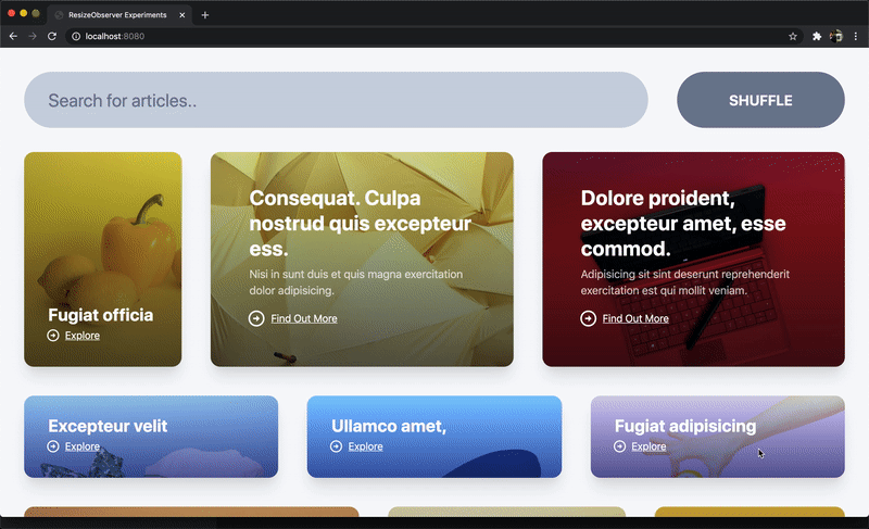
Now the effects are subtle here (compelling examples are hard to make) but everythings seems to be working as it should. The cards lay themselves out and choose what content to show based on their width, when the details pane is opened, it forces the grid itself to become smaller which in turn reduces the gap between the cards. You might notice as well that the font size of the search input also reduces somewhat when the aside panel is open and thats because it has a resize observer on it too!
You can play around with this interface here: http://stack.formidable.com/resize-observer-experiments/index.html
Now, admittedly this demo isn't totally groundbreaking and quite contrived :sweatsmile: but hopefully it serves as inspiration at least, a glimpse at a possible future where components are more self aware like this. It's really interesting to see how all these independantly "responsive" components can be combined to create an interface that works as a whole.
I feel like we have only just scratched the surface when it comes to uncovering whats possible with container queries in JS. The ability to modify markup and/or styles reactively at runtime, in an efficient manner like this is certainly a powerful thing, but it requires a lot of careful consideration to get right and it is certainly not applicable everywhere.
It would be fun to play around with some more elements like calendars, clocks, media players, modals, navs, tables and icons as I think nearly all of them could be enriched in one way or another by employing techniques similar to those outlined in this article.
Unfortunately that is all I have time for now. Sincere thanks for reading this far, I hope you learnt something. If you would like to contact me please do so on twitter @lukejacksonn or on GitHub.
Archived: This project is no longer maintained by Formidable. We are no longer responding to issues or pull requests unless they relate to security concerns. We encourage interested developers to fork this project and make it their own!