
Readme here: Readme in English | Readme in Chinese (中文)
This widget provide a Ant Design Button in Mendix. Clicking a Button will trigger some actions/logics in Mendix.
-
5 type of button provided:
- Primary button: indicate the main action, one primary button at most in one section.
- Default button: indicate a series of actions without priority.
- Dashed button: used for adding action commonly.
- Text button: used for the most secondary action.
- Link button: used for external links.
-
And 3 other properties additionally.
- danger: used for actions of risk, like deletion or authorization.
- ghost: used in situations with complex background, home pages usually.
- disabled: when actions are not available.
-
If a large or small button is desired, set the size property to either large or small respectively. Omit the size property for a button with the default size.
-
3 shapes options: Default, Circle, Round.
-
block property will make the button fit to its parent width.
- Download the mpk file from here.
- Copy the mpk file to your Mendix Project directory
{YourMendixProjectFolder}/widgets/. - Open your Mendix Project with Mendix Studio Pro and click on the menu
Menu > App > Synchronize App Directory.
-
Add widget
Antd Buttonto a Page. -
Config the parameters, including:
Caption,Type,Shape,Size,Block,OnClick Eventand etc.
-
Run the project locally and check.
- You can access the online demo from here to show the features of this widget.
- You can also download the demo project to run it on your own PC.
- Caption:button text.
- Button Type:button type.
- Button Shape:button shape.
- Button Size:button size.
- Button Block:full width as parent or not.
- Disabled:status default as
No. - Danger:status default as
No. - Ghost:status default as
No.
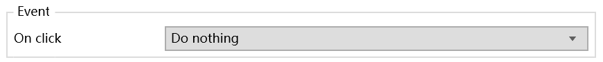
- OnClick Event:button event.
Here is a list of all the properties of Button in antd, with a description of whether this widget supports the property and why it does not. To see the meaning of the original property in antd, please move here.
| antd properties | Description | Supproted | Comments |
|---|---|---|---|
| block | fit width as the parent | Y | |
| danger | danger status | Y | |
| disabled | disabled status | Y | |
| ghost | make background transparent and invert text and border colors | Y | |
| href | Redirect url of link button | N | No need in Mendix |
| icon | Set the icon component of button | N | WIP |
| loading | Loading status | N | WIP |
| shape | Button shape | Y | |
| size | Button size | Y | |
| target | Same as target attribute of a, works when href is specified | N | No need in Mendix |
| type | Button Type | Y | |
| onClick | OnClick event | Y |
[link to GitHub issues]
- Install NPM package dependencies by using:
npm install. If you use NPM v7.x.x, which can be checked by executingnpm -v, execute:npm install --legacy-peer-deps. - Run
npm startto watch for code changes. On every change:- the widget will be bundled;
- the bundle will be included in a
distfolder in the root directory of the project; - the bundle will be included in the
deploymentandwidgetsfolder of the Mendix test project.