Add Theme Preview #513
Comments
|
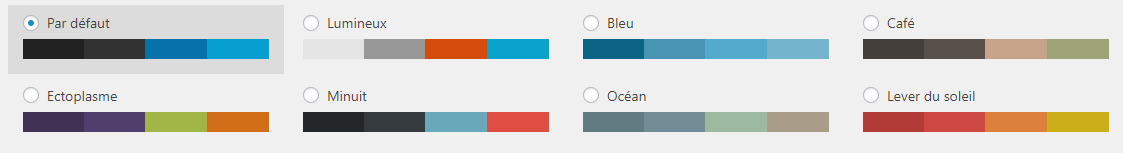
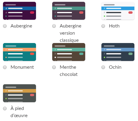
Another simple and elegant solution might be a "color palette" of the theme's main colors, like the one you can find in WordPress profile edit page
or a very basic illustration like in Slack settings.
|
|
Hi, this feature would be useful for sure....it's a bit annoying to restart the app every time :/ Unfortunately I'm out of time otherwhise I would collaborate for this. Bye |
|
..Or at least include a link to screenshots on the website! With no previews Anywhere, there is a huge disconnect with time and effort people have devoted to creating themes, and the ability for users to actually use them. If there is a webpage (anywhere) showing the themes, can somebody please include a link here - google search did not turn up any such page, but did bring up this one :-) Simply adding a page on your website with screenshots, is low overhead, requires no software changes, and could be done in a matter of hours. Or maybe somebody wants to make a blog post highlighting theme options..? (I don't have a blog, so..) Thanks. |
|
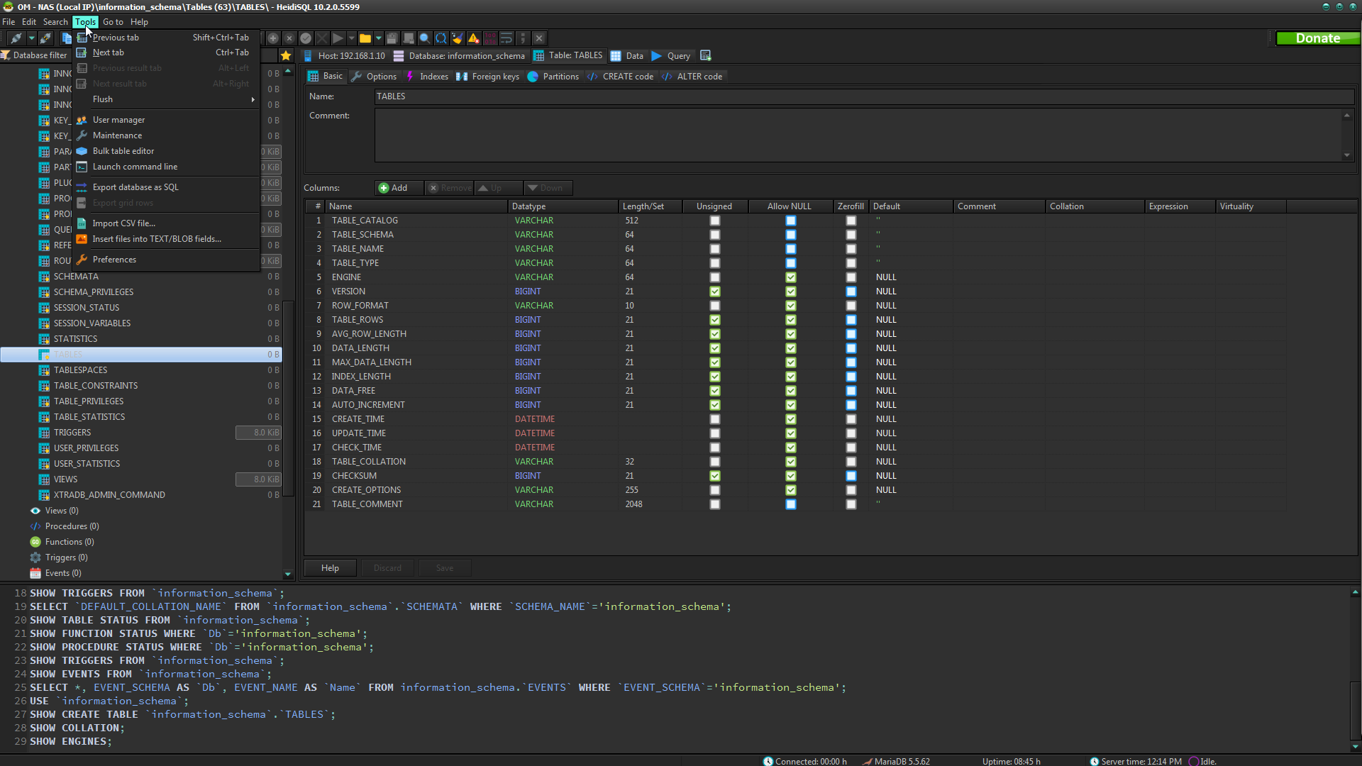
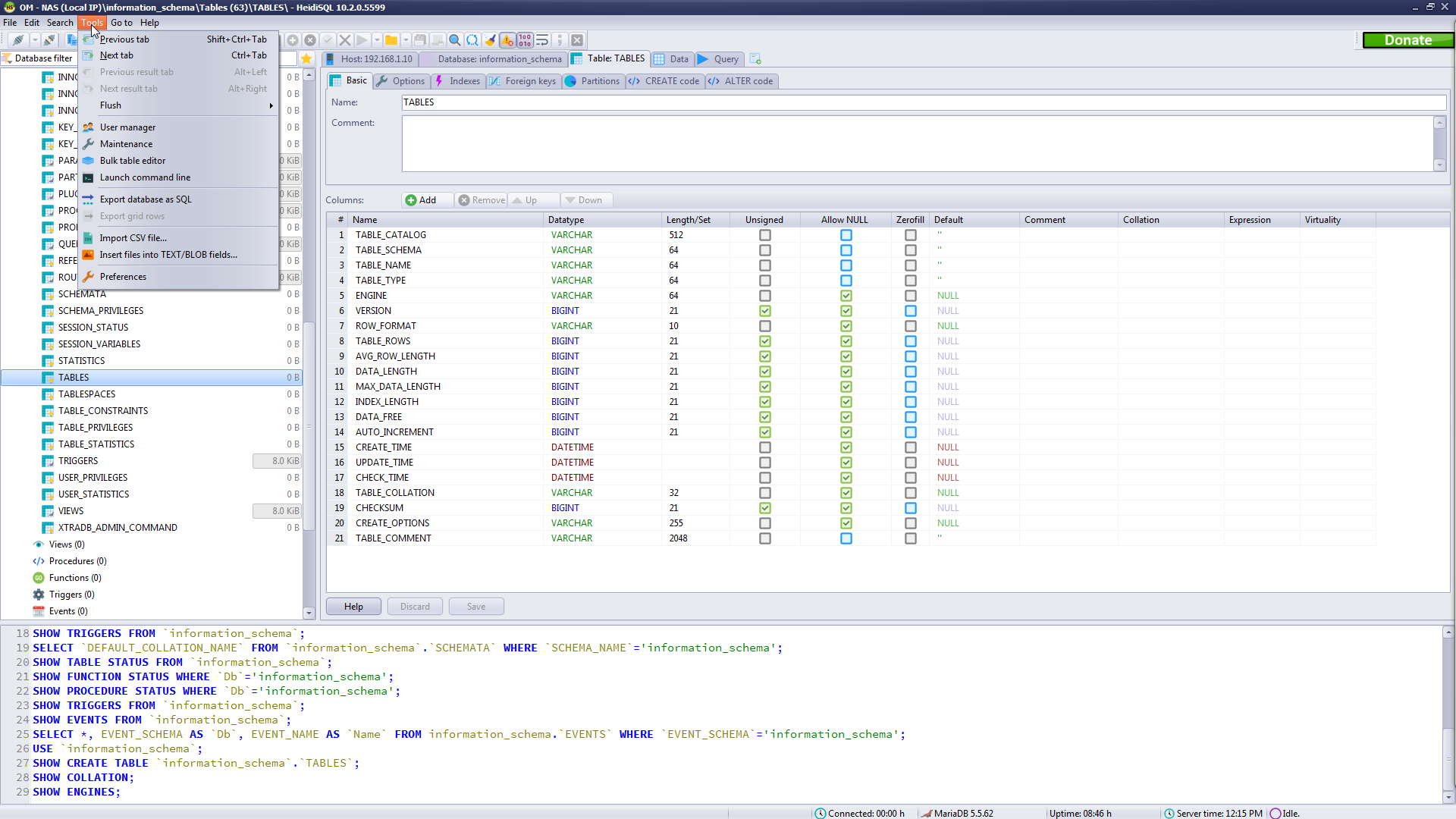
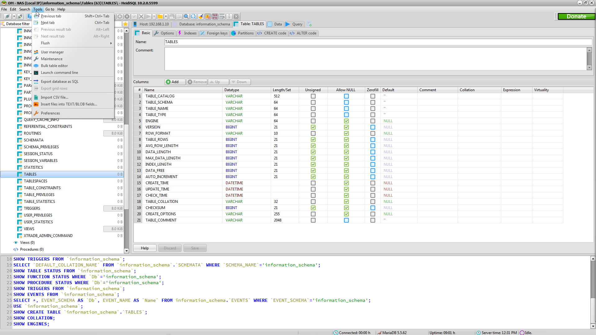
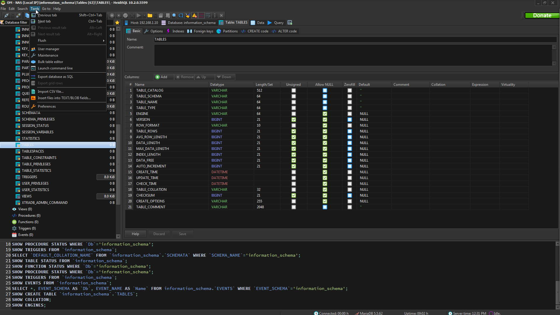
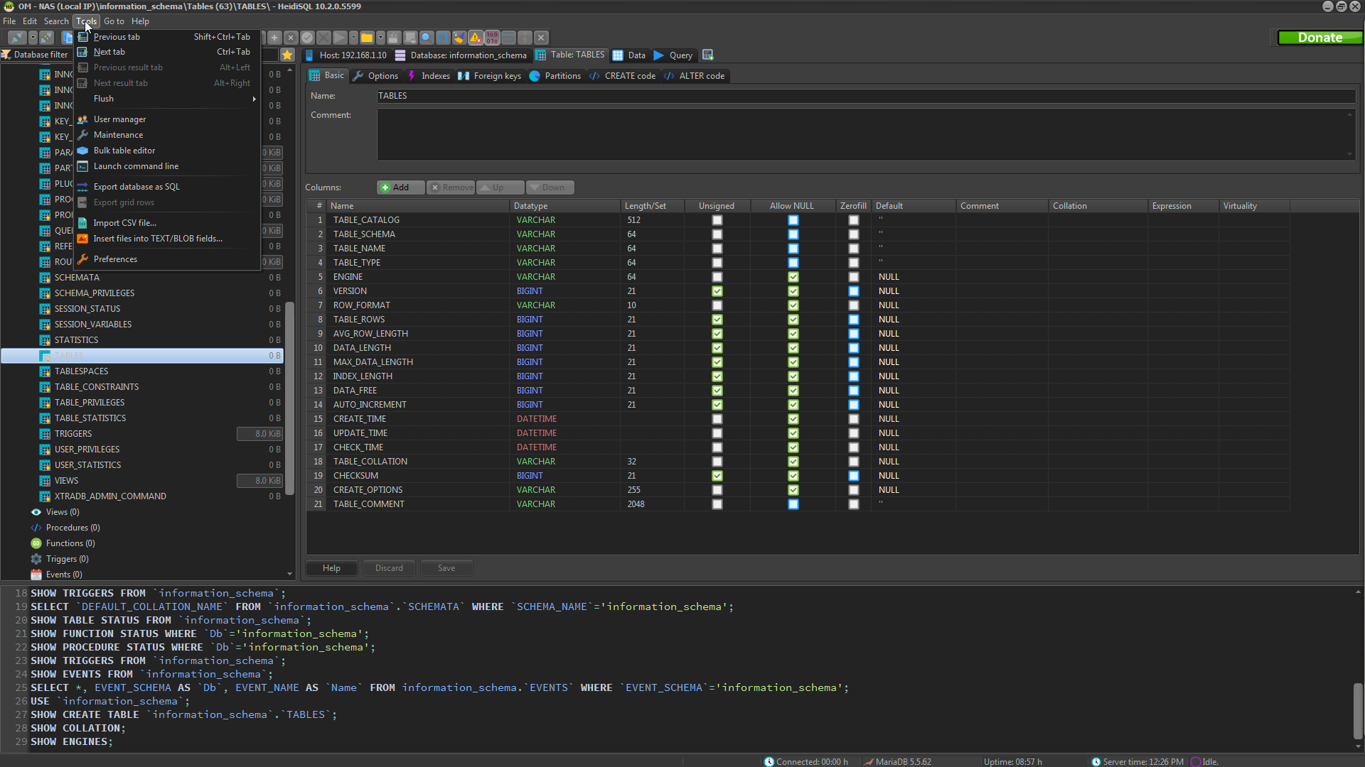
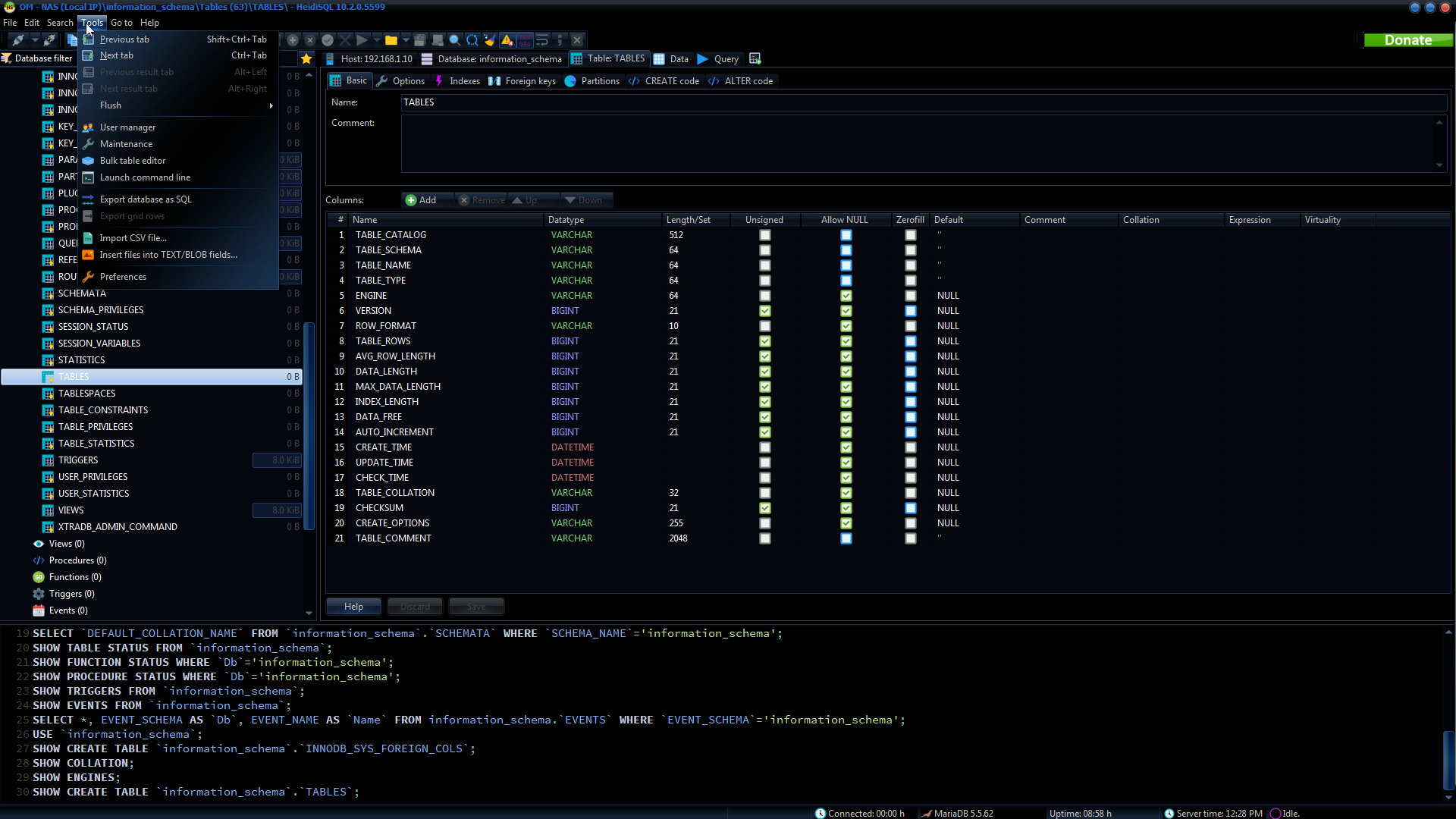
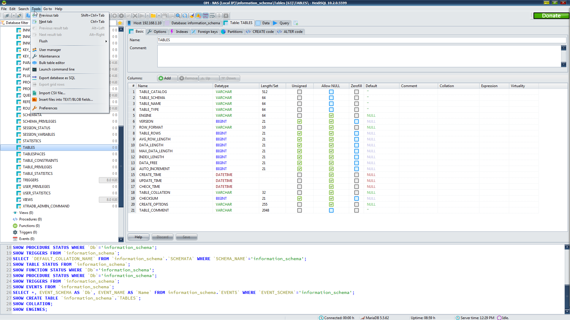
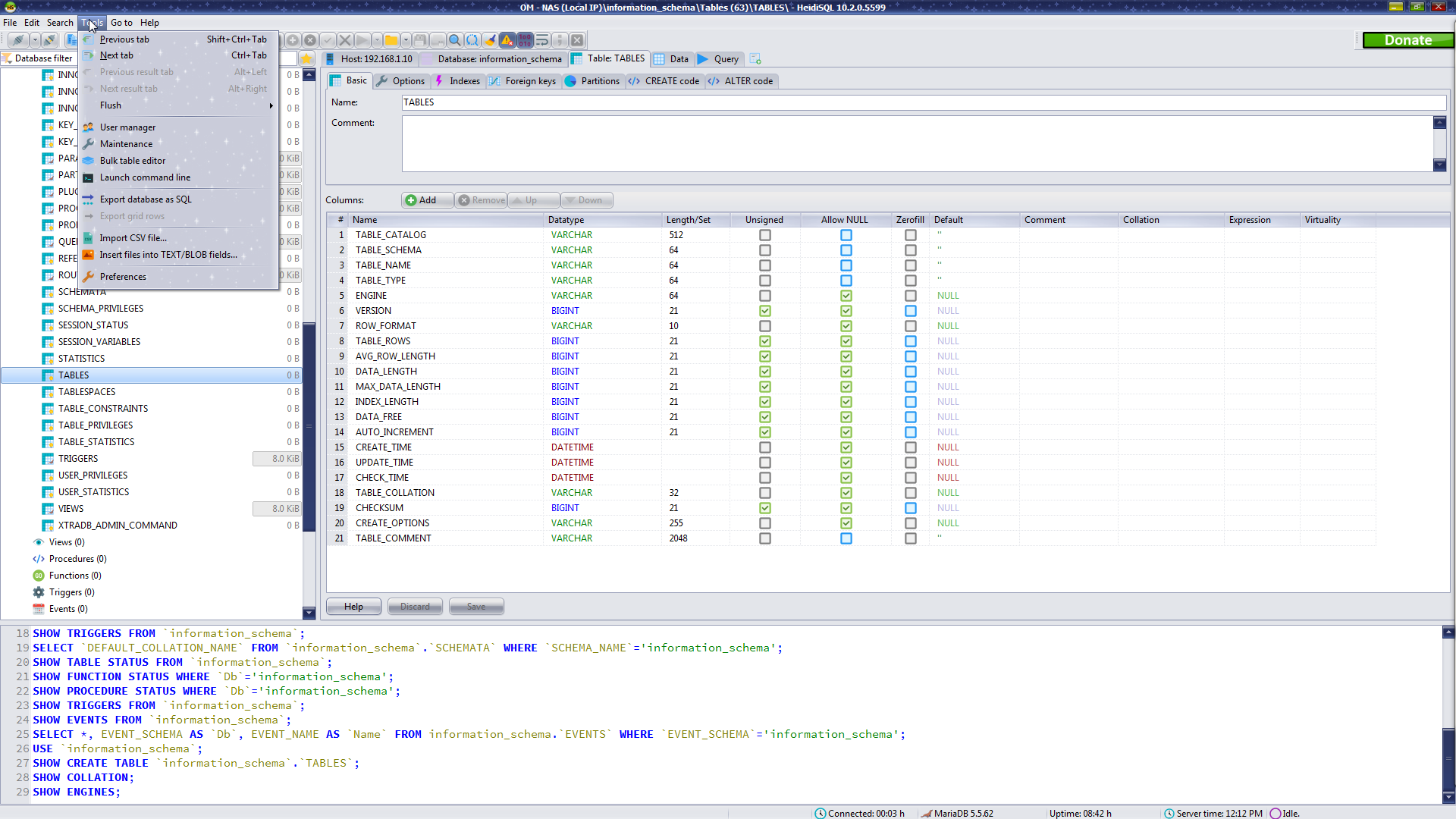
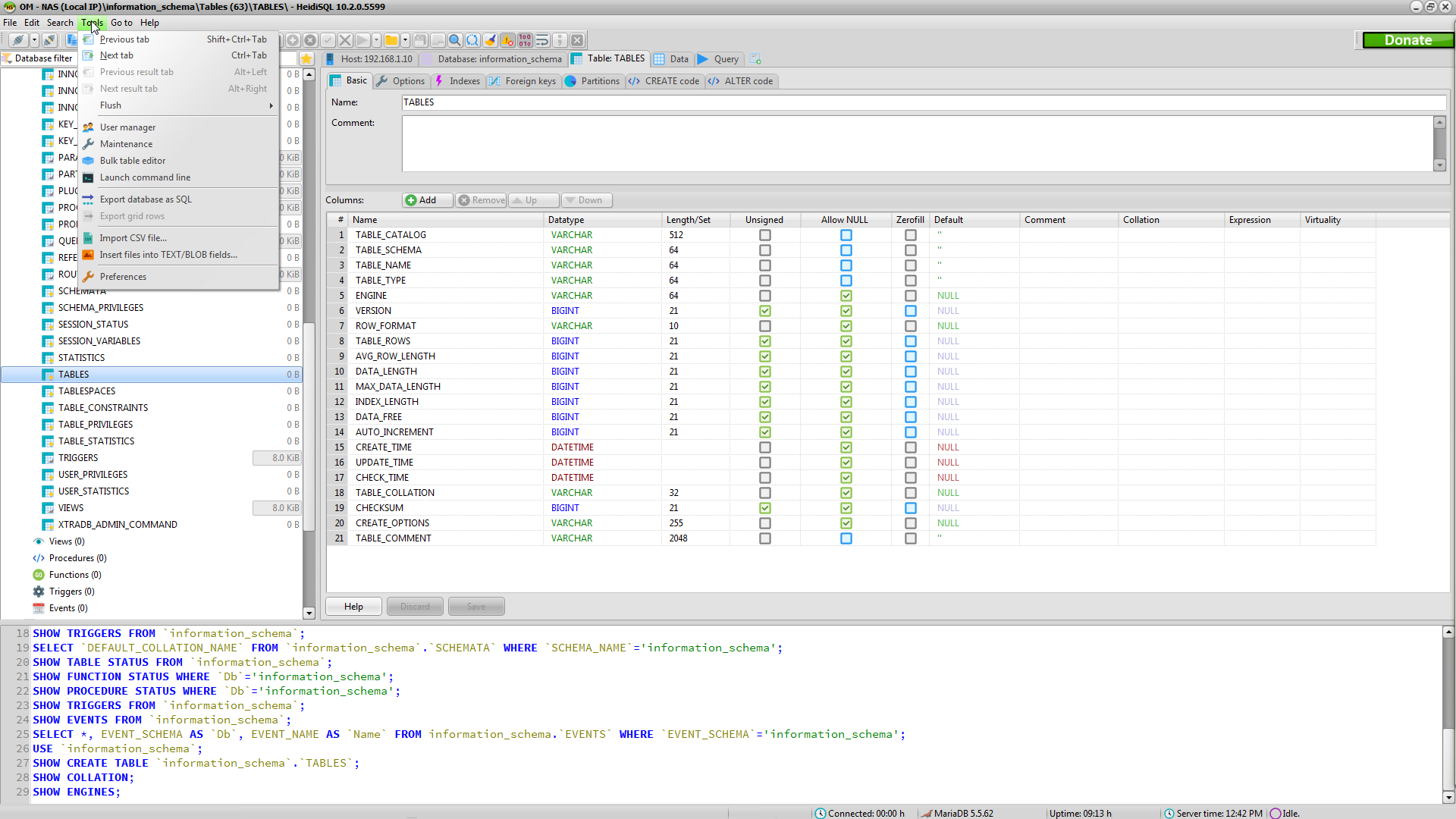
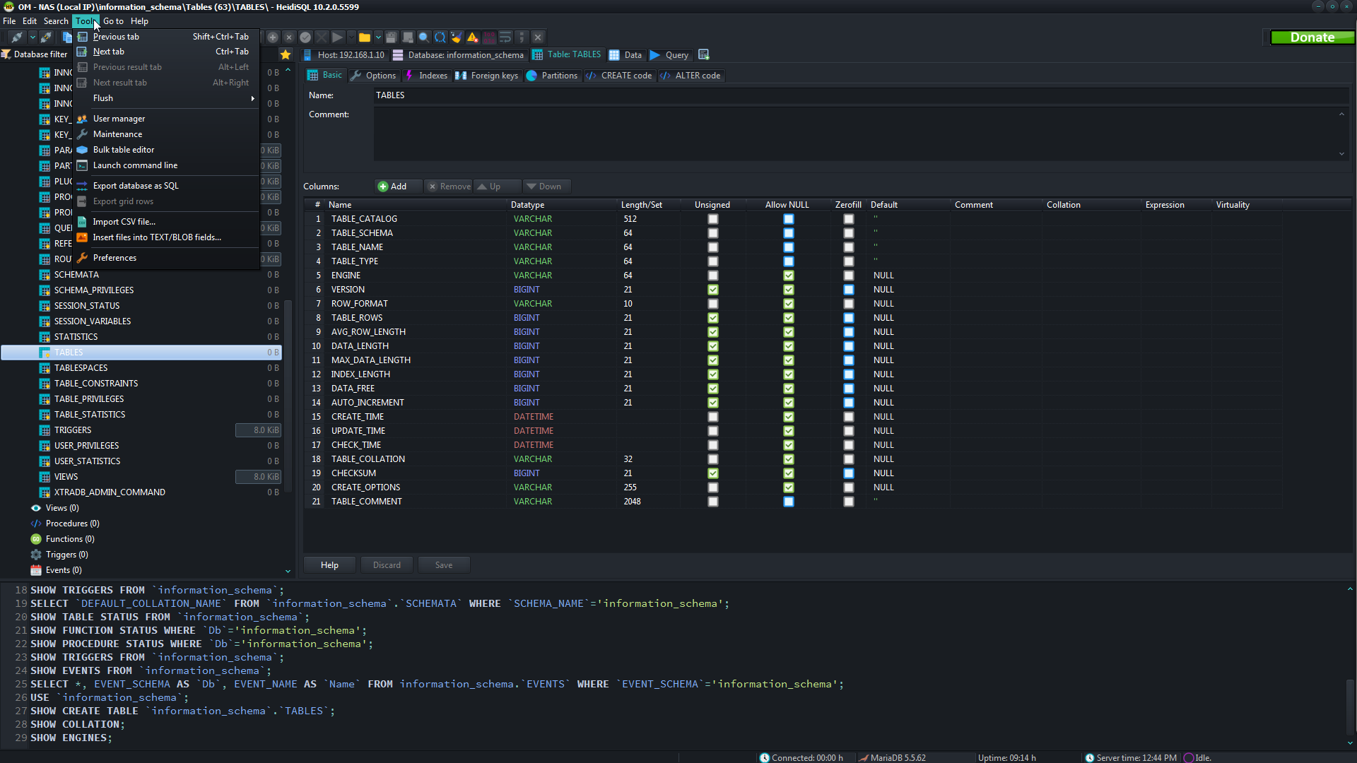
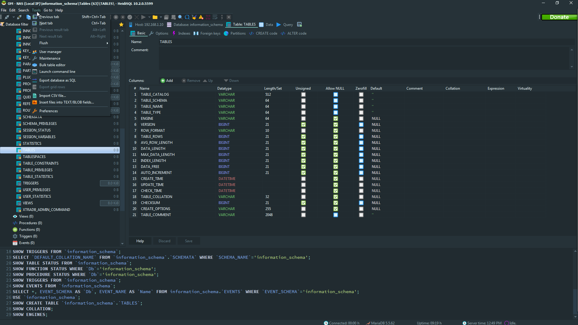
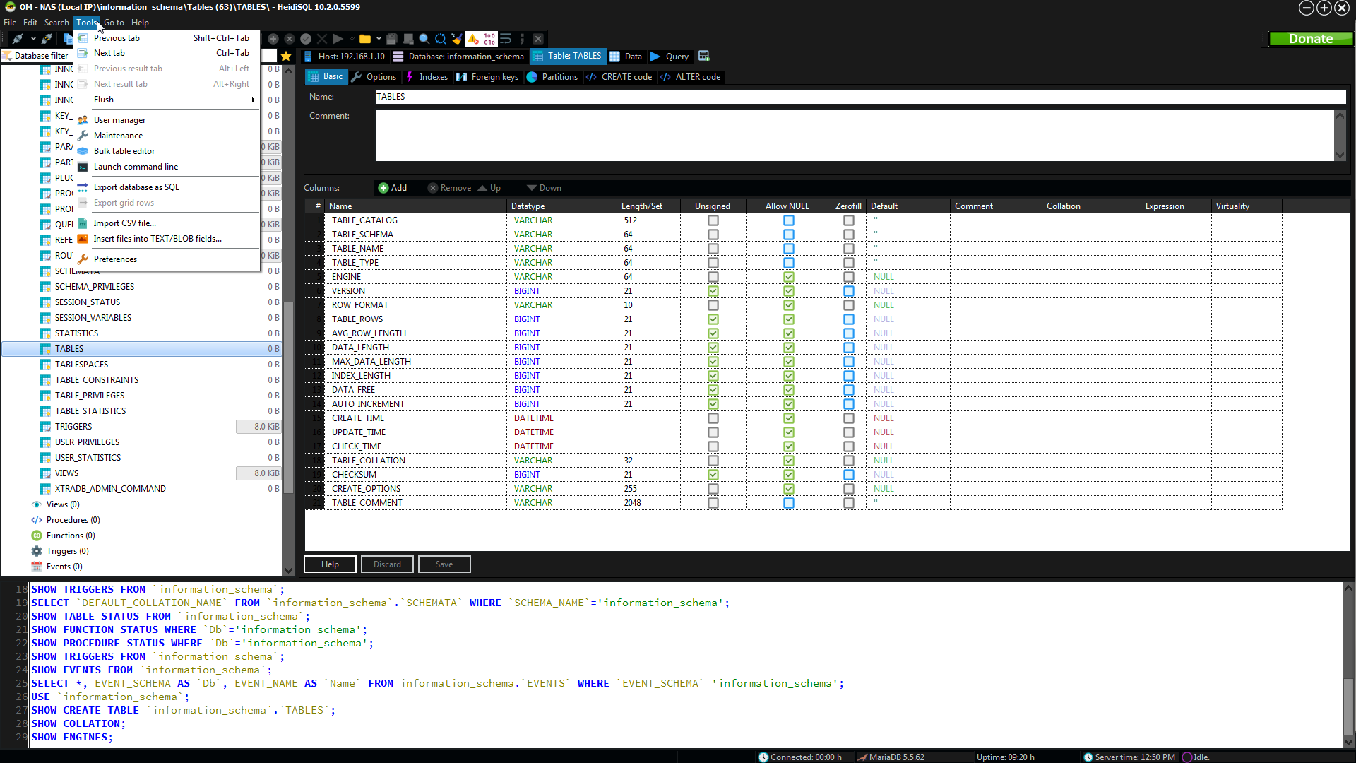
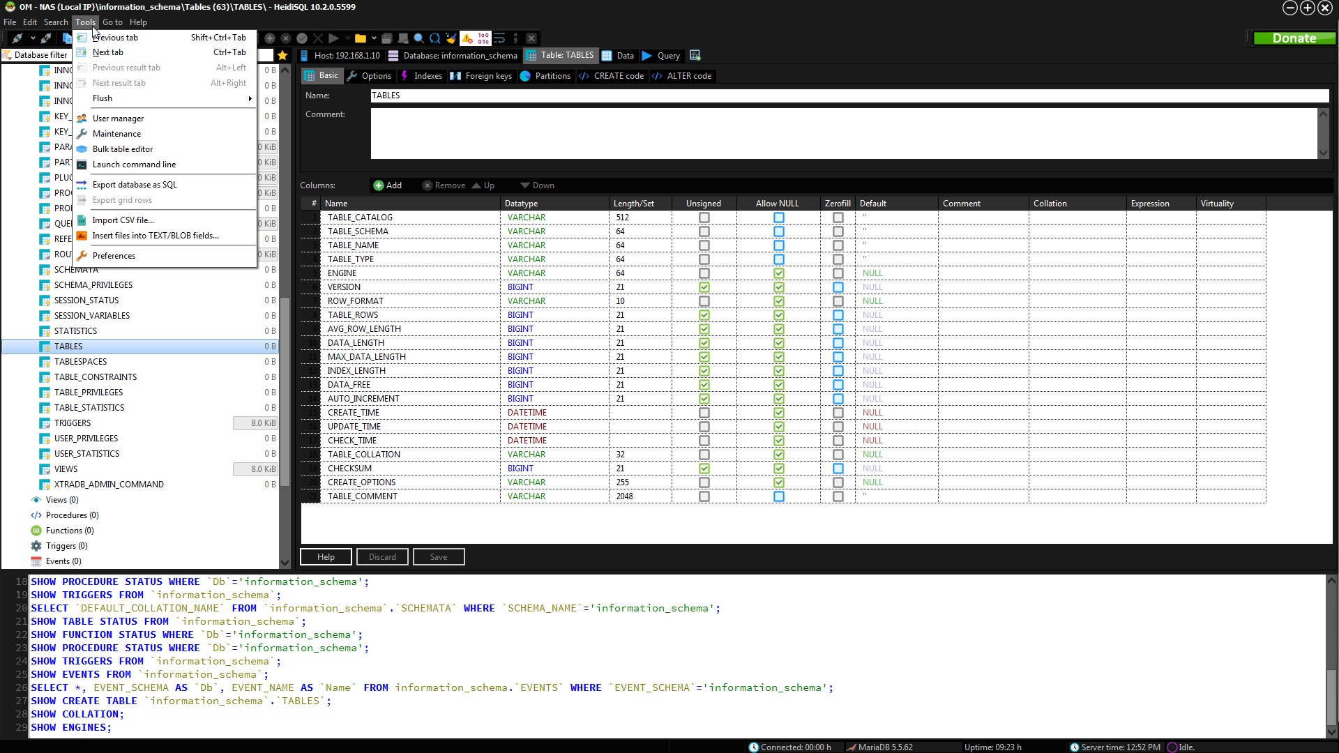
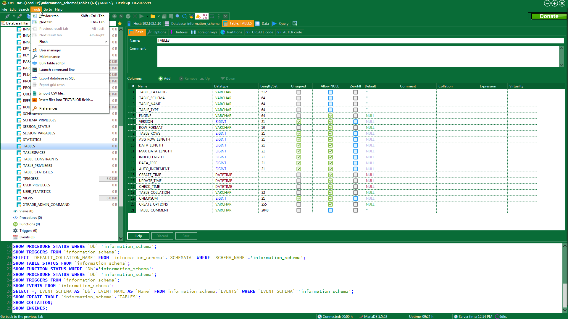
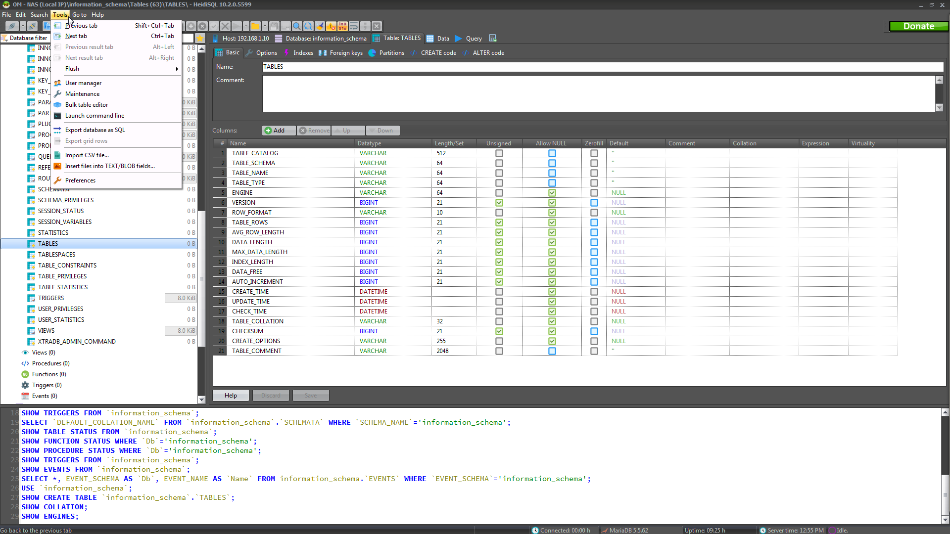
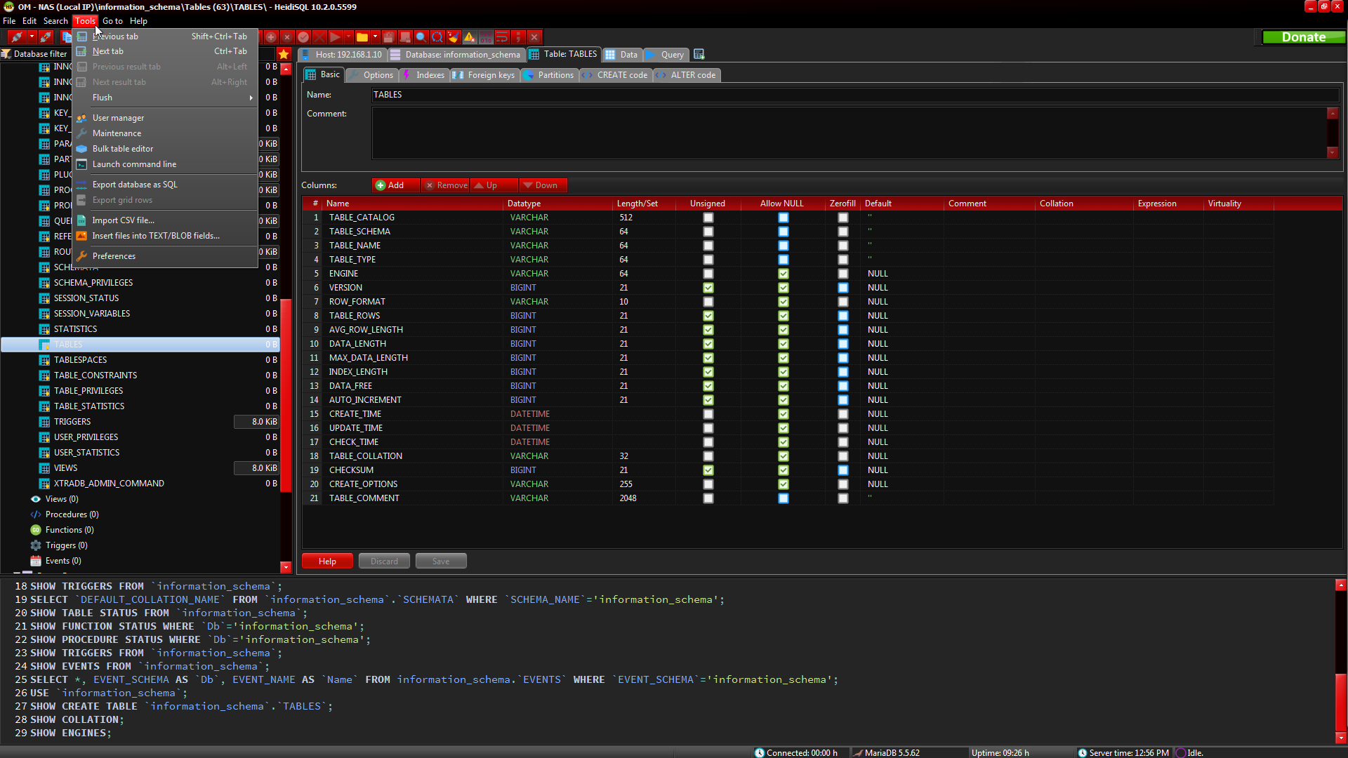
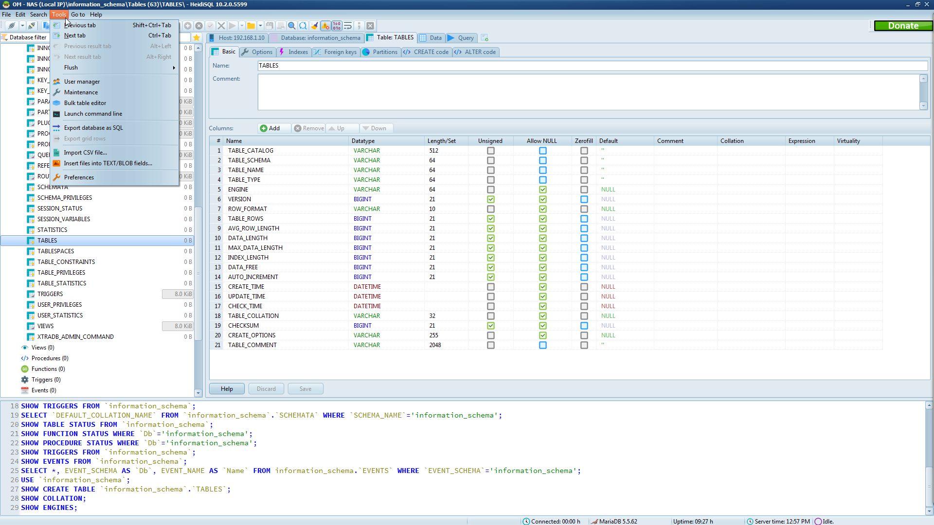
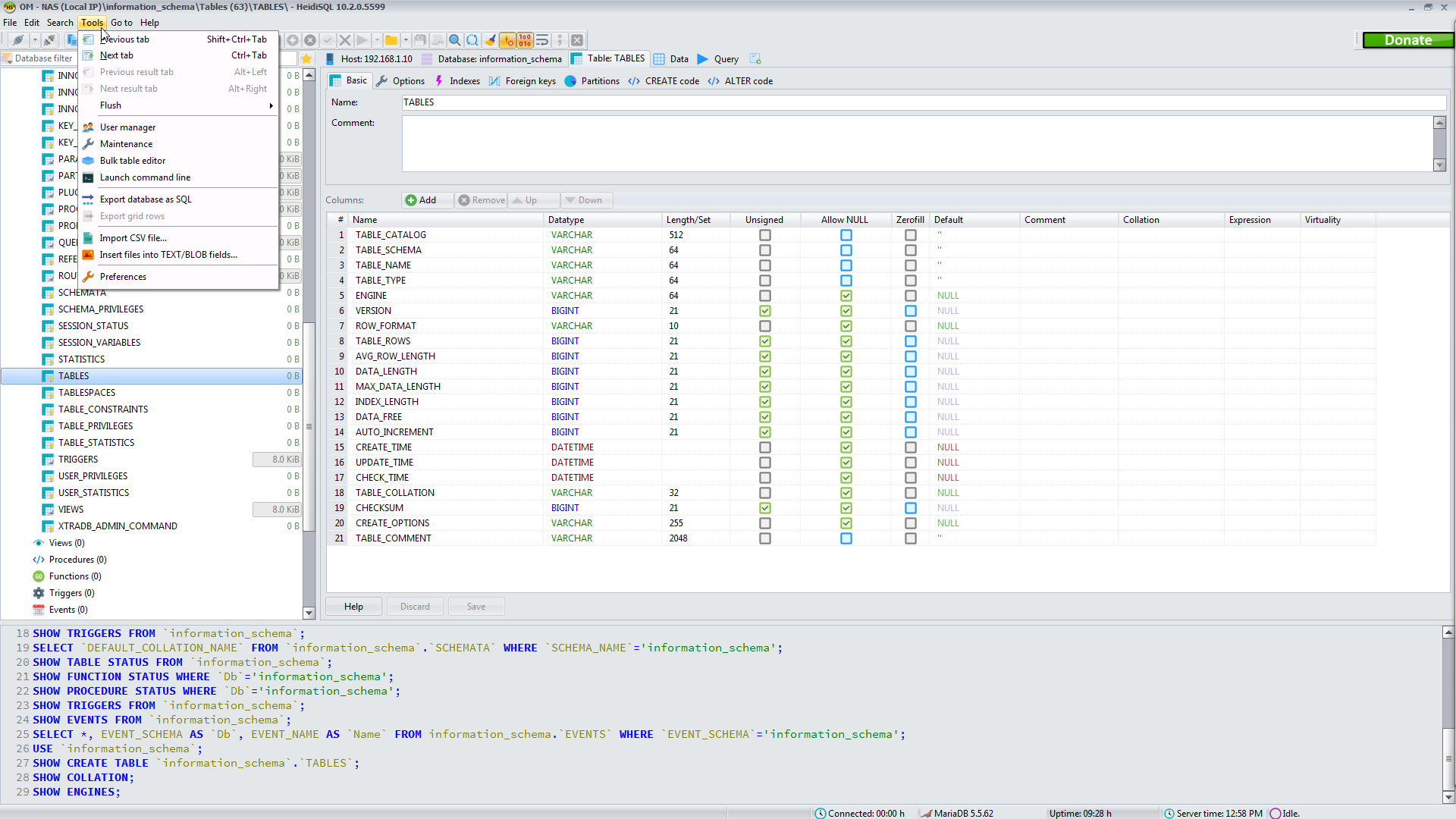
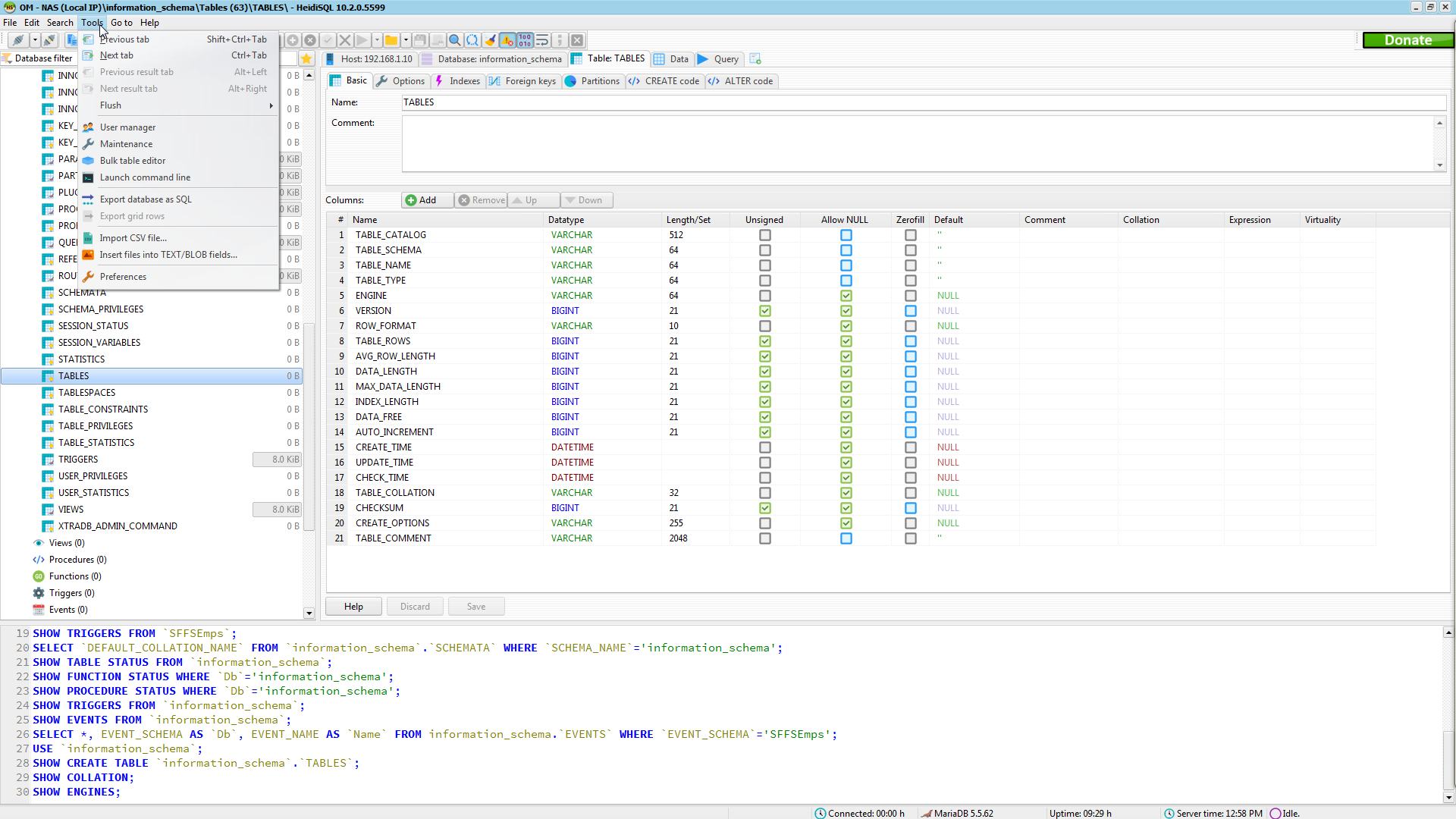
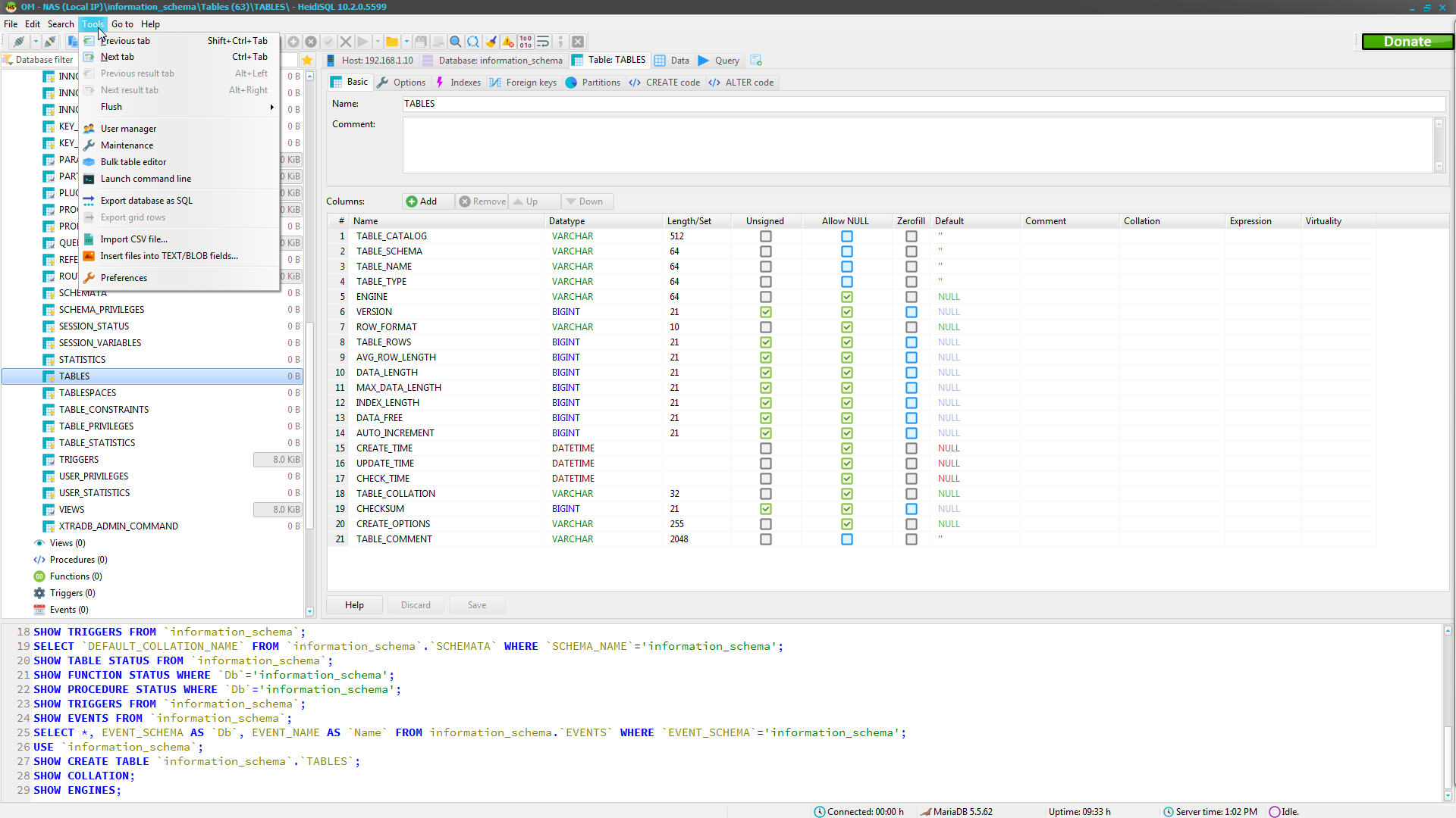
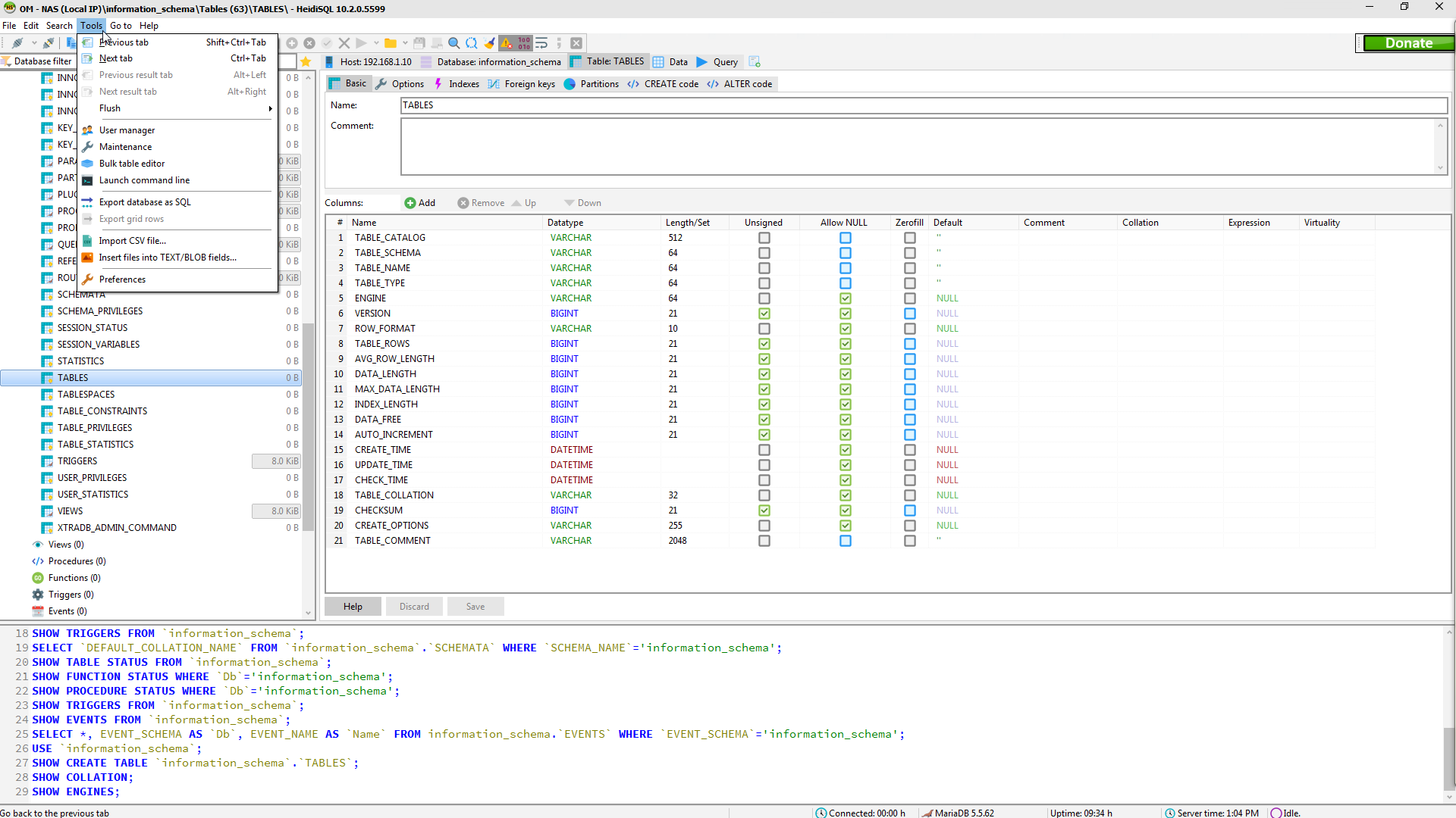
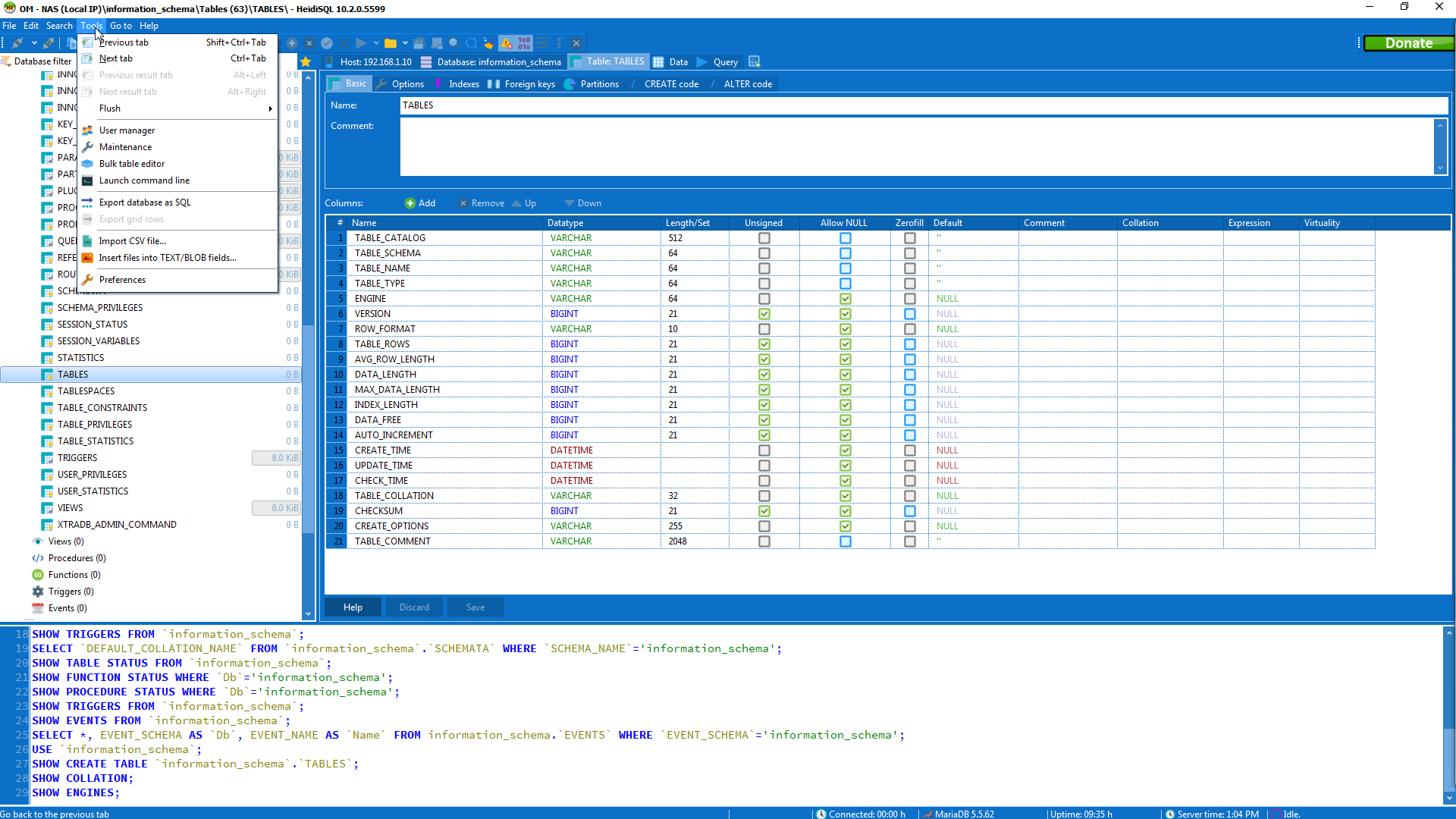
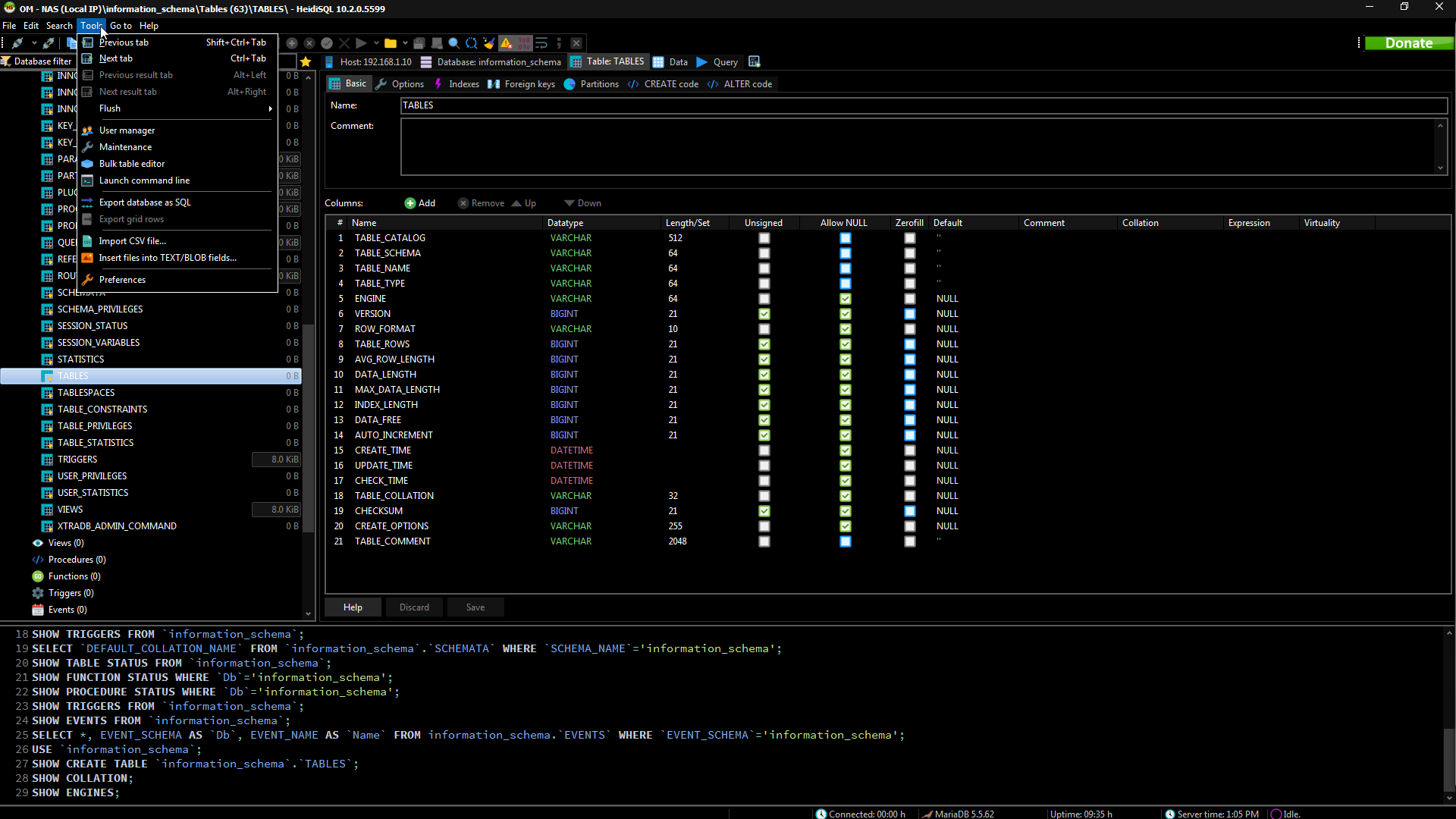
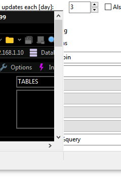
How about we help create the screen shots to save the coders some time. I will start the collection with 10 screen shots. If you can contribute, please let's all use the same shot. Open the Information_Schema database, scroll down until Events is the last item in the tree, select the TABLES table, and open the Tools menu. Grab a screen shot. Can we agree on 1920 x 1080? Then whoever can grab them all and do a blog or webpage can make things look uniform. I will come back and add more next week as time permits. Amakrits Amethyst Kamri Aqua Graphite Aqua Light Slate Auric Carbon Charcoal Dark Slate Cobalt XEMedia Cyan Dusk Cyan Night |


|
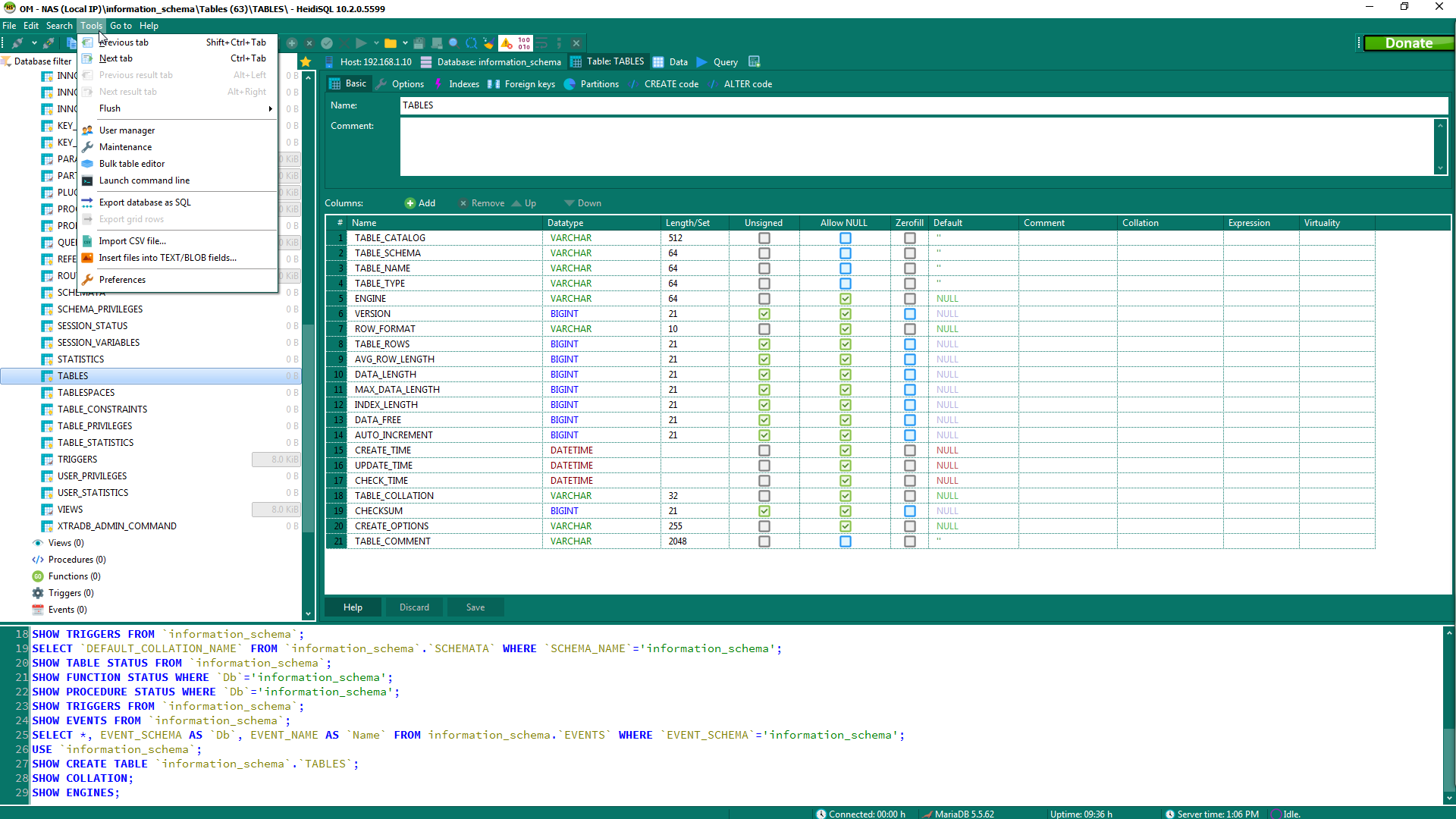
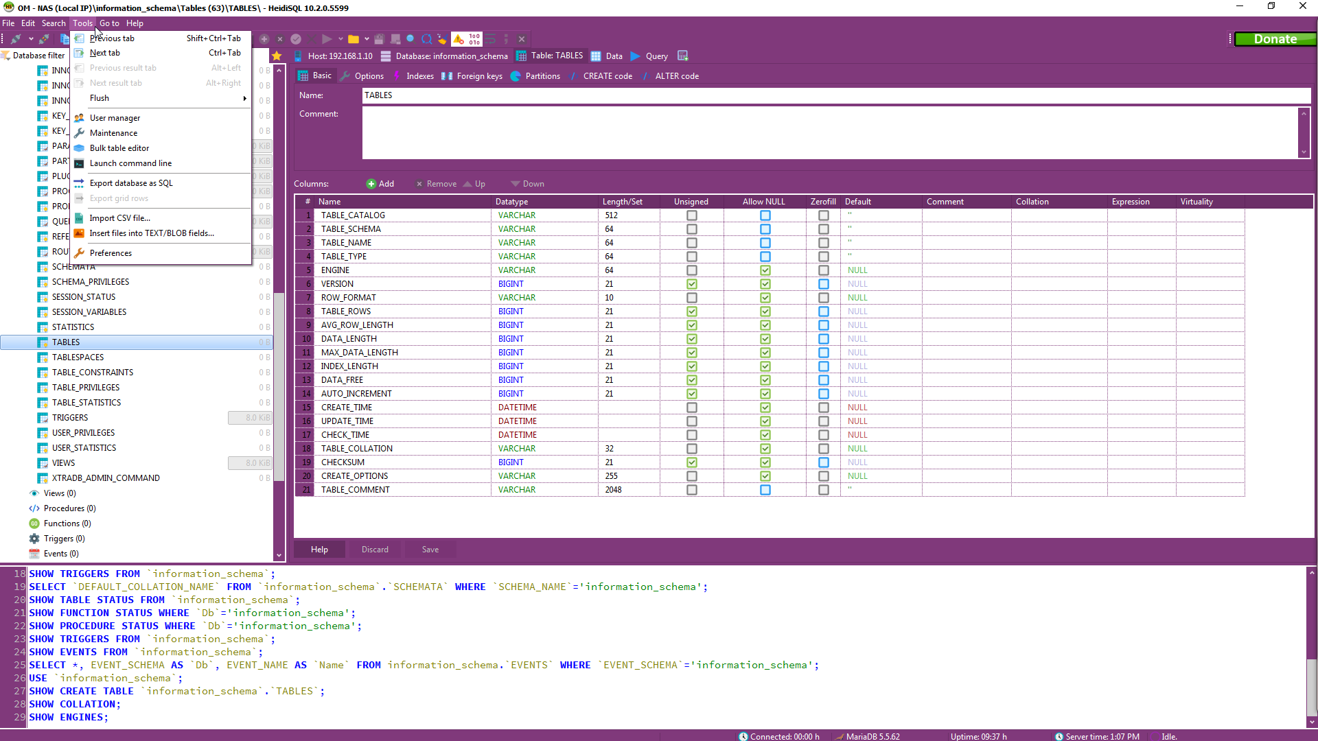
Heck, it didn't take long to do the first ten so here are the rest... Enjoy Emerald Light Slate Glossy Glow Golden Graphite Iceberg Classico Lavender Classico Light Luna Material Metropolis UI Black Metropolis UI Blue Metropolis UI Dark Metropolis UI Green Obsidian Onyx Blue Ruby Graphite Sapphire Kamri Silver Sky Slate Classico Smokey Quartz Kamri Tablet Light TabletDark Turquoise Gray Windows Windows10 Windows10 Blue Windows10 Dark Windows10 Green Windows10 Purple Windows10 SlateGray |


|
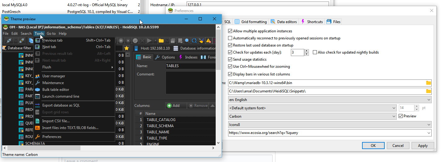
Hey @billom , thanks for the whole bunch of work, that's nice! I just thought I can integrate them in two ways: have them on heidisql.com on a theme preview page, plus create a preview button/dialog in the preferences window, like this:
|

|
Here's the just created overview web page: https://www.heidisql.com/themes.php |
|
How's that?
|
|
For testing yourself, please update to the latest build. And shout if there is something broken there. For me it works good (enough) currently. |
|
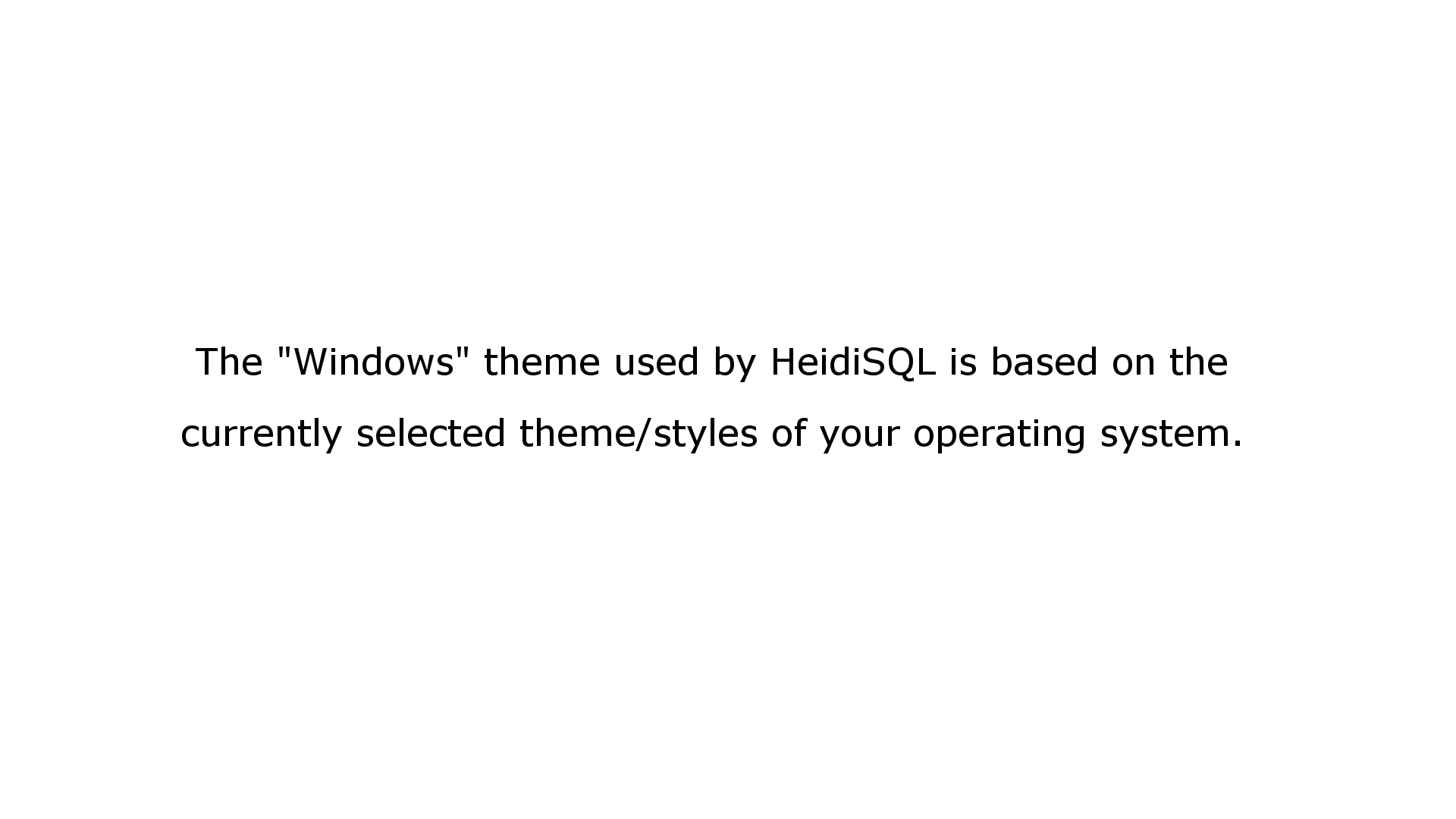
The preview worked great! Thank you. The only thing you may want to change is when we select "Windows", show something like the following screen shot. As it is now, the background stays to the one last selected.
|
|
Yes - I just uploaded that image too, so HeidiSQL should show it. |
|
Very nice - worked like a charm. Thank you for such an awesome tool. |
|
Hi @ansgarbecker, the preview is lookin cool! I'm thinking...is it possible to show it in a window which doesn't have the title bar, and has the classical windows 10 shadowed borders? Cheers ;) |
|
The borders of that window has shadows on my Win10: Setting the form's Well, this is not web design... |

When choosing a theme it would be useful to have a preview of some kind to show what the theme would look like.
Current behavior
To see a theme you must select it in the preferences and restart Heidi.
Possible solution
Either an image next to the dropdown in the preferences showing a screenshot with the selected theme or a page in the help documentation listing all themes with screen shots.
10.1
The text was updated successfully, but these errors were encountered: