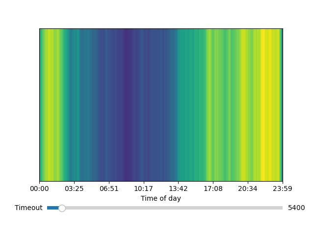
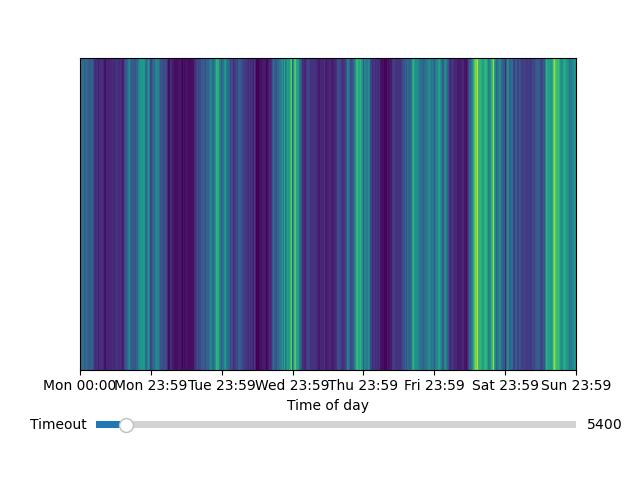
This is just a tool for taking activity "heartbeats" (where something outputs what it is currently doing periodically) and making a few interesting charts and graphs with it using matplotlib.
This was originally written specifically for Wakatime data, but there's no reason it couldn't be applied to other things. For example, I am planning on using this with Discord rich presense activity exports.
from sqlite3 import connect
from datetime import datetime
from HeartbeatsData.heartbeats_data import HeartbeatData, show
print("Reading data")
conn = connect("../wakapi_db.db")
cur = conn.cursor()
hbs = cur.execute("SELECT project,time FROM heartbeats WHERE user_id='hopperelec'").fetchall()
print("Parsing data")
hb_data = HeartbeatData()
for hb in hbs:
hb_data.add_hb(hb[0], datetime.strptime(hb[1][:19] + hb[1][-6:], "%Y-%m-%d %H:%M:%S%z"))
print("Producing legend")
hb_data.legend(ncol=2)
print("Plotting data")
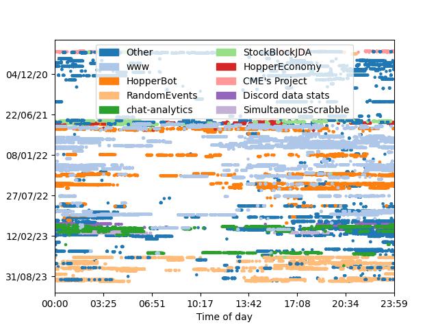
# hb_data.plot_scatter()
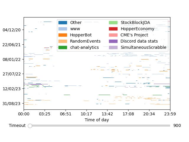
hb_data.plot_durations(slider_kwargs={"default": 900})
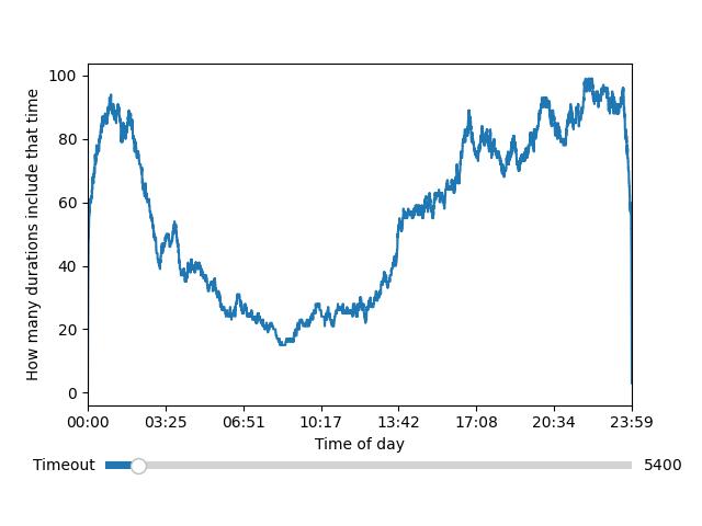
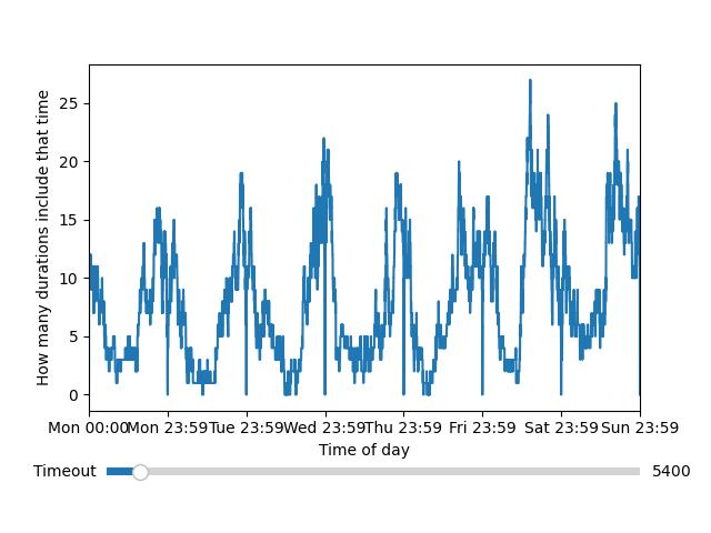
# hb_data.plot_duration_counts(False, True, slider_kwargs={"default": 5400})
print("Displaying plot")
show()(using the above code, all with the same data)