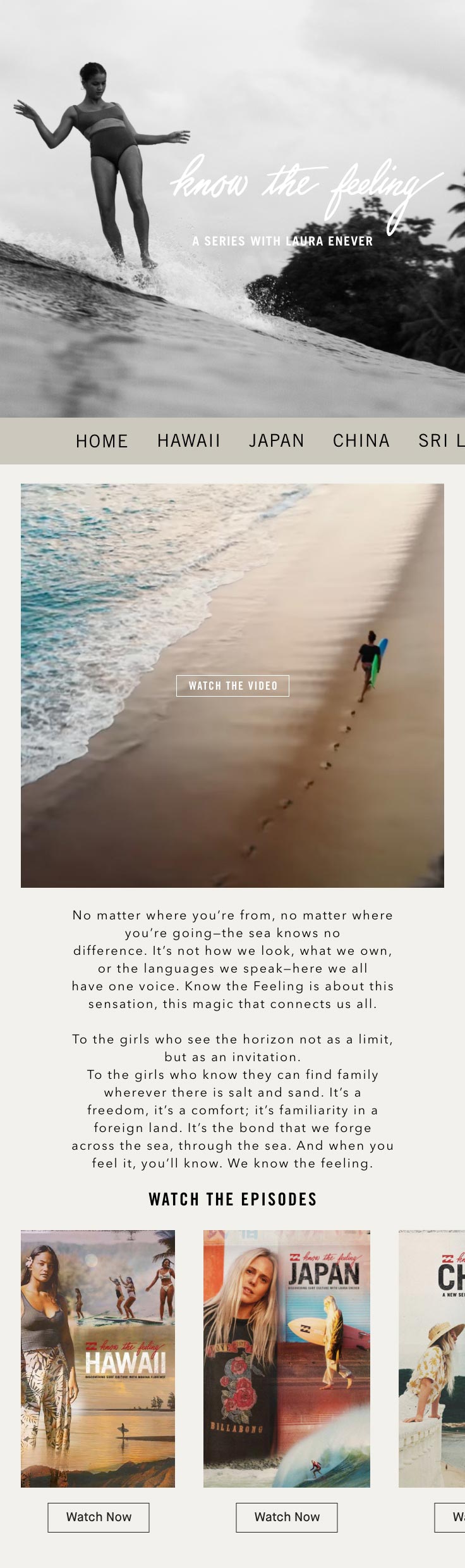
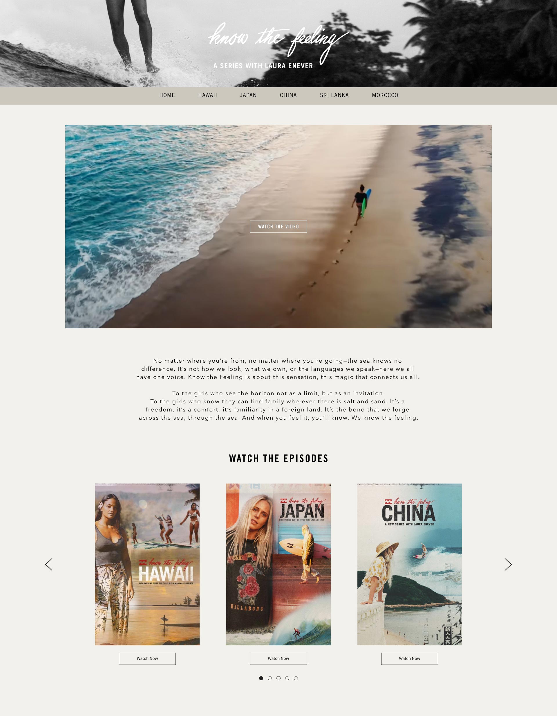
You will build a responsive, static page with some interactivity. Please refer to the mobile and desktop mocks for guidance. For functionality requiring javascript, you may write your own vanilla js or use libraries. Example, jquery, swiper.js, etc. Breakdown of the mock:
Display the appropriate hero banner whether desktop or mobile. Use 991 pixels width as threshold for desktop and mobile. The menu links can link to whatever you want. For mobile, the menu is a horizontal slider.
Display the appropriate mp4 video whether desktop or mobile. Use 991 pixels width as threshold for desktop and mobile. The mp4 should autoplay and loop on page load. When clicked on, a modal playing a youtube video shall open. Use any youtube video you like.
Format text in any preferred style.
Create an image carousel using the images provided. There are 5 images total. Desktop – show only 3 images at a time. On page load, the carousel will autoplay and loop. The carousel will slide automatically every 3 seconds. The carousel can also be navigated with forward/back arrows and pagination. Bonus, add a hover effect on each image using animation. Mobile – initially show 2.5 images. Allow user to swipe horizontally to see the other images.
I used SwiperJS to handle the carousel and horizontal slider in mobile navigation. In order to to make the mobile navigation dynamic/reusable, I used javascript to call a method on the navigation swiper to reset the position and disable the slider while using CSS to center the navigation slides.
Safari and iOS are picky when it comes to the video autoplay. It should run unless your phone is on low battery or your laptop is not plugged in or in low power mode.
For the modal I used YouTube's Iframe API to generate an IFrame with callable controls. This made it possible to easily start/pause the video when the modal is opened or closed.
The Text Blob was styled as closely to the original mock ups as I could without having access to/knowledge of the original font.
Image Carousel has had it's navigation replaced with an svg to more closely match the mockup. I also dug into the SwiperJS CSS to see how I could override the styling to make the pagination match the mockup.
I added a little bit of white space in the footer to let the bottom of the page breathe.