[BUG] App icon (default_icon) is not crisp #116
Comments
|
Hi @kryptonit1 I know what you mean and I also observed this. Tbh I didn't noticed the difference between custom path icons and the default one without your example. We'll work to improve this in the next iteration! |
|
Thank you for your quick reply as always! :) I think since the IBM Notifier default icon is black you don't see the difference as much as when you have a custom icon using other colors. |
Sign up for free
to join this conversation on GitHub.
Already have an account?
Sign in to comment
Describe the bug
This is not really a bug, but I would not consider it a feature either. When you rebrand IBM Notifier with your own app icon it becomes clear that the app icon is not very crisp. I first thought that this was due to some error on my part, but it seems like it's not.
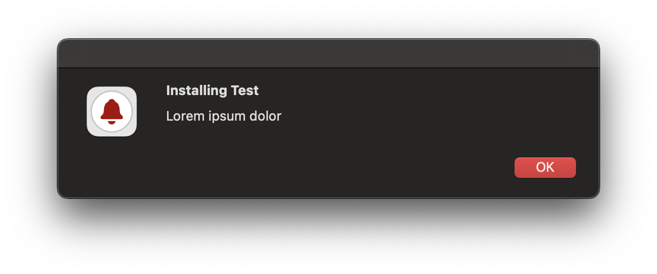
This is how my custom app icon looks like in the pop-up UI when an icon path has not been specified:

This is how the app icon looks like when I create and specify a separate ICNS-file that I use in the pop-up UI:
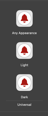
I think the difference in crispness is due to the lack of different icon sizes for the default_icon for the pop-up UI in the Xcode project:
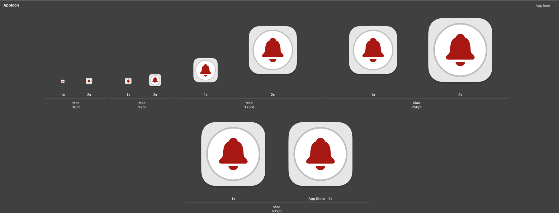
This is not a problem when you push out banners or alerts since it seems like it might be utilising the AppIcon asset under the Notification Agent in the Xcode project which contains more icon sizes:
To Reproduce
Steps to reproduce the behavior:
It's possible to work around this by specifying an icon path to a separately created ICNS, but it would be nice if the default_icon contained more sizes so that you would not have to create a separate ICNS in order for the icon to look more crisp.
Expected behavior
The app icon should look as crisp as the default macOS icons.
Screenshots
Please see above.
Desktop (please complete the following information):
Additional context
N/A
The text was updated successfully, but these errors were encountered: